
-
 Legendary London bookshop Claire de Rouen opens a new Shoreditch space
Inside the new outpost, designed as a hub for London's established and emerging artists to find inspiration and share ideas.
-
 15 interior design books to inspire your shelves and your spaces
Discover the Wallpaper editor's favourite interior design books, bringing together striking visual works that both inspire and illuminate
-
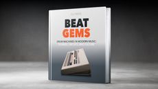 ‘Beat Gems’ is a new book about the cultural impact and evolution of the drum machine
New from Bjooks, ‘Beat Gems’ delves into the sounds, shapes and distinctive timbres of more than 60 iconic and cult examples of the modern drum machine
-
 For ‘The Kiss Book’, Tove Lo asked 600 people to kiss in a crowd. Here are the results
Kissing is intimate, primal and emotional. Musical artist Tove Lo and photographer Kenny Laubbacher celebrate the act in a new book
-
 A new book explores how Eddie Plein’s grills defined a cultural moment in hip-hop
‘Mouth Full of Golds’ traces Eddie Plein's mastery of a golden era of dentistry, and is re-released ahead of a forthcoming documentary film
-
 These eight design history books will teach you all you need to know about modernism and beyond
From sweeping surveys of 500 years of design to focused studies of colour in the 20th century, these landmark volumes will deepen your visual knowledge
-
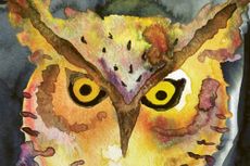 This enchanting children’s book explores girlhood with a host of gorgeously illustrated nighttime creatures
In 'Oralee: A Field Guide to a Young Human Who Learns to Glow in the Dark', artist Clare Crespo translates a fascination with owls into a meditation on growing up
-
 New book, 'Soviet Scientific Institutes', captures the afterlife of a society dedicated to discovery
Photographer Eric Lusito’s new monograph captures the strange experimental facilities and laboratories scattered across the countries left behind by the USSR
-
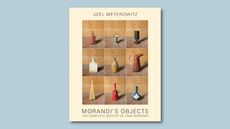 Photographer Joel Meyerowitz on reframing some of art history’s most famous props: ‘Morandi’s Objects’
In his newly updated book, 'Morandi's Objects. The Complete Archive of Casa Morandi', legendary photographer Joel Meyerowitz brings a practised eye to objects that inspired a master of still life
-
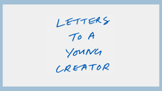 Find inspiration, aspiration and sage advice in the Steve Jobs Archive's ‘Letters to a Young Creator’
Some of the greatest modern minds come together to provide their insights into the creative process in this new publication
-
 Two new books explore different sides of the post-industrial landscape – real and virtual
‘The Edge of Ruin’ and ‘Photography, Video Game, Landscape’ offer up two viewpoints on modern landscape photography, both shaped by technology
-
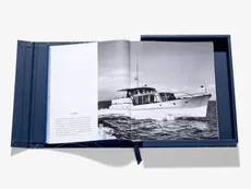 The ultimate monograph for the ultimate superyacht builder: Feadship by Assouline
Cast yourself away with this celebration of Dutch shipyard Feadship, a pioneering creator of unique superyachts
-
 Kengo Kuma talks technology and architecture to mark his new monograph, ‘Substance’
The new book from the celebrated Japanese architect features 35 material-led pavilion projects as well as his thoughts on the fusion of design, craft and technology; we interviewed him to find out more
-
 'Mexico Modern' has us longing to travel to the country's rich architectural landscapes
'Mexico Modern: Architecture and Interiors', a new book by Rizzoli surveying the rise of inspirational architecture in the country, is a feast of visuals and information to treasure
-
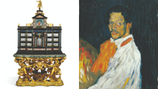 The 100 most iconic items ever sold at Sotheby’s, from a T-rex skeleton to a banana taped to a wall
A new Phaidon book, ‘Icons: 100 Extraordinary Objects from Sotheby’s History’, traces the auction house’s influence through its landmark sales, exploring how objects become cultural icons
-
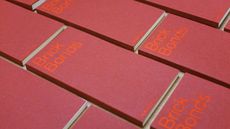 A new book on bricks and their patterns is a beautiful graphic object
‘Brick Bonds’ by Melissa Price is an artist’s book that renders architectural history with elegance and style
-
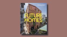 What happens next in domestic architecture? New book Future Homes points the way forward
Ellie Stathaki’s new monograph, ‘Future Homes: Domestic Architecture in a Changing World’, tackles the constantly shifting demands on home design without avoiding the realm of aesthetics and technology
-
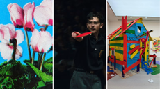 Out of office: The Wallpaper* editors’ picks of the week
January is about setting the tone for the year ahead, and the Wallpaper* editors have been doing just that, immersing themselves in art, music, food, literature and film. This week brings a taste of London’s best new dining spots, a nostalgic return to childhood through art and an escape to the country
-
 Tour these soothing courtyard homes around the world
‘Courtyard Homes’, a new book published by Phaidon, explores some of the most innovative interpretations of the genre, from Hawaii to south-east London
-
 Inside the seductive and mischievous relationship between Paul Thek and Peter Hujar
Until now, little has been known about the deep friendship between artist Thek and photographer Hujar, something set to change with the release of their previously unpublished letters and photographs
-
 Six beautiful books to gift the watch and jewellery lover
From an encyclopaedic love letter to watchmaking to a celebration of contemporary jewellery, these tomes are true gems
-
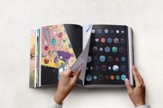
 The best contemporary art books to enjoy now
From maverick memoirs to topical tomes, turn over a new leaf with the Wallpaper* arts desk’s pick of new releases and all-time favourite art books
-
 Nadia Lee Cohen distils a distant American memory into an unflinching new photo book
‘Holy Ohio’ documents the British photographer and filmmaker’s personal journey as she reconnects with distant family and her earliest American memories
-
 David Kohn’s first book, ‘Stages’, is unpredictable, experimental and informative
The first book on David Kohn Architects focuses on the work of the award-winning London-based practice; ‘Stages’ is an innovative monograph in 12 parts
-
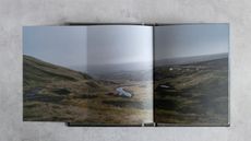
 Out of office: The Wallpaper* editors’ picks of the week
The rain is falling, the nights are closing in, and it’s still a bit too early to get excited for Christmas, but this week, the Wallpaper* team brought warmth to the gloom with cosy interiors, good books, and a Hebridean dram
-
 The best photography books for your coffee table
Flick through, mull over and deep-dive into the best photography books on the market, from our shelves to you
-
 Inside Davé, Polaroids from a little-known Paris hotspot where the A-list played
Chinese restaurant Davé drew in A-list celebrities for three decades. What happened behind closed doors? A new book of Polaroids looks back


