Latest

-
 Gary Hume’s artworks become furniture and design objects for Giobagnara
A limited-edition, marquetry-focused collection – from a cabinet to a screen – fuses the worlds of art and design for Giobagnara’s inaugural Art Edition series
-
 What is belonging? Jayden Ali on the London Festival of Architecture 2026 theme
The architect opened the LFA 2026 with a keynote lecture; his thoughts on this year’s theme, ‘Belonging’, span theory, practice and lived experience
-
 Art Basel insiders’ guide to the Swiss city
Looking for the best tables in Basel during the 2026 art fair and beyond? Five gallerists reveal their favourite restaurants, cafés and bars in the city
-
 ‘Everything starts from a glow’: Michael Anastassiades on sunsets and lightbulbs in Kyoto
On the occasion of his Kyoto exhibition, ‘From Warm Yellow to Saturated Red’ (at Taka Ishii Gallery until 4 July), Wallpaper* speaks with Michael Anastassiades about his approach to light, from sunsets to lightbulbs
-
 Enter the unsettling world of Lutz Bacher, a radical voice of American conceptual art
‘Burning the Days’, a new exhibition at Wiels in Brussels, unites four decades of the artist’s work and eschews easy answers about her practice
-
 Palazzo Gucci in Florence enters a bold new chapter under Demna
The Florence landmark reopens under new creative director Demna, who has curated Gucci Storia, an unexpected take on the Italian house’s history. During Pitti Uomo, Wallpaper* takes a tour
-
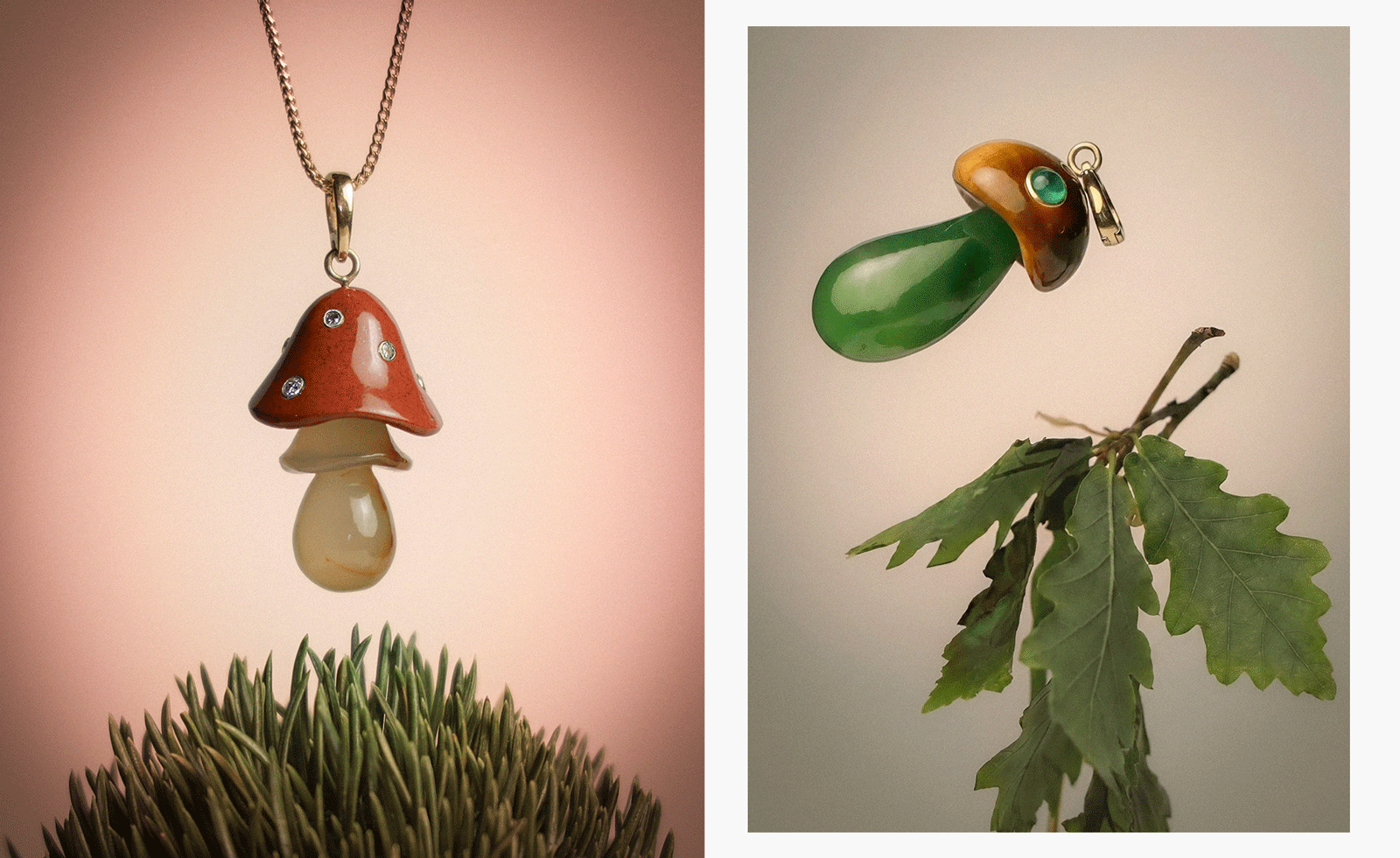 Emerging jeweller Martina Kocianova's mushroom jewellery is quirky, cool and spiritual
Central Saint Martins and Sarabande Foundation alumni Martina Kocianova presents her first jewellery collection
-
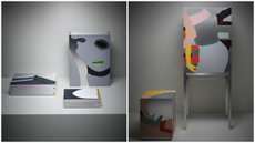
 At 3 Days of Design, designers focused on the small stuff
From a wooden crate and a whistle to cutlery sets and curtains, these are some of the everyday objects that caught our eye at 3 Days of Design 2026 in Copenhagen last week
-
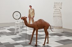
 Anish Kapoor disorientates, delights and disturbs at the Hayward Gallery
Anish Kapoor unveils vast new works in his first exhibition at the Hayward Gallery in 28 years
-
 These are the eight moments to look out for at Men’s Fashion Month S/S 2027
From Simone Rocha’s guest turn at Florence’s Pitti Uomo, to calendar shift-ups, designer returns and (a handful of) debuts, we pick the moments to look out for this Men’s Fashion Month (starting 17 June)
-
 Finally, Hudson gets the hotel it deserves
Pocketbook Hudson transforms a long-abandoned industrial landmark into the cultural centre of New York’s most creative small town
-
 Meet designer Rodolfo Agrella, whose work ranges from tables to saints
Freshly appointed creative director at Italian furniture company Potocco, Venezuela-born Rodolfo Agrella merges his heritage with a sensibility that crosses craft and industry
-
 A day at the Coworth Park spa offers modern wellness within a blissful, flowering meadow
Surrounded by polo fields, woodland walks and flowering meadows, Coworth Park's spa has unveiled a refined new chapter, blending restorative treatments, thoughtful design and sweeping views of the Berkshire countryside
-
 Architect Bill Bensley’s personal Eden opens its gates to guests in Thailand
For nearly two decades, the American architect has been building a fantastical estate in the Mae Rim valley. Now guests can experience it for themselves
-
 Inside Hermès’ extraordinary new London Maison, which is rooted in British eccentricity and craft
Comprising six buildings, 55 rooms, five floors and four elevators, Hermès Maison Bond Street is a staggering paean to construction and craft. As it opens this week, Nick Vinson takes a tour with architect Denis Montel
-
 Marc Isaacs takes his cult short film, Lift, back to 2001
Twenty-five years ago, award-winning director, Marc Isaacs, earned plaudits for his cult short film, compiling footage from hours spent in a London tower block elevator. Now, to mark the quarter-century anniversary, he’s releasing a new photography book
-
 After a decade in the making, La Hacienda, a Mexican temple to tequila, welcomes visitors
How five architecture firms created La Hacienda by Clase Azul as a testament to multidisciplinary collaboration and cultural heritage near Guadalajara
-
 What does it take to create a 'tropical', vintage-inspired dial?
Collectors call a brown dial ‘tropical’, referring to one that’s been faded through exposure to intense sun over the years. Does a new watch made to look old speak to a growing collector-influenced trend towards vintage-style pieces?
-
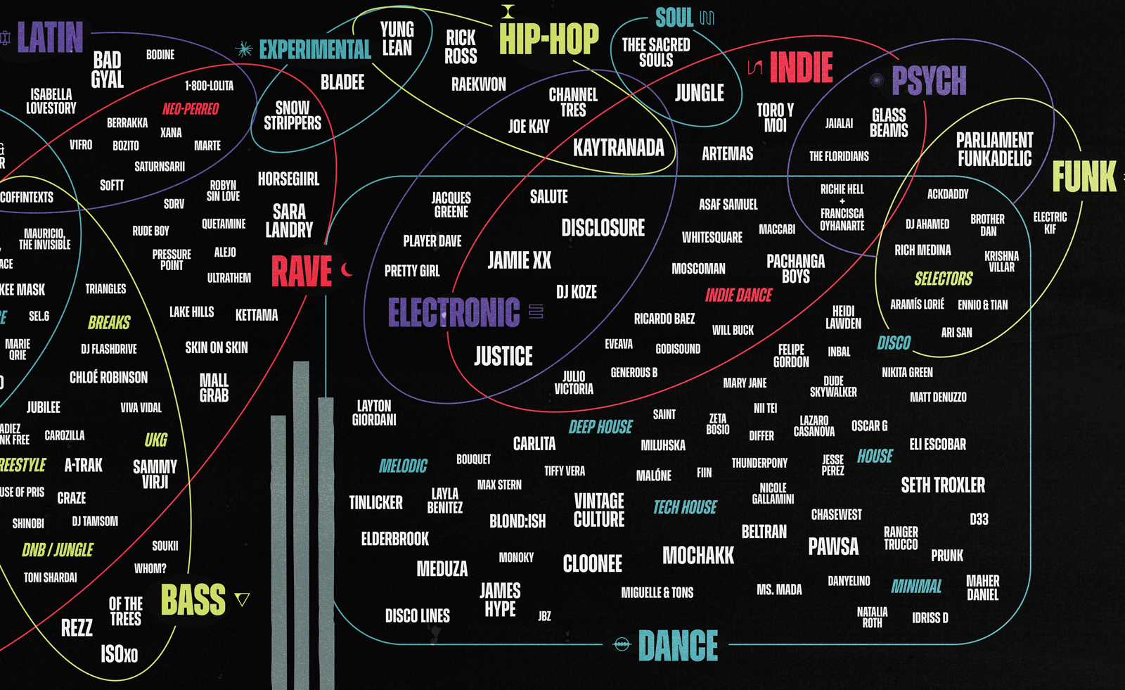 Why are festival line-up poster designs getting so hard to read?
As festival line-up posters become more abstract, we look at what is driving the increasingly complicated designs
-
 Shiro Kuramata, the designer of playful impermanence
Shiro Kuramata's distinctive approach combined traditional Japanese aesthetic concepts with modernist expression. We look at the late designer’s work across furniture, interiors and objects
-
 Tour John Lautner's Sheats-Goldstein Residence, an LA legend
A John Lautner-designed midcentury gem in the Beverly Crest neighbourhood of Los Angeles makes an appropriately angular backdrop to the July 2026 issue's fashion story; here we explore its architecture, refreshed by Conner + Perry
-
 Drawing on the house’s equestrian roots, Hermès’ ‘Clou de Forge’ bag is a future classic
First appearing in the Parisian house’s A/W 2026 runway show, the new bag features a closure inspired by the ‘Clou de Forge’ bangle
-
 A rare insight into Paul Thek – the ‘artist’s artist’ – at Pace Gallery, New York
Thek had a turbulent life and career. A major new show offers an exploration of his rarely seen works
-
 Samuel Nagel and Paul Feiler win the Rimowa Design Prize 2026
Bespoke Partnership
The creative duo’s ‘Nura’ bracelet wins the latest edition of the Rimowa Design Prize, which looks to the next generation of creative talent in Germany for ingenious ways to support mobility
-
 Chicago’s new Obama Presidential Center isn’t a monument – it’s a moment
The 19-acre museum campus, conceptualised by architects Tod Williams and Billie Tsien for Barack and Michelle Obama, provides a series of inspiring spaces that foster enlightenment, engagement and play on Chicago’s South Side
-
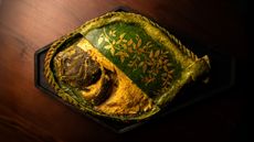 Oudh 1722 brings a forgotten Indian culinary tradition to London
Michelin-starred chef Aktar Islam’s first London restaurant is rooted in the historic food culture of Awadh, northern India’s former royal province
-
 The history of design through nine children's chairs
‘Mini Furniture: Chairs for Children’ at MK&G in Hamburg (14 June to 1 November 2026) surveys two centuries of practical, playful and innovative designs for kids
-
 Track the work of Carl Pruscha across Nepal and Sri Lanka – take our architectural tour
The Austrian architect’s work in the regions melds local traditions with a modern approach. Architect and photojournalist Nipun Prabhakar pays homage with a tour
-
 Check into South Tyrol’s newest design-led mountain retreat
Architect Matteo Thun’s latest project brings 24 new suites and a wellness complex to a 150-year-old retreat framed by the peaks of the Stelvio National Park


