Samuel Ross on the architectural influences and optimistic ethos behind his Acqua di Parma collaboration
Samuel Ross discusses the inspiration behind his redesign of Acqua di Parma’s iconic Colonia fragrance

Samuel Ross is not an architect, at least in the traditional sense, but his creative practice is inextricably linked to the semiotics and aesthetics of the discipline.
A Cold Wall*, the clothing line he founded in 2015 when he was only 24 years old, is ‘a material study for social architecture’; Concrete Objects, a range of functional designs co-created with Jobe Burns, are inspired by brutalism and Le Corbusier; and his studio SR_A, ‘operates within the fields of luxury industrial design, interior installation, architecture, furniture design, sound design and sculptural/visual communication’.

Colonia Limited Edition, designed by Samuel Ross
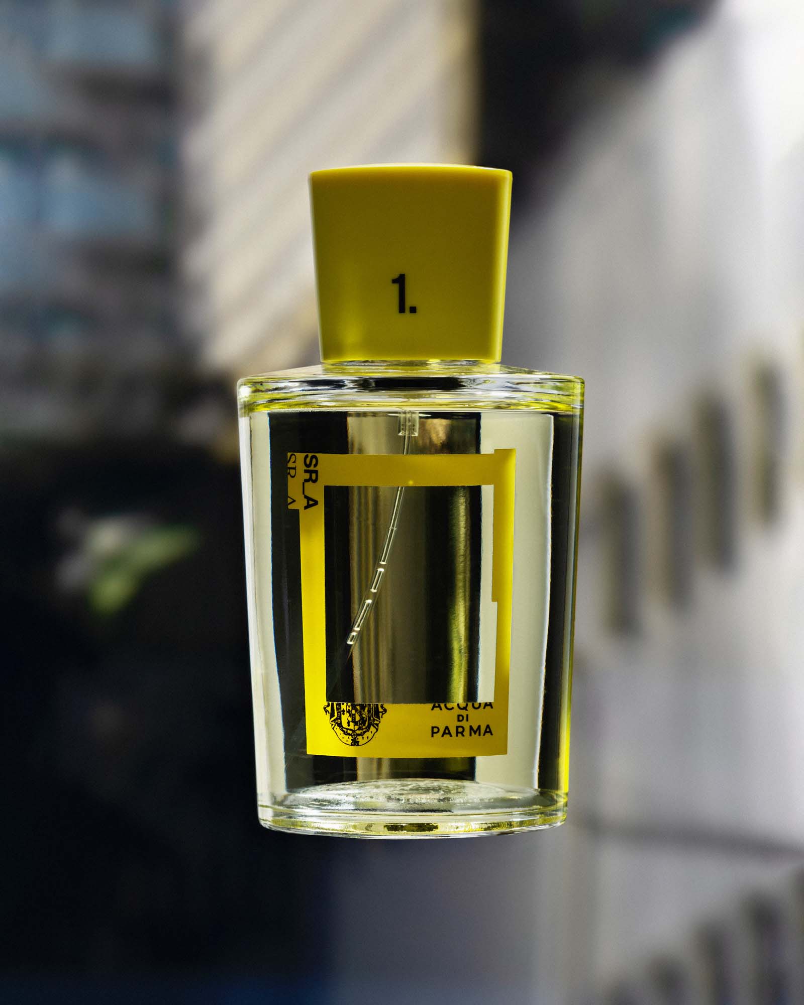
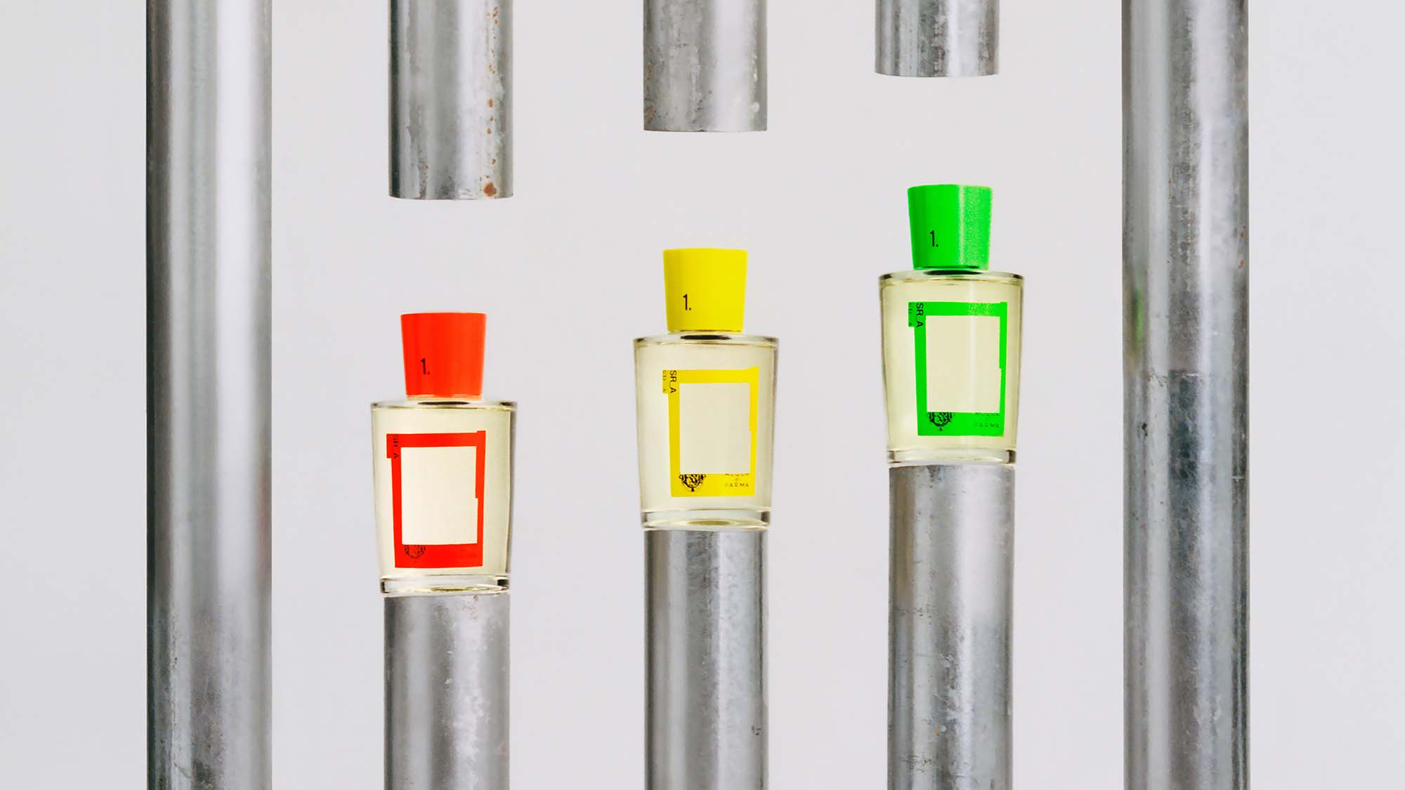
His latest project– a redesign of Acqua di Parma’s iconic Colonia bottle– is no exception. Colonia Limited Edition, designed by Samuel Ross sees him repackage the fragrance (which has remained unchanged since 1916) in a new design inspired by the architecture of Milan and London. The new bottle comes in three colours – Sun_Rise_Yellow, Grass_Blade_Green and Ultra_Orange – and features a scaffolding-like window frame in place of the traditional label.
Samuel Ross on the limited edition Colonia bottle
Ross is well-acquainted with both cities – he was born in London and operates SR_A out of 180 Strand; while A-Cold-Wall* relocated its atelier to Milan 2022. But the redesign of Colonia is hardly just an expression of Ross’ own familiarity with the two locations; rather, it is a product of, as Ross describes it, SR_A ‘fracking and mining’ the architectural dialogue between Milan and London in the wake of the Second World War, and then bringing the history of that connection into the present.

‘We were really looking at are there any connective points between the historic architecture of London across the 20th century in correlation to Milan, which this fragrance represents,’ says Ross. ‘We found post-modern architecture and modernism onward from World War II and this reintegration of what Europe could look like as the focal point. Especially as England has unfortunately left Europe, it felt like it was important to reassert a certain optimism and an optimistic connection between European cities.’
‘Architects that do that when on to inspire this product are Renzo Piano, Richard Rogers, and Superstudio, which all have this Italian-British connection that we really wanted to dive into,’ he continues. ‘And it was particularly those three practices that we focused on because they [express] an optimism in the face of adversity within a post-war society. If I think about post-Brexit and this yearning we have spiritually to be close. I wanted to frack and mine that in the past and bring that forward.’

In addition to the work of Rogers and Piano, Ross sites ‘Massimo and Lella Vignelli’s typographic works across visual maps and routes – specifically the New York Subway’ and ‘modernism’s use of flat bold primary colours, paramount across European architecture and city iconography’, as influences on the bold colour palette of the new collection. Meanwhile, the label draws from ‘the scenography of Milan, London and beyond’.
It is the inherent irony of good design that it takes a lot of thought to create something that seems simple and intuitive. Such is the case with Colonia Limited Edition, designed by Samuel Ross, a perfume bottle that, on its surface, just looks good, but really belies complex considerations and meticulous execution.
Receive our daily digest of inspiration, escapism and design stories from around the world direct to your inbox.
A version of this story appears in the April 2023 issue of Wallpaper*, available now in print, on the Wallpaper* app on Apple iOS, and to subscribers of Apple News +. Subscribe to Wallpaper* today
Mary Cleary is a writer based in London and New York. Previously beauty & grooming editor at Wallpaper*, she is now a contributing editor, alongside writing for various publications on all aspects of culture.