Chances are that most people will have read Charles Dickens's novel Great Expectations as a humble paperback, the typesetting and layout of the pages remaining invisible to almost everyone bar dedicated type nerds.
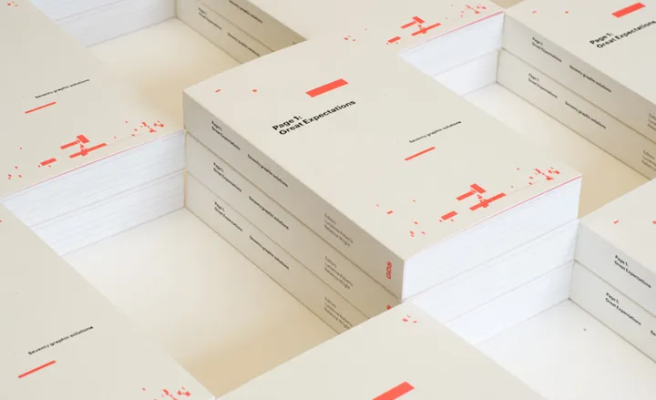
This was a determining factor when GraphicDesign&'s Lucienne Roberts and Rebecca Wright were deciding on the format for their first title. 'Page 1: Great Expectations' explores the relationship between layout, typography and how both affect the way we read.
Essentially a comparative exercise,
Page 1: Great Expectations centres around page one of the novel. A cast of 70 designers and typographers - including APFEL, Fraser Muggeridge, Research Studios, Sam Winston and Wallpaper's very own Editor-in-Chief Tony Chambers - have each produced typographic interpretations of the text. Great Expectations was chosen for its familiarity as a piece of text, and because of protagonist Pip's references to the lettering on his mother and father's gravestone in the novel's opening chapter.
The results of Page 1 are thoughtful and often surprising. Some of the contributors have remained steadfastly purist, approaching the text as if it's the first of a whole book; others have treated it as display text, or deconstructed it completely.
Many of the designers have considered how Dickens might have treated the novel had he published it now, through the likes of search engines, e-Readers, clip art and QR codes. All the treatments emphasise something different in the text, each of them subtly revealing more about it to the reader.
The version that perhaps resonates the most - given the current state of affairs - is Neil Donnelly's, which apes a typical British tabloid front page. Dickens would definitely have seen the funny side - Great Expectations was originally serialised in newspaper format, and he was certainly no snob. 'This cheap edition of my books is dedicated to the English people,' he wrote in a discarded dedication to an inexpensive serial edition of his works, 'in whose approval, if the books be true in spirit, they will live, and out of whose memory, if they be false, they will very soon die.'

The book explores the relationship between layout, typography and how both affect the way we read. Pictured here is a page typeset design by Typographics

Page 1: Great Expectations centres around page one of the novel and a cast of 70 designers and typographers have each produced typographic interpretations of the novel's opening text. Pictured here is a deconstructed offering by Cartlidge Levene

Alexander Cooper and Rose Gridneff of Workshop explore the novel's transition from magazine to book with a fold-out page

It replicates the structure and layout from 'All The Year Round', the weekly publication that Great Expectations was originally published in as a series between 1860 and 1861

Using the notions of shadows - specifically the 'shadowy misunderstandings' which loom over the characters Great Expectations, illustrator Sam Piyasena, aka Billie Jean, created a pictoral design for Page 1

The version that perhaps resonates the most - given the current state of affairs - is Neil Donnelly's, which apes a typical British tabloid front page

Wallpaper's Tony Chambers turned his typographical pet hate - the 'orphan' (a lonesome word that hangs at the top of a column) - on its head, in honour of famous literary orphan Pip

Fraser Muggeridge studio completely eliminated text in favour of an image-led interpretation

Pentagram's Luke Hayman created a contemporary version of an illustrated drop cap

Inspired by the passage '...five little stone lozenges, each about a foot and a half long...', Paul Finn of Fitzroy & Finn arranged his text in five columns, referencing rows of graves

Barnbrook's mathematical, unemotional analysis studies Dickens's grammar structure