Renowned architects design sculptural beauty packaging
Architects Kengo Kuma, Oskar Leo Kaufmann, and Tokujin Yoshioka are designing a new landscape in the world of beauty packaging

A recent trend has seen architects venture into the world of beauty and grooming, applying their knowledge of structure and form to everything from skincare packaging to facial rollers.
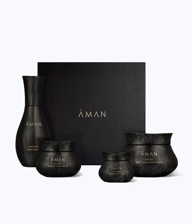
Ever the innovator, Japanese architect Kengo Kuma made a bold statement in 2018 with his packaging design for Aman Resorts’ first skincare line. The design reflected Kuma’s mastery of natural materials and organic shapes, creating structures that integrated themselves into their environment rather than imposing themselves upon it.

His packaging for Aman is made out of a veined, black material that recalls burnt timber or black marble, and is rendered in curved, voluminous forms, a break from the linear style of most beauty containers.
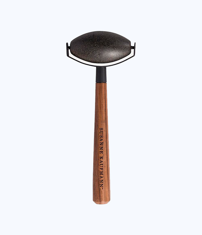
Like Kuma, Austrian architect Oskar Leo Kaufmann channelled his preference for natural materials into the black obsidian face roller he made for his sister, skincare maven Susanne Kaufmann. Susanne’s signature line of serums and body oils are made from Alpine botanical ingredients and composed in a small production facility in the Bregenz Forest, where she and Oskar grew up.

To create the roller, Oskar sourced obsidian from nearby South Tyrol – the stone is said to help relieve muscle inflammation, strengthen connective tissue, and aid the body to better absorb vitamins C and D.
Oskar then added a wooden handle with a steel mount designed by an expert blacksmith and metal specialist Felder, in Andelsbuch, creating a fitting tribute to the craftsmanship and natural materials of the region.

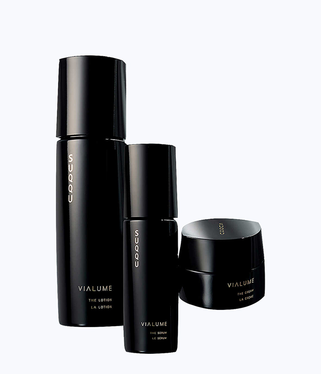
Meanwhile, Tokujin Yoshioka’s packaging designs are more evocative of modern cityscapes. Yoshioka designed monochromatic, sculptural vessels for the Vialume skincare line, one of the latest creations from luxury Japanese cosmetic brand Suqqu.
The packaging’s tall, elegant forms and highly reflective, ultra-black surfaces, reminiscent of lacquer, make them instantly eye-catching, like a miniature skyline on your bathroom shelf.
INFORMATION
Receive our daily digest of inspiration, escapism and design stories from around the world direct to your inbox.
Mary Cleary is a writer based in London and New York. Previously beauty & grooming editor at Wallpaper*, she is now a contributing editor, alongside writing for various publications on all aspects of culture.