LA-based graphic design studio ELLA has created the identity for this year’s Chicago Architecture Biennial. It’s colourful, layered and architectural – bringing together the curatorial vision, the architecture of Chicago and the many stories in between.
Inspired by Yesomi Umolu’s curatorial vision that takes a research-led approach driven by architecture in Chicago that performs as site for social action and advocacy, ELLA pulled out three guiding themes – multiplicity, unexpected connections, and open ways of thinking about architecture.

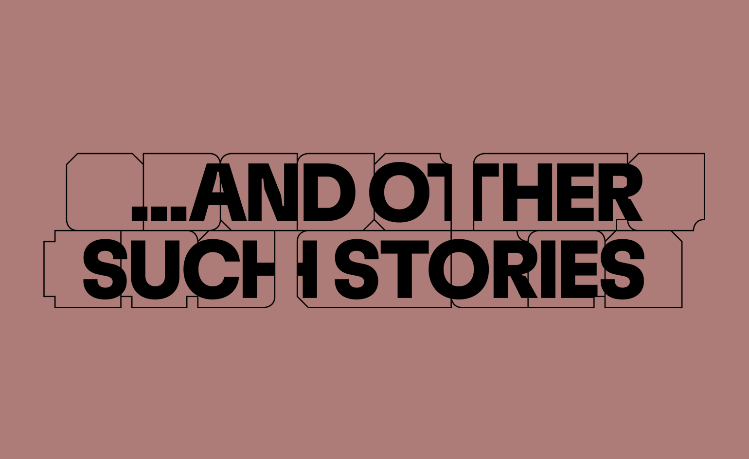
Text and images from the early stages of the design process, combined with the final logotype. The images are from an early research trip and the small flag shows the colour palette inspired by the Nationalities Maps from Hull-House Maps and Papers.
After spending time documenting parts of the city, visiting neighbourhoods and looking closely at architectural details, they decided to build the identity as an ‘open framework’. The structure would be built of signs, posters, classified ads and plaques found all around the city – their edges and shapes would become blocks, bricks, pathways and roads, making to the stories of Chicago.
RELATED STORY

As part of the research, ELLA came across a 1895 map charting the nationalities represented in the community of the Hull House settlement, Jane Addams and Florence Kelley in 1889. The settlement undertook social research of the community, and mapped it out, using a colour key to show the vast range of nationalities living there.
These colours – a bright, burnt orange; a deep petrol blue; a yokey yellow – would become the base palette for the identity, paying homage to the Hull-House social workers' legacy in Chicago and beyond. It recalls the diversity of backgrounds that the colours represent in the map, and that make up the city. The identity is a joyful celebration of the city.

Hull House Nationalities Map, 1985

Photograph from the early stage of the design process
INFORMATION
chicagoarchitecturebiennial.org