Frith Kerr on developing a graphic language for Design Emergency
Design Emergency began as an Instagram Live series during the Covid-19 pandemic and is now becoming a wake-up call to the world, and compelling evidence of the power of design to effect radical and far-reaching change. Co-founders Paola Antonelli and Alice Rawsthorn took over the October 2020 issue of Wallpaper* – available to download free here – to present stories of design’s new purpose and promise.

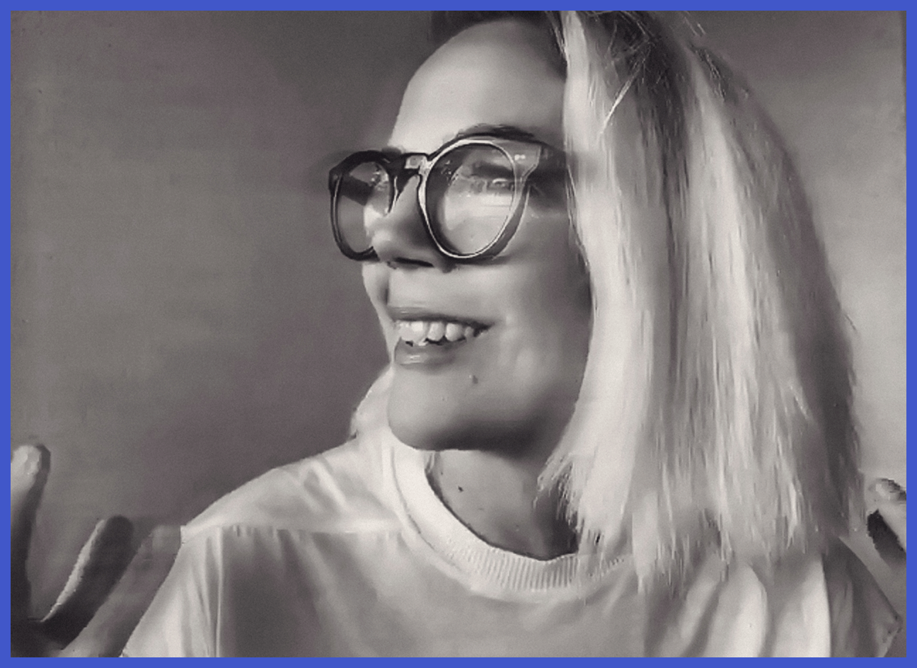
Brigitte Lacombe - Photography
Design Emergency’s compelling visual identity is the work of London-based design consultancy Studio Frith. Called upon by Paola Antonelli and Alice Rawsthorn, studio founder Frith Kerr and her team came up with a bold and memorable response that has helped Design Emergency to cut through and capture contested attention. Translating the identity into print, Studio Frith has designed this issue’s newsstand and limited-edition covers, and art-directed this Guest Editors’ section. Kerr talked to us about letterforms, lucidity in blue and white, and lessons learnt.
Design Emergency announced its arrival on Instagram on 30 April with a blue square and a curious typeface. It made an immediate impact. For most of us, time spent on Instagram during lockdown had swollen horribly. Here was a purposeful punctuation mark amidst the sourdough loaves and saccharine quotes. It vibrated like an alarm and rang like a siren. For anyone with even a mildly trained eye on such matters, this bold square bore the hallmark of London’s Studio Frith. Frith Kerr has a knack of waking people up with her work. She is an original in an industry that gets stuck in derivative loops. This is why she’s the go-to partner for people who understand the potential of graphic design to go beyond communication or commerce, to shift a bigger needle. When Studio Frith is attached to a project, you know it will be something of substance. It has a roster of agenda-setting clients – Frieze Art Fairs, Roksanda, Chisenhale Gallery, WeTransfer, Ilse Crawford and the Pellicano Hotels group – and has been central in establishing their identity, mission and momentum.
Of course, it made perfect sense that Studio Frith would be on speed dial to help Design Emergency rise above the torrent of Instagram Live chats. Together with her team, Kerr developed a graphic language that, from that inaugural post, felt more like a movement than a brand. ‘We needed to create an identity that was serious but not corporate, distinctive but not dominating, and that had a sense of urgency without being scary,’ Kerr explains. ‘There was so much fear that, tonally, we wanted to be careful to alarm without being alarmist – to allow the audience to engage with the platform in an investigative and compassionate way.’
‘Creating work that has a distinctive and consistent look allows audiences to feel confident and connected.'
The team designed a bespoke typeface with a clever modular construction, allowing them to build new letterforms as needed. ‘Emergency typography,’ Kerr remarks, before adding with her trademark wry wit: ‘Obviously typefaces don’t regularly save lives.’ The logotype is formed from the same system, in a shape reminiscent of an alarm. ‘There is a three-dimensional quality to the letterforms and the marque; this gives a tension which conveys a sense of urgency,’ she says. The letters feel like temporary constructions, which establishes the feeling that this is an ongoing, episodic venture. ‘The tall forms and sharp edges feel urgent and optimistic simultaneously, while the blue and white were selected for their lucidity and clinical quality,’ she adds. The identity has a mesmeric character that already feels archetypal: ‘I think that’s about simplicity,’ says Kerr. ‘It’s like a Matisse drawing (pardon the pretension). When something works in just a few lines, it means it’s instantly accessible to the mind.’
Wallpaper* was thrilled to commission Studio Frith to bring Design Emergency to life in print for the first time. ‘Translating visual languages across platforms is fundamental to the brand identity work we do,’ Kerr says. ‘Creating work that has a distinctive and consistent look allows audiences to feel confident and connected. After all, brands are emotional – they only manifest as how people feel about them. Our bespoke typefaces are always designed to cross platforms.’ She points to the dexterity of the Hotel Il Pellicano typeface, which has successfully travelled from books to buildings to Birkenstocks.
RELATED STORY

‘When we work on projects, we experiment putting our designs into magazines, animating and scaling them on different things, from boxing gloves to water bottles, to explore how identity lives. Design should be non-hierarchical. Instagram is just new to the party and is extremely powerful at the moment. Of course, this will change. ‘Print requires more conversations about colour and tone and attention span,’ continues Kerr and, in this case, the opportunity to creatively direct a portfolio of portraits. ‘Our concept for the portraits was to create a visual conversation in time and space between the designers who were scattered around the world, each dealing with a pandemic in a different way.’ Photographer Brigitte Lacombe was chosen, with Zoom as her makeshift studio. It was a serendipitous discovery that Lacombe was already a follower of Design Emergency. ‘Brigitte’s photography has a classic quality to it – the beautiful shapes she creates with her subjects are so strong, and hence it felt like a perfect interaction with the limitations of Zoom,’ Kerr says. ‘When we commission photographers, we always look for people who can create visual ideas. Brigitte has created a series of pictures that speak about personality and purpose in a way that is both subtle and poignant – pixels from around the world creating a community portrait that is alive and beautiful in its urgency.’ As with so many of us, Kerr has been doing some personal and professional interrogation, and she too is motivated by the common threads of principle and purpose that emerge in the many narratives within Design Emergency: ‘I’d love to take some of the learning back to our other clients,’ she says. ‘So much of what we do now in a business context is asking the question: how can it be better? What can we do to make this world a better place? Listening to medical illustrator Alissa Eckert talk about visualising a disease is a reminder that design can communicate across borders in so many ways that are almost invisible to us. Great design is often invisible, it does its job and retreats without fanfare. That is not to say that everything should be tasteful or discreet. There is nothing tasteful about Covid-19, and the fact that Alissa’s symbol looks like some appalling cat-toy is perfect.’
INFORMATION
A version of this story appeared in the October 2020 issue of Wallpaper*, guest edited by Design Emergency. A free PDF download of the issue is available here.
