Irma Boom on books and beyond – meet the Dutch graphic design legend in her studio
A pioneering force in the world of print, Boom welcomes us to her Amsterdam studio to discuss the infinite possibilities of book design, curious heroines and holy encounters
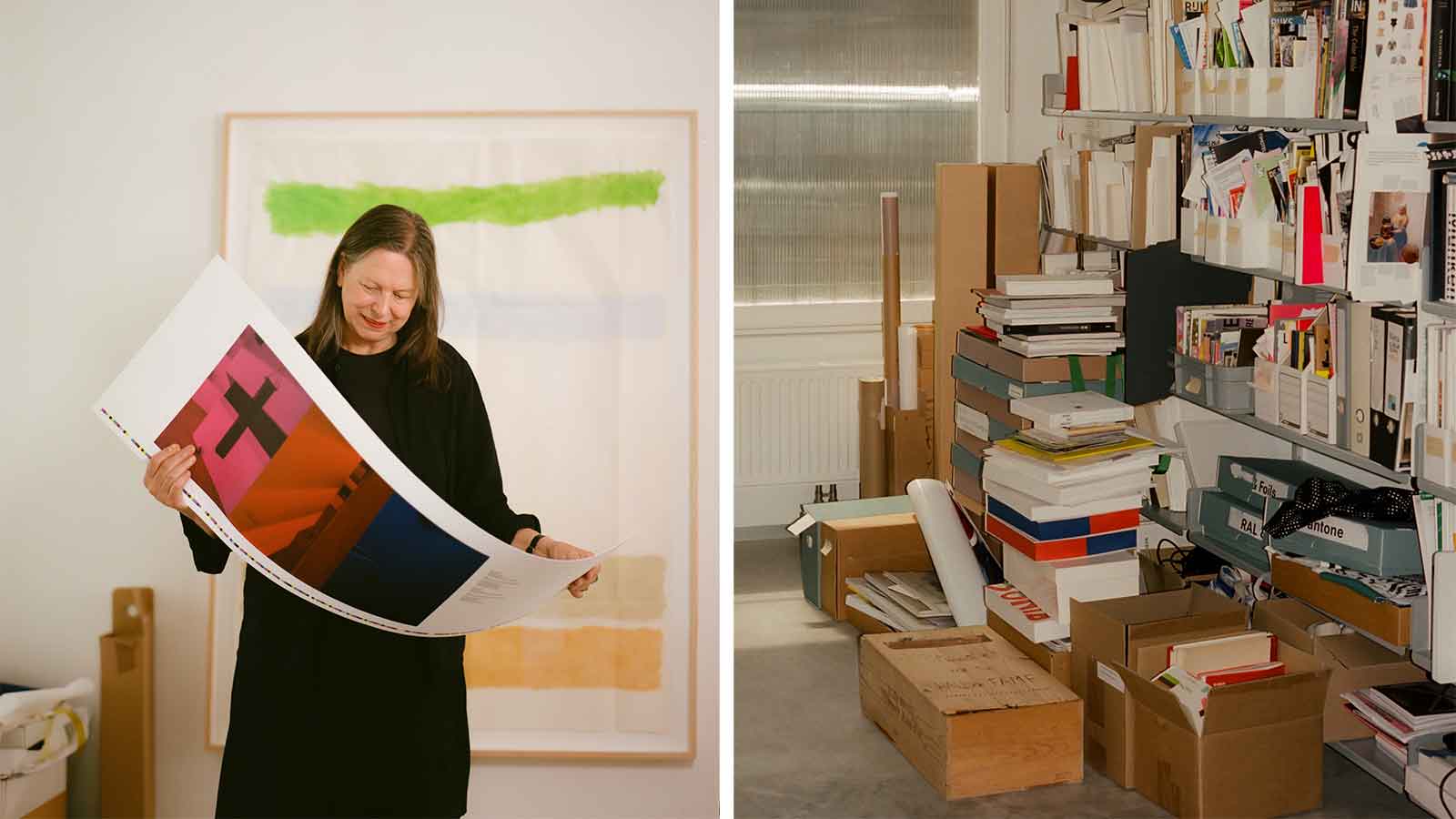
It seems fitting that Irma Boom – a woman who has done more than perhaps any other living person to alert the world to the possibilities of the book as a desirable, cutting-edge medium for the transmission of knowledge, and whose very surname means ‘tree’ in her native Dutch – should seek to communicate via print, even in person.
‘Every year, it grows by three per cent, whether it’s produced or not,’ she says, laying out three tiny volumes of varying dimensions, each no bigger than a matchbox, on the kitchen table of her premises in Amsterdam’s Oud-Zuid district. These are successive editions of her signature ‘little red book’, cataloguing her life’s work in reverse chronological order with the designer’s ‘comments here and there’. The covers are emblazoned with BOOM in Flintstonian capitals. ‘It works super well in English, too,’ she says of her surname. ‘Because it’s also an explosion.’
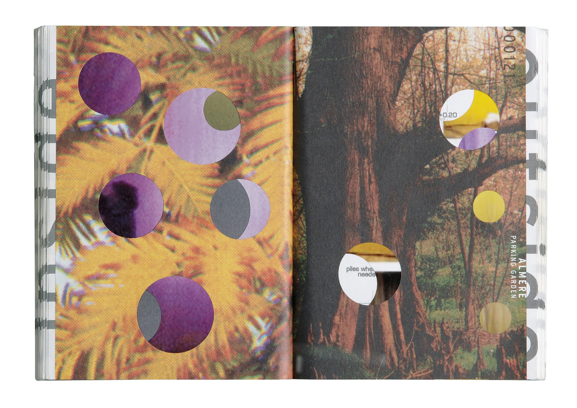
A catalogue for the 2000 ‘Inside Outside’ show at Storefront in New York, Movements can be read from back to front (interior designs) and front to back (outdoor projects). Every page has holes, connecting both ‘in and ‘out
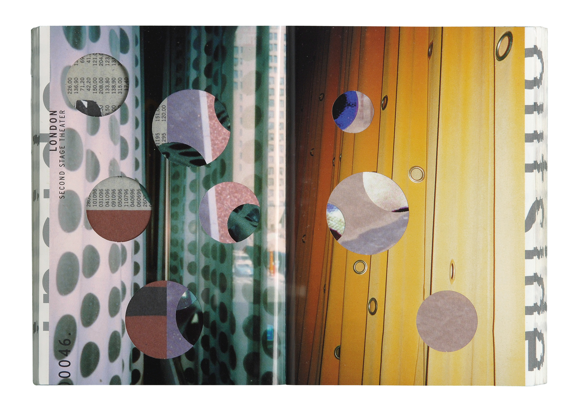
The Movements catalogue
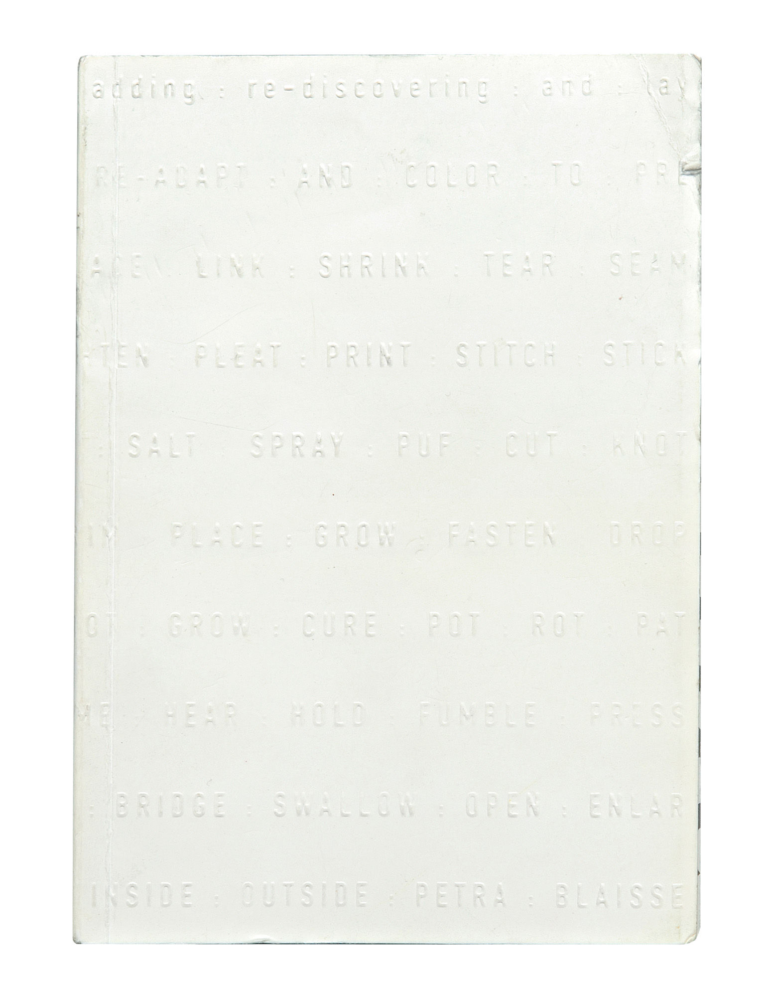
The Movements catalogue
Inside are the greatest hits of the so-called ‘Queen of Books’, from her Viktor & Rolf tome, a sort of anti-coffee table volume consisting entirely of dust jackets printed with imagery in inverted colours (if you want straightforward representations of their clothes, she reasons, you can Google them), to her Eileen Gray monograph published in conjunction with a Bard Graduate Center Gallery exhibition on the designer. Its edges resemble Gray’s geometric rugs; the texts and images inside are arranged ‘like architecture’.
These conceptually single-minded yet strangely flamboyant volumes change hands for great sums on the resale market. She has heard that the ink-free book she made in honour of Chanel No. 5, which, at Boom’s behest, originally retailed for $100, can fetch $18,000 secondhand. She disapproves. ‘That is not the idea. What I like about making books is that it is a democratic multiple. If you compare it to architecture, it’s more social housing than villas.’
All being well, the red catalogue will reach 21.92cm in length (roughly the size of a Moleskine notebook) by the time Boom, now 65, turns 100. Who can say how many new and fabulous projects will throng its pages by then? Certainly not Boom, who says she accepts commissions ‘on intuition’ without crunching the numbers or consulting her schedule.
She has two full-time assistants, reads non-fiction voraciously, even in her ‘free’ time, and says of her intensive working process, ‘the creation is solitary, the production is a collaboration’.
Boom remains the youngest ever recipient of the Gutenberg Prize for persons and institutions that have made outstanding contributions to the art of the book. Like her friend Rem Koolhaas – with whom she designed ‘Elements of Architecture’, an exhibition and encyclopaedic Taschen-published opus exploring the fundamental components of buildings for the 2014 Venice Biennale – she seems to straddle the boundary between individual and institution. It was her idea to clad Cuyperspassage, the Benthem Crouwel-designed bicycle and pedestrian tunnel at Amsterdam’s Centraal Station, with 80,000 hand-painted Delft blue tiles that took five years to produce, and she oversees all of the publications by the Rijksmuseum, whose logo she re-engineered to controversial effect.
Receive our daily digest of inspiration, escapism and design stories from around the world direct to your inbox.
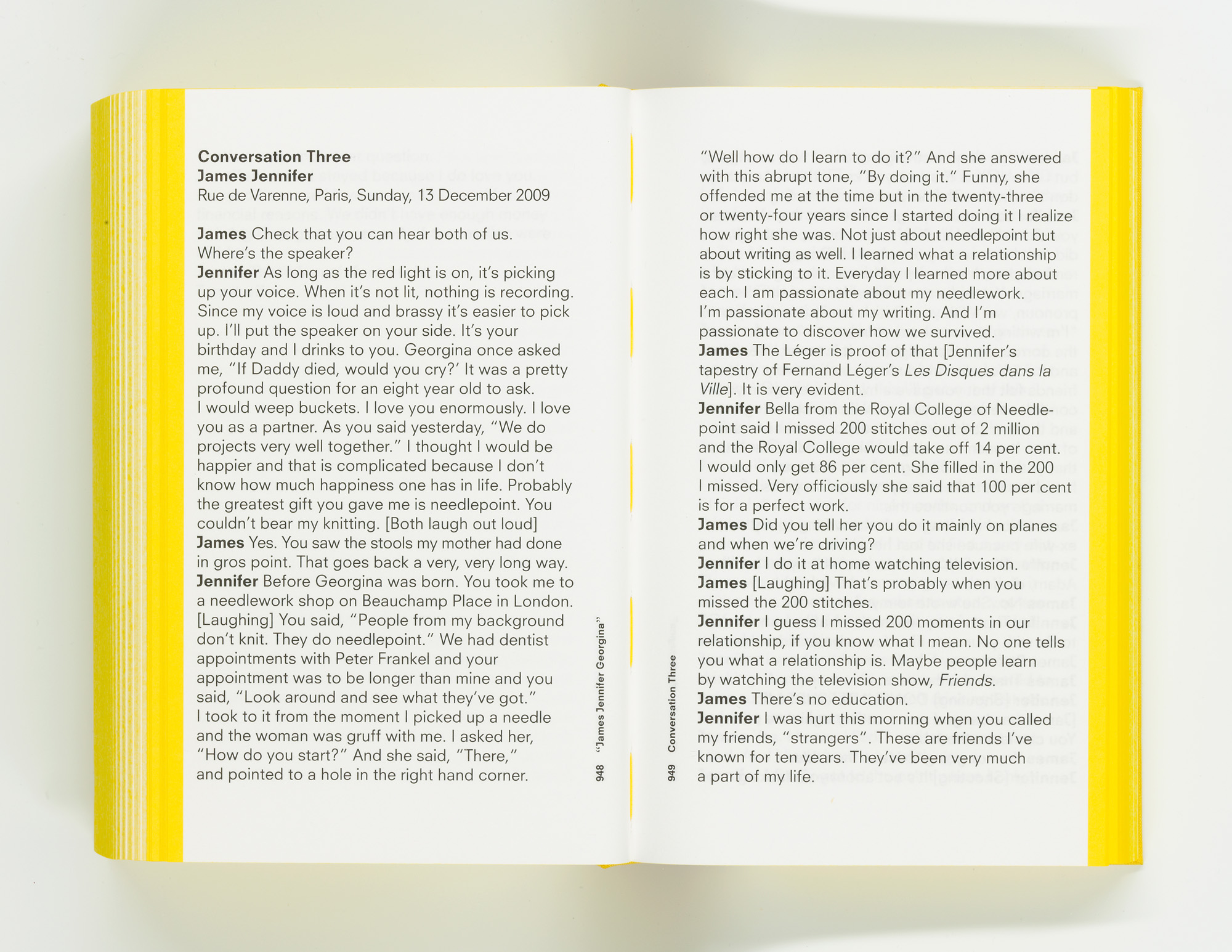
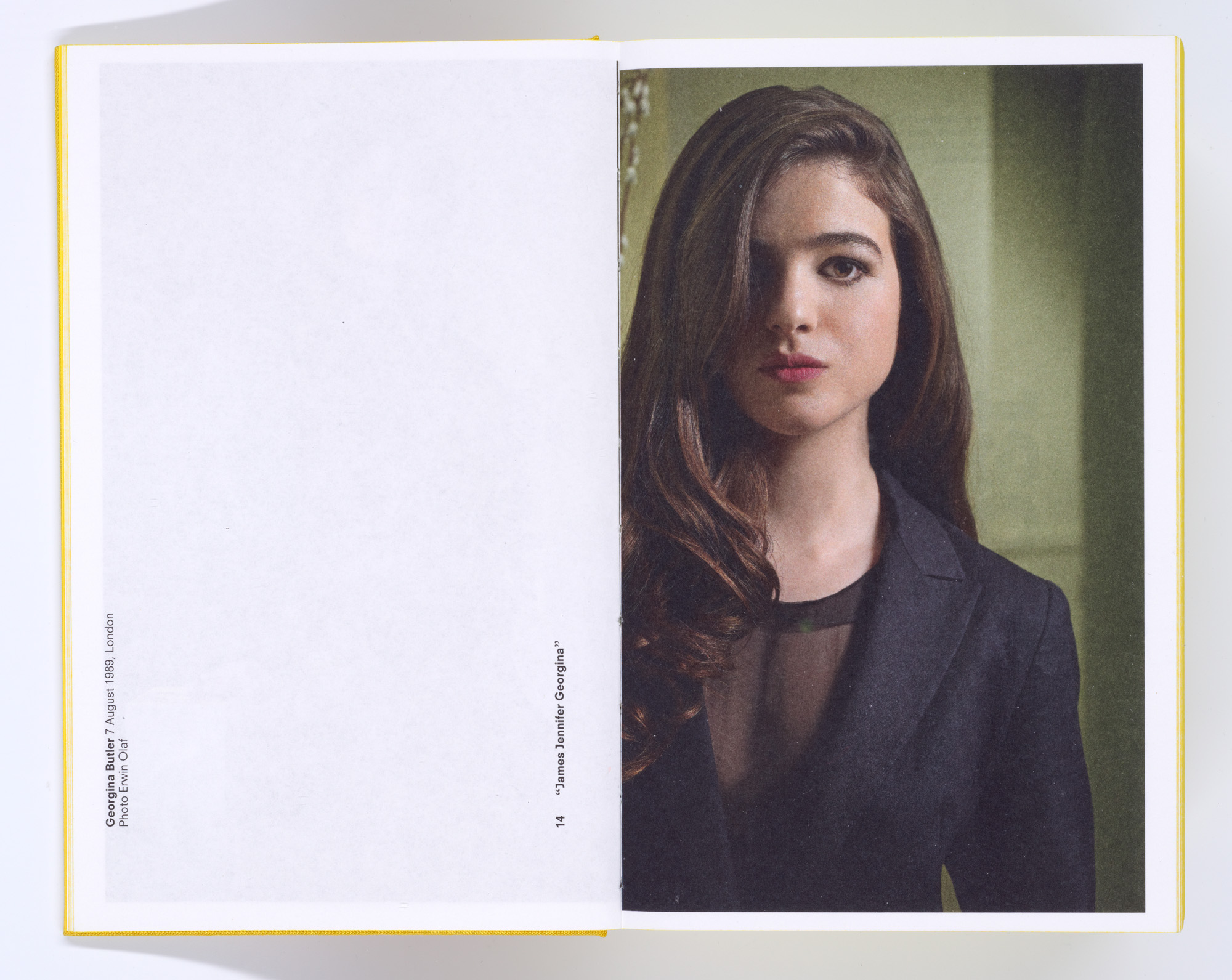
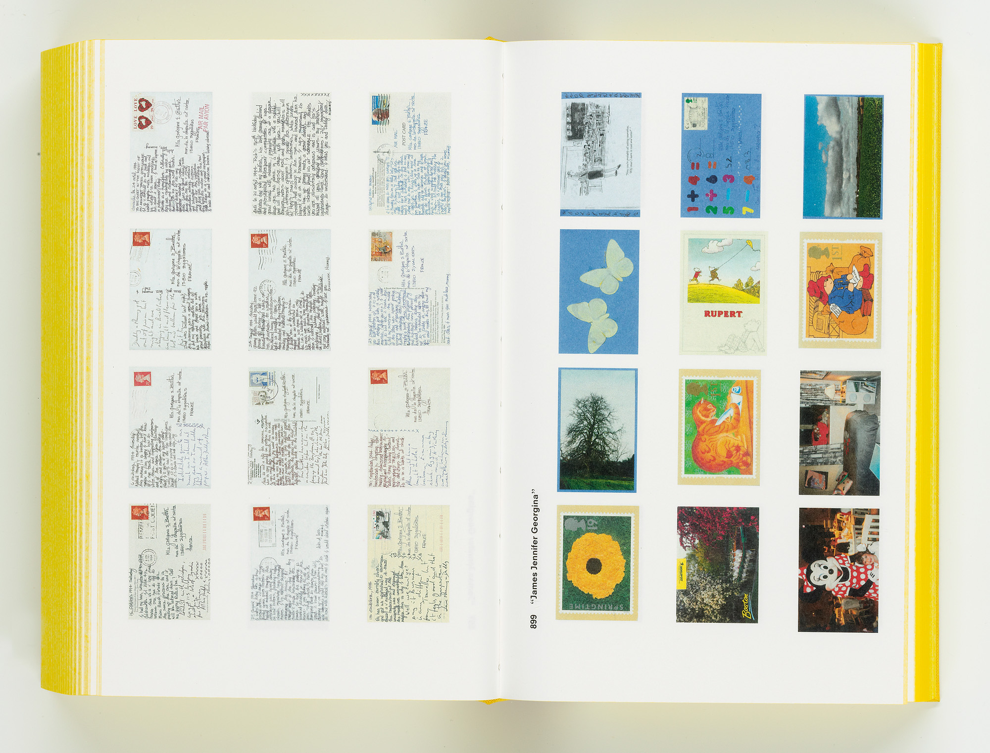
James Jennifer Georgina, published by Erasmus in 2010 and also known as The Yellow Book, is the autobiography of the Butler family, told in three sections, 210 postcards, 21 conversations and 1,200 pages
James Jennifer Georgina
James Jennifer Georgina
Irma Elizabeth Francisca Maria Boom was born in 1960 in Lochem in Gelderland, the ‘spoiled’ youngest of nine children, and she continues to maintain a superstitious attachment to the number three and its multiples, which often feature in her work and guide her decision-making. She did not wear hand-me-downs, she notes, ‘but my sisters and I were always dressed the same, as if we were twins of different sizes’. Lewis Carroll’s Alice’s Adventures in Wonderland, with its ever-curious heroine who grows in stature and confidence, was the formative book of her childhood. ‘It made such a big impression on me. I don’t know how many times I read it – maybe a hundred,’ she says.
Aspiring to be a painter, she studied at the AKI Academy of Art & Design in nearby Enschede, where the artist and typographer Abe Kuipers would visit every Wednesday with two suitcases full of notable books: atlases, dictionaries, volumes of poetry. On one occasion, he rhapsodised about Turkish Delight and Horrible Tango, novels by Dutch author Jan Wolkers with compellingly lurid cover typography by Jan Vermeulen that captured the intrigue within. ‘I knew immediately: this is what I want. To create something meaningful,’ Boom once told Dutch newspaper Het Parool. She never touched a paintbrush again.
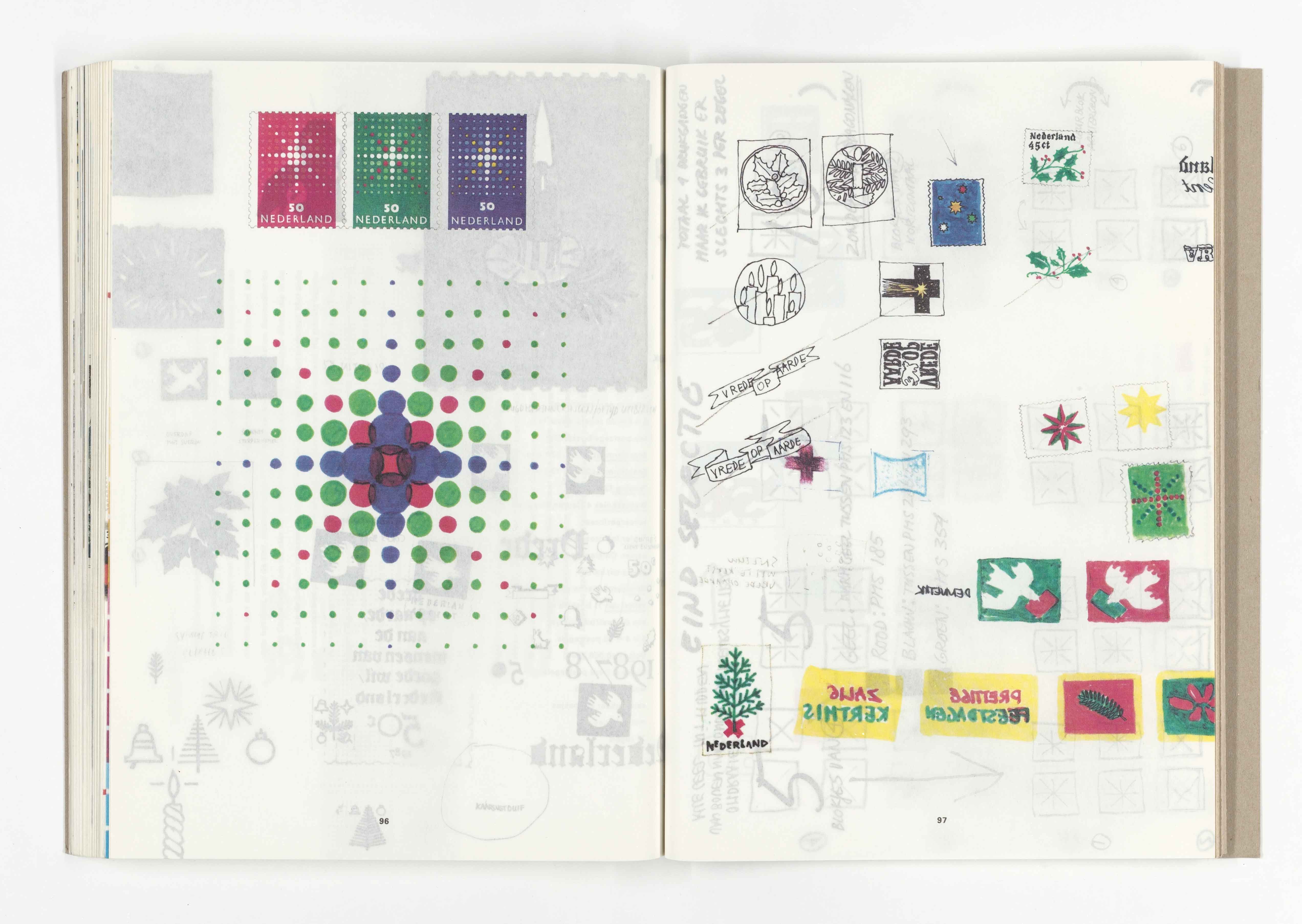
In 1987, Boom was commissioned to design the official annual Dutch postage stamp books. Her controversial volumes polarised readers, bringing her both hate mail and fan letters
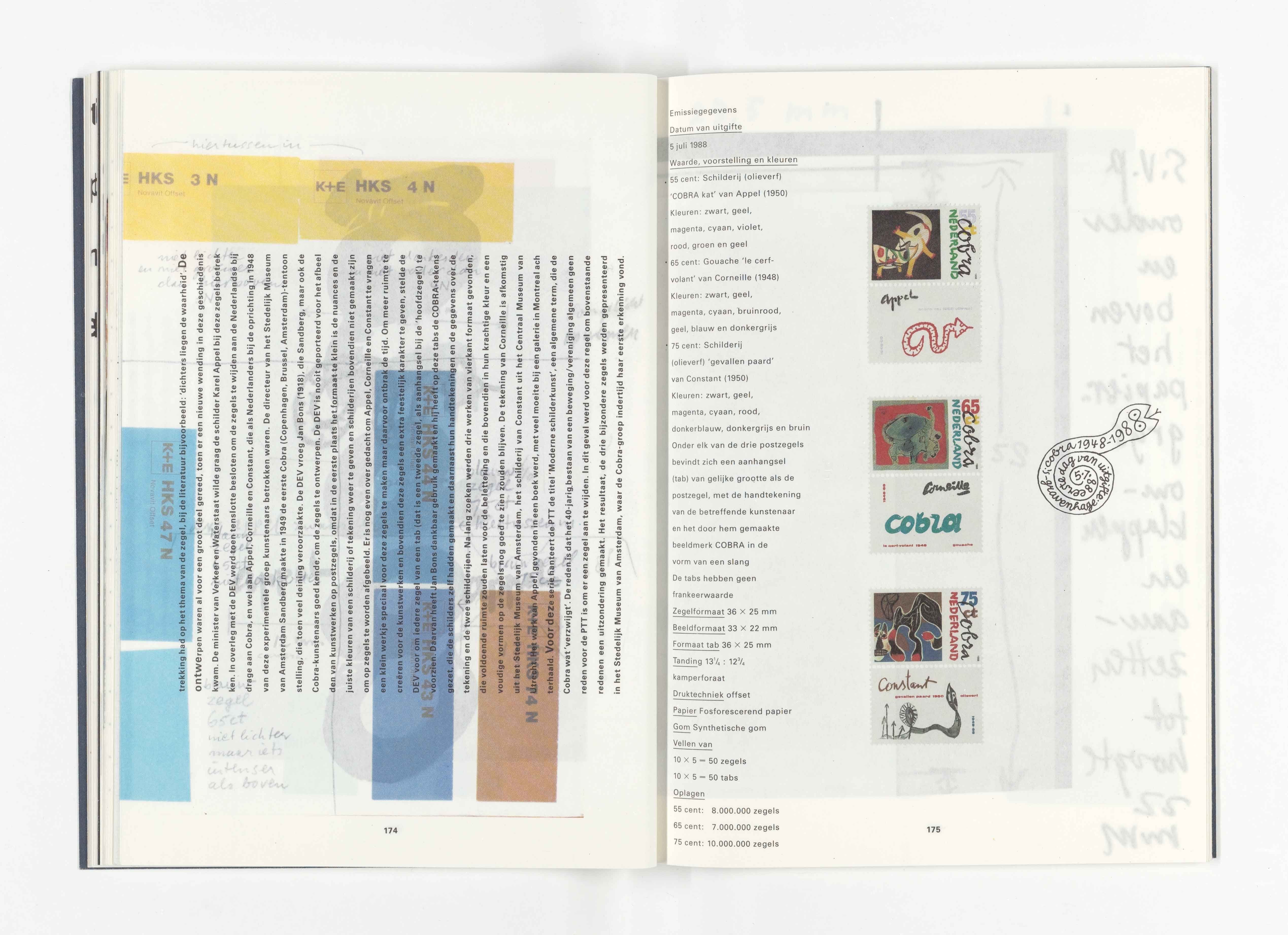
Dutch postage stamps book
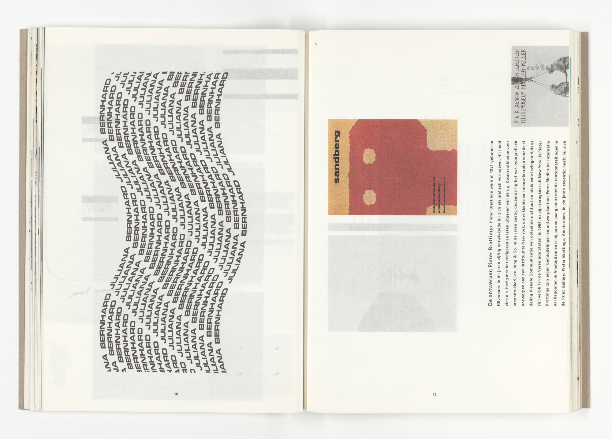
Dutch postage stamps book
After art school, Boom went to The Hague to work in the design department of the government’s publishing and printing office, where she fell for a handsome colleague, only to discover that he was Jan Vermeulen’s son, Julius. The pair were inseparable until Julius’ death from cancer in early 2024, and his portrait, by their longtime friend, photographer Rineke Dijkstra, dominates Boom’s white-walled studio. ‘He was my most important critic,’ she notes. ‘He always pushed me to my limits and would say, “That’s good, but can it be better?”’
She established Irma Boom Office in 1991, and her first major commission came from SHV Holdings, a privately owned Dutch multinational company whose request for a corporate history was an unlikely catalyst for the aesthetic riot that followed. ‘They don’t create, they only trade. There’s nothing sexy about it,’ she says of her erstwhile commissioner’s business activities. ‘But we turned it into something because they gave us a lot of freedom and trust.’
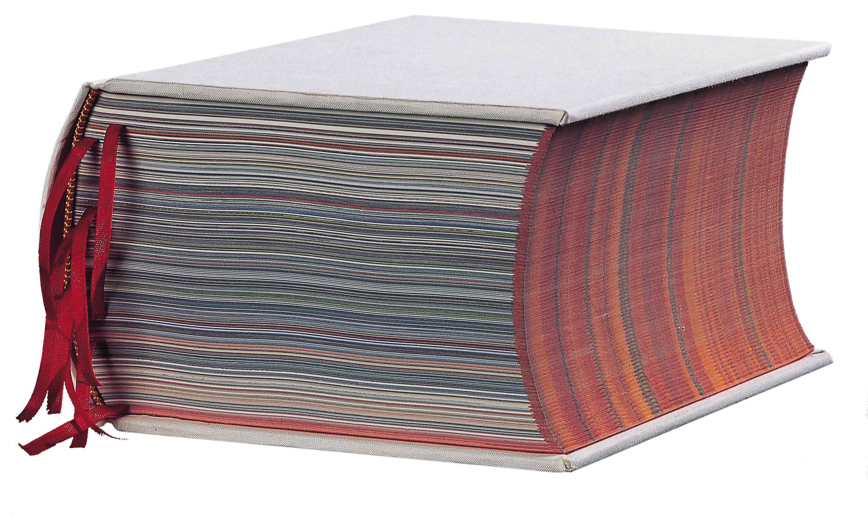
SHV Think Book 1996-1896, a commission from SHV Holdings
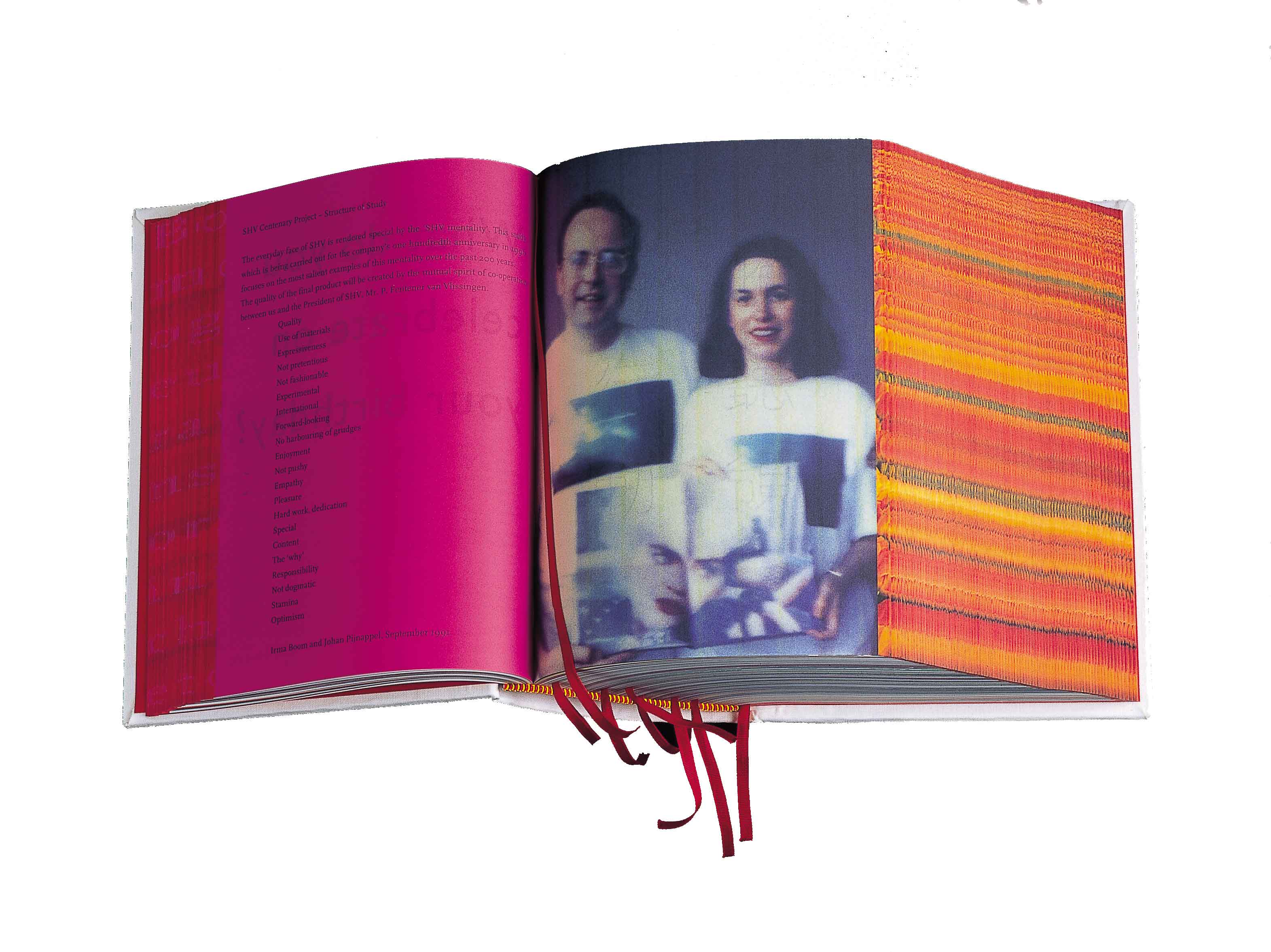
SHV Think Book 1996-1896
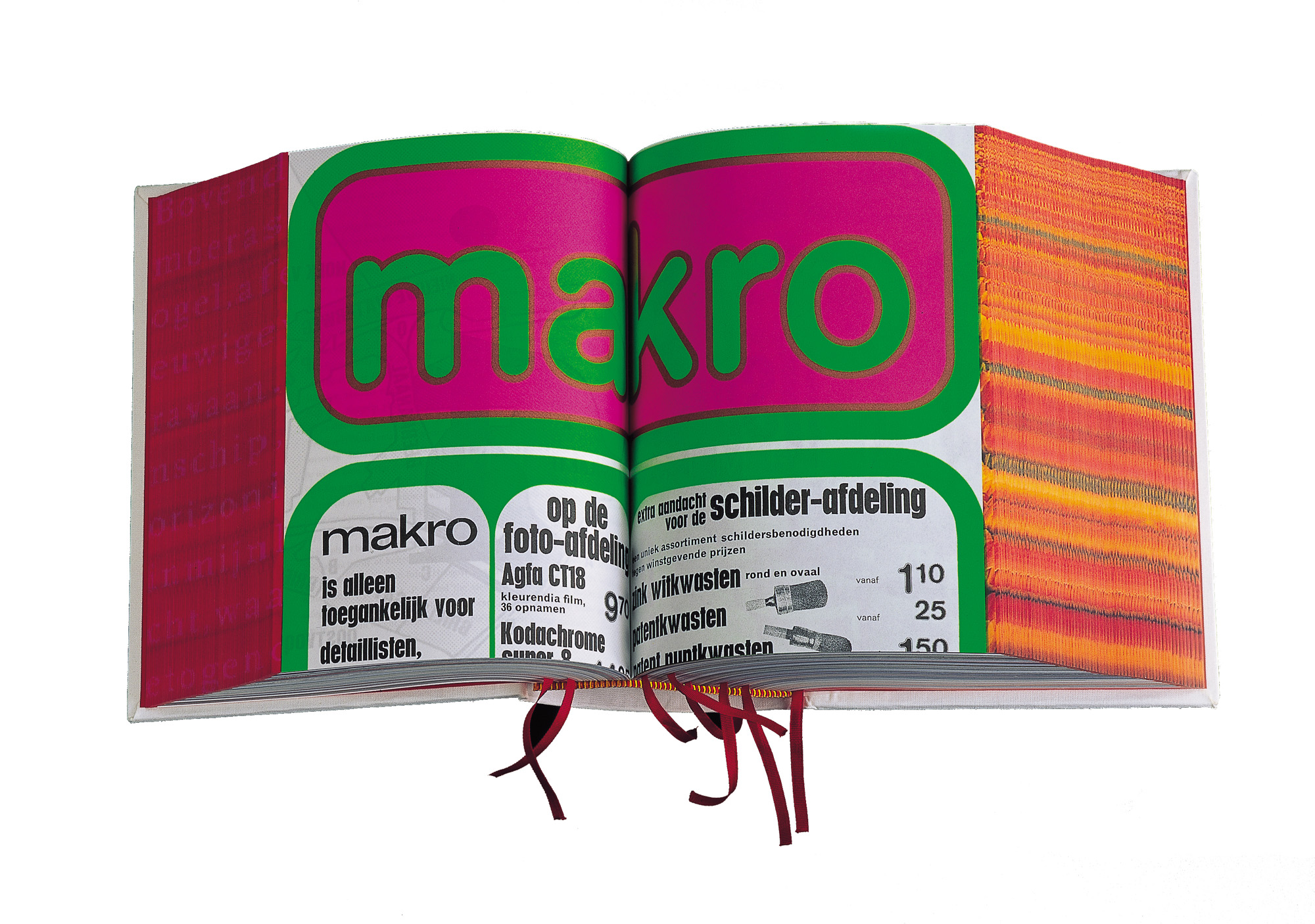
SHV Think Book 1996-1896
A 2,136-page medley of internal memos and contracts pertaining to liquid gas, printed on Bible paper and bound in shocking pink, with interstitial pages posing quasi-philosophical questions (‘Has change produced progress?’), this kaleidoscopic ‘think book’ remains, for many, Boom’s defining masterpiece. To see it, I go to the Special Collections unit of the University of Amsterdam, where print curator Mathieu Lommen removes it from its protective box and fans the fore-edge this way and that to reveal, variously, fields of tulips and hidden lines of poetry. ‘Her books are never run of the mill,’ he observes.
Boom’s refusal to see limitations in print’s material constraints has arguably protected her from the vicissitudes of less stable technologies. Had she embraced the SHV commission using the paraphernalia ‘of the day’ – a CD-ROM, say – it would have become obsolete within the five years of the think book’s genesis, she comments. Nevertheless, its numberless pages are inspired by the experience of ‘reading’ on the internet. ‘You really scroll through the book, and you come across things you weren’t looking for.’
The sheer unreasonableness of the project seems to have set the tone for all the relationships that followed. While traditional publishers scrimp on typesetting and license their cover art from Getty, Boom is busy commissioning bespoke paper, articulating spines and experimenting with obscure binding methods to set readers on a multisensory adventure. Don’t her patrons dread the spiralling costs, I ask. ‘If something is lousy, then no one wants to execute it,’ she replies. ‘But I think if you have a good idea, if you come with a good argument, then things work. And anything is possible.’
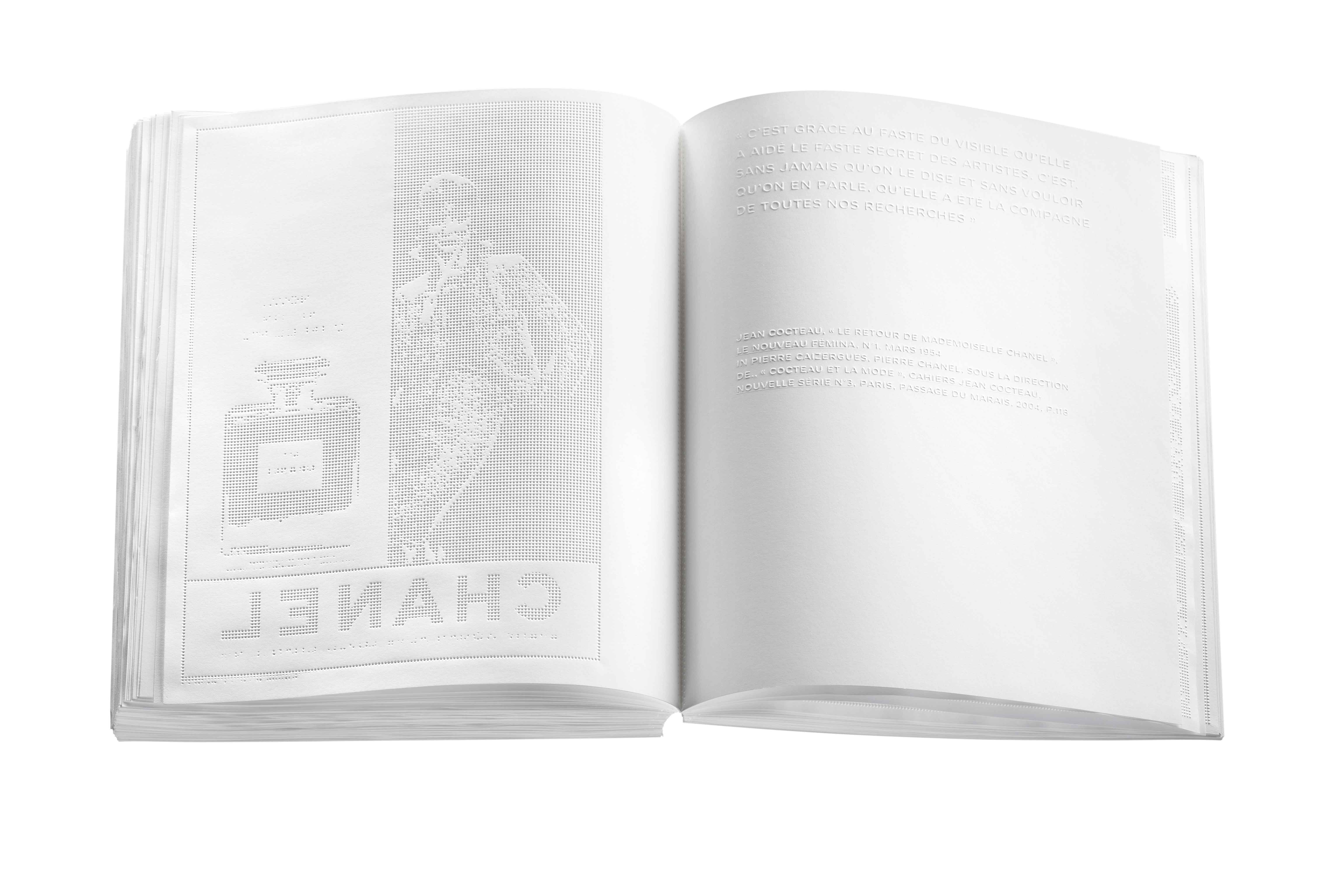
Inspired by the fact that fragrance is invisible, No. 5 Culture Chanel, 2013, uses no ink. Each of its 300 crisp white pages is blind embossed with a drawing or quotation. It is the same size as the perfume’s bottle
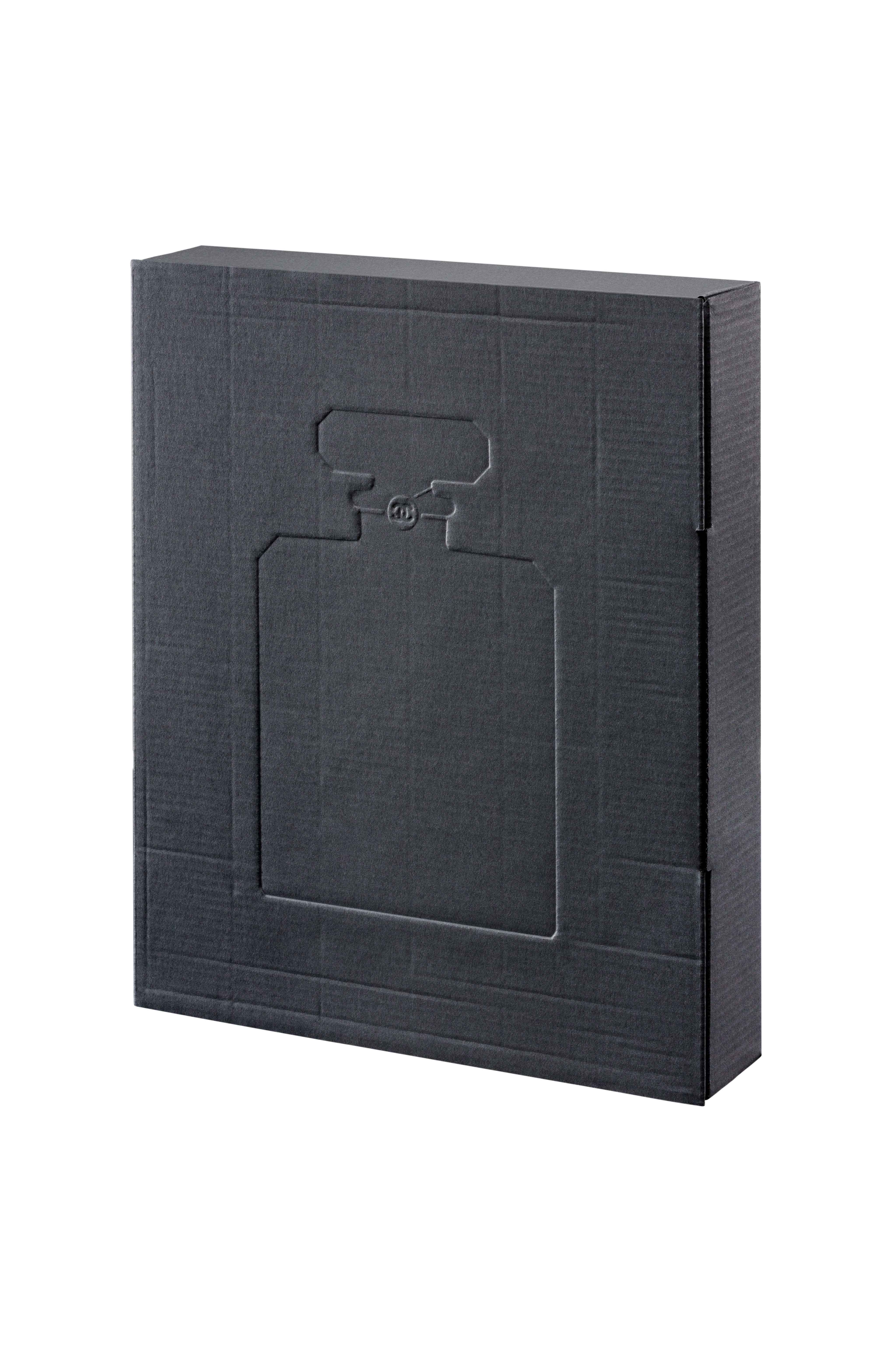
No. 5 Culture Chanel
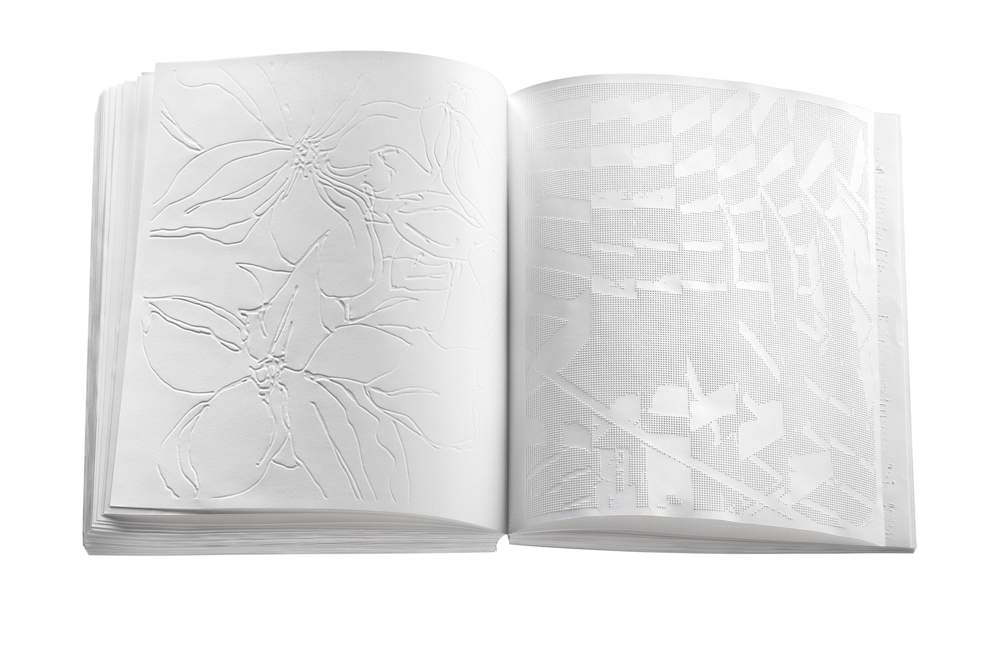
No. 5 Culture Chanel
Adjoining Boom’s home, Irma Boom Office shares a front door with Julius Vermeulen’s fêted Eenwerk art gallery in a purpose-built glass, steel and basalt interruption to the red-brick townhouses on an arterial road in this manicured part of Amsterdam. It was designed by Barend Koolhaas (Rem’s nephew) and contains both a rooftop greenhouse and a glass garage in which a grey Porsche is charging for an imminent trip to Switzerland. Since Vermeulen’s death, Boom has taken over the running of the gallery, which has just played host to a solo exhibition of works by the late minimalist artist Corrie de Boer.
A dummy of the latest book with her long-term collaborator, the artist and filmmaker Steve McQueen, has just arrived from the printer and she fingers it with suspicion or reverence (it’s hard to tell which). Next year, she will reissue her red book in Japan, with a ‘Book Activist’ gloss, inspired by her admiration for the writer and Black Panther Angela Davis. To this end, she has just finished writing a text on Mao Zedong’s Little Red Book, although she claims not to have pondered this notorious Chinese antecedent to her BOOM book the first time around. Beyond that, Boom is looking forward to returning to Italy, where, in 2018, she began a design residency at the American Academy in Rome, and a course of study she had to abandon when Vermeulen became ill.
While in Rome, Boom sought access to the Vatican Apostolic Library, which is accessible only to those with ‘acceptable qualifications’. Despite her storied credentials in academia (Boom is an academy fellow at the Yale School of Art), she was subject to rigorous vetting before being granted ten of the coveted day passes. Inside, Boom found many pre-1501 early books, or incunabula, among the fragile bibliographic treasures. She describes her time there in terms of the proverbial candy store. ‘I had too many books open, books everywhere and I was so excited that I was running back and forward between the manoscritti and the stampati on the wooden floor. Can you imagine… in these clogs?’ She whips off her wooden-heeled garden centre mule and taps it on the table in demonstration.
At the Vatican Apostolic Library, ‘I was running back and forward between the manoscritti and the stampati. Can you imagine... in these clogs?’
Irma Boom
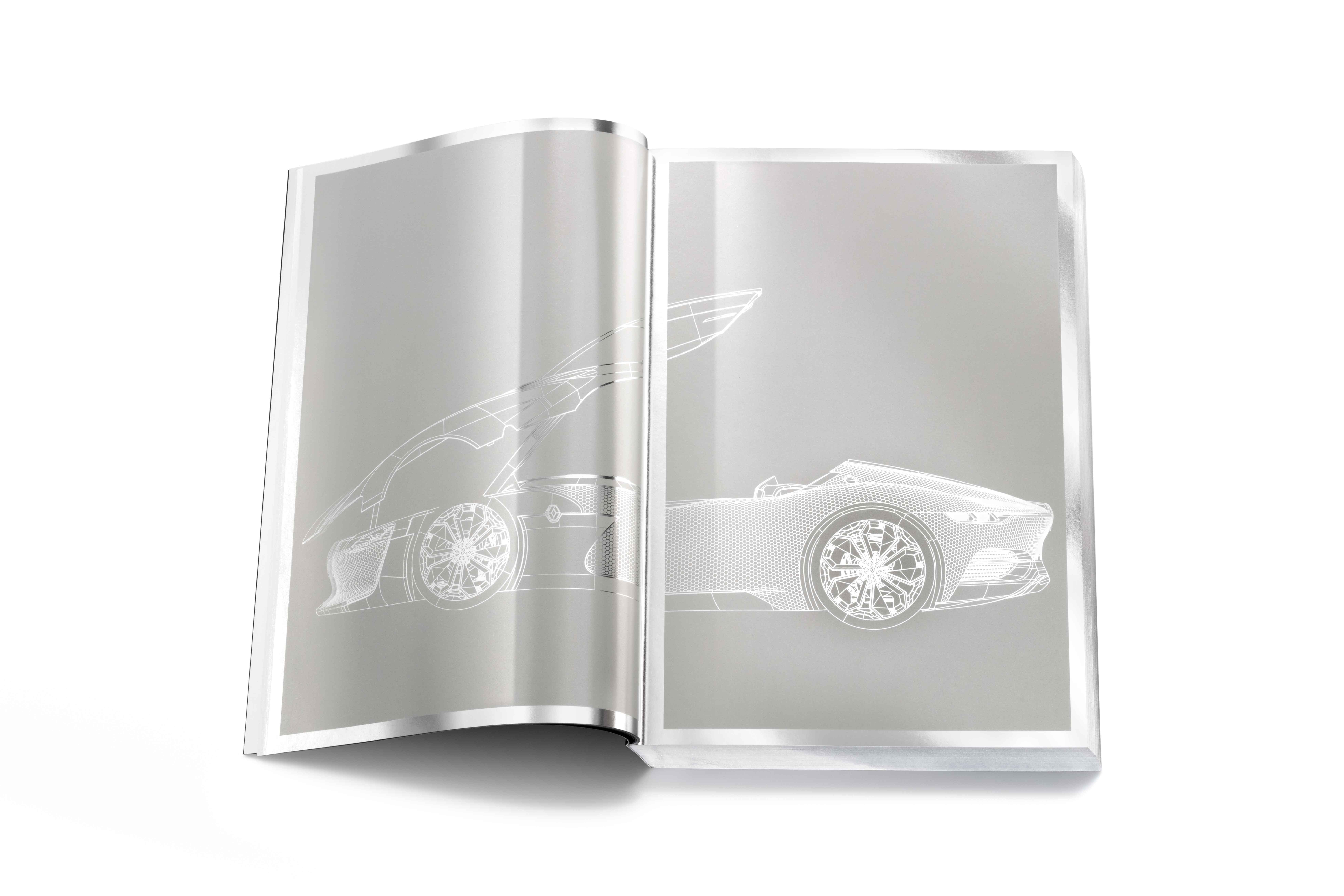
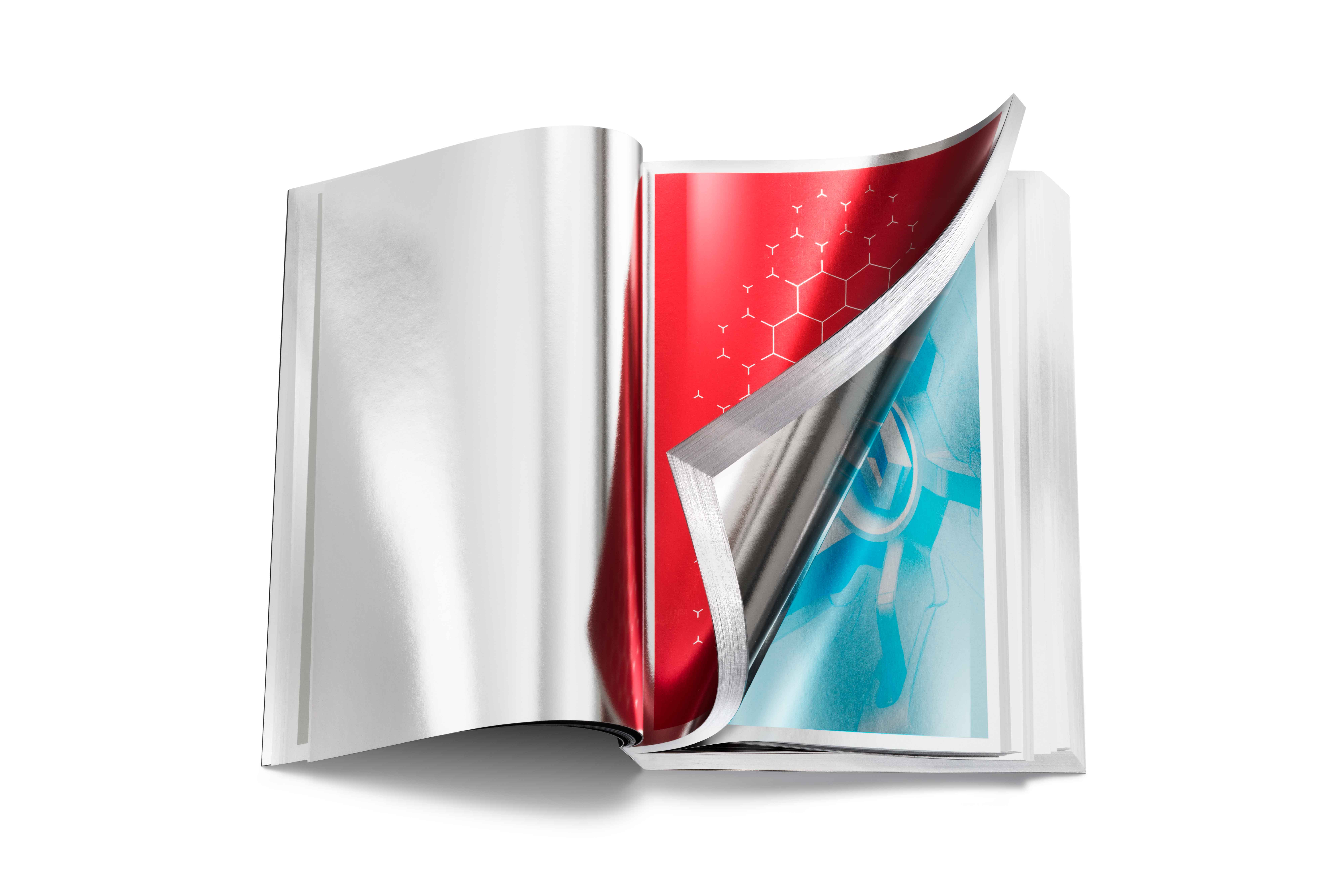
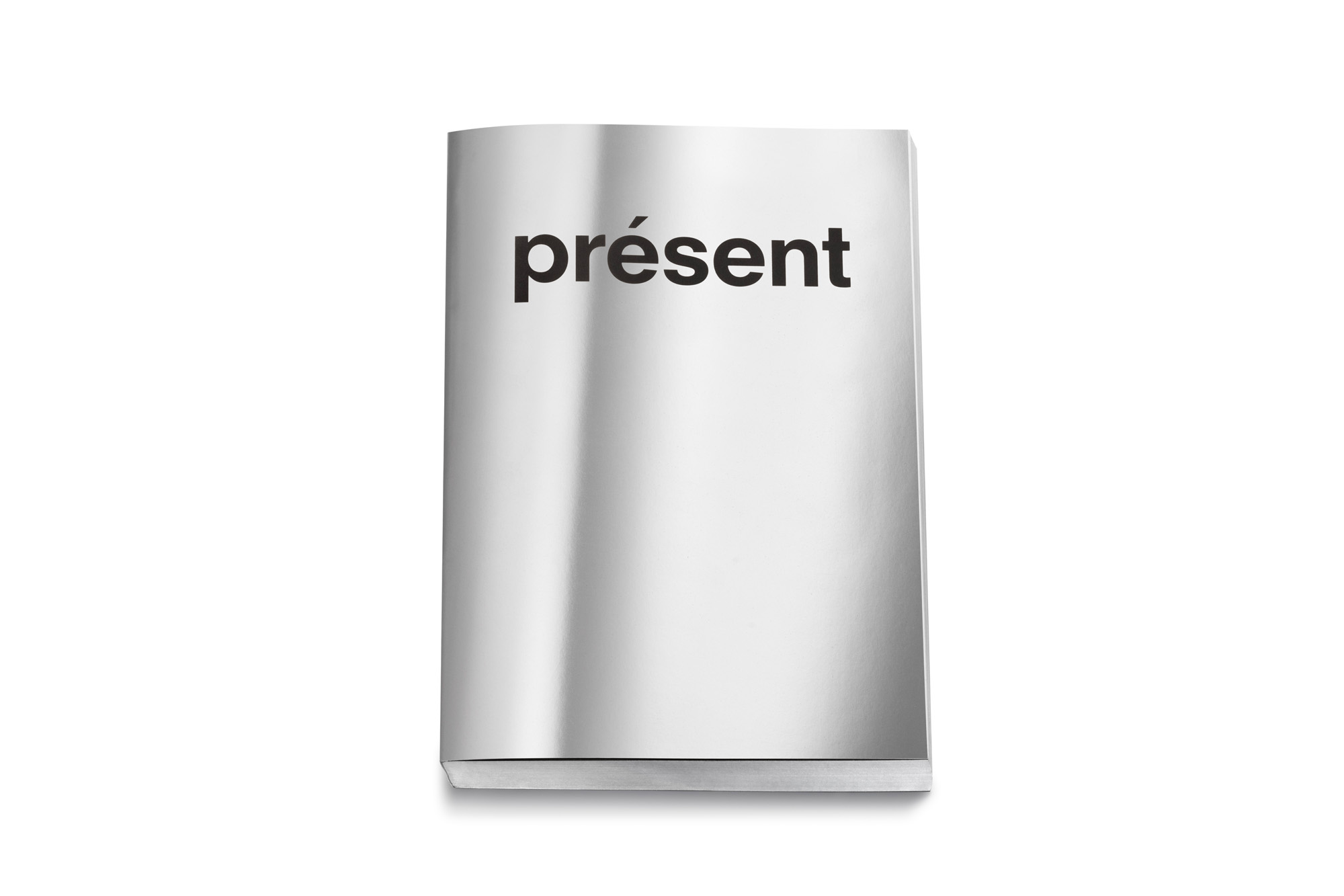
Commissioned by Renault in 2016, this limited-edition book was printed on wafer thin, glossy aluminium paper, resembling the body of a car. The company’s logo, designed by Victor Vasarely, is printed on a single aluminium plate
Renault book
Renault book
Apparently some studious priests complained about the unholy din, and Boom was summoned to an audience with Cardinal José Tolentino de Mendonça, who was, at the time, the librarian and archivist of the Holy Roman Church. Acquaintances were terrified on her behalf, she says. But the cardinal was intrigued and, instead of reprimanding her, invited her to stage an exhibition, ‘Book! Boom! The Vatican Apostolic Library meets Irma Boom’, for which there was a prosecco-soused opening.
It was here in the Vatican Library, amid some of the oldest printed matter on earth, that Boom says she became aware of something she had always known, albeit unconsciously. ‘What I realised is that you make books not for the past or for the present… but for the future.’
This article appears in the October 2025 issue of Wallpaper*, available in print and on newsstands, on the Wallpaper* app on Apple iOS, and to subscribers of Apple News +. Subscribe to Wallpaper* today