Sunny side up: Josef Albers’ yellow paintings look on the bright side
Receive our daily digest of inspiration, escapism and design stories from around the world direct to your inbox.
You are now subscribed
Your newsletter sign-up was successful
Want to add more newsletters?
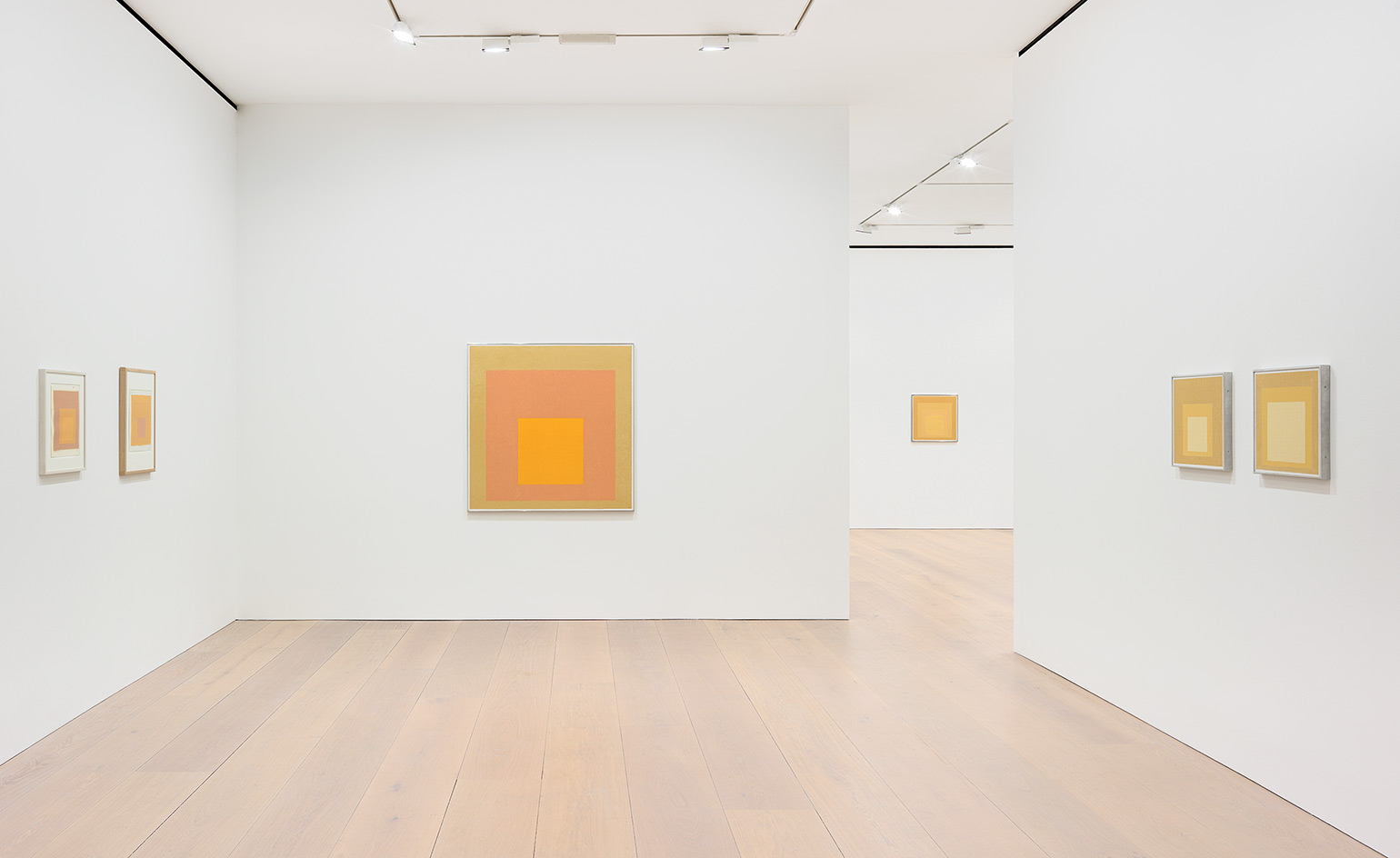
‘Josef had a weakness for yellows,’ says Nicholas Fox Weber, executive director of the Josef and Anni Albers Foundation, speaking to an assembled crowd at London gallery David Zwirner. Standing amidst an uplifting selection of the German-born American artist’s renowned Homage to the Square paintings in varying shades of mustard, saffron and pale lemon, Fox-Weber is in town to celebrate the opening of the gallery’s new exhibition, ‘Sunny Side Up’, which gathers a collection of Albers’ paintings in which the colour yellow takes centre stage.
On a grey January day in London, the warm saturated canvases come as a welcome sight. Elegantly arranged across two floors of the Mayfair gallery space, the yellow Homage to the Square works occupy the ground floor alongside a selection of the abstract painter’s rarely exhibited colour studies – working-experiments complete with notations which Fox Weber only uncovered after Albers’ death in 1976. Upstairs, Albers’ earlier Variant/Adobe series, which he initiated in 1947 in La Luz, New Mexico, during a sabbatical from teaching at Black Mountain College, show the profound influence of Latin American art on his oeuvre.
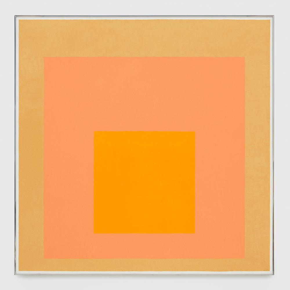
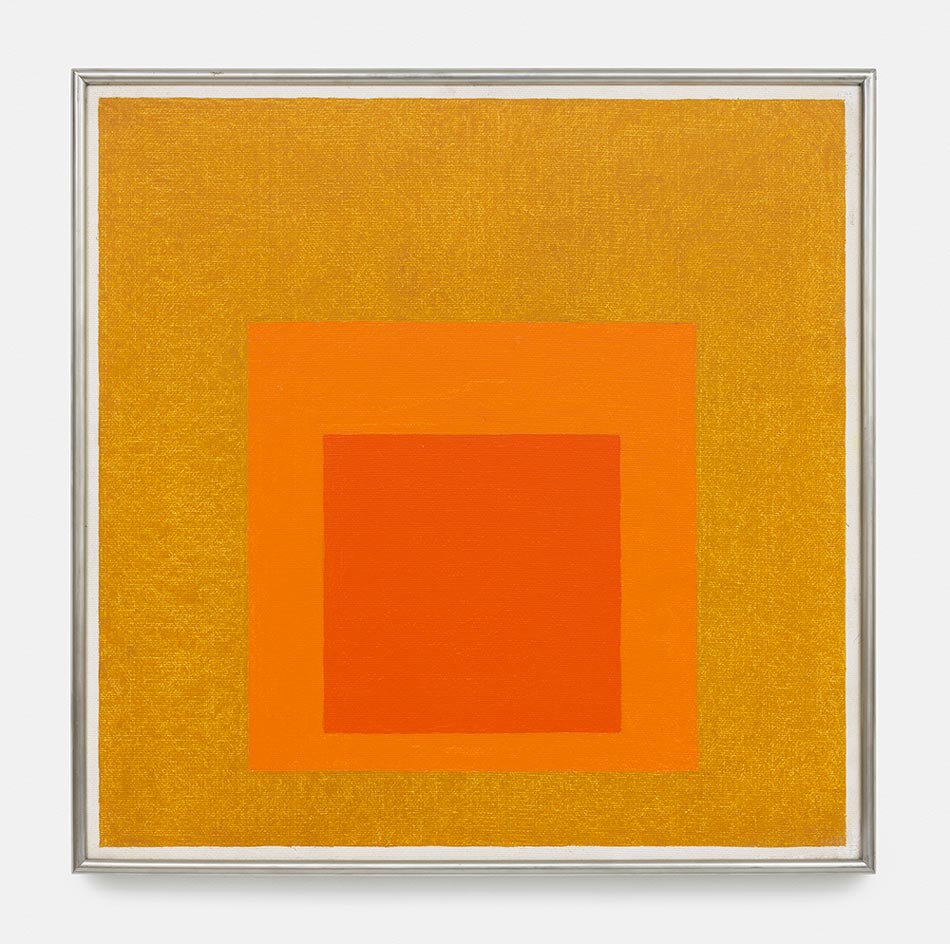
'Homage to the Square', 1971. © The Josef and Anni Albers Foundation/Artists Rights Society (ARS), New York.
In 1950, just three years after the initiation of the Variant/Adobe series, at the age of 62 Albers painted his first Homage to the Square. In the last 26 years of his life, he went on to paint over 3,000 of them on both 40- and larger 48 sq in canvases. They were always created using the same process: Albers would begin by dividing the canvas into ten units – a technique which he referred to as ‘a platter to serve colour’. He would then apply the paint directly to the canvas from the tube, unmixed, starting from the centre and working his way outwards, just as his father, a house painter, carpenter, plumber and general technician, had taught him – a technique that ‘catches the drips of paint and keeps cuffs clean’ he used to say.
‘If you say the word ‘“yellow” it means so many different things to so many different people,’ says Fox Weber surveying the assembled works. ‘You should be aware that verbal language doesn’t always have the subtlety and the breadth of the language of color, which was Josef’s language. Josef wanted to reveal colour in the same way that a religious figure wants to reveal the spiritual presence he believes in. He wanted to reveal line and form and its magic in the same way.’
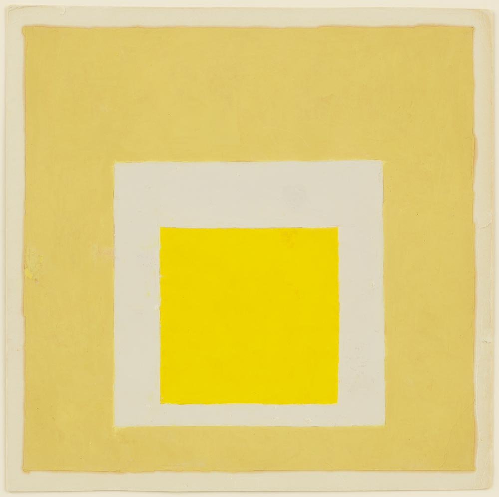
'Study for Homage to the Square', undated. © The Josef and Anni Albers Foundation/Artists Rights Society (ARS), New York.
‘Sunny Side Up’ follows on from David Zwirner’s November/December 2016 Albers survey in New York, ‘Josef Albers: Grey Scales, Grey Steps, Grey Ladders’, which focused on the artist’s use of black, white, and grey. To commemorate the two consecutive exhibitions, David Zwirner Books is publishing a fully illustrated catalogue called Josef Albers: Midnight and Noon – a title that nods to Albers’ 1964 series of color lithographs, which brought together two opposing colour sets (blacks and greys and an array of yellows) in a single portfolio.
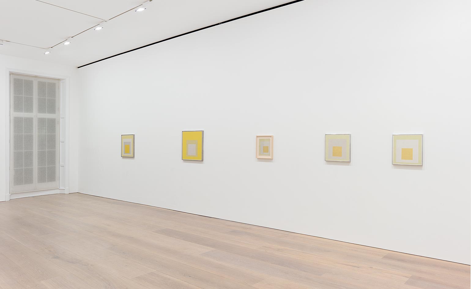
The yellow Homage to the Square works occupy the Mayfair gallery alongside a selection of the abstract painter’s rarely exhibited colour studies
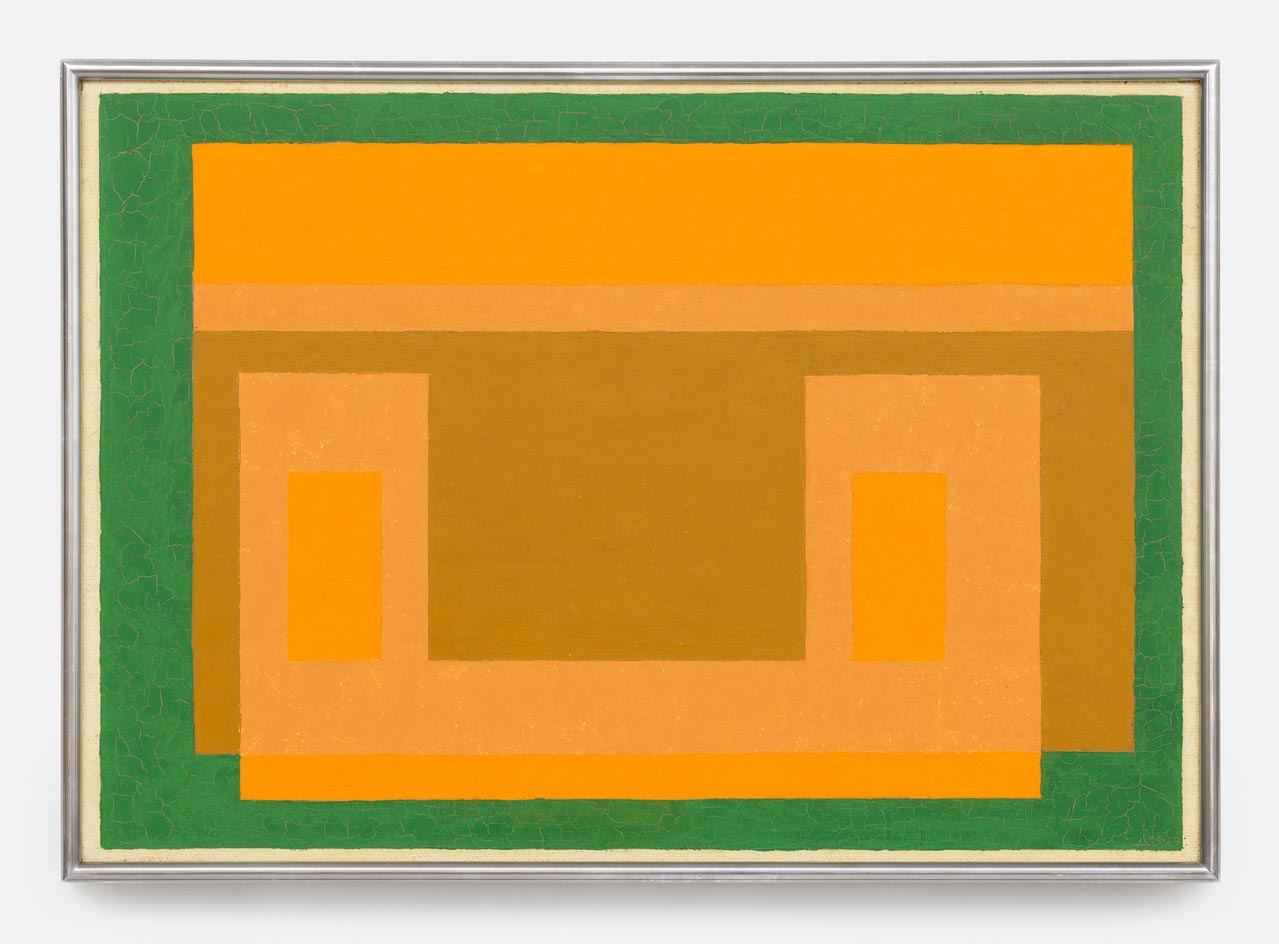
Untitled (Variant/Adobe), 1956-1958. © The Josef and Anni Albers Foundation/Artists Rights Society (ARS), New York
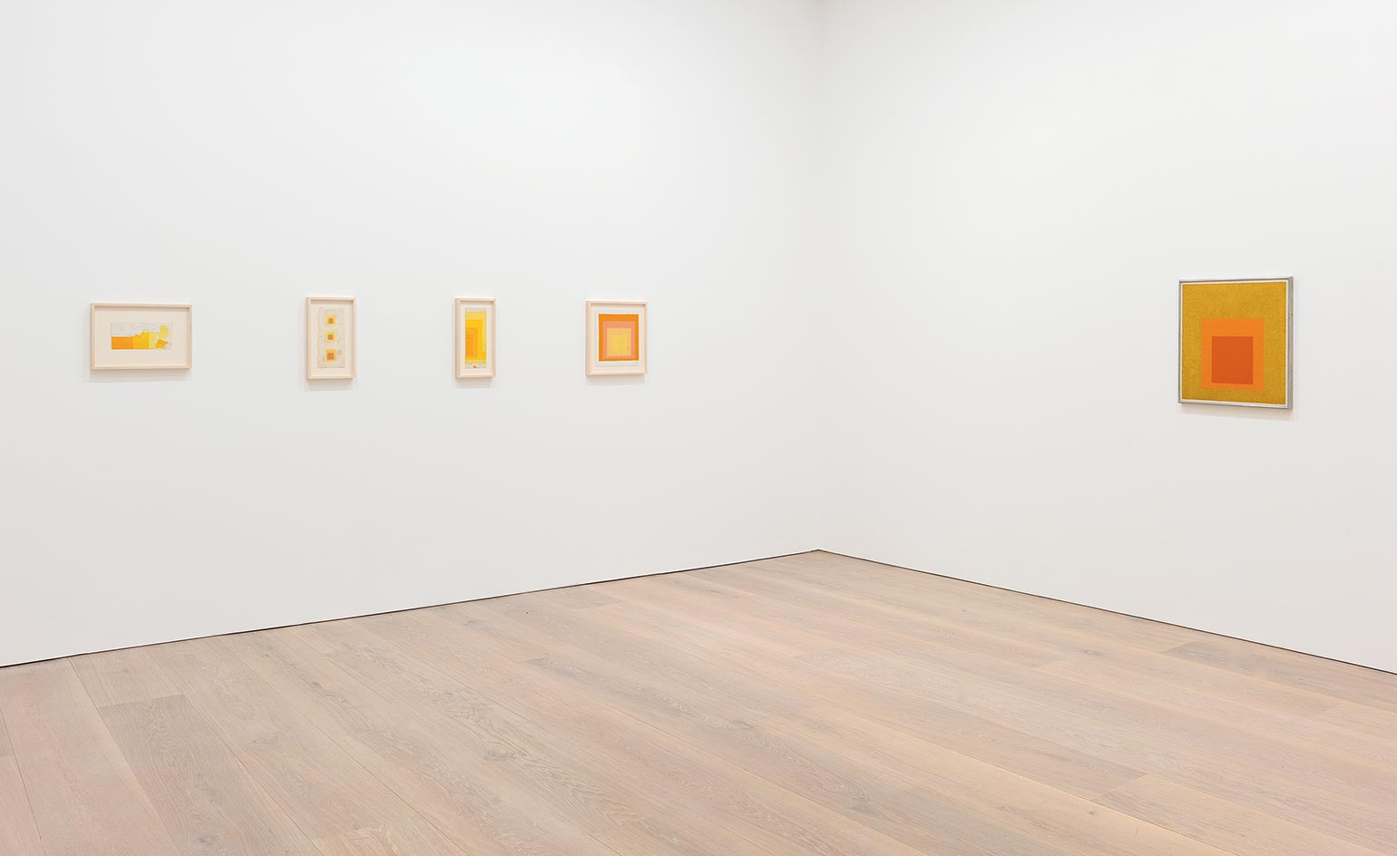
‘Josef wanted to reveal colour in the same way that a religious figure wants to reveal the spiritual presence he believes in,’ explains Nicholas Fox Weber, executive director of the Josef and Anni Albers Foundation
Study to Homage to the Square: Aurora, 1957. © The Josef and Anni Albers Foundation/Artists Rights Society (ARS), New York
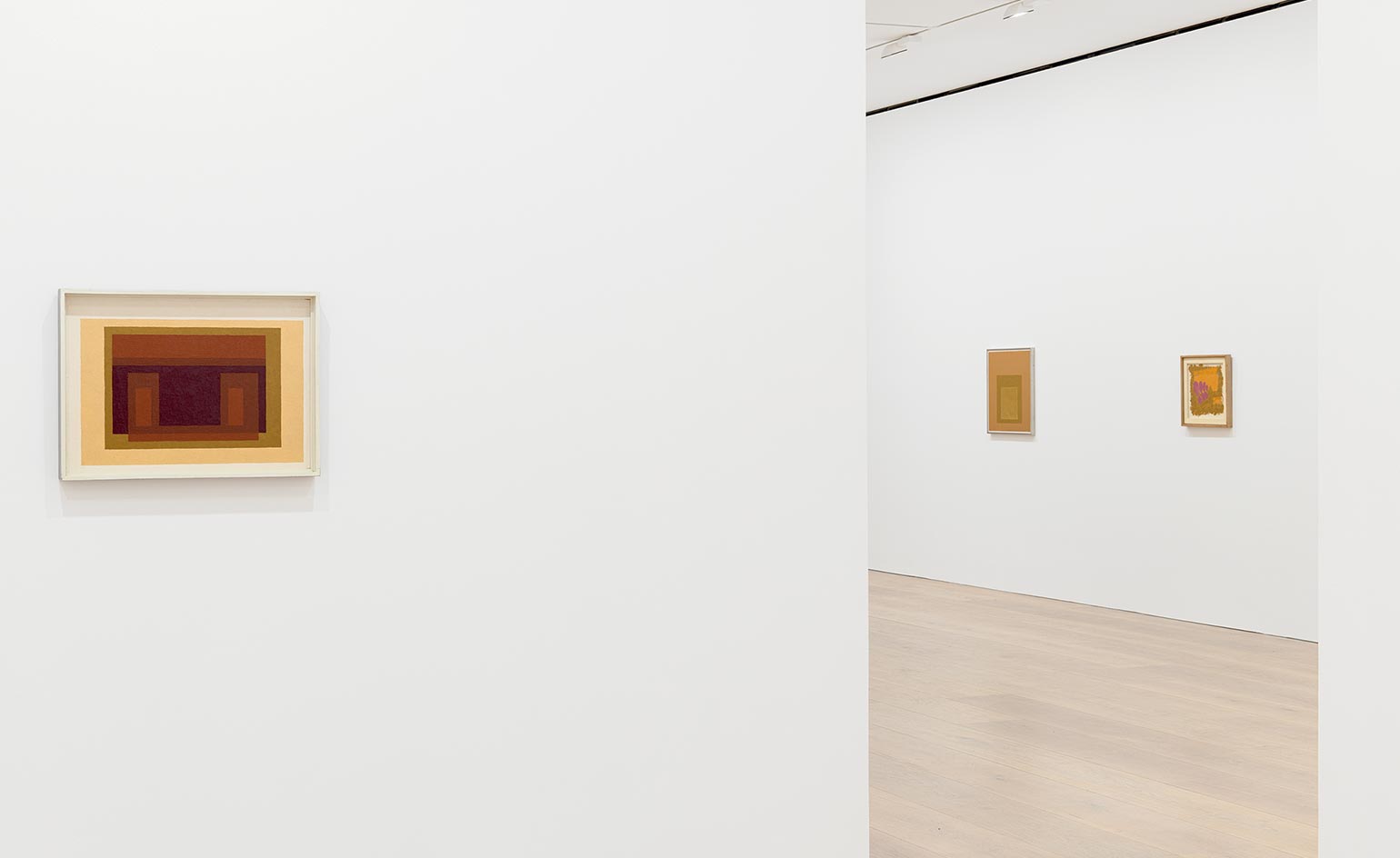
Examples of Albers’ earlier Variant/Adobe series, which he initiated in 1947 in La Luz, New Mexico, show the profound influence of Latin American art on his oeuvre
INFORMATION
’Josef Albers: Sunny Side Up’ is on view until 10 March. For more information, visit the David Zwirner website
ADDRESS
Receive our daily digest of inspiration, escapism and design stories from around the world direct to your inbox.
24 Grafton Street
London W1S 4EZ
Ali Morris is a UK-based editor, writer and creative consultant specialising in design, interiors and architecture. In her 16 years as a design writer, Ali has travelled the world, crafting articles about creative projects, products, places and people for titles such as Dezeen, Wallpaper* and Kinfolk.