Architect David Kohn adds colourful extension to shoe designer Rupert Sanderson’s London home


Receive our daily digest of inspiration, escapism and design stories from around the world direct to your inbox.
You are now subscribed
Your newsletter sign-up was successful
Want to add more newsletters?
The humble house extension is many a London architect’s bread and butter, but not David Kohn’s. In the past decade, he has made his name by steering clear of trends and diligently applying his distinct approach to a healthy mix of cultural, residential and commercial commissions. Cleverly executed, unusual projects, such as the unconventional Room for London – a mini one-room, ship-shaped hotel perched on the roof of the Queen Elizabeth Hall at the Southbank Centre – and the Prism outdoor screening space for our very own Wallpaper* Handmade in 2012, helped him carve his niche in the capital’s architecture scene.
So, when shoe designer Rupert Sanderson and his wife, publishing professional Rowan Routh, approached Kohn for a conversion and extension to their Tufnell Park home, it was, for his practice, fairly unusual. ‘We don’t always take on jobs working with existing houses,’ says Kohn. ‘So I said, “It would be lovely to work with you, but we’ve got to do something reasonably ambitious.” They were completely on board in terms of taking risks and trying different things. And it is exciting for us to work with people in the design industry.’
Kohn and his clients met during the Frieze London art fair about three years ago and quickly established a rapport. ‘We got talking about a project,’ says Kohn. ‘And we found that we all go to the same small Italian town on holiday every year.’ It emerged that both parties have links to Italy (Sanderson’s shoe factory is in the north of the country and Kohn’s wife is Italian) and a shared admiration for the culture, which created strong common ground and led to the commission.
One of the first references they looked at was the Villa Necchi Campiglio in Milan. Kohn has always been fascinated by continental European domestic architecture, something his practice has embraced when designing its interiors, Kohn explains. ‘In the UK, additions to 19th-century buildings have tended to be about a kind of contrasting high modernism – clean lines, openness, seamlessness – whereas craft, comfort and conviviality have been lower down the pecking order of concerns. We have consciously chosen to pursue these ideas.’
Back in London, Sanderson and Routh had been in their home for about six years and their growing family – then of four, now of five – meant that extra space, in the form of an extension project, was becoming a pressing necessity. At the same time, though, they were keen to make it more of a design project. ‘We were excited about the idea of not having the white box that everyone else has,’ says Routh. ‘We thought if we could persuade David to work with us on this, we could get something braver. And we have.’

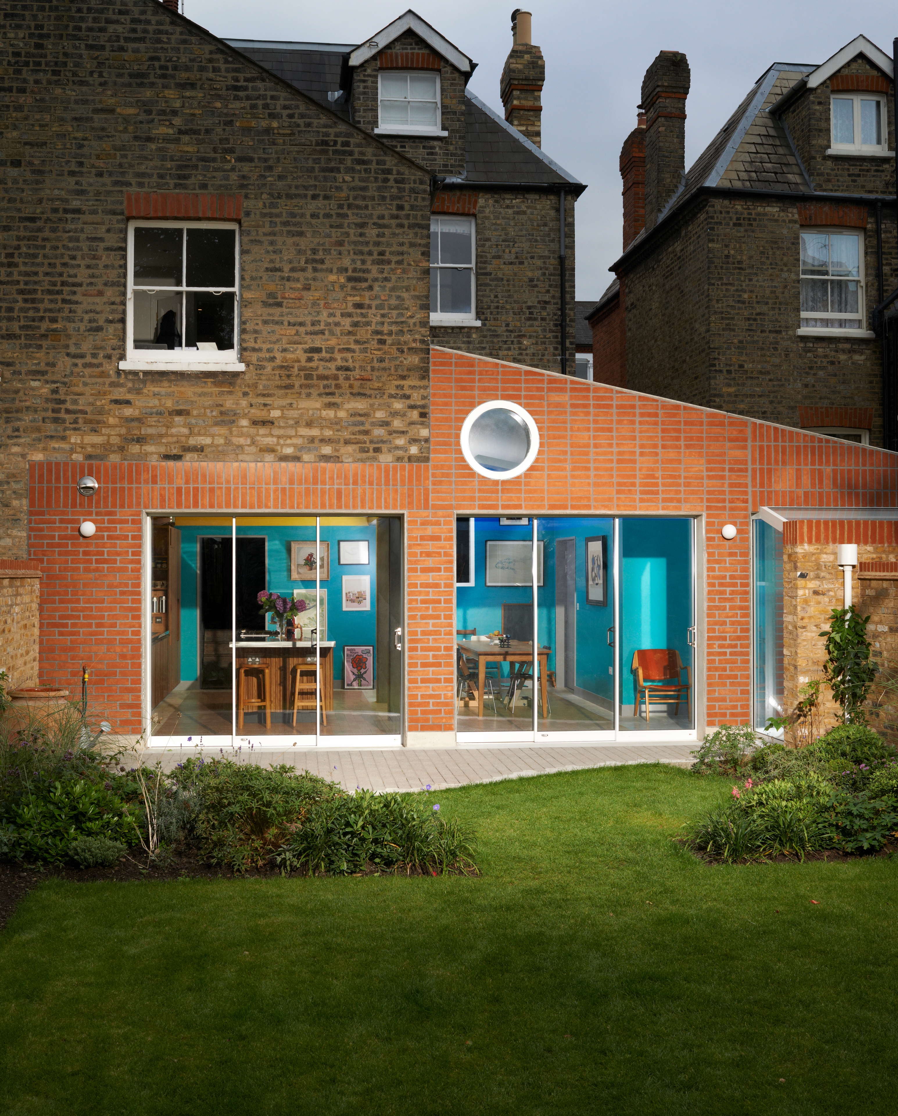
The extension's rear facade, with its vertical and horizontal terracotta bricks and circular window, brings to mind an abstract fox. Photography: Leon Chew
From the entrance in the Victorian part of the house at the front, which was left almost untouched, a hallway leads towards the back of the house and the extension. A spacious open-plan room that covers the plot side-to-side, containing workspace for cooking, a kitchen island and a dining area, replaces the old galley kitchen and garage. A quiet library-cum-play area is situated in a bright skylit corner towards the garden, leading up to the neighbour’s boundary. So far, so normal.
The rich selection of colours and materials is far less ordinary. In a clear break from the ‘white extension box’, blue, green and yellow hues envelop the space, complemented by the tactile textures of exposed concrete (the columns and part of the floor), oak (the floor insert) and smoked ash (for the kitchen units). Kohn’s references for these were once again in line with his continental European influences. ‘The colour schemes mostly came from a discussion about painted Adolf Loos interiors,’ explains Kohn. ‘They often have very bold colours, sometimes even shiny. I feel he is misrepresented, mostly, as being the father of stripped-down modernism and the rejection of detail. I think what he was saying was that there must be a reason for every detail. So detail needs to contribute to something experiential or functional. It can’t just be frivolous.’
The approach resonated with the clients. ‘It absolutely chimes with Rupert’s design ethos,’ says Routh. Similarly, rather than insisting on a limited material palette, the architect opted for a more pluralist route, anchored to the project’s overall aim for a warm, comfortable living space where elements that appear to be ‘just’ ornamental are in fact an integral part of the architectural concept.
Different types of timber serve various purposes, while the kitchen island’s sculptural undulation has the added bonus of contributing to the room’s acoustics. The concrete is bare in places – a reminder of the structure’s core material. The glazing panels neatly fold to one side, opening up the space to the outdoors, while a curtain to separate the library from the dining area, also reaching across the windows, is one of the final touches still to be added.
Views to and from other parts of the house were important to unify the space. The extension’s subspaces were carefully thought out so every wall’s twist and turn, every skylight and opening, was surgically sculpted for a reason. The columns, for example, were not necessary, structurally speaking, but were adopted to enhance the idea of a ‘pavilion’. An early design decision was for the new space to feel light, almost as if it were outdoors, and a fully glazed side, as well as elements of the interior, reflect this. ‘It should feel like a construction standing in a garden, rather than the extension of a Victorian house,’ explains Kohn. Walls were also informed by the clients’ love of art; there needed to be space for it to be hung. ‘It was not about creating big expanses of space. There was more concern about creating relationships. In a large volume, how do you create different experiences? How do you find the balance between the benefits of the more open architecture that suits a modern lifestyle, and retaining some of that “room-ness” that means that there is an invitation to do different things in different parts?’
The rear facade is clad in brick, in both vertical and horizontal coursing. Its terracotta colouring and outline loosely resemble an abstract fox – an unintentional detail that the family immediately warmed to. At the same time, a curved concrete terrace extends towards the garden, its brick-block edge inspired, Kohn says, by the Brazilian pavements of Roberto Burle Marx. It is this witty balance of architectural history and playfulness, craft and a burst of colours, shapes and textures that make Kohn’s extension design work so well.
As originally featured in the January 2015 issue of Wallpaper* (W*190)
INFORMATION
For more information, visit the David Kohn Architects website
Receive our daily digest of inspiration, escapism and design stories from around the world direct to your inbox.
Ellie Stathaki is the Architecture & Environment Director at Wallpaper*. She trained as an architect at the Aristotle University of Thessaloniki in Greece and studied architectural history at the Bartlett in London. Now an established journalist, she has been a member of the Wallpaper* team since 2006, visiting buildings across the globe and interviewing leading architects such as Tadao Ando and Rem Koolhaas. Ellie has also taken part in judging panels, moderated events, curated shows and contributed in books, such as The Contemporary House (Thames & Hudson, 2018), Glenn Sestig Architecture Diary (2020) and House London (2022).
