There’s no place like the Museum of the Home, thanks to a new and inviting rebrand by design consultancy dn&co. The new visual identity goes hand-in-hand with the museum’s £18.1 million redevelopment by London-based architecture firm Wright & Wright, scheduled for opening in summer 2020.
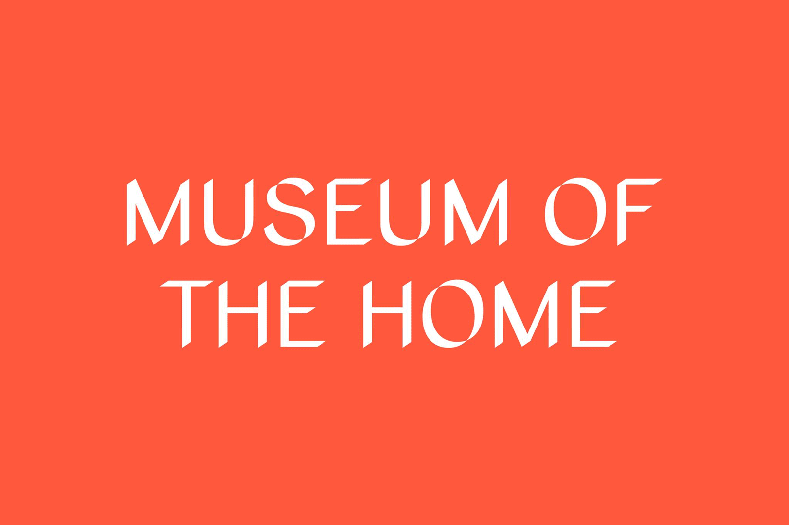
While the Hoxton-based institute holds a focus on the diverse perspectives of the humble abode, its new typeface Home Sans further explores the intricacies of our daily residencies. Inspired by household objects obstructing light and casting angular shadows, dn&co partnered with design agency Colophon Foundry to create its letterforms, the shape of which varies depending on the angle of light. Letters transform from attenuated dashes to wide, angular shadows.
Light plays an incredibly important role in homes. It creates spaces, sets the atmosphere, brings things to the fore, or hides them from view
Not only does the type boast the brand's unique expression, Home Sans encourages us as the viewer to reflect on the ambition of the museum, to rethink the ways in which we cohabit and how our environment affects our behaviour.

With its 360-degree adaptability, the typeface allows for a flexible narrative; more sharp and cornered text speaks louder on the page as opposed to daintier variations. Much like our homes, different rooms and spaces make us feel a certain way; the various patterns of the design reflect the same expressions. Extenuated with the trio colour palette, which was taken from the museums surroundings — brick red, sky blue and garden green — the refreshingly white text is offset against the pronounced colour.
INFORMATION