Receive our daily digest of inspiration, escapism and design stories from around the world direct to your inbox.
You are now subscribed
Your newsletter sign-up was successful
Want to add more newsletters?
Last summer, the Lionesses – England’s Sarina Wiegman-led women’s football squad – won the UEFA Euro 2022 final, beating Germany in front of a record-breaking 87,192-strong crowd at north London’s Wembley Stadium.
Echoes of that historic victory are found in the team’s football kit for another monumental opportunity this weekend, the 2023 FIFA World Cup final, which will take place at Stadium Australia in Sydney on Sunday (the match will kick off at 8pm local time and 11am BST). England will take on Spain for the title in a blockbuster match-up of two footballing nations.
The England women’s football kit, which is designed by Nike, finds its roots in ‘the heritage of Wembley’, a stadium that began its construction in the 1920s and celebrates its centenary this year. The national stadium continues to set the record for the two highest-attended women’s football matches ever, both set at England women’s team matches, and has also been the site of numerous other sporting occasions, including the 1966 World Cup final – England’s last World Cup triumph – and the 1948 Olympics.
The story behind the 2023 England women’s football kit
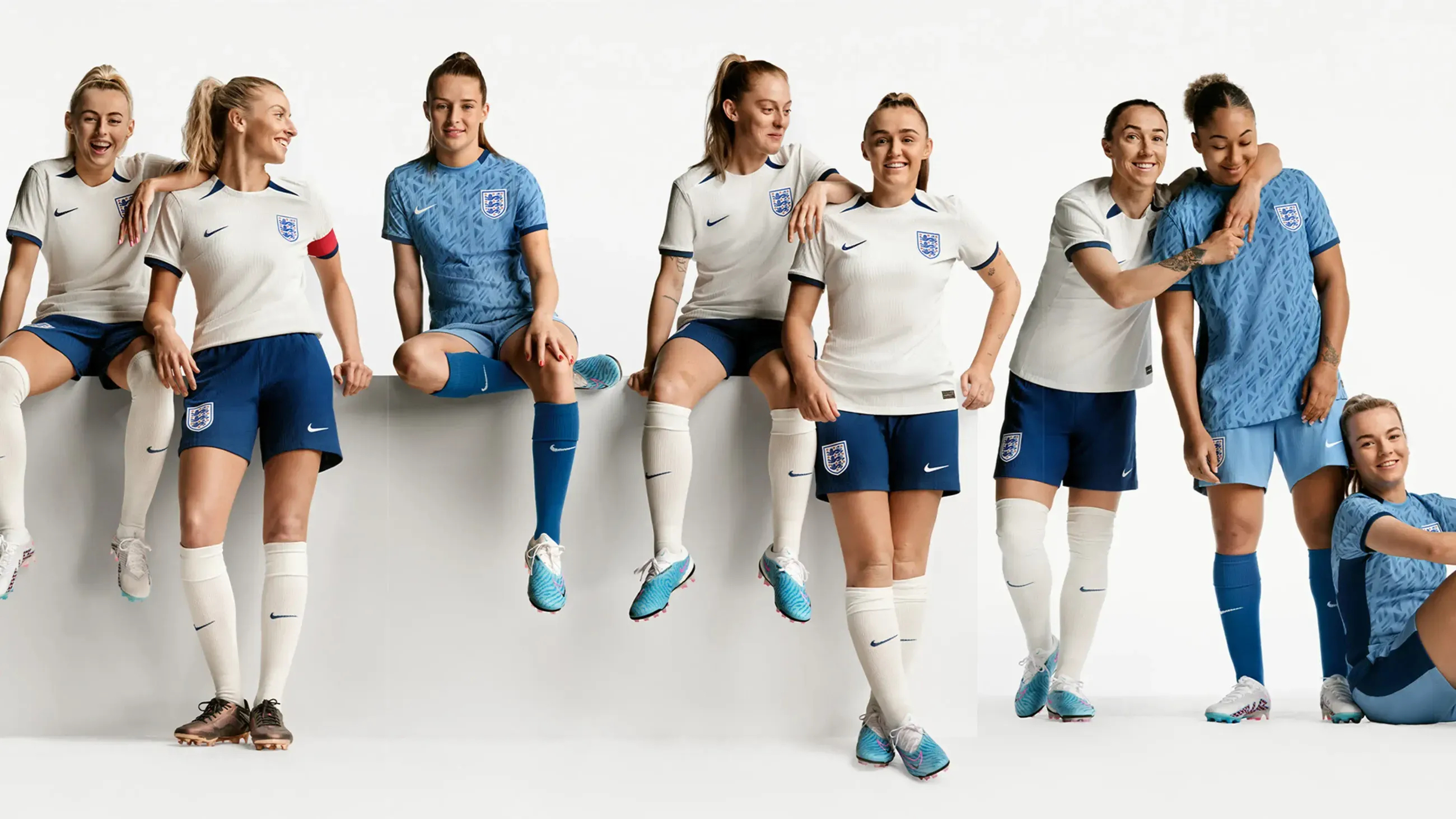
The England women’s football team in the home and away kits for this year’s World Cup
The kit itself draws on the original Wembley Stadium, which was inaugurated in 1923 and is known for its distinctive white ’twin towers’ (the site was rebuilt in the 2000s to a design by Populous and Foster + Partners, opening in 2007). At the time of its original completion, England was in the midst of the art deco movement – a gleaming, decorative style that emerged in a period of post-First World War prosperity – a mood reflected Sir Robert McAlpine’s stadium, built to house the British Empire Exhibition of 1924-25. Its first event was the FA Cup Final of April 1923; in the century that has followed, it has become perhaps the world’s most famous football stadium. ‘Wembley is the cathedral of football,’ said Pelé. ‘It is the capital of football and it is the heart of football.’
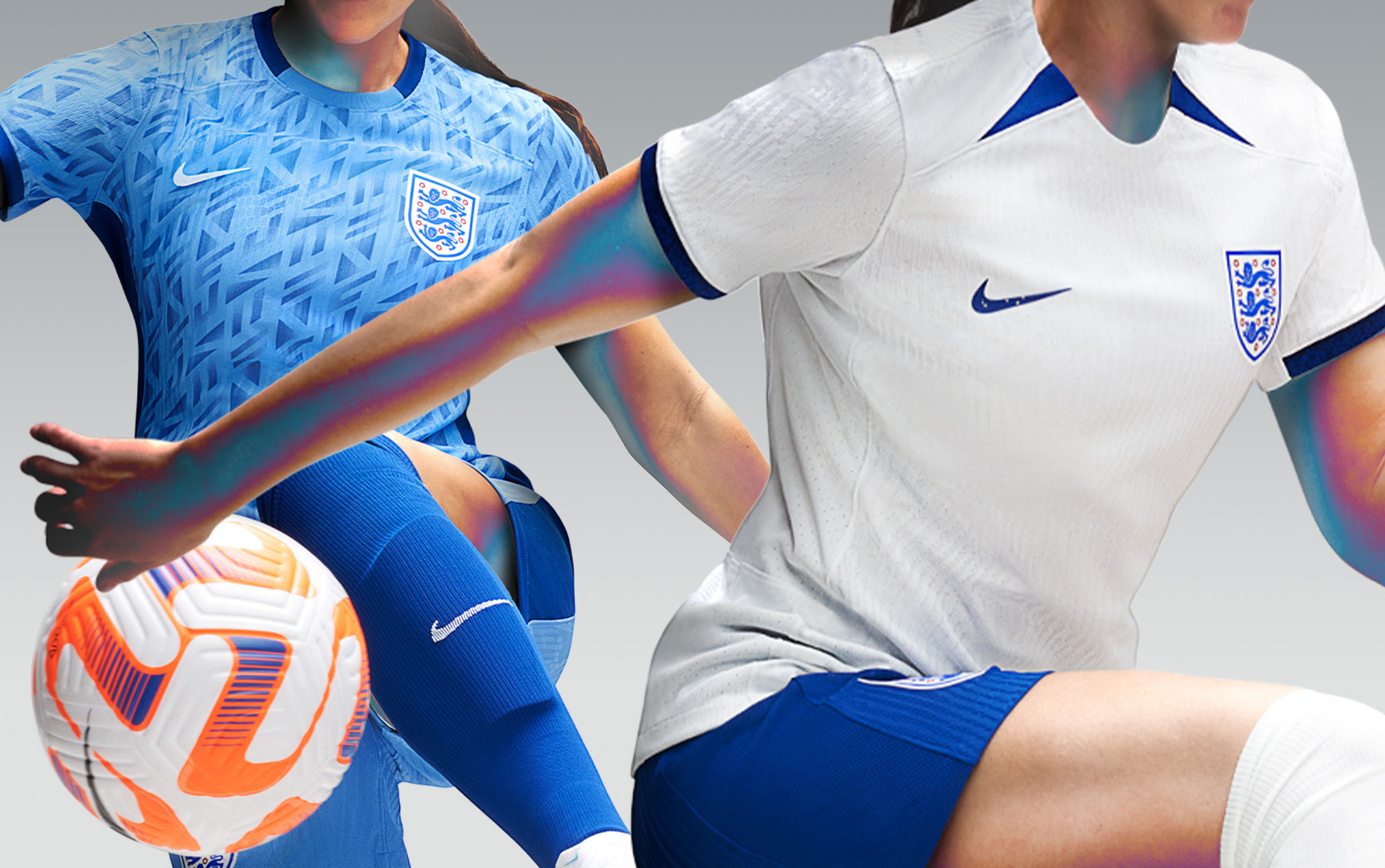
The kit’s design – white with blue shorts for home matches, a paler blue with matching shorts for away – draws inspiration from art deco‘s ‘colour, patterns and gradients’, according to Nike. The home kit references ‘the original Wembley’s white, chalky brick exterior’ in its just off-white shade, while also providing an homage to the 1984 England women’s team, which was the first women’s team assembled for the country. The home kit follows the same shades of blue and white as the original 1984 uniform.
The away kit, meanwhile, is distinct for its geometric patterned design, a direct nod to the decorative motifs of the art deco movement. The slight gradient is once again a reference to Wembley’s original chalky façade, as well as screever chalk paintings – the street paintings drawn on pavements by ‘screevers’ outside sporting events or at tourist attractions – a style which was popular at the time. It is also notable for its pale blue colour, a departure from the usual red that both the men’s and women’s England teams have traditionally worn at away games.
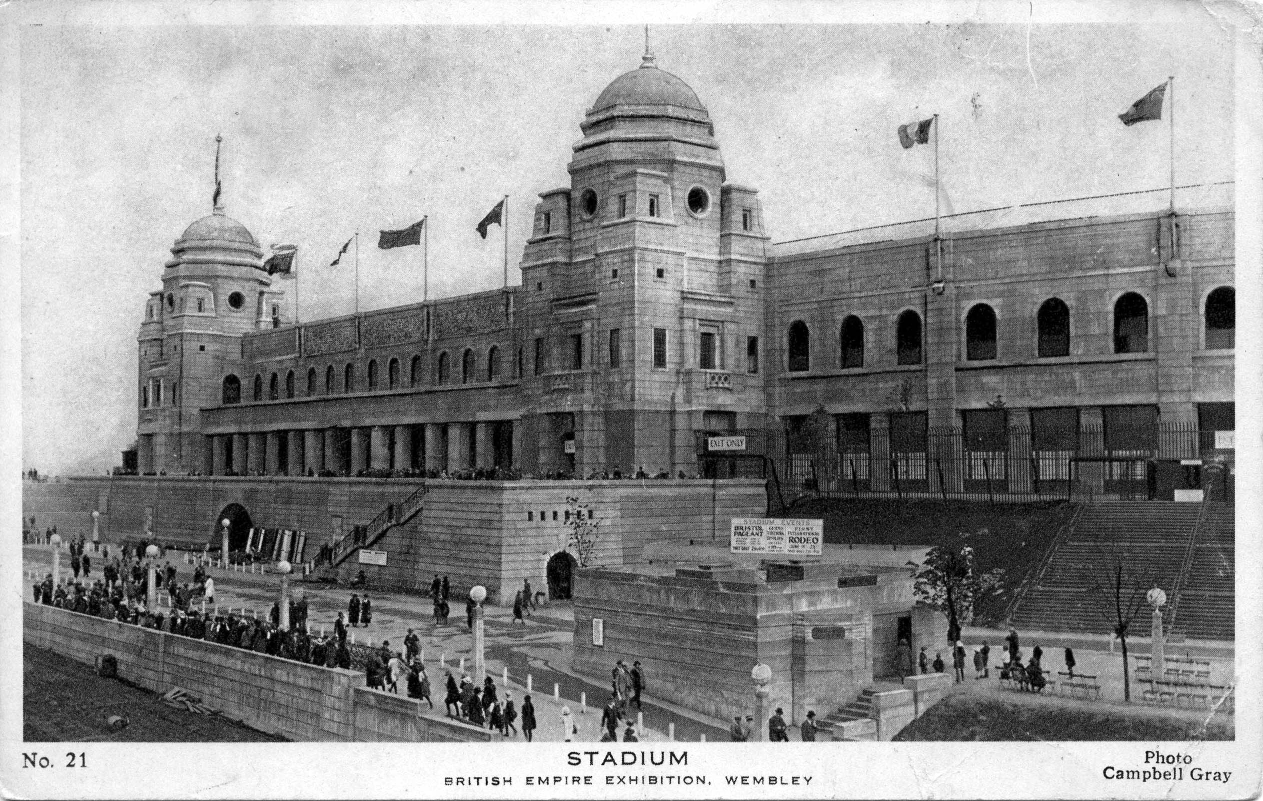
A postcard of the white ‘twin towers’ of Wembley Stadium, dating back to when it hosted the British Empire Exhibition of 1924-25
Though it is perhaps England goalkeeper Mary Earps’ patterned jersey, in gradient shades of red, orange and pink, which has proved the most talked-about garment of the tournament, having not yet been made available for sale by Nike. ‘I can’t really sugar-coat this in any way, so I am not going to try. It is hugely disappointing and very hurtful,’ she said at the opening of the tournament of the decision. After England’s slew of wins and progress during the World Cup, a petition to get the jersey into production has garnered over 45,000 signatures (Nike is yet to comment on its plans to produce the shirt).
Receive our daily digest of inspiration, escapism and design stories from around the world direct to your inbox.
Each element of the kit is completed with typography by pioneering British graphic designer Neville Brody, who is best known for his work on The Face magazine in the 1980s and whose subsequent clients have included Apple, BBC, The Times and Channel 4 (he also created a special-edition ‘blank canvas’ cover for Wallpaper’s August 2009 edition). Here, he adapted fonts created for the men‘s team in 2014, alongside a lighter font with ‘adjusted angles’ to adapt to the women’s uniform’s scale.
The designs have proved popular, with Google searches for ‘Lionesses shirt’ and ‘England shirt’ purportedly rising by up to 4,000 per cent ahead of the final, with the most searched-for styles including forward Lauren Hemp, captain Leah Williamson, and goalkeeper Earps.
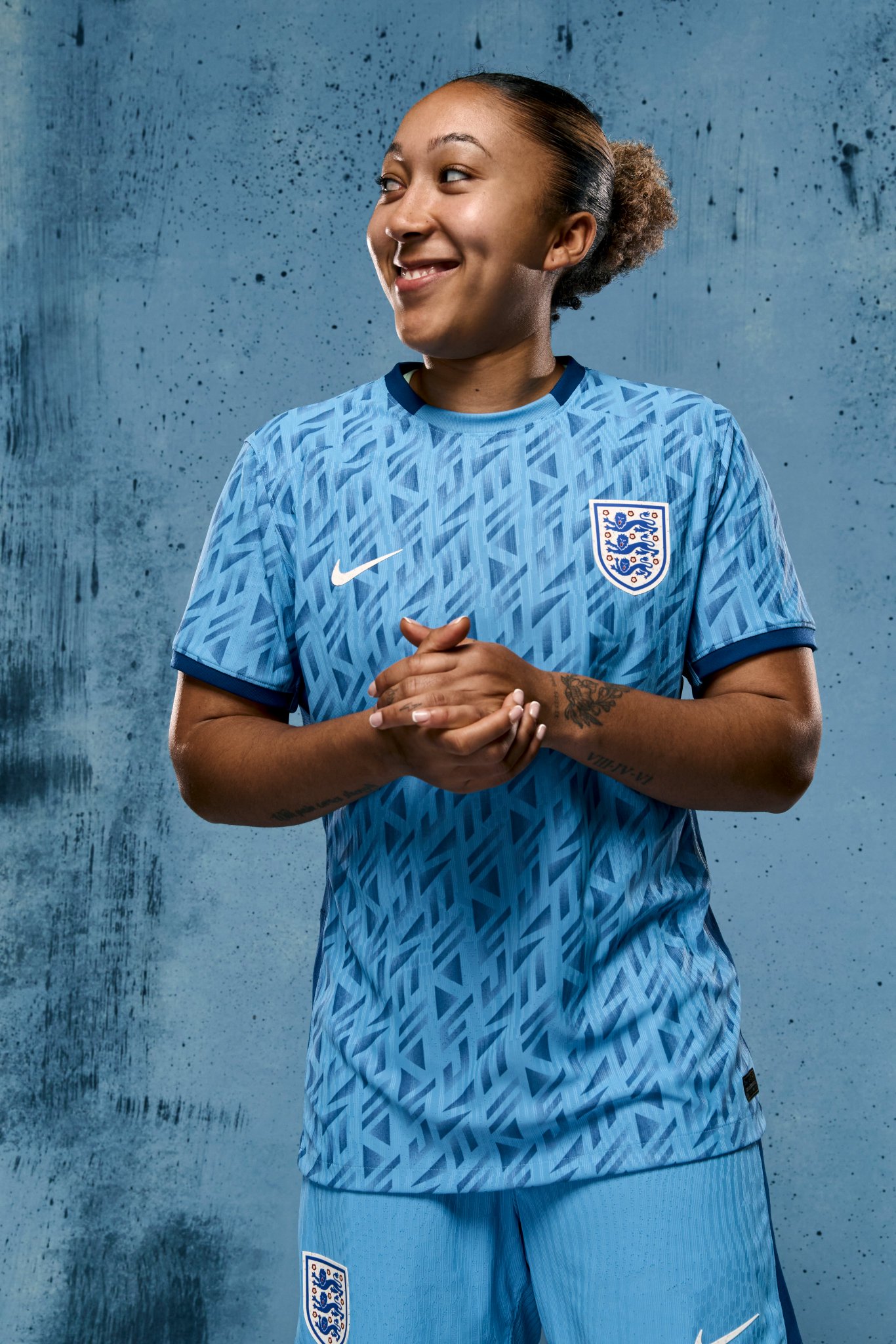
Lauren James in the team’s away kit, featuring geometric motifs inspired by the art deco movement
Nike also produced the kit for 12 other nations in this year’s women’s World Cup alongside England, including hosts Australia and New Zealand, as well as the Netherlands, Nigeria, USA and France. Each features a similar technical design and cut, part of a growing initiative from the brand to engineer sporting garments specifically for the top level of women’s sport (Nike says designs for this World Cup are backed by the brand’s ‘largest-ever investment in women’s specific innovation’).
Led by body mapping, 3D-rendering and data-driven technologies, each element is specifically designed for a woman’s body in movement, the brand noting that each seam, sleeve and sweatline was placed to ensure ’no distractions’ on the pitch. Such elements were fitted ‘pixel-by-pixel’, according to Nike, whereby ways to interchange mesh and ribbed textures were able to be done digitally, a move forward from the designs for the 2019 World Cup. These digital renderings were first tested on a female football avatar, before being tested on the pitch by players themselves.
The England team’s kit also features integrated ‘Nike Leak Protection: Period’ technology, an ultra-thin absorbent lining for more comfortable bleeding if a player is on her period during a match. Women‘s periods were also part of the shift from white to blue shorts for the home kit, after players like Beth Mead spoke out about the impracticality of white shorts for women during the Euro 2022 competition.
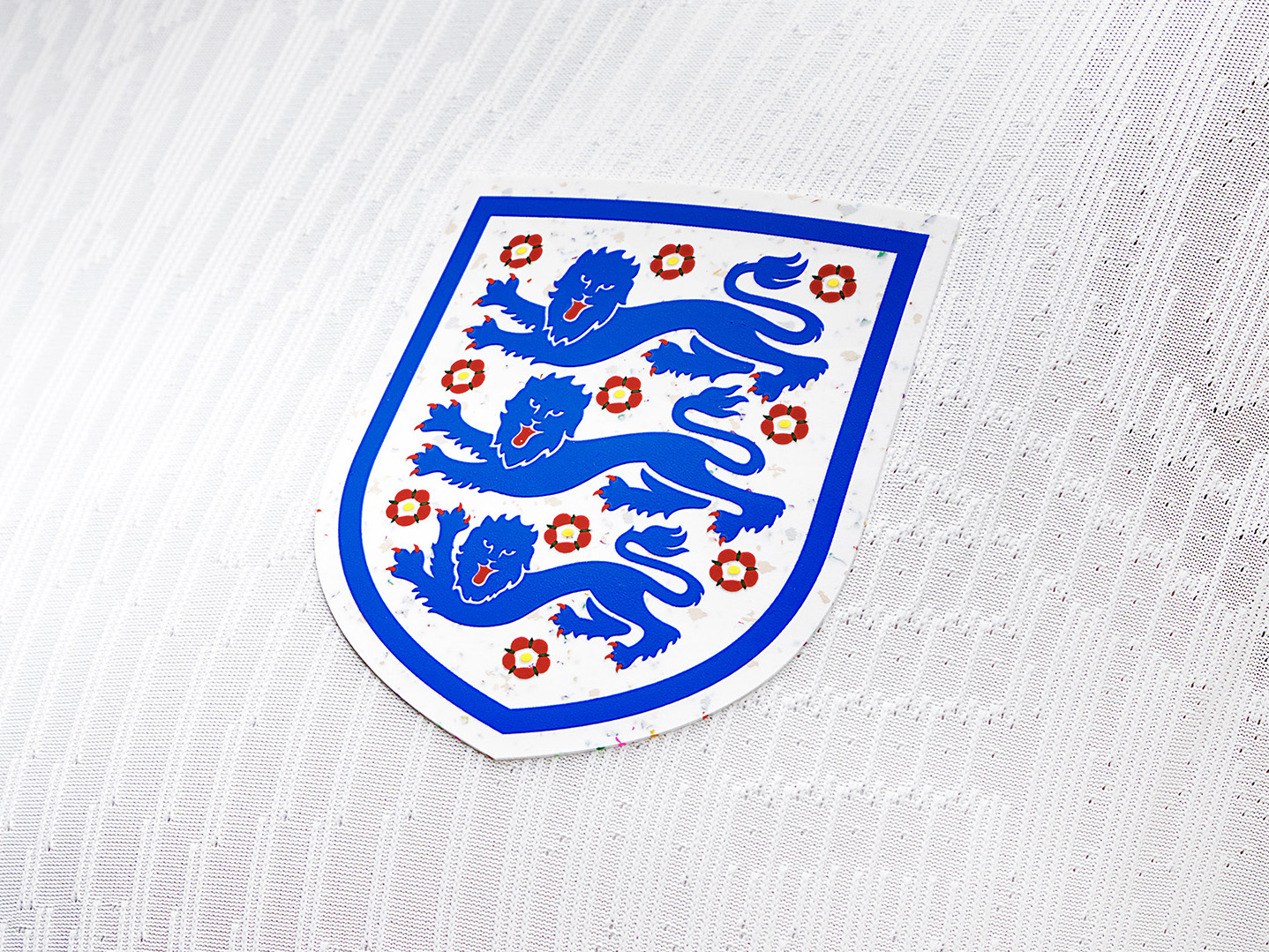
England’s ‘Three Lions’ emblem, here crafted from 100 per cent ‘Nike Grind’, an innovative recycled material made from manufacturing leftovers and recycled shoes
The Nike kits are also their most sustainable yet – digital testing and prototyping lowered fabric waste of physical samples, while fabric yield went up to 85 per cent compared to the 40 to 50 per cent of the 2019 World Cup. The kits themselves, meanwhile, are crafted from at least 80 per cent recycled material which is derived from recycled plastic bottles, while federation crests, signature Nike ’Swooshes’ and trims are made from 100 per cent ‘Nike Grind’, a recycled material made from manufacturing leftovers, recycled post-consumer shoes (from the brand’s ‘Reuse-a-shoe’ program) and unsellable garments.
‘The future of the game is critically important to these athletes, making sustainability of the gear they wear essential,’ says Nike. ‘England’s kit is a reflection of listening to the voice of the athlete.’
Jack Moss is the Fashion & Beauty Features Director at Wallpaper*, having joined the team in 2022 as Fashion Features Editor. Previously the digital features editor at AnOther and digital editor at 10 Magazine, he has also contributed to numerous international publications and featured in ‘Dazed: 32 Years Confused: The Covers’, published by Rizzoli. He is particularly interested in the moments when fashion intersects with other creative disciplines – notably art and design – as well as championing a new generation of international talent and reporting from international fashion weeks. Across his career, he has interviewed the fashion industry’s leading figures, including Rick Owens, Pieter Mulier, Jonathan Anderson, Grace Wales Bonner, Christian Lacroix, Kate Moss and Manolo Blahnik.