
Anyone familiar with the dynamic posters and typography conceived over decades by Philippe Apeloig might be surprised to discover that his designs for La Manufacture de Sèvres are absent of lettering. Instead, he’s used the slashes and punctuation marks that frequently feature in the composition of his typefaces to produce three rhythmic motifs that speak to the fluidity of his work. Unlike the prescribed right-side up format of a page or sign, the porcelain maker’s classic ‘Diane’ service plates encouraged Apeloig to consider how the circular shape would dictate the placement of his patterns.
In this way, ‘Tourbillon’ consists of gold slashes that diffuse outward and curve like a cresting wave; the pointillist array that glows from the Sèvres blue surface of ‘Galaxie’ demonstrates how grammatical dots can be arranged as cosmic scenery; while elongated hyphens that make up ‘Paille’ (straw) appear as a fine sprinkle of sprigs.
As the Paris-based graphic designer tells Wallpaper*, parameters such as kerning – or spacing – became integral to achieving a kinetic impression with each creation. ‘It’s like frozen motion,’ he says from the Galerie de Sèvres, where the plates have been mounted as an exhibition alongside limited-edition prints of the motifs on traditional washi paper from the Awagami Factory in Japan. ‘It’s interesting to limit yourself to one element and see all that you can do,’ he adds. 'This is typography as well; I just didn’t want to write something in words.’

‘Tourbillon’ by Philippe Apeloig
The invitation was extended to Apeloig by Romane Sarfati, general director of the Cité de la céramique Sèvres et Limoges after she saw his drawings and watercolours in a show at the Galerie de Multiples in Paris last spring. Yves Mirande, the manufacturer’s director of culture and communication, suggests that she recognised ‘the balance’ inherent to Apeloig’s work, noting that he is the first graphic designer to contribute a series.
Apeloig, who devised a scarf for Hermès in 2014 by using the page layout of Roland Barthes’ Fragments d'un discours amoureux (A Lover’s Discourse: Fragments) to arrive at a genius geometrical pattern, is no stranger to abstracting and reimagining references both ordinary and esoteric. With the plates, a nod to Japanese artist Hokusai comes through – not just in the wave but also in the broader arrangement of the minimalist patterns. However, his talent for coaxing such beauty from prosaic punctuation is what makes these works unique.
Worth noting, too, are the precise production aspects: for ‘Tourbillon’, the result of photosensitive printing, the gold slashes continue around the downward edge of the plates; whereas ‘Galaxie’ and ‘Paille’ were engraved to enhance the depth of the gold detailing. High-gloss and slightly concave in all five sizes, the plates ultimately absorb Apeloig’s serene markings into their self-contained volumes.
This does not preclude them from being used, especially when the food is up to a similar standard. He notes how he intentionally avoided concentrating the pattern activity at the centre, for instance. ‘The plates play with emptiness – they’re not over-designed,’ he says. Even if the focus becomes a stack of asparagus stalks, his effort would not go unnoticed. ‘It’s a real motivation to reinvent yourself. I’m not bringing recipes,’ he says, gliding over the double entendre.
His reproduced signature – his truest typography of all – happens to be on the reverse side, adding to the Sèvres branding. But of course, it’s poor form to look.

Elongated hyphens that make up ‘Paille’ (straw) appear as a fine sprinkle of sprigs

‘Galaxie’ demonstrates how grammatical dots can be arranged as cosmic scenery

‘Tourbillon’ consists of gold slashes that diffuse outward and curve like a cresting wave

‘Galaxie’ was engraved to enhance the depth of the gold detailing

For ‘Tourbillon’, the result of photosensitive printing, the gold slashes continue around the downward edge of the plates

‘The plates play with emptiness; they’re not over-designed,’ Apeloig says
INFORMATION
‘Typography: Apeloig à Sèvres’ is on view until 29 July. For more information, visit the Galerie de Sèvres website
ADDRESS
Galerie de Sèvres
4 Place André Malraux
75001 Paris
-
 Cult 1960s boutique Granny Takes A Trip gets a sustainable reboot
Founded on King’s Road in 1966, ‘radically creative’ fashion store Granny Takes A Trip is being reimagined for a new generation. Dal Chodha takes a closer look
-
 Find yourself at Six Senses Kyoto, the brand's breathtaking Japan debut
Six Senses Kyoto opens its doors boasting tranquil, luxurious interiors by Blink Design Group
-
 Shigeru Ban’s mini Paper Log House welcomed at The Glass House
'Shigeru Ban: The Paper Log House' is shown at The Glass House in New Canaan, USA as the house museum of American architect Philip Johnson plays host to the Japanese architect’s model temporary home concept


-
 SlowMo eases digital mental health therapy into daily life
SlowMo is a new mental health support app developed by design studio Special Projects and King’s College London that uses visual prompts to combat unhelpful thoughts
-
 Mark Dalton on helping people navigate a pandemic through design
Design Emergency began as an Instagram Live series during the Covid-19 pandemic and is now becoming a wake-up call to the world, and compelling evidence of the power of design to effect radical and far-reaching change. Co-founders Paola Antonelli and Alice Rawsthorn took over the October 2020 issue of Wallpaper* – available to download free here – to present stories of design’s new purpose and promise. Here, Alice Rawsthorn talks to creative director Mark Dalton
-
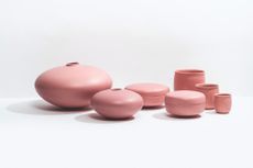 Raawii enlists ceramic artist Alev Siesbye for a multi-chromatic collection
The collection by Turkish artist Alev Siesbye for Danish brand Raawii includes cups, boxes and vases in multicoloured hues
-
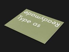 APFEL’s new digital foundry explores type as ‘readymade’
London-based graphic design studio A Practice for Everyday Life has launched the APFEL Type Foundry, through which it will publish a growing library of typefaces developed through visual, textual and experiential research
-
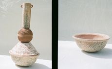 Lauren Manoogian’s personal Peruvian ceramics collection
The New York-based fashion designer launches Object, a 12-piece edit of rustic, hand-built vases, pots and sculptural clay objets, crafted by a community of women in San Martin
-
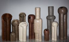 Jeremy Anderson unveils ceramics inspired by industrial architecture
The co-founder of Apparatus, Jeremy Anderson, reveals his first body of ceramic work, inspired by the black and white photographs of Bernd and Hilla Becher depicting water towers and other industrial structures
-
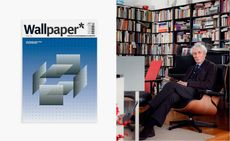 In memoriam: Wim Crouwel (1928-2019)
 -
 V&A Museum’s new map navigates seven miles of gallery space
Anyone who has ever found themselves waylaid in the V&A will welcome the addition of a new map, and nearly 400 signs, comprising 60 totems, 130 hanging signs as well as an entirely new signage at gallery thresholds


