David Rockwell designs a graphic and vibrant new tile range for Bisazza
Receive our daily digest of inspiration, escapism and design stories from around the world direct to your inbox.
You are now subscribed
Your newsletter sign-up was successful
Want to add more newsletters?
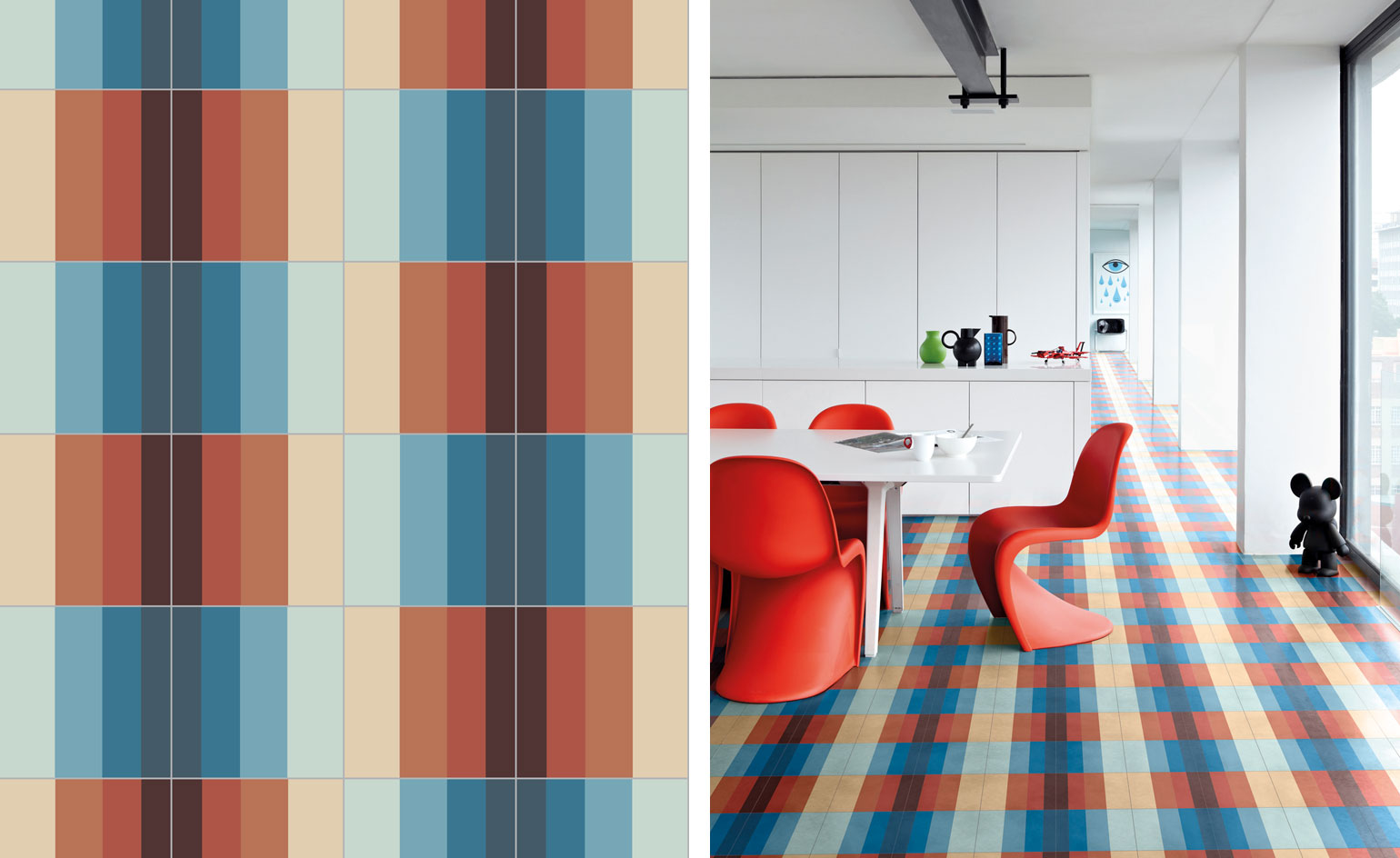
When it comes to sophisticated tiled surfaces, Bisazza’s offering is the one to beat. The Italian design company’s latest undertaking is an inspired collaboration with the designer David Rockwell – the first American on Bisazza’s books. Comprised of a suite of graphic patterns that is available in four colour families, Rockwell’s 'Tonal' collection brings a contemporary slant to Bisazza’s artistic 'Cementiles' collection.
‘Last year [when] we started working properly on a collection, [David] decided to go with the Cementiles,’ recalls Rosella Bisazza. ‘We gave him freedom to design and select the patterns that he wanted. He just asked us to add a new colour. David loves blue and we didn’t have enough blues in our palette, so we were happy to add this blue that we now call the "David Rockwell Blue".’
David Rockwell is no stranger to Bisazza and has been using its tiles for years, ‘the first question I had was how can we make a contribution that feels unique?’ he says. ‘The Cementiles interested me because it’s a material I’ve always loved, and it brings me back to early days in Mexico when I was a kid.’
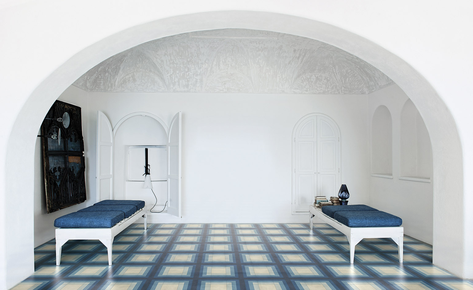
'Maze' by David Rockwell for Bisazza on display
‘With all of Bisazza’s product, the thing that intrigues me is the combination of craftsmanship and the way it interacts with light. In the Cementiles, each tile is slightly different. We started to imagine a way to combine the notion of ombre because the idea of transition links my work in theatre and architecture. The in-between spaces are the most interesting spaces and ombre-ing from one colour to another has always felt like a kind of illusion.’
Within these parameters, Rockwell created a set of graphic patterns, ranging from bold chromatic stripes to a vivid end grain, which can be combined in a myriad of ways. The colour palettes – a sepia-toned warm neutral, a charcoal cool neutral, a family of rust and then the blues – enhance the matte finish of the tiles to provide a latent energy and sense of movement to the larger environment.
‘In some ways, the simpler patterns emphasize the quality of the material; they don’t distract from the material,’ says Rockwell. ‘[There is] a kind of boldness that felt (in a world of lots of elaborate details) like something that would stand out.’
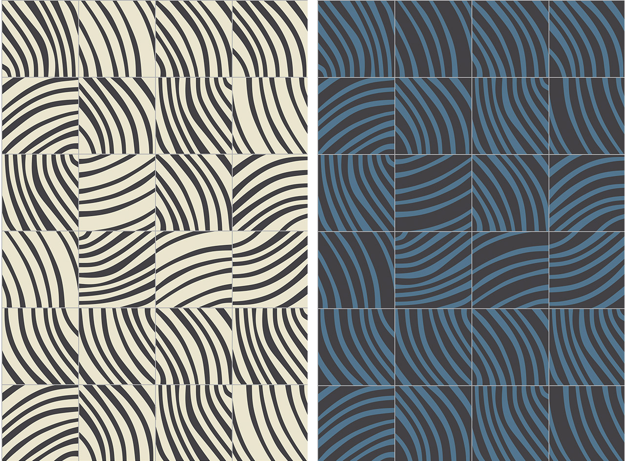
'End Grein' in black and white (left) and ocean (right)
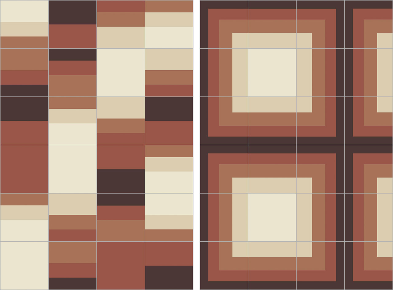
'Swing' and 'Maze' designs, both in the rust colour palette
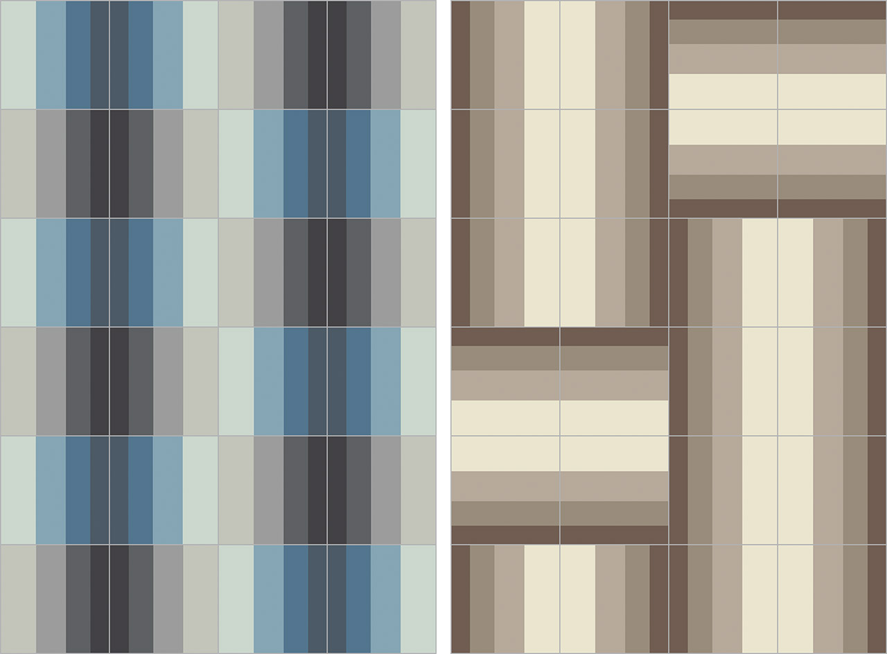
Left, 'Pass' in lakes. Right, 'Leap' in sepia
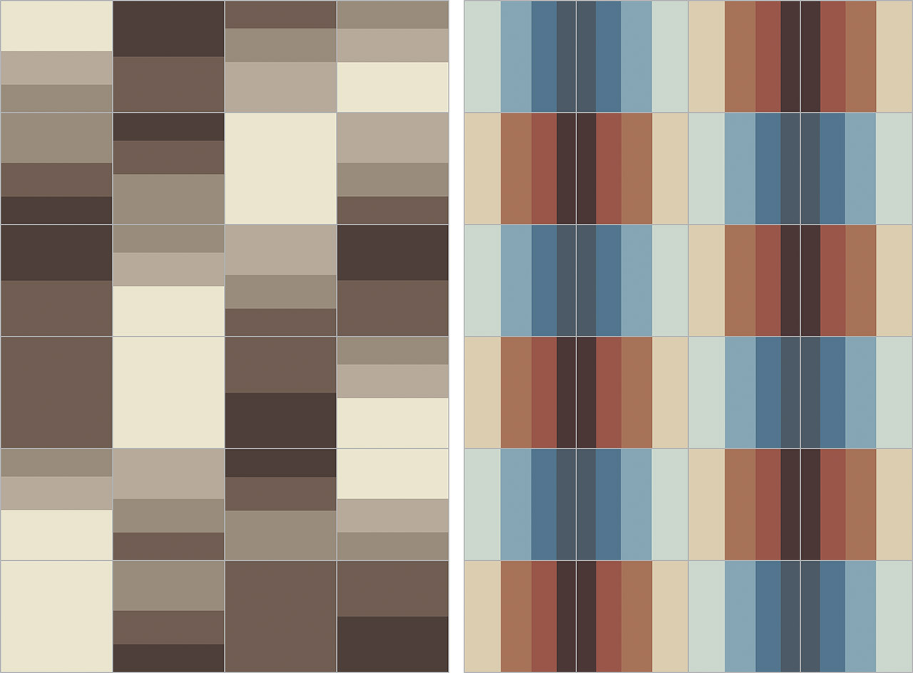
Left, 'Swing' in sepia. Right, 'Pass' in horizon
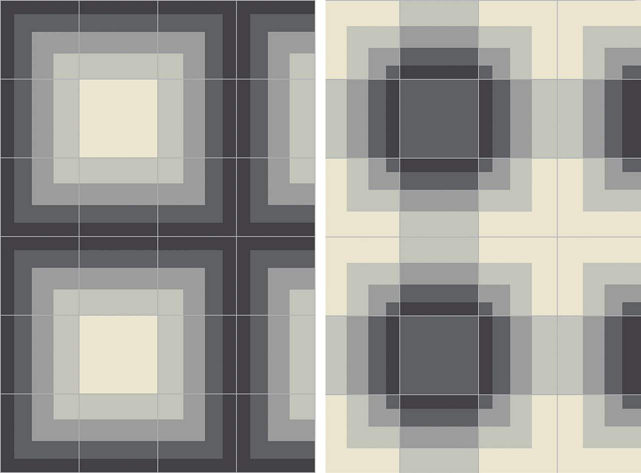
'Maze' and 'Jump,' both in charcoal
INFORMATION
For more information, visit the Bisazza website
Receive our daily digest of inspiration, escapism and design stories from around the world direct to your inbox.
Pei-Ru Keh is a former US Editor at Wallpaper*. Born and raised in Singapore, she has been a New Yorker since 2013. Pei-Ru held various titles at Wallpaper* between 2007 and 2023. She reports on design, tech, art, architecture, fashion, beauty and lifestyle happenings in the United States, both in print and digitally. Pei-Ru took a key role in championing diversity and representation within Wallpaper's content pillars, actively seeking out stories that reflect a wide range of perspectives. She lives in Brooklyn with her husband and two children, and is currently learning how to drive.