
Los Angeles was awarded the 2028 Summer Olympics and Paralympics back in September 2017, which will make it only the third city to have hosted the games three times (after London and Paris, which was the last Olympic city in 2024). LA last hosted back in 1984 (and before that 1932); in theory the city is well versed in the art of the spectacle. A little bit more of the aesthetic and artistic approach to the games was unveiled today, as the slogan – ‘Stars Align’ – and a short brand film and logo were revealed.

Los Angeles 2028 Olympics identity
It’s no exaggeration to say that Olympic design is freighted with cultural significance and expectation. London 2012 famously fell foul of the taste police, while Rio 2016 was a little cartoonish and Tokyo 2020 (held the following year due to the pandemic) felt understandably muted. Paris 2024, overseeing by director of design Joachim Roncin, raised the bar, walking a stylish tightrope between bold graphics and cultural sensitivities.
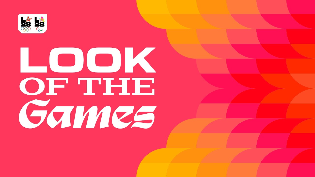
Ric Edwards, VP of Brand Design and Look for LA 2028, has described the brand as ‘platform of infinite expression to reflect the diversity of LA stories’. One of the key jumping off points for the ‘Look of the Games’ was the colourful floral display put on by Southern Californian superblooms, when the desert bursts into life. Colour is therefore a key part of the identity, which is further broken down into 13 patterns, or ‘blooms’, each tied in to an integral community and cultural component of the city.

Stars Align for the LA28 Olympics
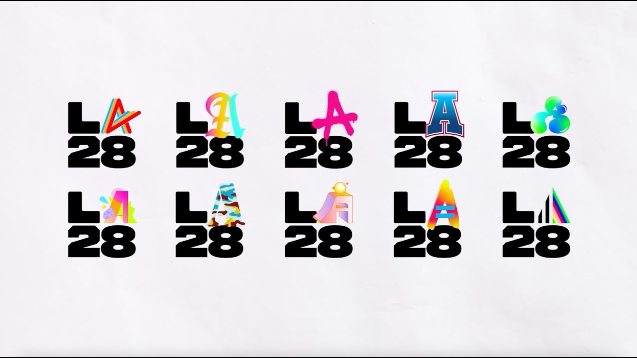
On top of this, there are four unique typefaces developed for the identity, each one taken from elements of urban typographic design like the strip mall and hand painted signage. For the first time, the LA28 Olympic emblem emblem will be a dynamic one, cycling through the first dynamic Olympic emblem, with the ‘L’, ‘2’ and ‘8’ represented by three different typefaces and the ‘A’ cycling through graphical representations drawn from the cityscape.
There’ll be naysayers, inevitably, but it’s a valid attempt at creating a visual identity that embraces the massive scale and complexity of LA, one of America’s most diverse cities. It also acknowledges the huge contribution made by the Games workers, both during the events themselves and the period leading up to the opening ceremony. ‘No one makes the Games alone.
It's an athlete's years of early mornings, a volunteer's first shift, a small business getting ready for the world, a fan's voice in the stands. Each of those matters on its own,’ says LA28’s Chief Marketing Officer Alex Merchán, ‘'Stars Align' is what happens when they all come together at the same moment, and that's where the extraordinary comes from.’
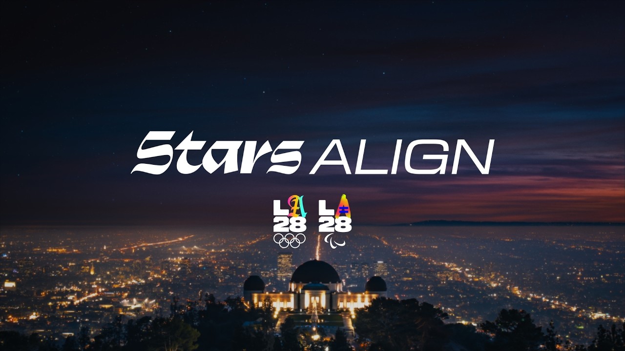
The ‘Stars Align’ reveal film is soundtracked by the Red Hot Chili Peppers ‘Can’t Stop’, a rather obvious choice given the sheer scope of options that must have been available. Nevertheless, it’ll certainly help with brand recognition. As the Games draw closer, expect to see the LA28 burst forth just like those desert superblooms, garlanding the city in a colourful celebration of the competition to come.