Exclusive interview: Dries Van Noten on launching his new beauty line
In an exclusive interview, the Belgian designer shares the story behind the creation of Dries Van Noten Beauty
Mathilde Hiley - Photography
Receive our daily digest of inspiration, escapism and design stories from around the world direct to your inbox.
You are now subscribed
Your newsletter sign-up was successful
Want to add more newsletters?
Dries Van Noten likens smelling his perfume to eating olives. ‘The first one makes you go, “Ooh, what is this?”’ he says over Zoom from his Antwerp studio. ‘But after that you always like it. I think you have to learn to appreciate things, and sometimes you have to learn to appreciate my vision of beauty.’
That beauty can (and often should be) consciously attained rather than instantly perceived has been a defining feature of Van Noten’s work since he debuted his first fashion collection in 1986. The Belgian designer is a connoisseur of contradictions, with a matchless ability to synthesise sartorial opposites – slouchy streetwear silhouettes are blended with impeccably tailored couture; collections are influenced by the high-brow (he once based an entire season on Elizabeth Peyton’s painting, Democrats Are More Beautiful (after John Horowitz), 2011) and the mundane (prints made from iPhone photos taken by his team), while styles from disparate pasts (19th-century dandies, 1970s Glam Rock) are scavenged and reworked to create distinctly modern pieces.
The story behind Dries Van Noten Beauty
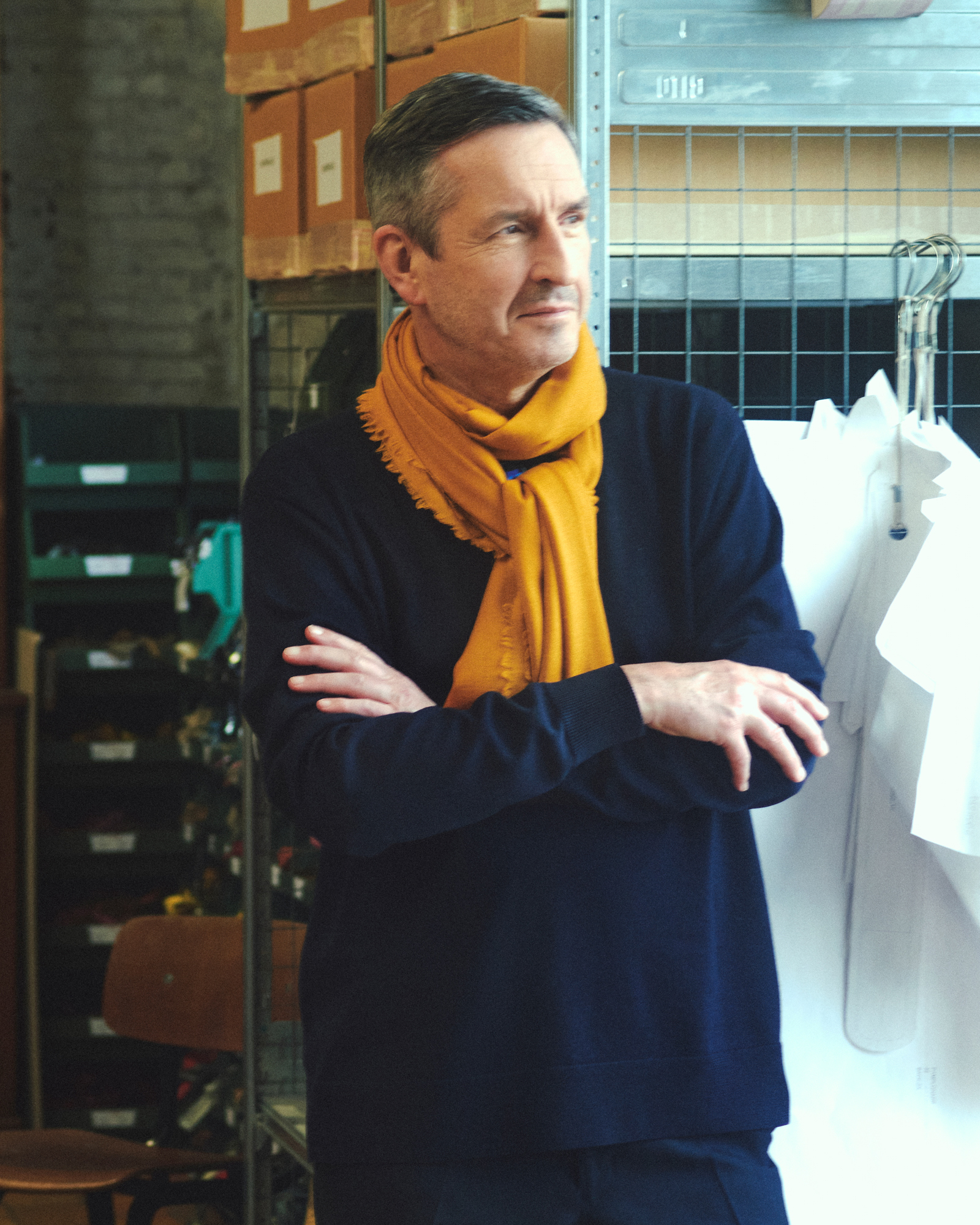
Van Noten in his expansive textile studio in Antwerp
The most crystalline expression of Van Noten’s penchant for ‘impossible combinations’ is inarguably his use of colour and pattern. He produces all of his own textiles (the portrait shown here was taken in his store room) and his particular brilliance as a designer lies in his ability to combine textures, patterns, and colours that would, to anyone else, seem inherently wrong. Take, for example, his latest S/S 2022 collection, which paired psychedelic silkscreened button-ups with flapper-esque fringe outfits of seafoam green, tangerine, and royal blue.
The newly launched Dries Van Noten Beauty sees the designer translate his unique understanding of colour and texture into a new medium, and create a beauty line that stands apart from anything else in the industry. ‘There's so much beauty out there. Is there still something we can do?’ Van Noten asked himself before launching the line. ‘For me, the answer was yes, we can tell a different story. Because with my fashion collections, I am a storyteller. My clothes make you feel certain associations and connections, because I work with all those contrasts, all those opposites.’
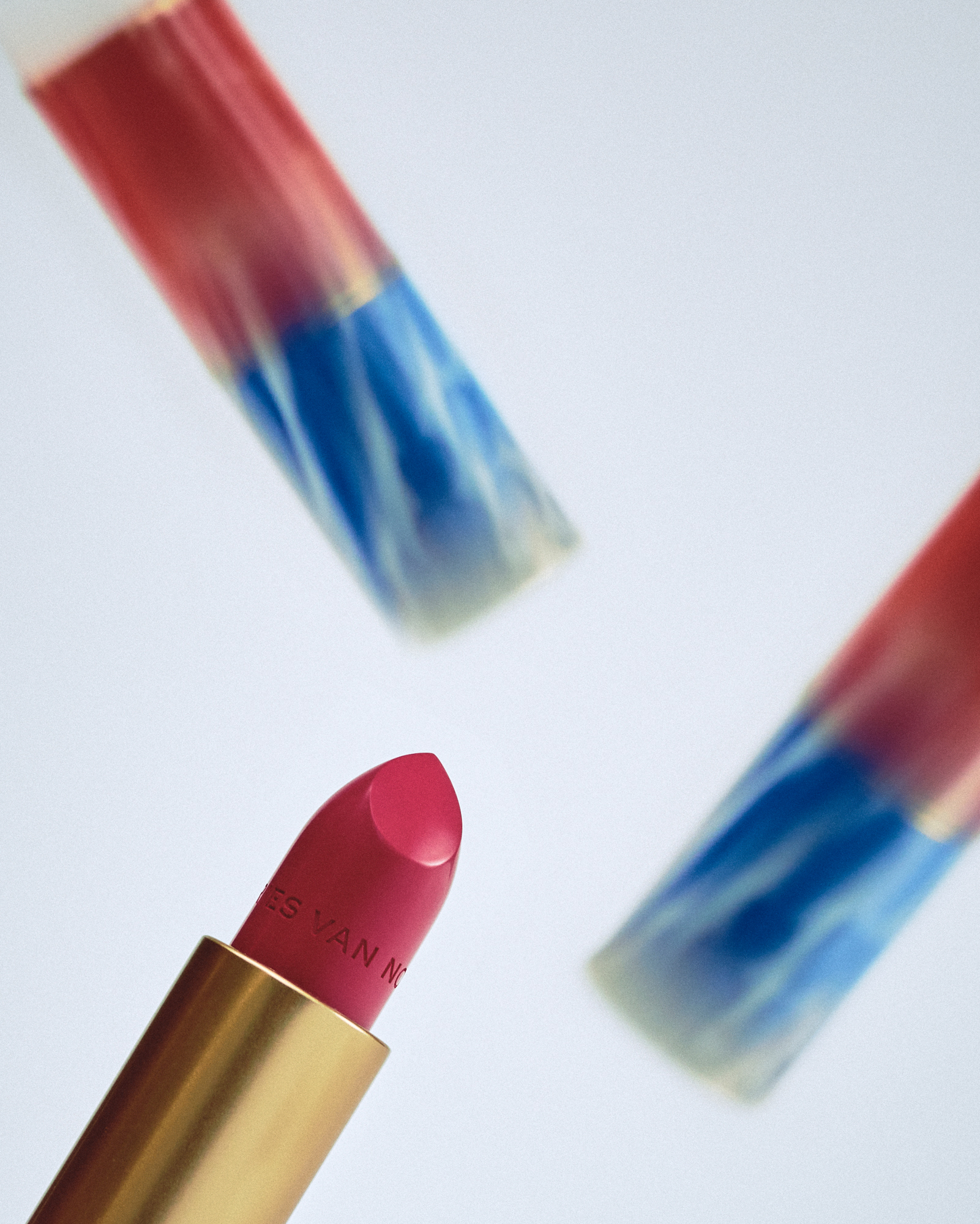
Dries Van Noten Beauty lipstick in no.45 Rose Cliché in Coral Ceramic case
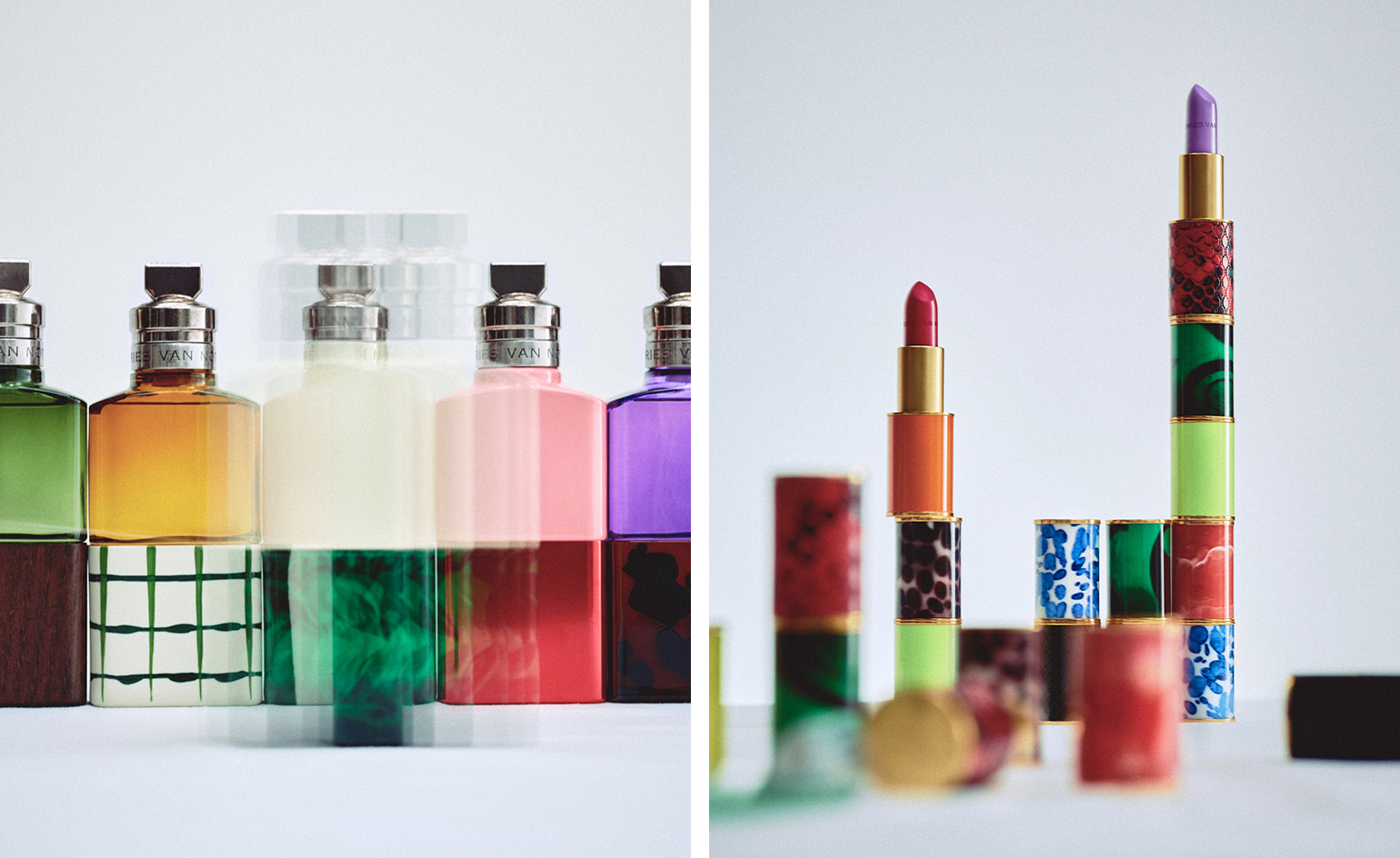
As of now, the collection comprises perfumes, lipsticks, and companion accessories, including compact mirrors, combs, and pochettes. The fragrance collection features ten genderless scents, each created by a different perfumer and each its own unorthodox interpretation of traditional floral fragrances. Flowers have been an enduring source of inspiration for Van Noten, with his collections regularly featuring prints, colours and forms informed by his own gardening. Before the noses got to work on the fragrances, Van Noten invited them to explore the sprawling, bucolic garden he maintains on his 19th-century estate outside Antwerp.
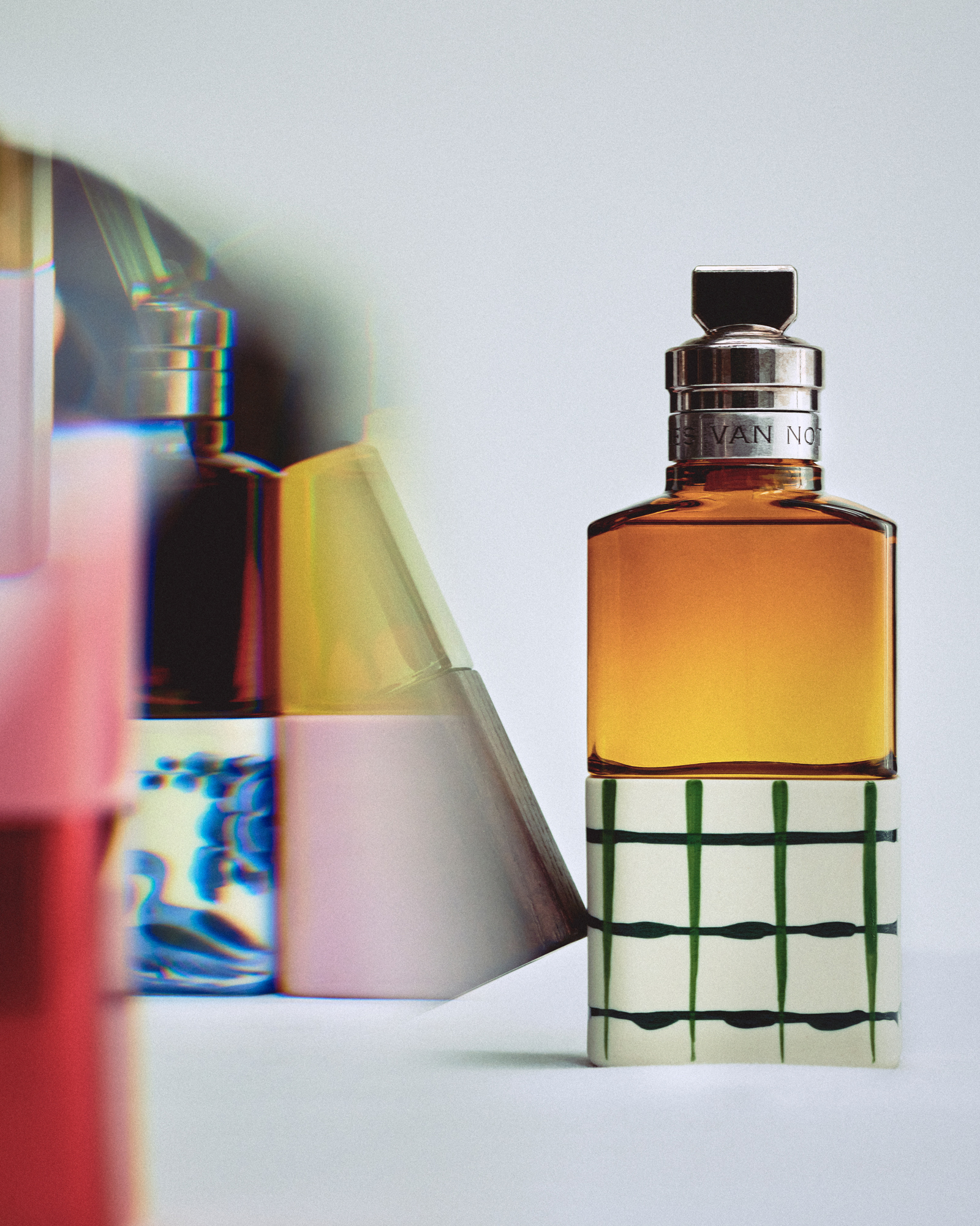
Dries Van Noten Beauty perfumes, from left Raving Rose, Soie Malaquais, Jardin de l'Orangerie, and Rock the Myrrh
‘I worked with the perfumes the same way I would work with my team when we’re working on our fashion collections,’ says the designer. ‘So the idea was really that I gave them quite a wide brief. I told them my story. I invited them to our house and our garden, to see how I work with plants, with flowers especially – I take risks by putting flowers together in strange ways.’
Roses are Van Noten’s favourite flower, and the two different rose perfumes within the fragrance collection are emblematic of his idiosyncratic approach to beauty. Rosa Carnivora, by perfumer Daphné Bugey, is a creamy blend of rose, vetiver, and patchouli, while Raving Rose, by perfumer Louise Turner, is a spicy take on the flower with a near startling infusion of pepper. The two fragrances ‘are kind of a kick in your face’, as Van Noten puts it.
Receive our daily digest of inspiration, escapism and design stories from around the world direct to your inbox.
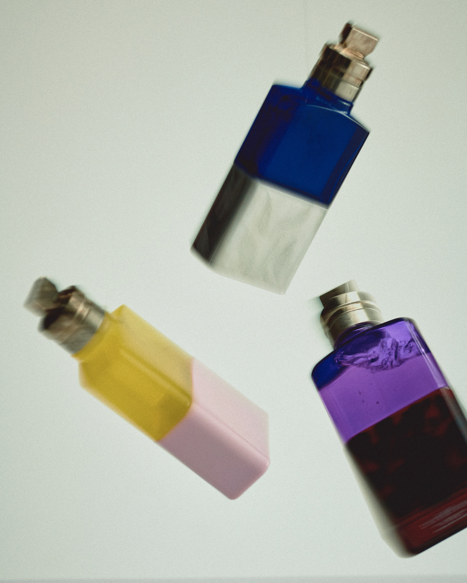
Dries Van Noten Beauty perfumes, from left Jardin de l’Orangerie, Fleur du Mal, and Voodoo Chile
‘Something perfectly beautiful can also become boring,’ he continues. In many ways, these perfumes are an attempt to enliven the inherent beauty of flowers through surprising pairings. That approach is mirrored in the packaging of the bottles, which juxtapose patterns drawn directly from Van Noten’s print collection to visualise the essence of each fragrance. For example, Voodoo Chile is a cool blend of rosemary, patchouli, and cedarwood that comes in a cerulean blue glass bottle with a silver base engraved with herb leaves. Soie Malaquais, a blend of chestnut and silk accord, is contained in a dark burgundy bottle with a Delft blue pottery base.
This two-tone packaging is repeated in the lipsticks, which are the first element of what will eventually become a fully fledged make-up range. The lipsticks include 15 satin shades, ten matte shades, five sheers and one transparent balm. For Van Noten, developing the lipstick shades was a natural extension of his experiments with colour and texture in clothing.
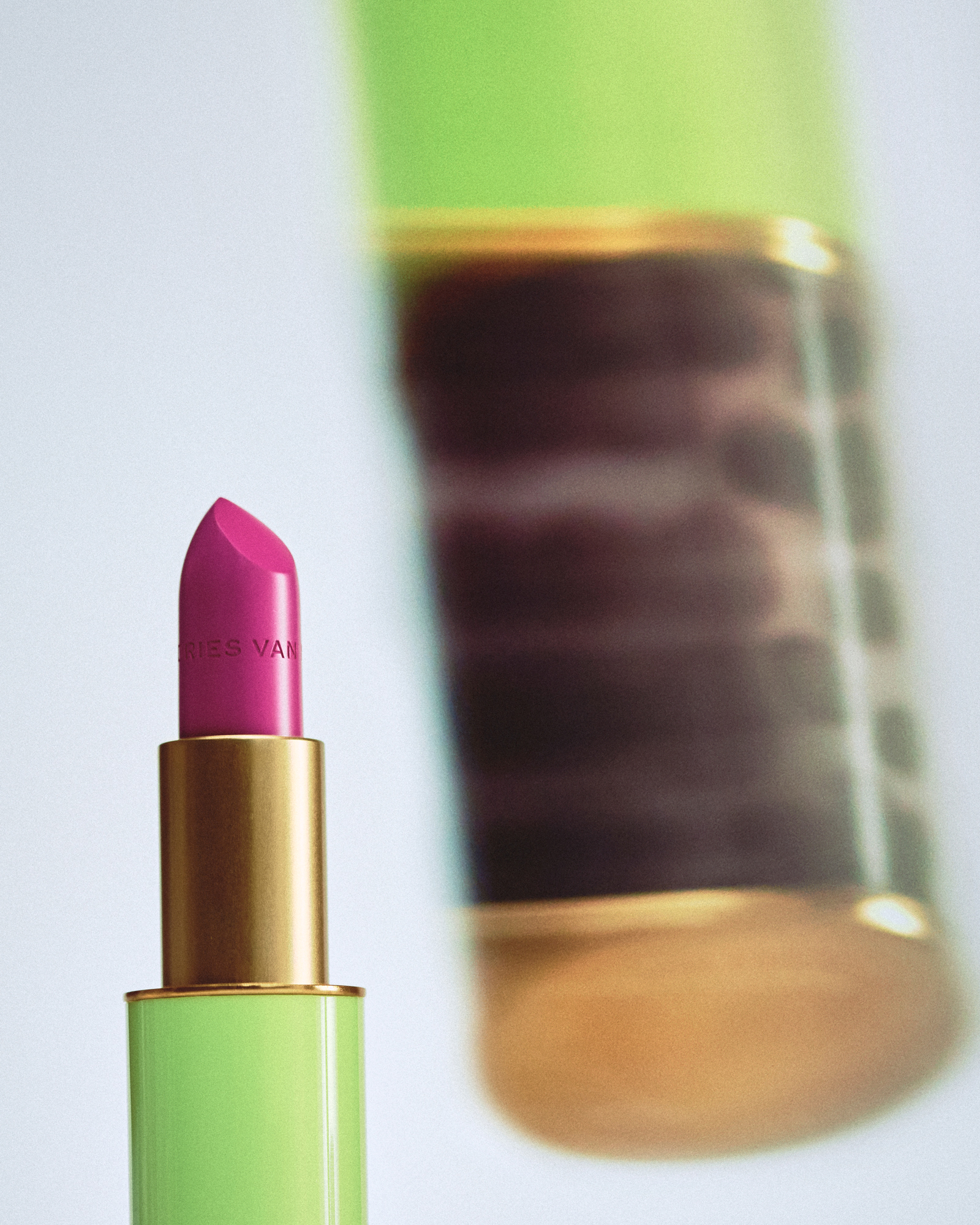
Dries Van Noten Beauty lipstick in no.36 Neon Pink in Neon Print case
‘It's really about finding that balance between the brightness of colours, and of course, with my experience creating fabrics, I know very well how I can balance out those things. It was quite interesting to see the colours and discuss the density – if something has to be shinier or more matte, and how we could go with it.’ The resulting shades range from classics like the matte cherry Crafted Red, to bolder colours like the charred eggplant of Bohemian Scarlett or Barbie-esque Neon Pink, to the all-out unconventional shades of blue and green to be launched soon.
Van Noten’s beauty collection is an intelligent reiteration of his iconic vision of beauty. One that is contradictory and compelling or, as Van Noten puts it, ‘what is beautiful for me may be very ugly for you, and vice versa. Something that is considered by a lot of people as beautiful I think is boring. That’s why I like so much to work with contrasts. I like to have strangeness in my beauty.’
INFORMATION
Mary Cleary is a writer based in London and New York. Previously beauty & grooming editor at Wallpaper*, she is now a contributing editor, alongside writing for various publications on all aspects of culture.