When did you start?
Bibliothèque was established in 2003 by directors Tim Beard, Jonathon Jeffrey and Mason Wells, We are a creatively-led graphic design consultancy, based in London.
Where are you based?
We have a studio of six people, based in Shoreditch.
How did working with the Design Museum on Rams’ retrospective come about?
We had known about the Rams exhibition taking place in in Tokyo through contacts at VITSŒ, so when we were informed that The Design Museum was going to host the exhibition, we approached the curators to consider us as the designers.
We were working on the Super Contemporary exhibition with the team at the Design Museum, and our credentials seemed to fit the bill. Previously we had produced the graphic design for Cold War Modern at the V&A, and we had self initiated an exhibition on the 1972 Olympic Design Programme by Otl Aicher – both projects having links to Dieter Rams, so we were confident that we were right for the job.
Did it make your job easier or more difficult devising the graphic identity for a designer who has such a clearly delineated design ethos himself?
We didn’t devise a graphic identity for the exhibition as such, it was more about extrapolating key visual elements from a selection of the products, (speaker grilles, calculator layouts, hi-fi interfaces etc). We used these to help organise the exhibition space and illustrate stories behind the development of the products - these worked as backdrops and introductions to sections.
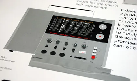
Rams’ quite clearly delineated design ethos only made our job easier, insofar that was such a vast array of beautiful objects to choose from. The layouts on many of the Braun products are excellent examples of three-dimensional information design. This is not just from the use of controlled typography, but also in the pragmatic use of colour, geometry, positioning and alignment of dials, switches, buttons, jackplugs and even screws.
As well as the graphics we also designed the spatial aspect – here we tried to keep the gallery as open as possible to reflect the linear development of many of the products. Simple open tables, allow the objects to be viewed from all sides, where very often the back is just as well considered as the front. Also seeing the sheer number of exhibits is quite astonishing, bearing in mind that most of them pre date any involvement of computers or digital technology in the design process.

A detail of the poster Bibliothèque designed of Rams' 10 Principles of good design, commissioned by Vitsoe
Did you work very closely with Rams on the process?
The initial concepts and layouts for the exhibition were all passed on to Dieter for his approval. We were very keen that he supported our design direction, and our close relationship with the Deyan Sudjic and Alex Newson at the Design Museum, and Mark Adams at Vitsoe I think helped this.
However, on the penultimate day of installation we had the good fortune of being introduced to Dieter as the exhibition designers. Our first (very nervous) question – did the exhibition meet his expectations? ‘Of course’ he said, ‘I can see how much hard work has gone into it’. He understood our graphic interpretation of the products, and he was keen to explain his own approach to graphic design within the sphere of product design. It was an absolute honour and an inspiration to get firsthand insight from one of the elder statesman of design.
Take us through the results that you came up with?
The exhibition features 244 objects across five sections spanning six decades. Our implementation uses several graphic processes – each appropriate to specific content. The entrance – an internal façade using the 606 compression system, spans the entire 15m width of the upper gallery.
Key graphic elements are integrated using the visual language from selected products of Braun and VITSŒ in order to set the tone. The five sections – Dieter Rams solo projects, Braun team projects under Dieter’s leadership, VITSŒ, Typology and Legacy are delineated by panel/partitions that use product elements such as grilles, button layouts and interfaces relevant to each story.
In each instance we have removed elements by routing away the geometric shapes of the products Рthe effect is as if the product has been deconstructed and re-scaled beyond the intended proportions. A seven metre-wide mural on the back wall (painted Рas opposed to vinyl or digital runout) of the Audio 300 stereo system reinforces the rational approach to product layout. Finally technical illustrations that combine line artwork with photographic elements (allowing for subtle undulating forms, concave and convex buttons and changes in lighting) have been used in the subsequent exhibition marketing and a VITSΠside-project Рa seven colour A0 poster, featuring the famous ten principles.
What other projects are you currently working on?
We have just completed Wildlife Photographer of the Year at the Natural History Museum and are also working on ‘Magnificent Maps’ for the British Library, collaborating again with Universal Design Studio. Also we are just finishing an identity for a German luxury fashion brand, another book for Adrian Shaughnessy, an identity for a leading childrens charity. And somewhere amongst all that, we are working on the re-design of our web site, which should be done in time for the spring.
Dieter Rams has 10 Principles of good design – what is Bibliotheque’s one principle of good design?
Do good work. For us the quality of the work coming out of our studio is THE most important thing, above all else. You are only as good as your last job. Sometimes its easy to get sidetracked by commercial requirements, but for us the number one principle is absolute commitment to work of the highest quality. We try not to stray from that.