A Practice for Everyday Life gives 59th Venice Biennale a richly surreal graphic identity
London-based graphic design studio A Practice for Everyday Life (APFEL) gives an otherworldly identity to the surrealism-infused 59th Venice Biennale theme ‘The Milk of Dreams’
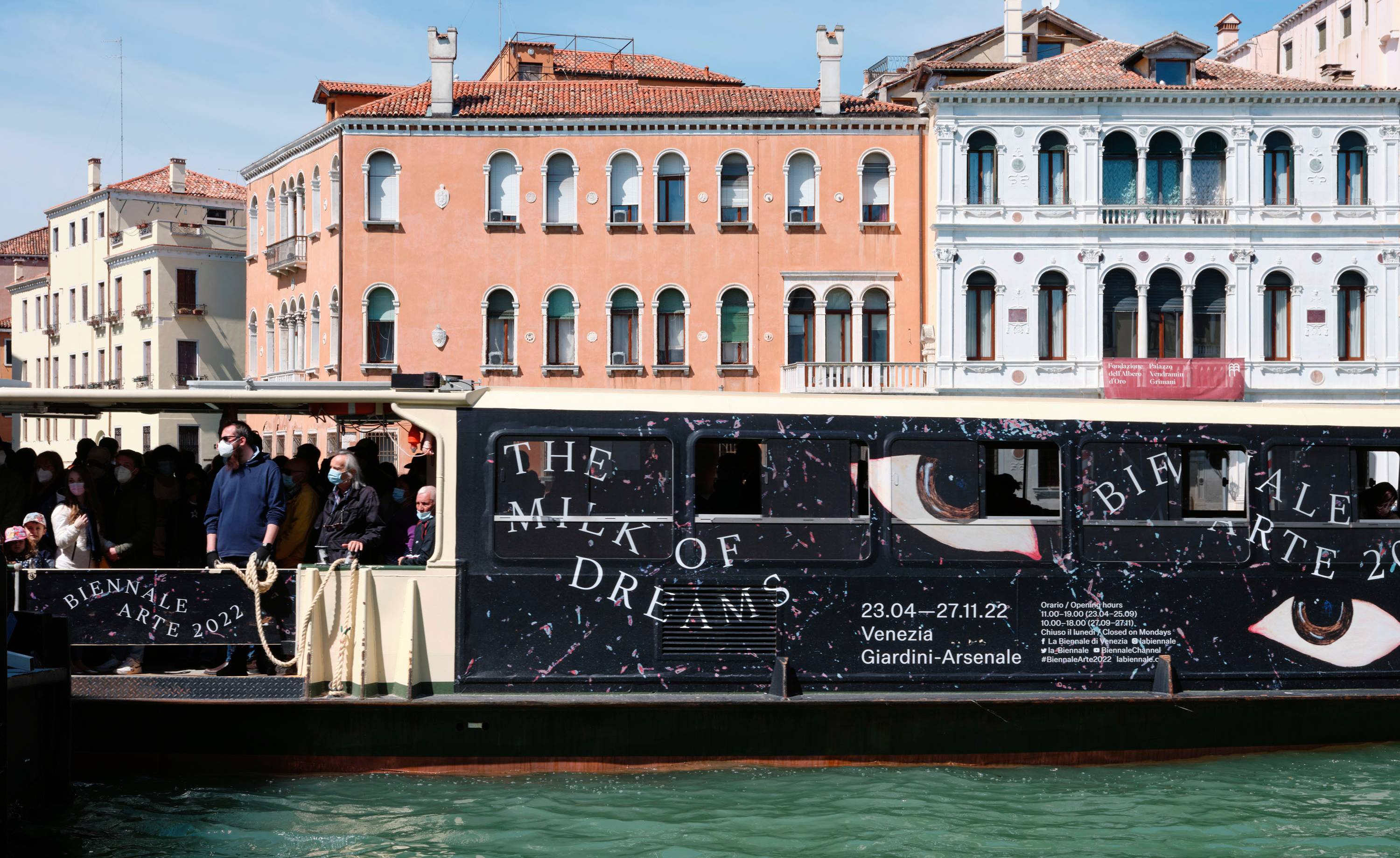
The 2022 Venice Biennale has been warmly embraced by the art world after its enforced absence from the international calendar. Curated by Cecilia Alemani, the biennale, entitled ‘The Milk of Dreams’, is presented in a multifaceted exhibition shaped by Formafantasma, with a graphic identity by London-based studio A Practice for Everyday Life (APFEL).
Founded by Kirsty Carter and Emma Thomas in 2003, APFEL has a strong portfolio of artistic collaborations, both in terms of working closely with galleries – most notably the Hepworth Wakefield and the House of Voltaire, as well as Tate, Kettle’s Yard, the Whitney Museum of American Art, the Design Museum, the V&A and many more. The team have also collaborated with contemporary artists and designers and have been outspoken in their desire to ‘focus on what are underrepresented communities too within the art world; different social and ethnic backgrounds and of different genders, sexual orientations, emerging and underrepresented individuals’.
Guiding visitors through ‘The Milk of Dreams’ has been a richly varied commission that draws on all these strengths. Named after an illustrated book by the artist Leonora Carrington, originally published in Spanish as Leche del Sueño, Alemani’s show in the Arsenale starts with Carrington’s central theme of transformation and runs with it, with a majority female exhibitor list (90 per cent of whom are first-time Venice Biennale participants), and a mission to rethink and reframe the traditional patriarchal view of art and culture.
Carrington, who died in 2011, was a pioneering surrealist and feminist, and the book was a collection of intense, strange, and unnerving children’s stories.
Although Carter and Thomas joined the process after Formafantasma had been signed up, Alemani ensured they were an integral part of the planning process. ‘Cecilia had come across our work in the art world,’ says Carter. ‘She had the title of the show at that point and shared some presentations with us, but many artists were still coming on board.’
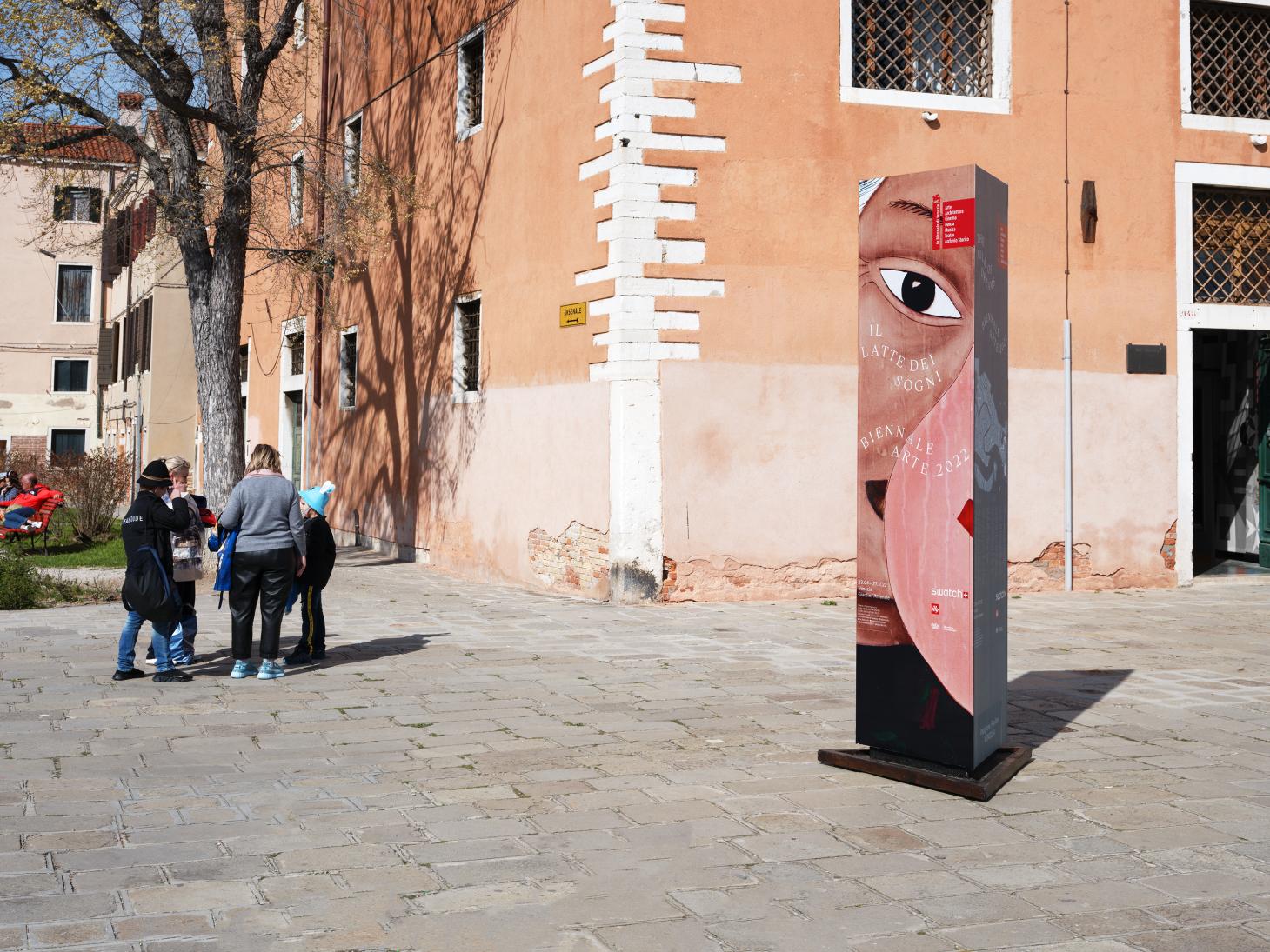
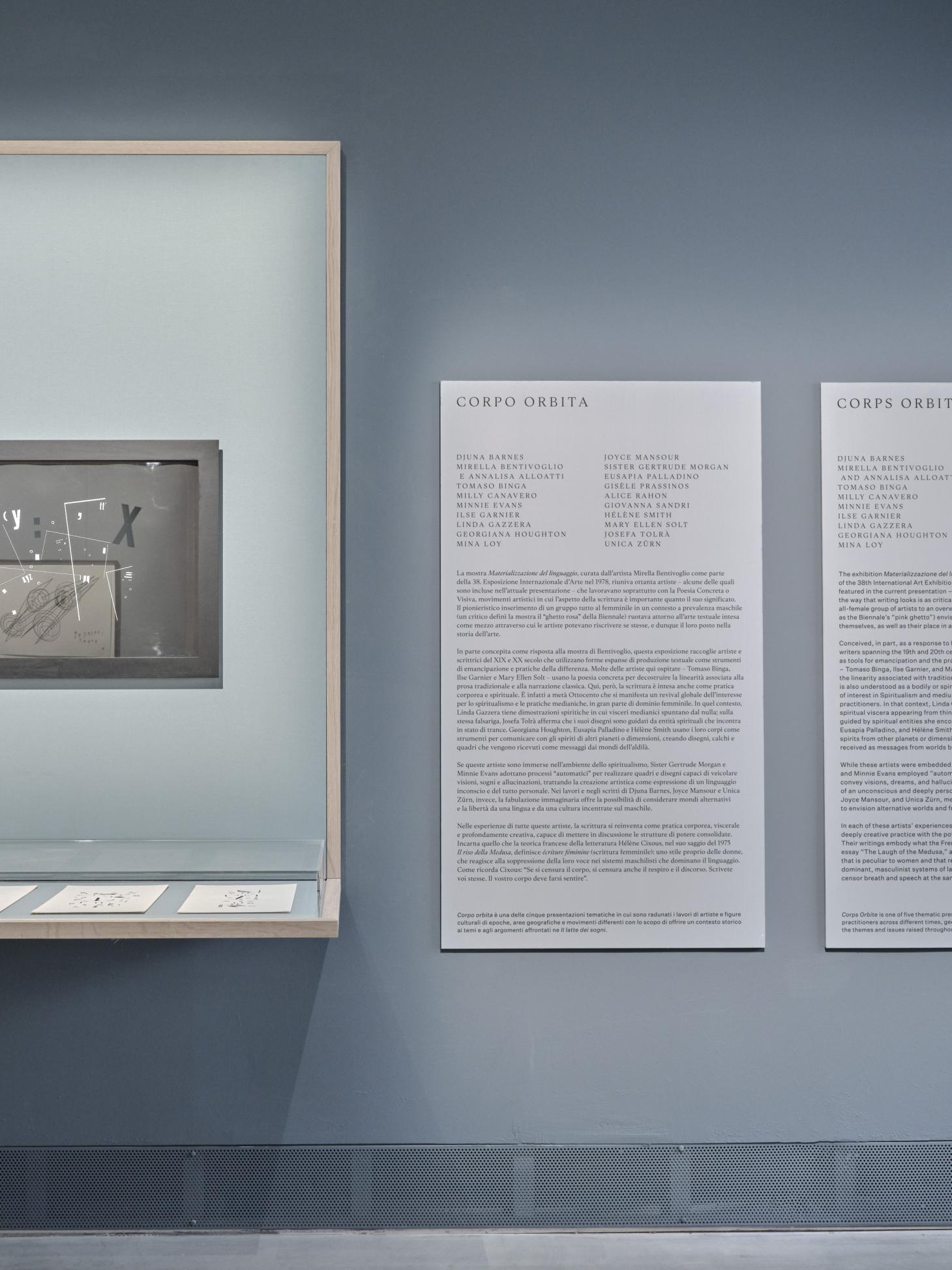
The scope of this commission is far-reaching, for it embraces not just the overall identity, but also signage, posters, way-finding and information panels, not to mention the substantial publication that accompanies every biennale, also in this case titled The Milk of Dreams.
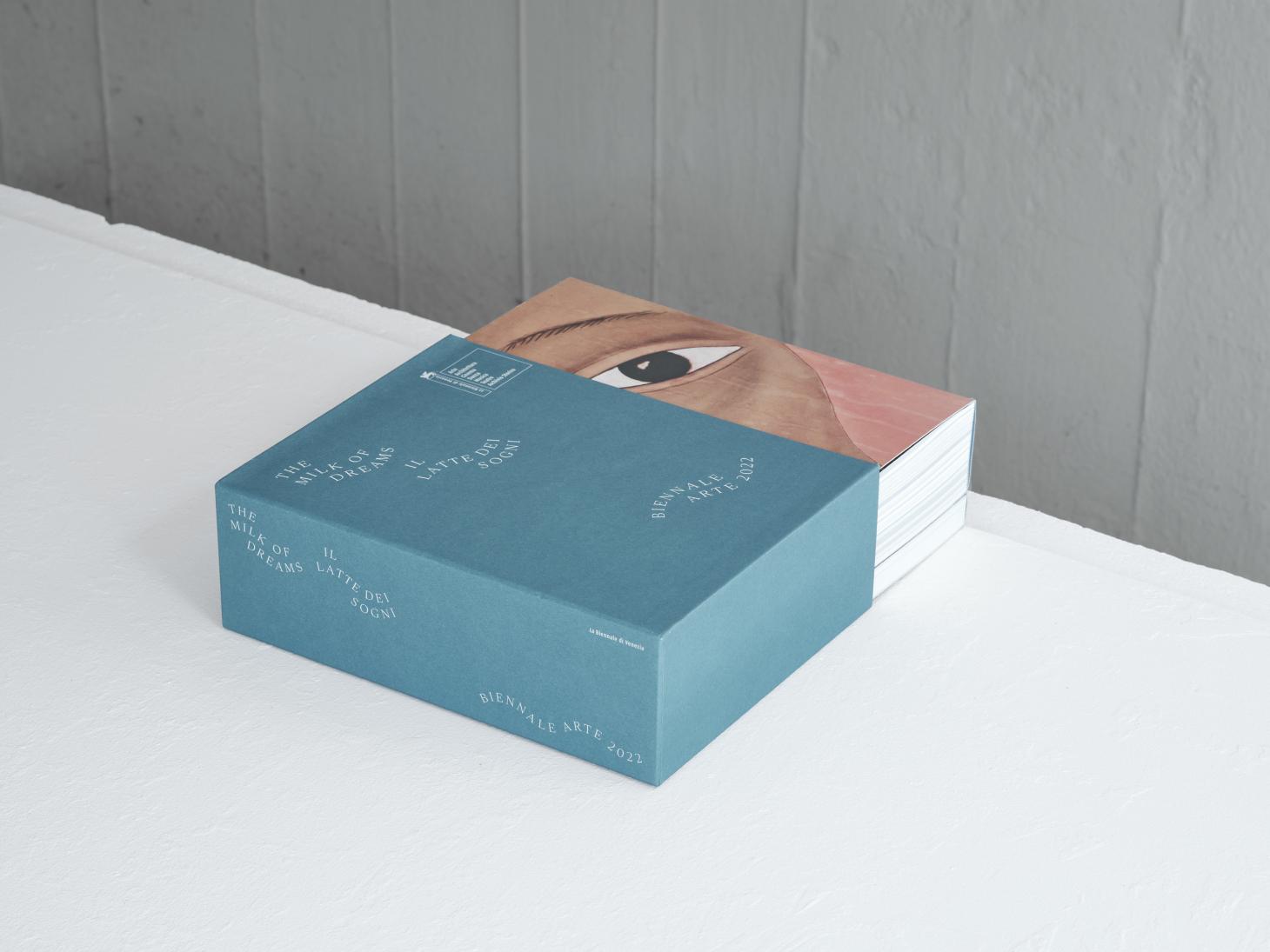
‘We're very used to working both in print and in an exhibition context,’ Carter says, ‘as well as with historical work. The book is almost the exhibition in miniature, in a much more literal way than a monograph is in relation to a regular exhibition.’
Receive our daily digest of inspiration, escapism and design stories from around the world direct to your inbox.
APFEL has adeptly managed the spatial challenges of the biennale, along with the dense accompanying narratives. Fluidity is one of the defining themes, and central to the studio’s graphic treatment are artists’ works, making this one of the rare occasions when exhibitors have also been featured in the biennale’s identity.
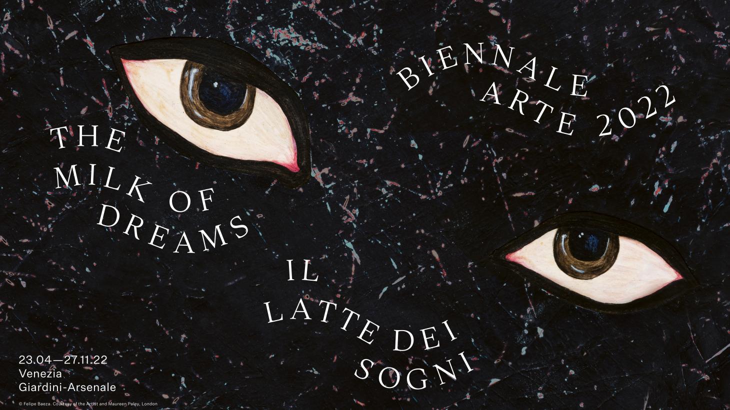
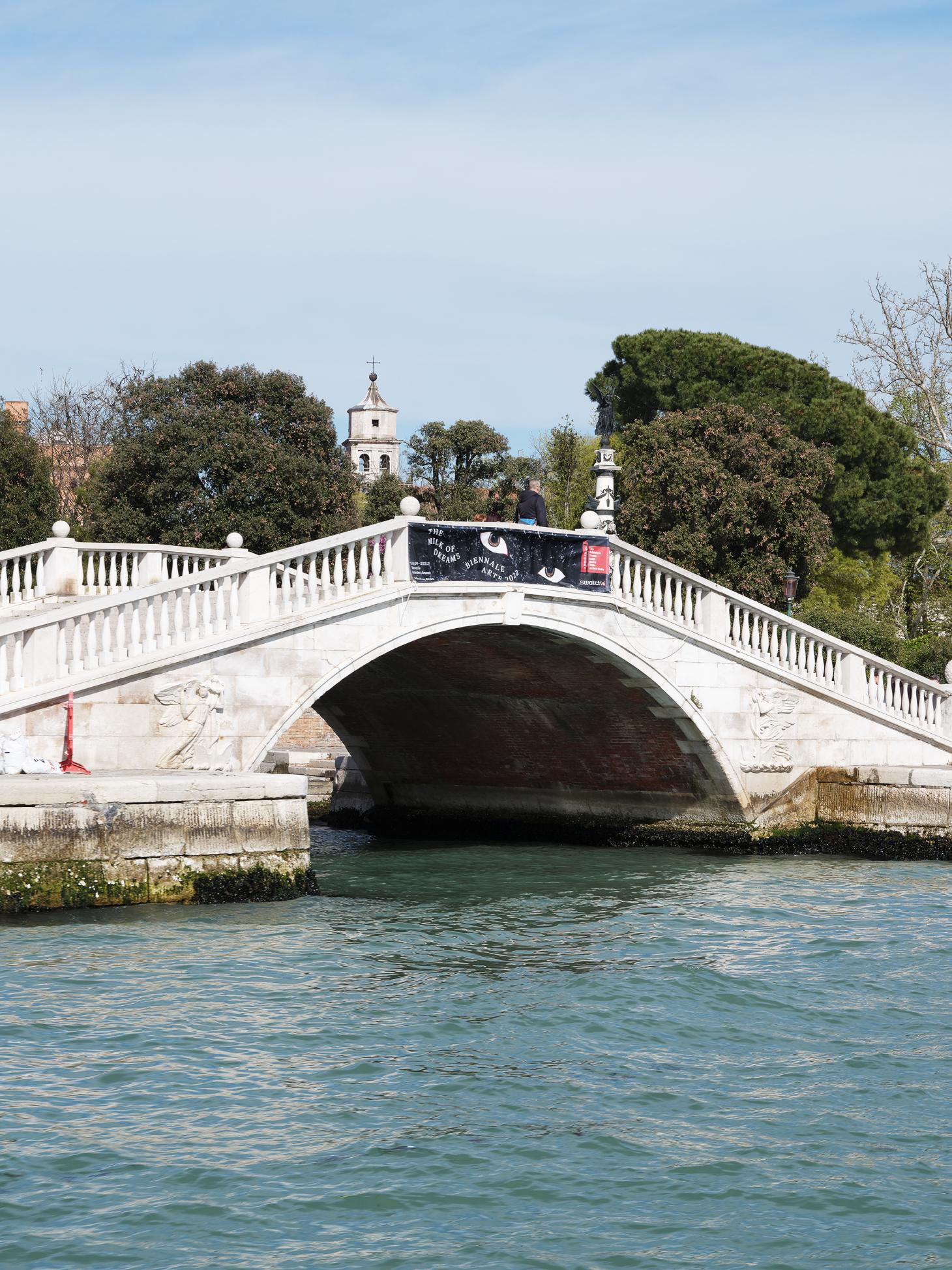
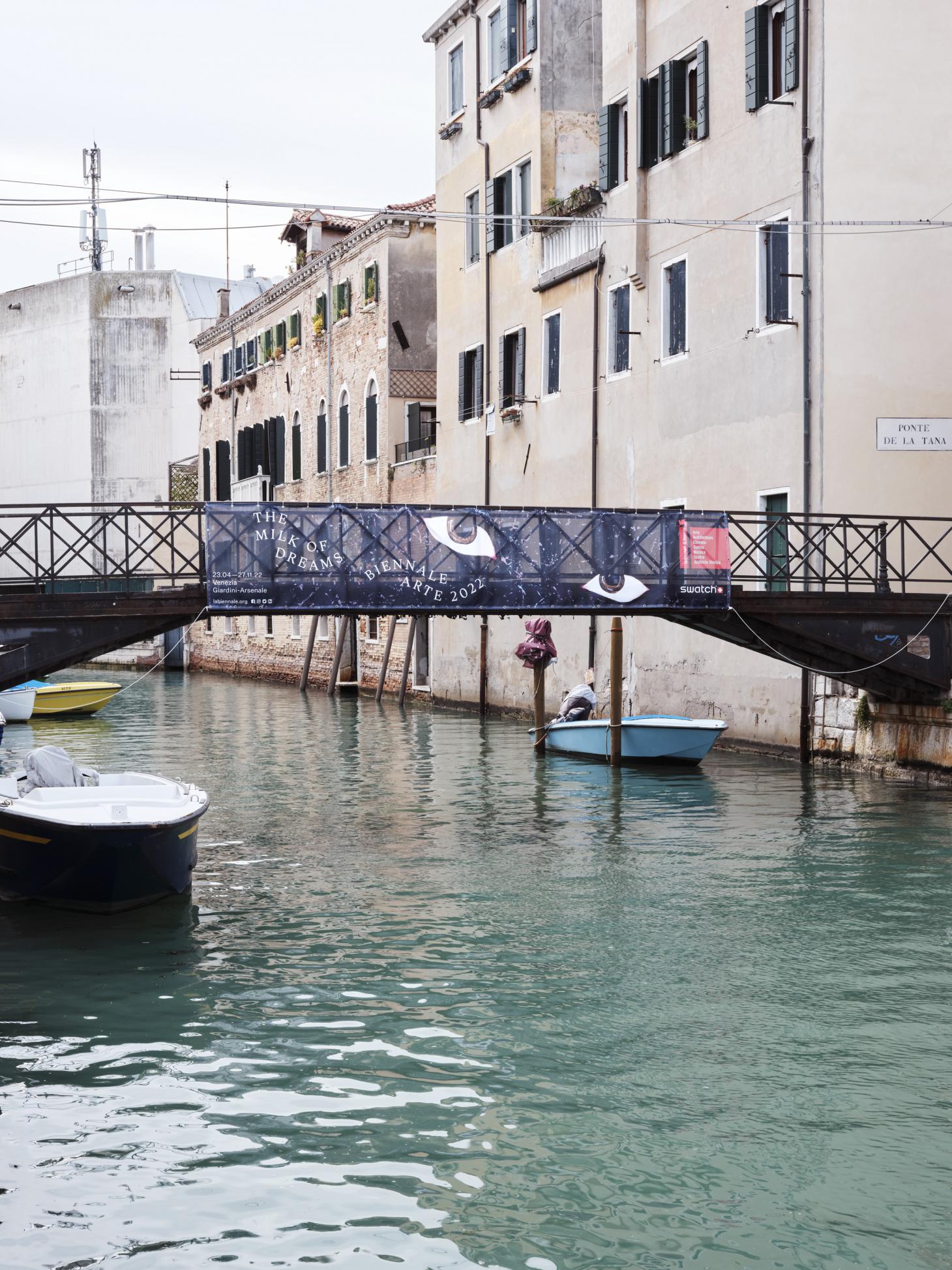
For strong visual markers, Carter and Thomas chose four distinctive eyes, using artworks by Cecilia Vicuña, Felipe Baeza, Tatsuo Ikeda, and Belkis Ayón. These motifs are playful, sinister, and yes, surreal. ‘It’s fun to have these huge eyes on the side of buildings, or on vaporetti or bridges,’ says Thomas. ‘We had this huge pool of artists’ works to sift through, just trying to find interesting and suitable eyes.’
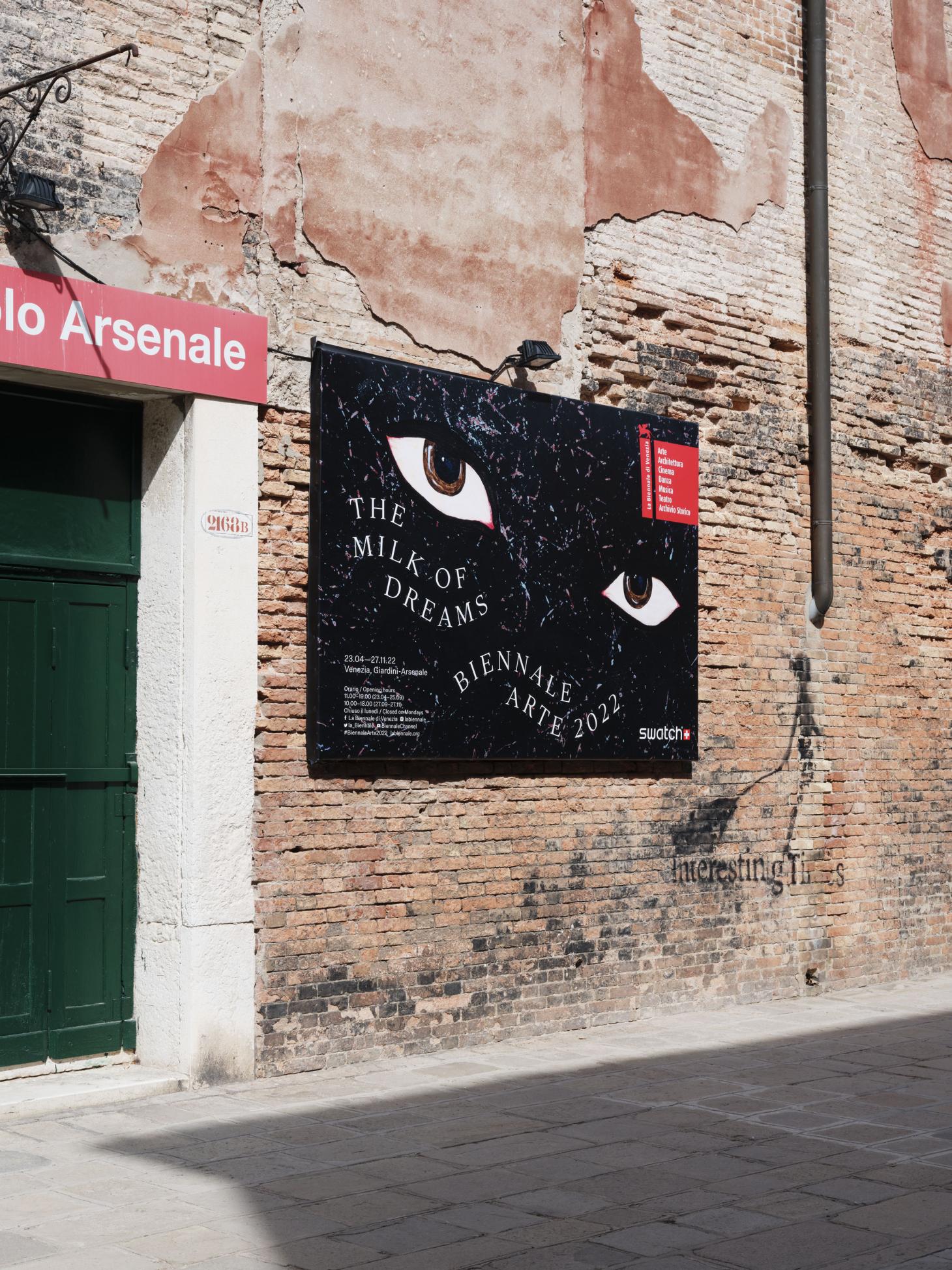
The illustration is paired with strong classical lettering, albeit transformed into a flowing, organic medium. ‘We loved the idea of using a Roman serif,’ says Thomas. ‘Of course, it suits the Italian context of the biennale, but also historically there have been a lot of hard and cold identities for the biennale, and we wanted to subvert that by using a more classical typeface in all caps and then making it more fluid, metamorphic and animated.’
The same treatment is given to the weighty biennale catalogue, a slip-cased volume that – when presented en masse – gives off the same uneasy presence as some of Carrington’s original drawings.
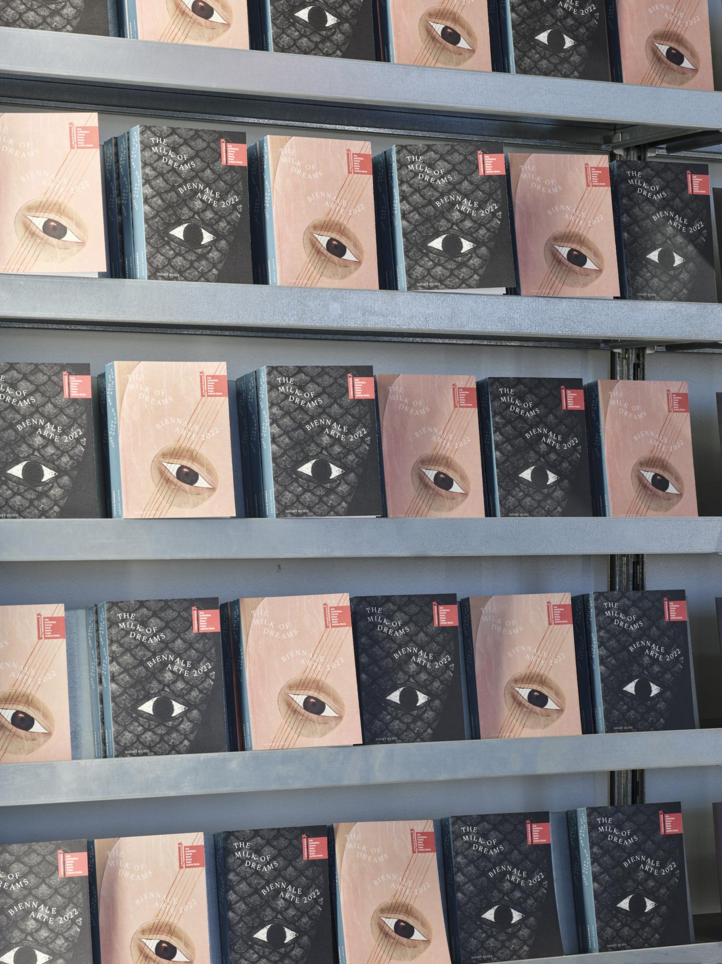
The end result gives the biennale a sense of playful intrigue that plays on Venice’s image as a magical and mysterious city, as well as the power of art as a catalyst for changing identity and focus.
‘In our work, we are often balancing, extruding and amplifying voices and ideas within artists’ practices and their context, opening this up and developing new ways of communicating this to different people,’ the duo write, and the biennale graphics walk the line between shaping a strong visual symbol of the event as a whole, and the idea of the individual artistic identity. ‘That challenge is what keeps us excited and interested every day,’ Carter concludes.
INFORMATION
apracticeforeverydaylife.com
The 59th International Art Exhibition, The Milk of Dreams’ runs until 27 November 2022. labiennale.org
Jonathan Bell has written for Wallpaper* magazine since 1999, covering everything from architecture and transport design to books, tech and graphic design. He is now the magazine’s Transport and Technology Editor. Jonathan has written and edited 15 books, including Concept Car Design, 21st Century House, and The New Modern House. He is also the host of Wallpaper’s first podcast.