Jaguar reveals its new graphic identity ahead of a long-awaited total brand reboot
Jaguar’s new ethos is Exuberant Modernism, encapsulated by a new visual language that draws on fine art, fashion and architecture
Receive our daily digest of inspiration, escapism and design stories from around the world direct to your inbox.
You are now subscribed
Your newsletter sign-up was successful
Want to add more newsletters?
In early November, the automotive press was invited to Jaguar’s design studio in Gaydon, Warwickshire, for a sneak preview of the brand’s long-awaited reinvention. Ushered into a series of dimly lit corridors, soundtracked by a whooshing, spa-like New Age ambience, we were shown a small but crucial fraction of the fruits of the studio’s labour – an all-new graphic identity.
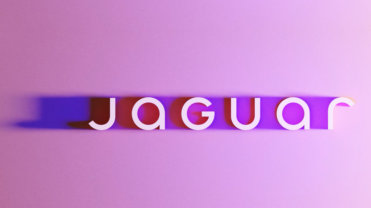
The new Jaguar logo
This imagery is the first creative work from a company that has been holed up in the studio for well over two years, refining its vision of what luxury means in the modern world. Based on the imagery released today, the British brand is reinventing itself as a paragon of ‘exuberant modernist philosophy’. With the taglines ‘break moulds’, ‘copy nothing’, ‘live vivid’, ‘delete ordinary’ and ‘create exuberant’, Jaguar is hoping to leap a generation and enter the 2030s as a fully fledged global luxury player.
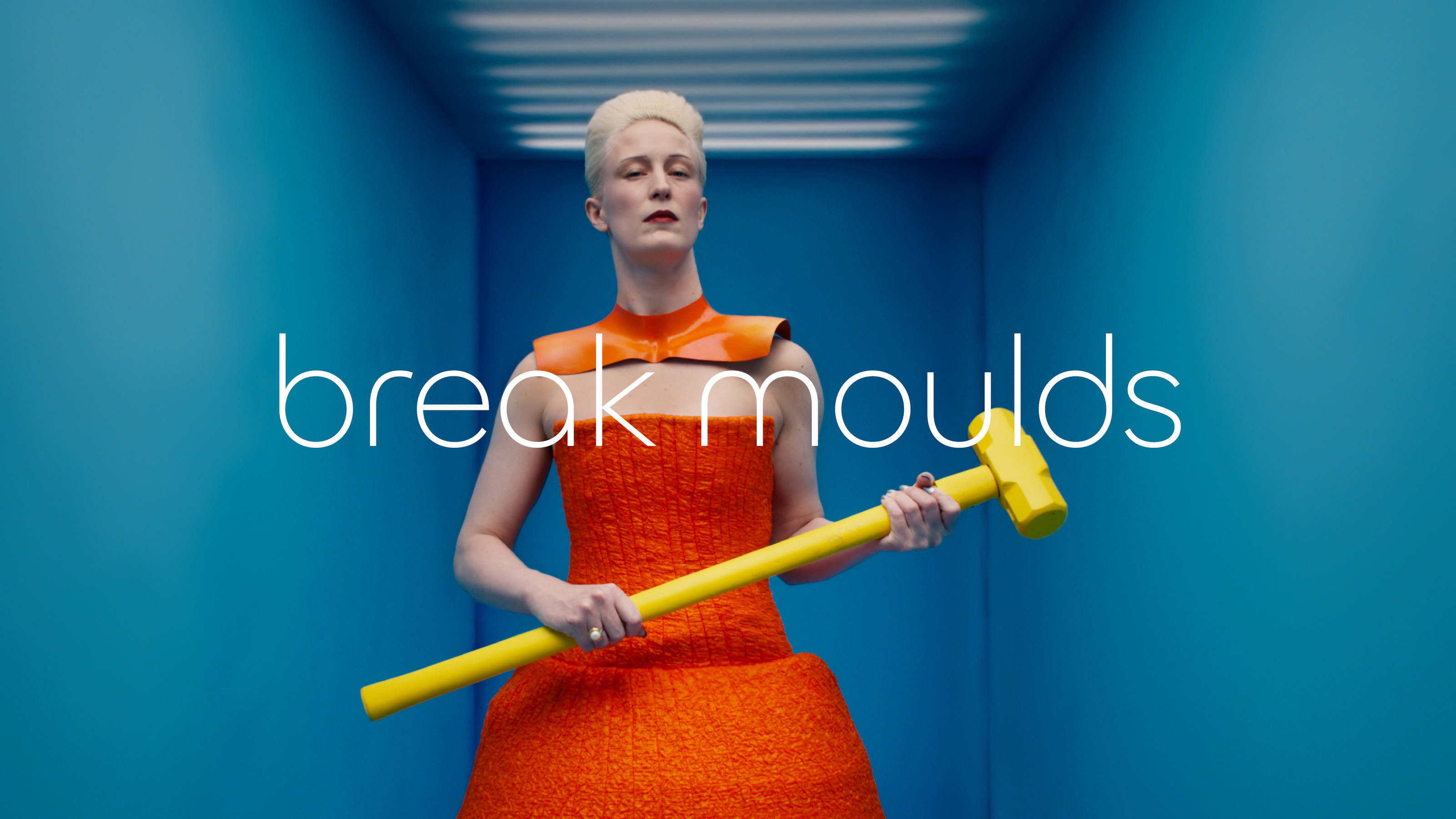
Break moulds: a still from Jaguar's new brand film
In terms of product, Jaguar’s rebirth will begin with a bold new concept car, due to be unveiled early next month at Miami Art Week 2024. It’ll be followed by up to three production cars, each using a specially developed EV platform that places a focus on space, pace and grace. Forgive us, because that was an old Jaguar slogan, one now deemed surplus to requirement in an image-obsessed era where the brand has to come before the horse.
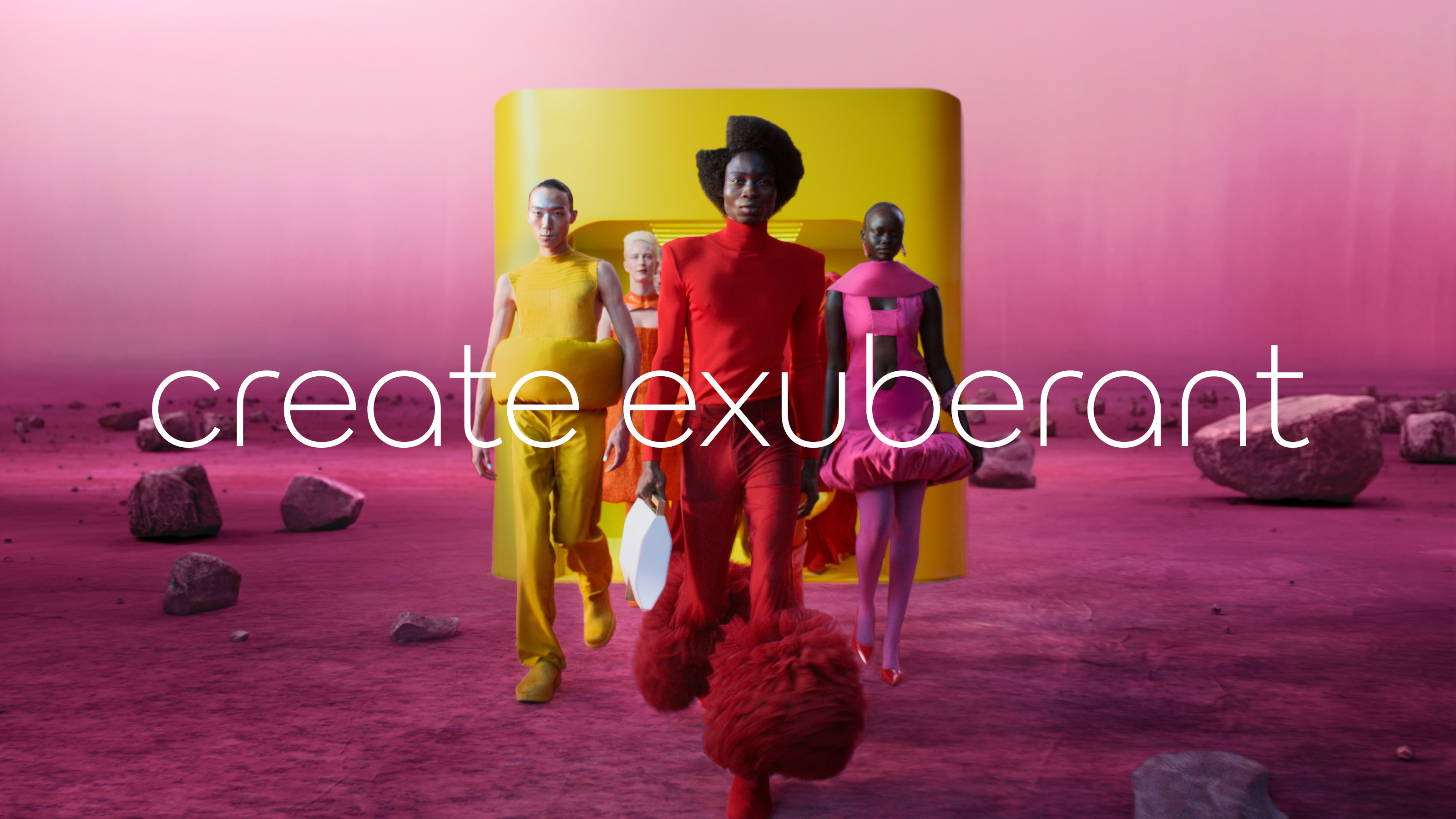
Create exuberant: a still from Jaguar's new brand film
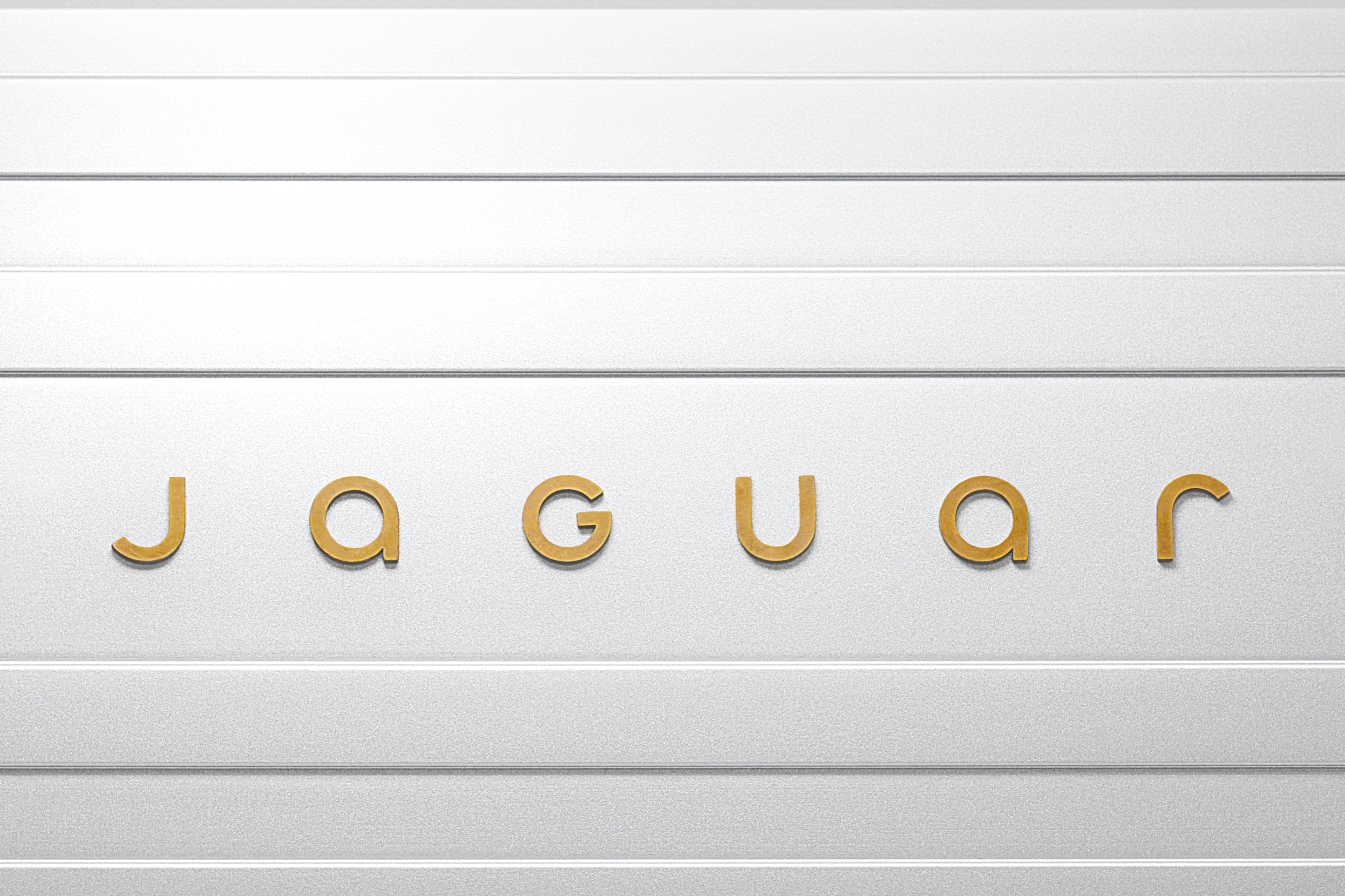
Jaguar has undertaken all this work in-house, ripping up the branding rulebook by discarding almost all the equity and associations that have accreted since the company was founded in 1935. That’s not to say that nothing remains, however, for the famous leaping cat symbol has been burnished and rethought as the ‘Makers Mark’, along with an all-new typeface for the Device Mark, plus a dedicated Monogram and a signature graphic pattern, which Jaguar is calling its Strikethrough.
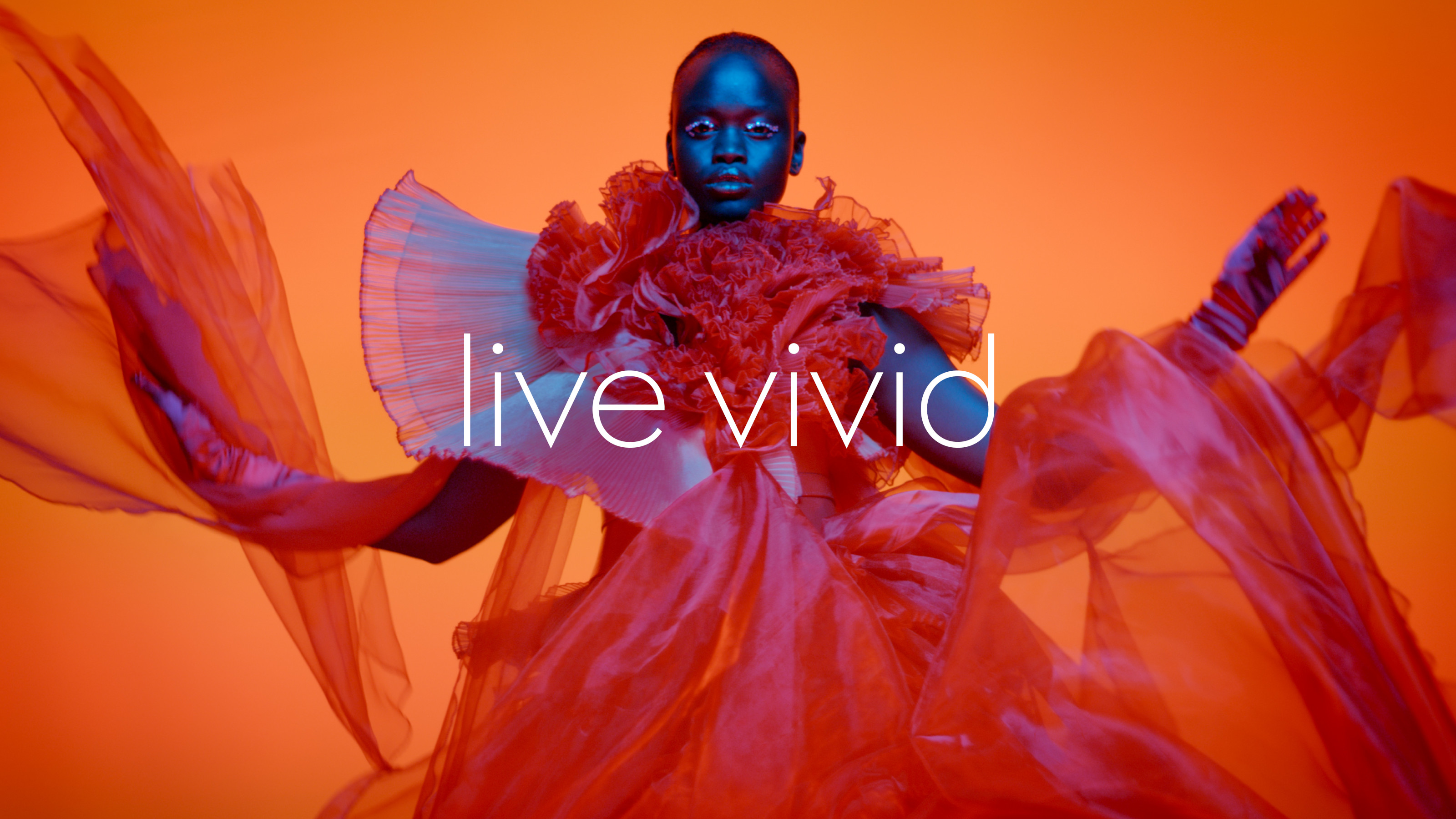
Live vivid: a still from Jaguar's new brand film
These ‘four key symbols of change’ will all find their way onto the new concept in some form or another, starting with a ‘Jaguar’ logo that’s been reborn as a mix of upper and lowercase characters. No austere minimalism, or midcentury throwbacks here, just a very straightforward graphic font that emphasises geometry and symmetry in each letter form. Then there’s the new leaper graphic, silhouetted against the Strikethrough pattern. One of the best-recognised auto identities of all time, it’s understandable why the company hasn’t abandoned it completely, but it does heavy lifting here as the only direct link to Jaguar’s past.
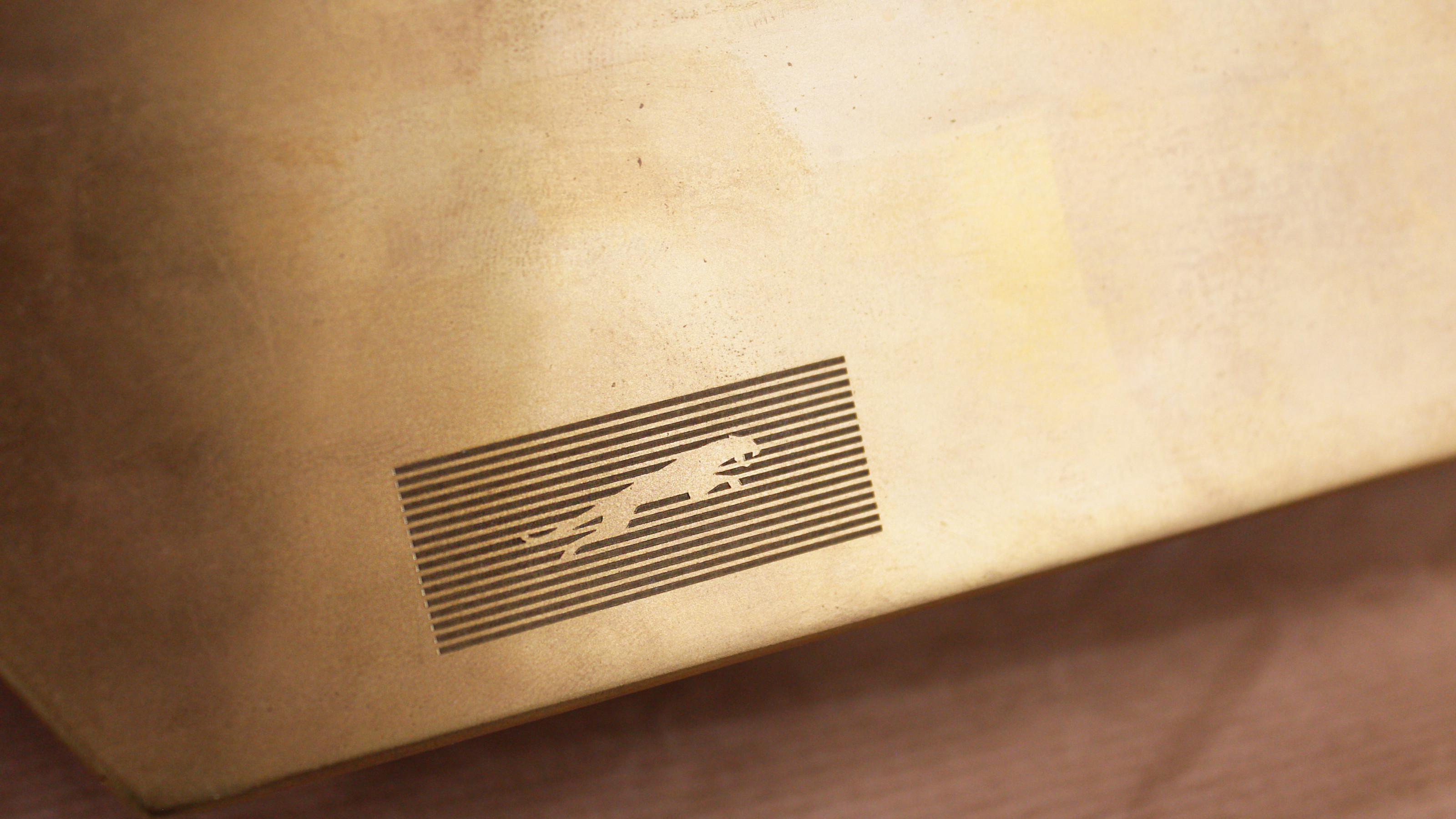
The Makers Mark, the Jaguar leaper against the new Strikethrough graphic
The Strikethrough graphic is part Donald Judd installation, part Paul Rand’s IBM logo, and forms a stylised auto grille in an era when such devices are no longer required. It’s joined by a Monogram, two intertwined and stylised ‘J’s in a circular pattern, the kind of thing you might see on a steering wheel or wheel nut.
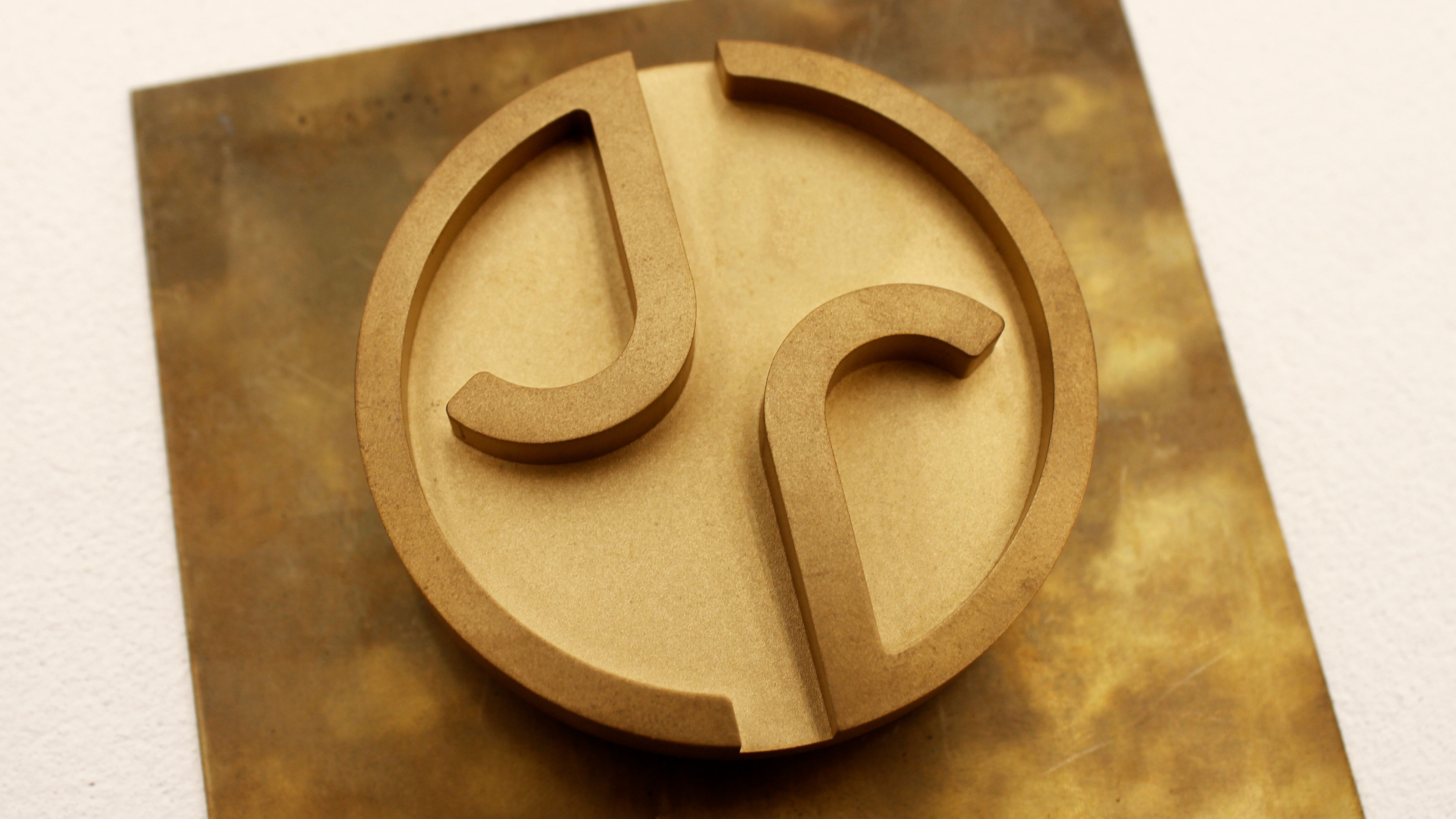
The new Jaguar Monogram
All this ‘Exuberant Modernism’ is filtered through a shifting palette of red, yellow and blue, used not as flat colours but as ‘tonal building blocks’ that blur together in a Rothko-esque smudge of contemporary ambience. We were also shown new material applications for the graphic set, especially brass, chosen for its ability to patinate over time.
Receive our daily digest of inspiration, escapism and design stories from around the world direct to your inbox.
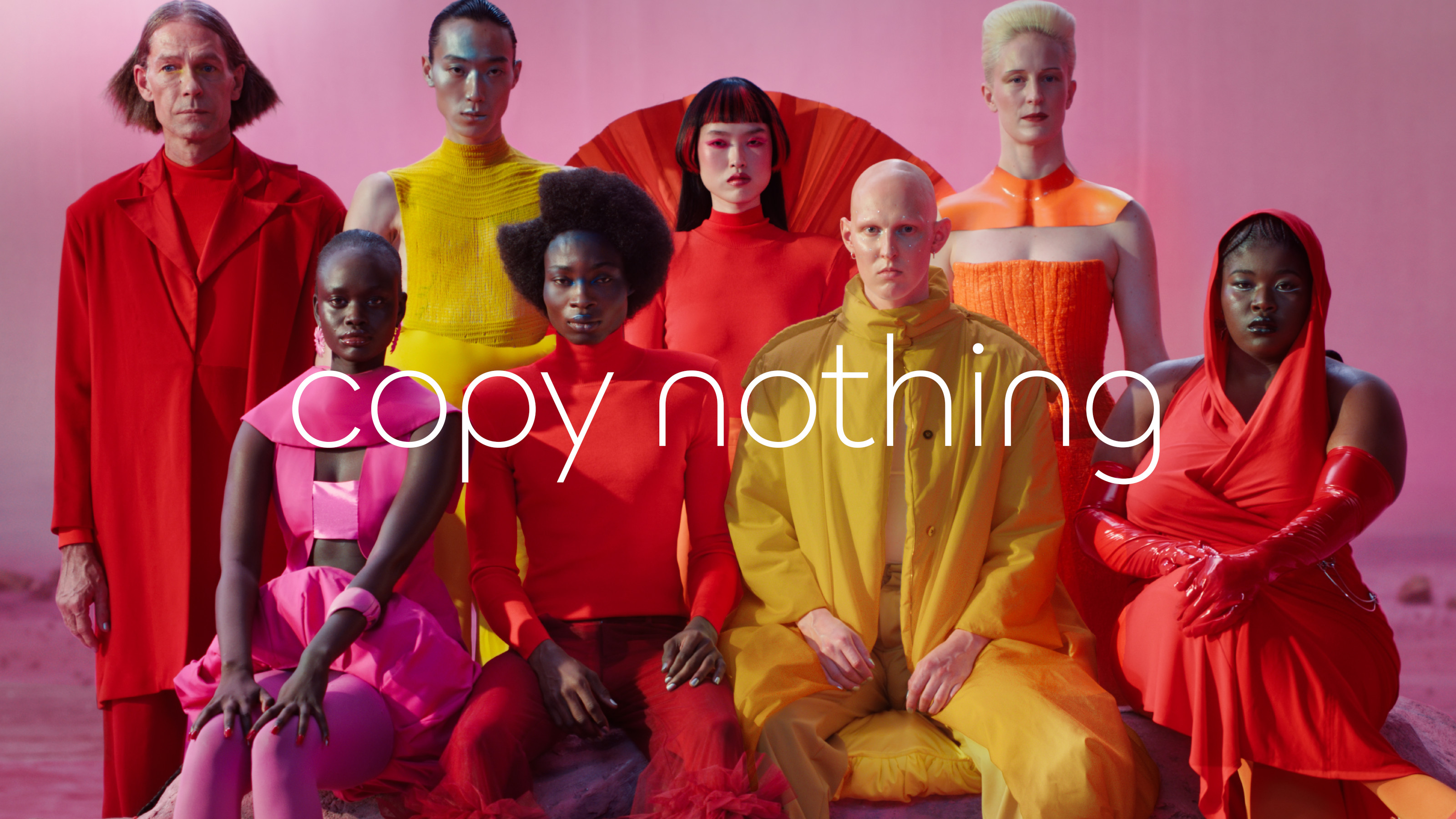
The new Jaguar ethos is 'copy nothing'
‘We are creating Jaguar for the future, restoring its status as a brand that enriches the lives of our clients and the Jaguar community,’ says Professor Gerry McGovern OBE, JLR’s chief creative officer and the man responsible for overseeing the transformation. McGovern is an unabashed admirer of modernist thinking, but for Jaguar 2.0 he and his team have also drawn on the avant-garde, especially the worlds of fashion and fine art.
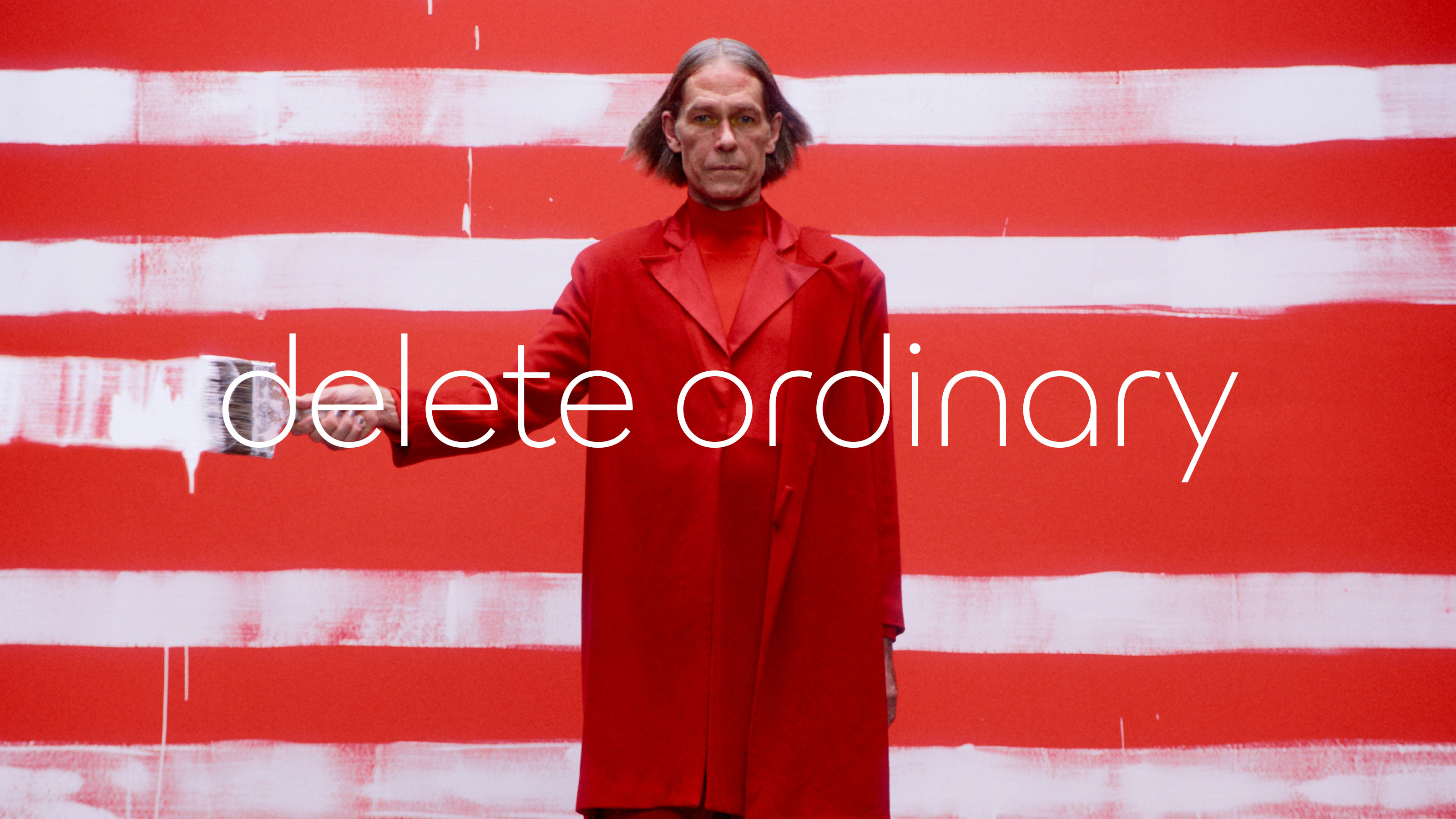
Jaguar is being reborn as a brand that wants to stand out
The latter explains the decision to launch in Miami, where the new concept car will be shown alongside ‘new and groundbreaking emerging artists who share its ethos of Copy Nothing’.
‘To bring back such a globally renowned brand we had to be fearless,’ says Rawdon Glover, Jaguar’s MD, ‘Jaguar was always at its best when challenging convention. This is a complete reset. Jaguar is transformed to reclaim its originality and inspire a new generation.
Jonathan Bell has written for Wallpaper* magazine since 1999, covering everything from architecture and transport design to books, tech and graphic design. He is now the magazine’s Transport and Technology Editor. Jonathan has written and edited 15 books, including Concept Car Design, 21st Century House, and The New Modern House. He is also the host of Wallpaper’s first podcast.