
The basic structure of the India typeface by Geetika Alok and A2/SW/HK’s Henrik Kubel is the dot grid used in traditional Indian floor drawings and pattern art, known as Kolam

The development of the India typeface


Works by Geetika Alok
Project: Happy installation and video
Client: Wolff Olins
Year: 2011


Geetika Alok
Typeface: Seashell
Project: ‘Englishes’ - an exploration of the status of English as a language in India in the present context of globalisation
Client: Self-initiated
Year: 2010

Geetika Alok
Typeface: Maya
Project: Englishes
Client: Self-initiated
Year: 2010

Geetika Alok
Typeface: Flower
Project: Englishes
Client: Self-initiated
Year: 2010


Geetika Alok
Peter Saville poster
Project: Because, a series of talks
Client: Wolff Olins
Year: 2010

Geetika Alok
Marina Willer poster
Project: Saudade, a talk at the Typographic Circle
Typeface: Geetika Alok in collaboration with Henrik Kubel
Client: Wolff Olins
Year: 2011

Geetika Alok
U Ok No, 2010
Writing with rice powder on mud ground in collaboration with local Indian women
Client: Self-initiated
Year: 2010

Works by A2/SW/HK, cofounded by Henrik Kubel
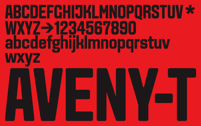
Typeface name: A2 Aveny-T
Client: Aveny-T Theatre
Project: Typeface for contemporary theatre in Copenhagen
Year: 2000
A2/SW/HK
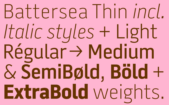
Typeface name: A2 Battersea
Client: A2/SW/HK + 1508 A/S
Project: Typeface for identity for Danish based digital design agency 1508 A/S
Year: 1999
A2/SW/HK
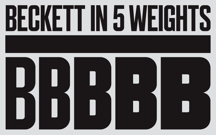
Typeface name: A2 Beckett
Client: Faber & Faber
Project: Typeface for Samuel Beckett complete works, 18 book covers
Year: 2009
A2/SW/HK
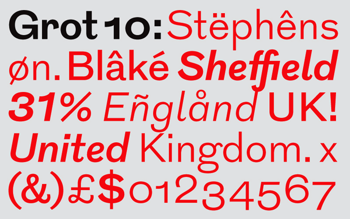
Typeface name: A2 Grot10
Client: A2-TYPE
Project: Text typeface for commercial release
Year: 2010
A2/SW/HK
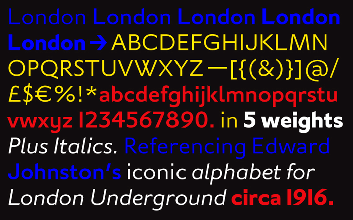
Typeface name: A2 London
Client: A2-TYPE
Project: Text typeface for commercial release
Year: 2010
A2/SW/HK
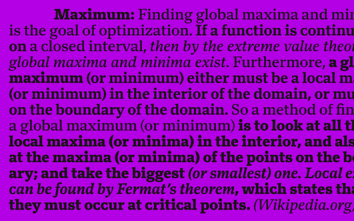
Typeface name: A2 Maximum
Client: A2-TYPE
Project: Text typeface for commercial release
Year: 2009

A2/SW/HK
Typeface name: New Rail Alphabet designed in collaboration with Margaret Calvert
Client: A2-TYPE
Project: Revival of Rail Alphabet designed in the early Sixties by Margaret Calvert of Kinneir Calvert Associates
Year: 2009
A2/SW/HK
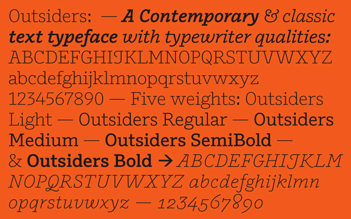
Typeface name: A2 Outsiders
Client: Hayward Gallery
Project: ’Laughing in a Foreign Language’ publication
Year: 2008
A2/SW/HK
Typeface name: A2 EyesLies
Client: Hayward Gallery
Project: ’Eyes, Lies + Illusions’ exhibition signage
Year: 2004
A2/SW/HK
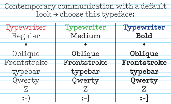
Typeface name: A2 Typewriter
Client: A2/SW/HK
Project: Internal correspondence
Year: 2000
A2/SW/HK
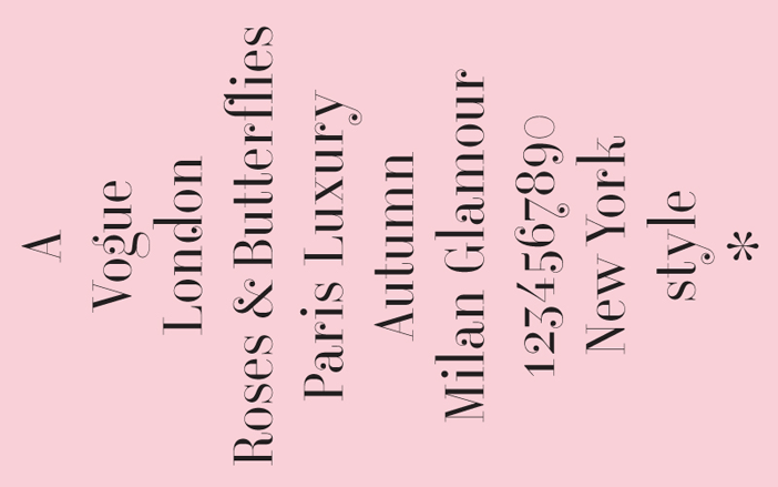
Typeface name: A2 Vogue Floral
Client: Vogue UK
Project: Sketch for a new display typeface
Year: 2006
A2/SW/HK
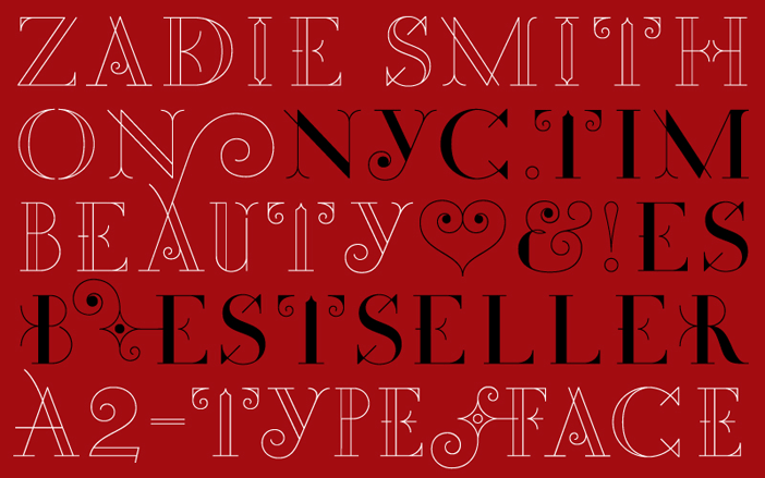
Typeface name: A2 Zadie
Client: Penguin Press, NYC
Project: Zadie Smith ’On Beauty’ novel
Year: 2005
A2/SW/HK
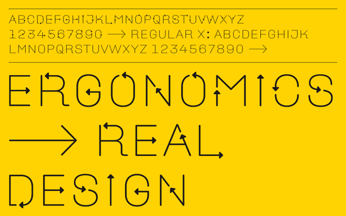
Typeface name: A2 Ergonomics
Client: Design Museum, London
Project: Exhibition identity and applied graphics for ’Ergonomics ‹ Real Design’ exhibition
Year: 2009
A2/SW/HK
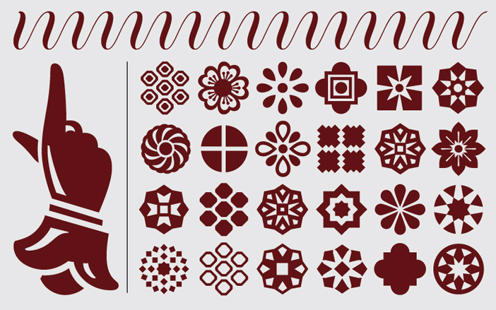
Typeface name: A2 Flowers
Client: Various, Nørrebro Bryghus
Project: Printers flowers and illustrations for various clients and publications
Year: 2005
A2/SW/HK
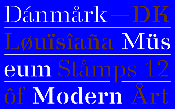
Typeface name: A2 Danmark
Client: Danish Post
Project: A set of 4 stamps for Louisiana Museum of Modern Art in Denmark
Year: 2008
A2/SW/HK
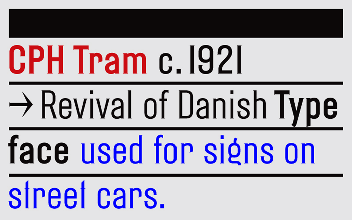
Typeface name: A2 CPH Tram
Client: Kissmeyer Beer & Brewing
Project: Identity and packaging design
Year: 2009/11
