How Peter Saville came to art direct the best of contemporary culture
From Peter Saville's first steps with Factory Records and legendary album designs to his later work in art and fashion: we chart the history of the British art director

Peter Saville was born in Manchester in October 1955. Over a career spanning half a century, Saville evolved into the quintessential contemporary graphic designer, a creative whose work was always greater than the sum of its parts, a branding specialist who could visually depict an inner truth about a band or company, and an artist who parlayed modesty and subtlety into the sumptuous and extravagant.
Peter Saville in the 1970s: first steps towards design and music
Logo for Factory Records, Manchester
As a teenager, Saville attended a Roman Catholic grammar school, St Ambrose College, in Altrincham. It was here that he studied history of architecture alongside art classes, become well versed in the evolution of Victorian and twentieth century architecture, especially the modern movement. As he told the designer Vince Frost on the Design Your Life podcast, ‘the principles of design were illuminated to me through architecture.’
After going on to study graphic design at Manchester Polytechnic in 1975, Saville also found kinship in the music and style of 70s art pop and rock, citing Bowie, Roxy Music and Kraftwerk as key influences at this time. For many, it is the graphic identity of Factory Records, the label founded in 1978 by Alan Erasmus and Manchester grandee Anthony Wilson, that is their first introduction to Saville’s work.

Logo for Factory Records
Conjuring up a neo-modernist aesthetic infused with avant-garde typography, abstract art and modernist forms, Saville, along with producer Martin Hannett, was instrumental in shaping the public perception of Factory’s bands, not just in terms of their music but their image and attitude. It was post-punk, for sure, but still anti-establishment, aspiring to a form of idealised, artistic corporate identity that still preserved the identity of the individual without giving too much away. In an era when the image of musicians was largely governed by album art, Saville’s work helped define the image of an era.
The Factory work had evolved out of poster design, at a point when Saville cited the work of typographers like Jan Tschichold as major influences. The German designer (1902 – 1974) had pioneered what was described as ‘New Typography’, a break with established typographic traditions – and, for a while, the use of serif fonts – in favour of standardised, unified proportions. Tschichold went on to become a noted designer for Penguin Books.
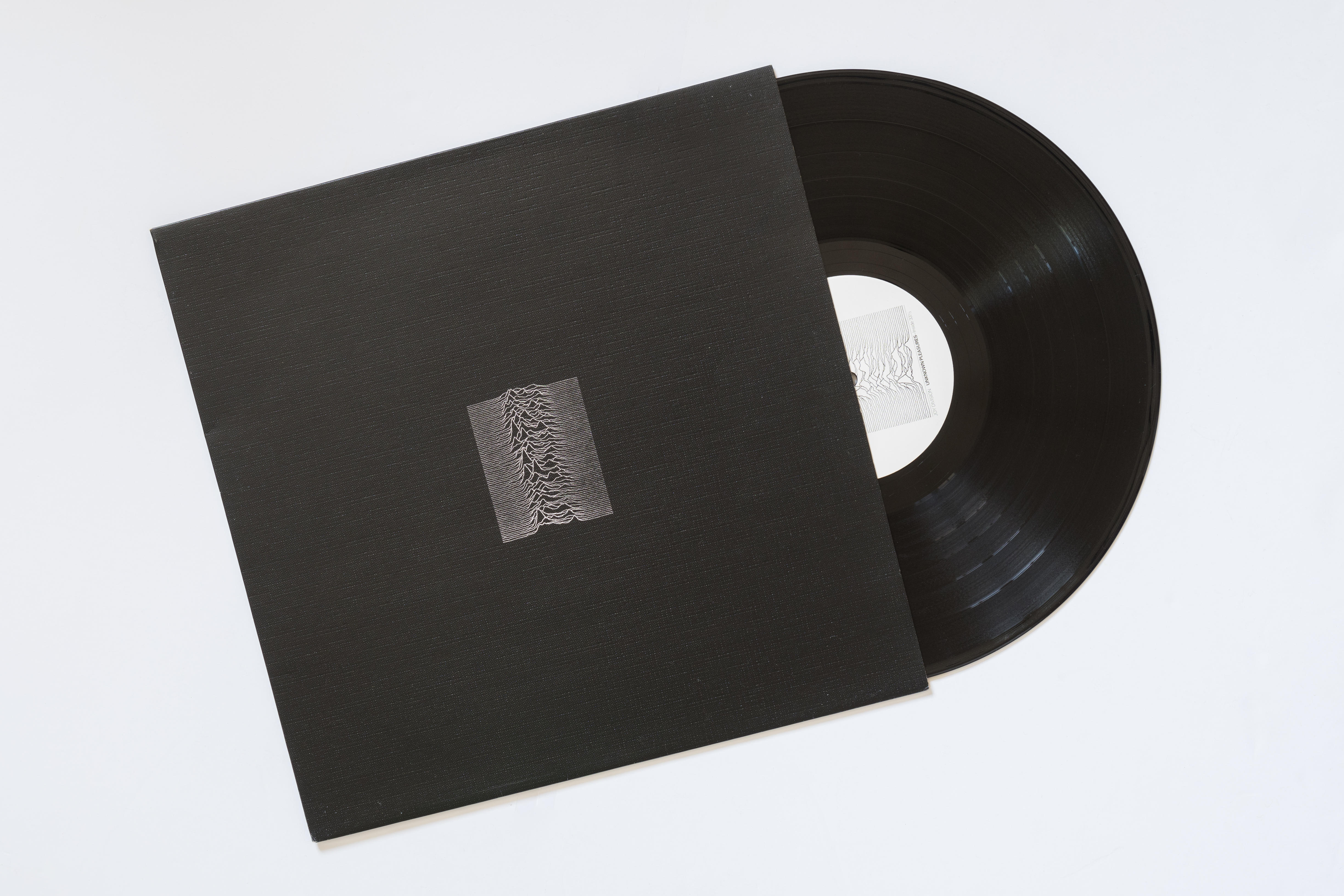
Album cover for Unknown Pleasures, Joy Division
Saville evolved a hands-off way of working that essentially treated music as a cultural commodity to be branded. ‘I never did covers about music,’ Saville has said, emphasising how visual imagery could be used to create preconceptions about how a band should sound. Working with artists like Joy Division, and then New Order following Ian Curtis’ death, Saville also had the luxury of a world with obvious cover stars or poster children, a genre that favoured abstract sound and visuals, introversion and introspection. ‘In a way, the image and identity of the group fell to me,’ he told Frost, ‘[the covers created] people’s imagined perception of New Order.’
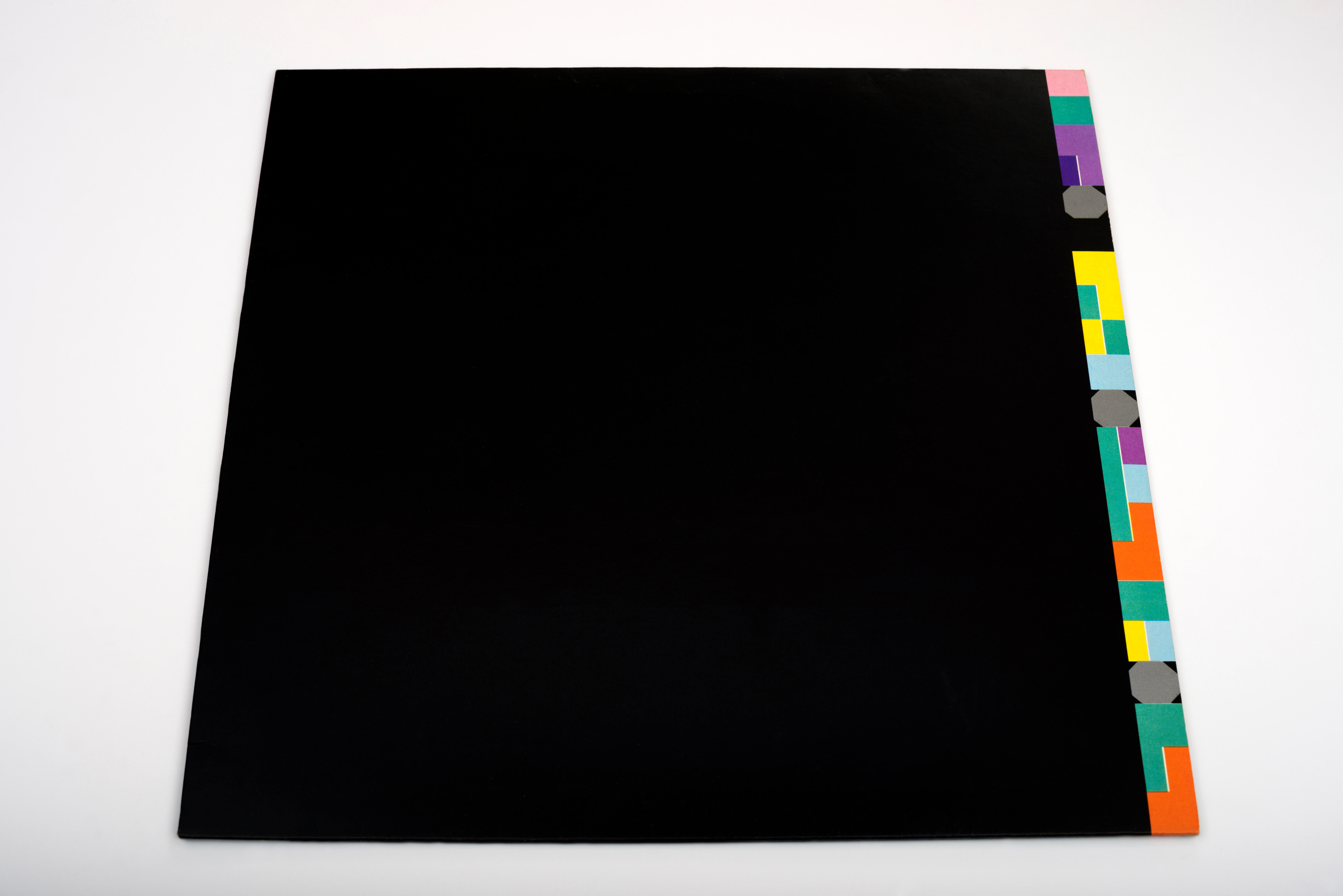
12" single cover for Blue Monday, New Order
It wasn’t long before the work of Peter Saville Associates began to attract attention of other bands. By this point, Saville was what he describes as a semiotician, someone who translates signs and codes. By combining a thorough understanding of context with a distinctive sense of style and presentation, Saville became a chameleon-like figure, working across cult acts and chart toppers alike.
Receive our daily digest of inspiration, escapism and design stories from around the world direct to your inbox.
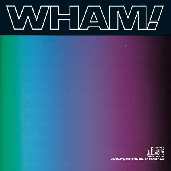
Album cover for Music from the Edge of Heaven, Wham!
The latter is epitomised by his work for Wham!, brought on board at the behest of George Michael. Looking back on his career, Saville described himself as ‘acting as the art director of the principal artist,’ with their level of engagement depending entirely on their own perceptions of art, culture and design.
Michael was hands-on, as were other clients like Brian Eno, Bryan Ferry and Jarvis Cocker, but others were happier for him to take the lead. For Wham!, Saville spliced an up-to-the-minute fashion magazine aesthetic for the band, extending to the use of a fashion photographer (Tony McGee) and even helping select clothes and hairstylists – even today, he describes himself as more of a stylist than a designer.
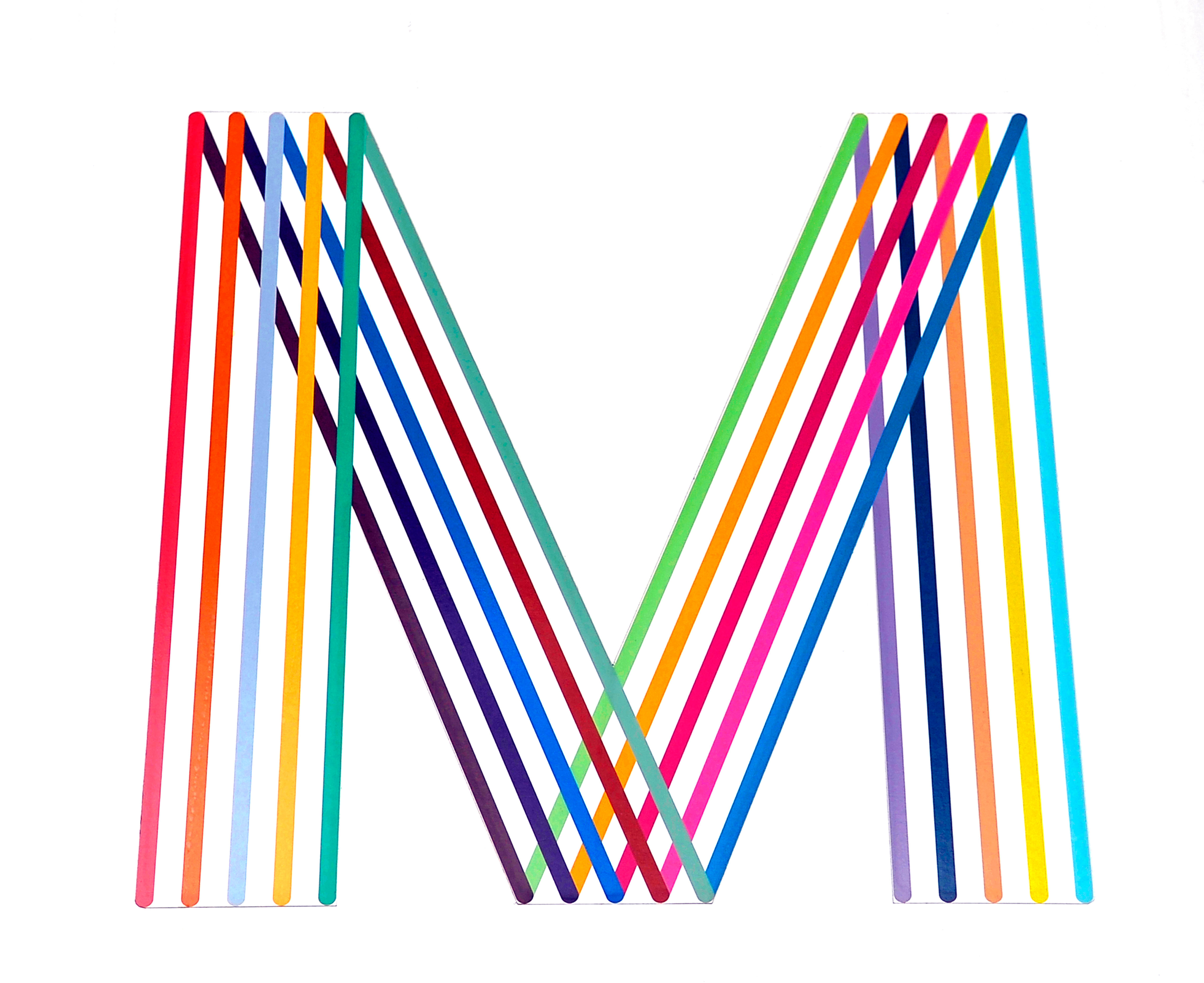
Logo for the city of Manchester
The full spectrum of Saville’s music work can be found online, many of which were designed with his long-term collaborator in Peter Saville Associates, Canadian graphic designer Brett Wickens. Without a website of his own, or even an official comprehensive archive, Saville himself references the impressive Peter Saville Sleeve Design website created by ‘tosq from Japan’ as a place to revisit the 300-odd records he has been involved in. These include artists as diverse as Martha and the Muffins, Ultravox, Nico, Roxy Music, Orchestral Moves in the Dark, Peter Gabriel, Depeche Mode, Goldie, Suede, Björk and many, many more.
1980s: joining Pentagram, art, fashion and more
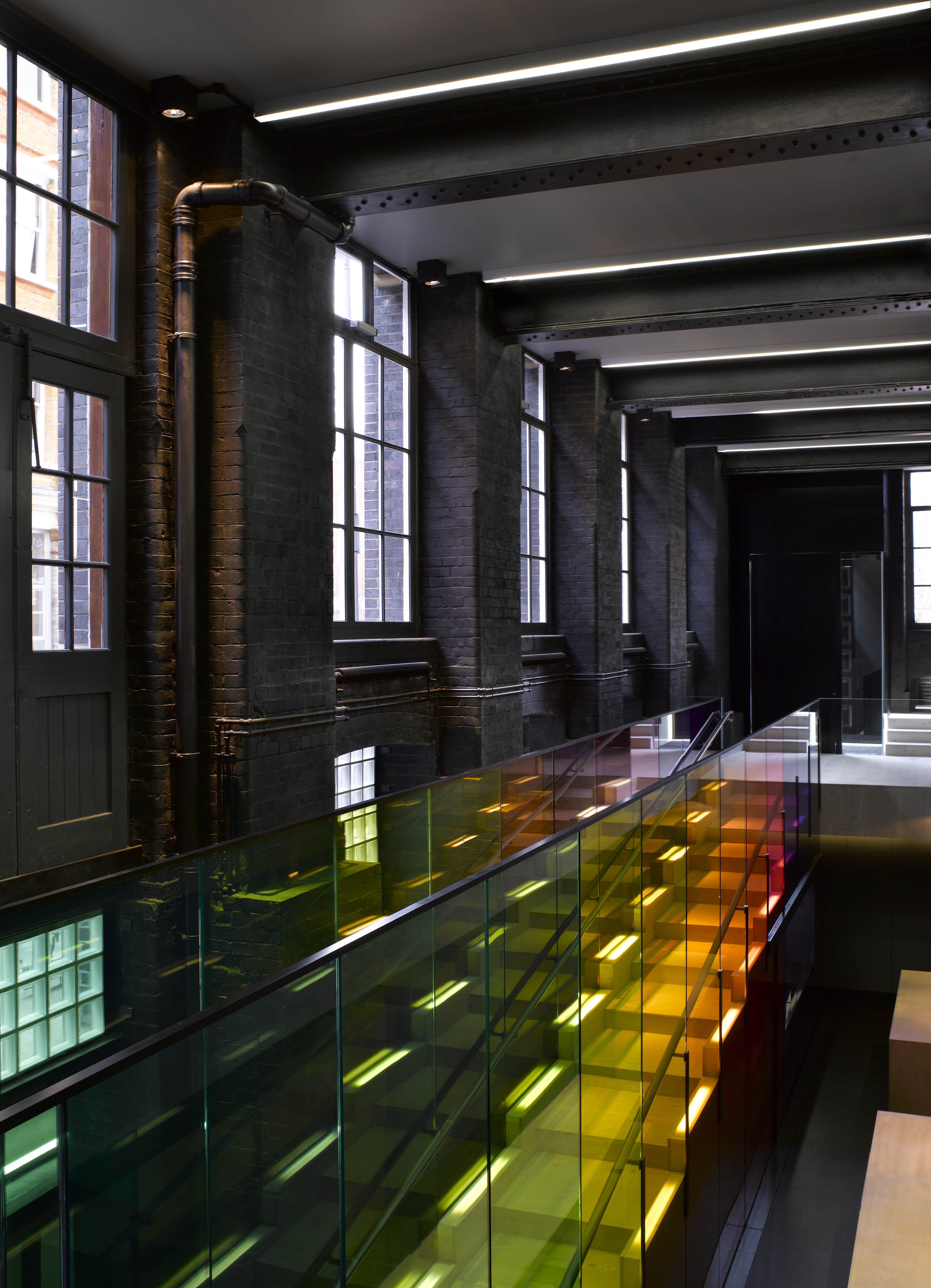
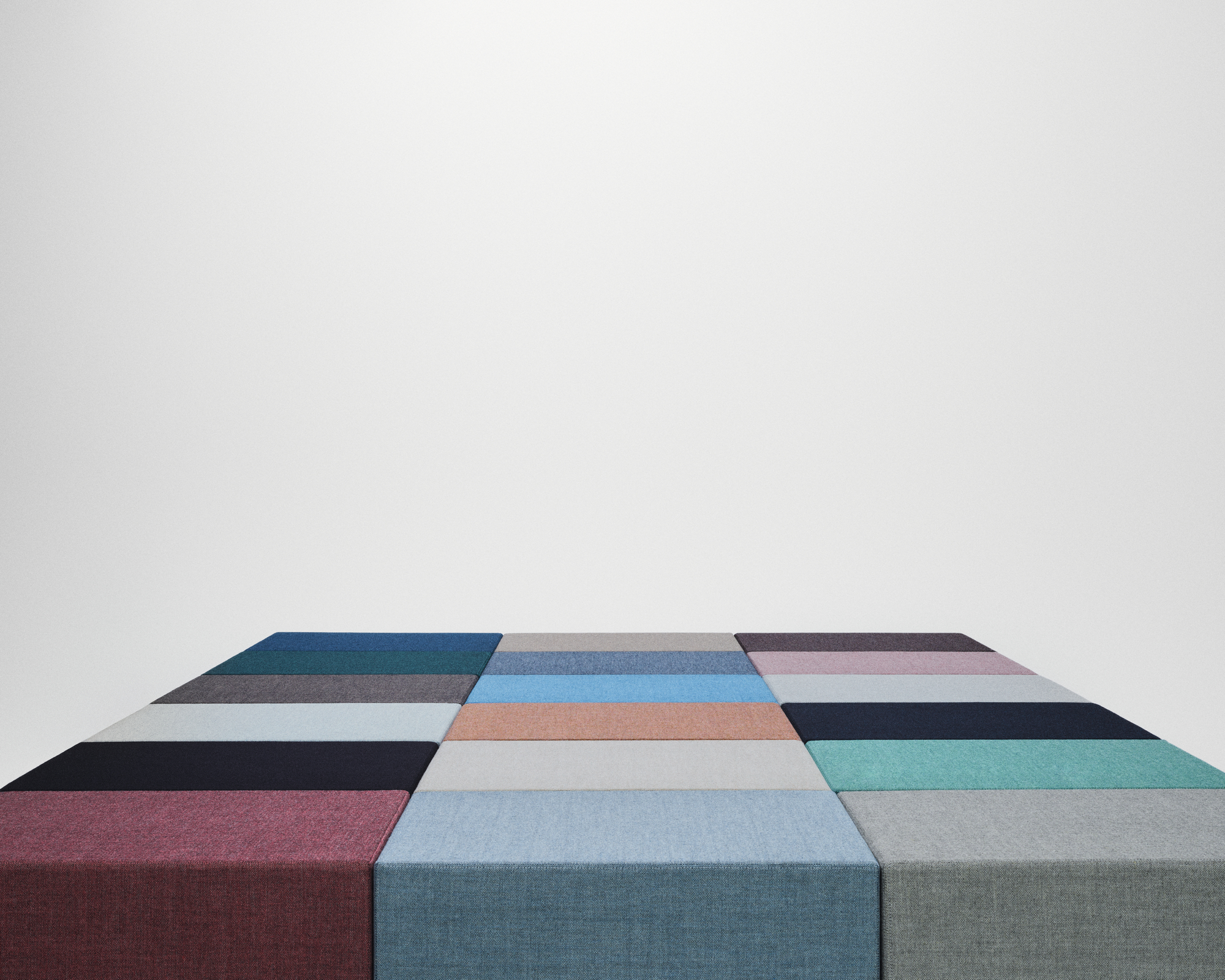
Kvadrat Showroom, London, by Peter Saville
Describing the output of his studio in the 80s as a ‘sort of fantasy art venture,’ one that eventually ran out of steam with the recession at the end of the decade. At this point, Saville joined Pentagram at the invitation of director John McConnell, not least because Peter Saville Associates was, by that point, ‘insolvent’, in Saville’s words. Pentagram proved educational, not least as an introduction to a broader design landscape than the album covers and cultural work that he had become known for.


Aston Martin wings badge, revised and redrawn in 2022
Despite retaining a passion for music and close connections with the industry, Saville began weaning himself off over-reliance on the sector from the mid-80s onwards when he was approached by the then director of the Whitechapel Gallery, Nicholas Serrotta, to oversee a new identity for the iconic building, then in the midst of a substantial overhaul and expansion. At the same time, Saville also branched out into fashion, working with Nick Knight on a Yohji Yamamoto campaign.
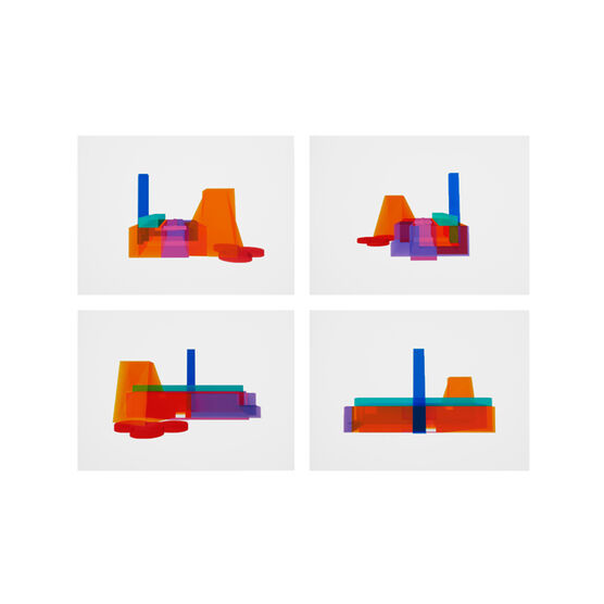
Multicolor TM for Tate Modern
Since then, he has worked with major brands across all sectors, from Kvadrat, and Chanel to Aston Martin, Uniqlo, and Tate Modern. Saville has also undertaken many projects with friend and photographer Nick Knight and Jony Ive, with whom he collaborated on LoveFrom, Serif.
A creative magpie
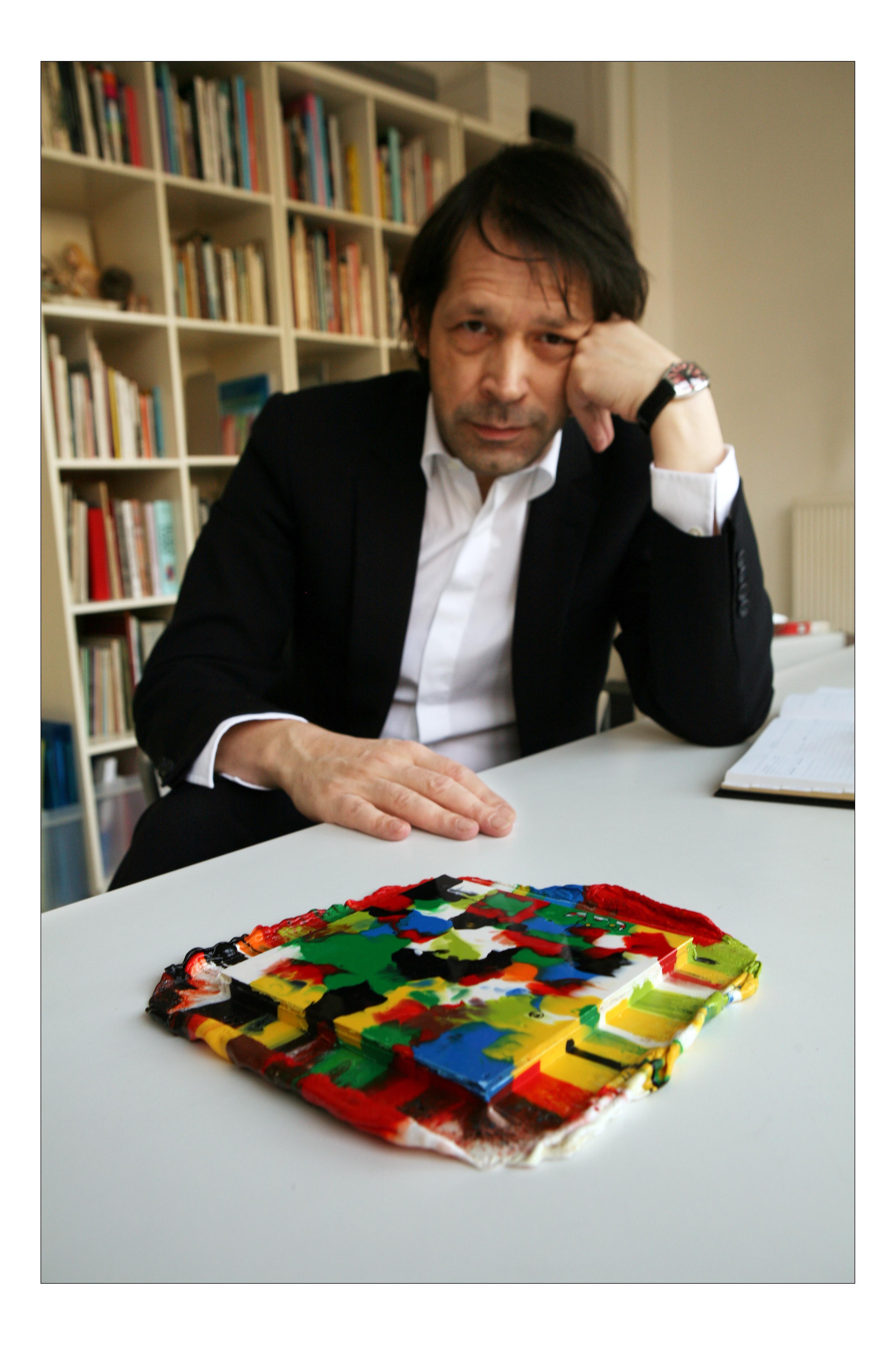
An artwork for Lego's 50th anniversary in 2008
The scope of Saville’s work ethic is substantial, encompassing everything from football kits to glassware and textiles to being appointed Creative Director for Manchester. He is the co-founder, with Nick Knight, of SHOWstudio, and worked with Knight on Wallpaper*’s infamous sex issue in 2009, and is also a frequent collaborator with his partner, the artist Anna Blessmann. In 2020, he was appointed a CBE for his services to design.
Despite this monumental output, Saville very much works to live, occupying a sparsely furnished apartment in central London and able to choose the clients he wants to work with. Now 70, he shows no sign of abandoning his well-established role as a cultural and creative overseer.
Jonathan Bell has written for Wallpaper* magazine since 1999, covering everything from architecture and transport design to books, tech and graphic design. He is now the magazine’s Transport and Technology Editor. Jonathan has written and edited 15 books, including Concept Car Design, 21st Century House, and The New Modern House. He is also the host of Wallpaper’s first podcast.