Over in London, a strong summer message came in the form of Acne’s thick flourescent invitation card, featuring a graphic debossed font
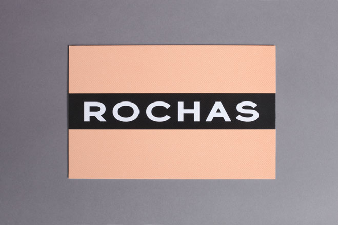
For Paris, Rochas used a varnish treatment on textured card to create the ’vinyl effect’ black strip
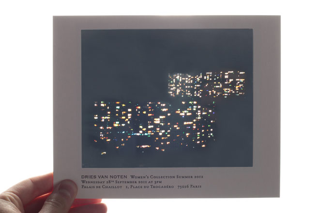
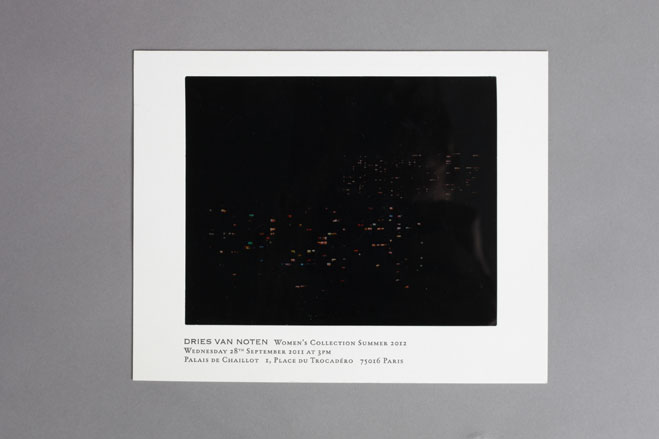
Dries Van Noten
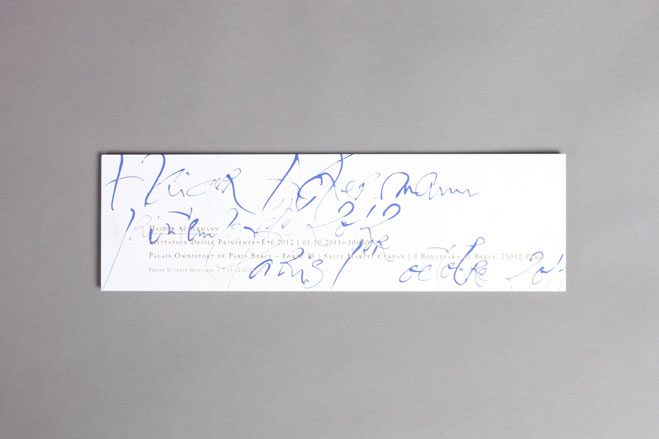
Loose calligraphy-style writing marked out Haider Ackermann’s gold foil printed card
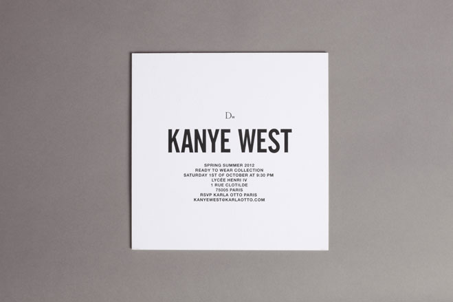
Kanye West’s first fashion week invitation was to the point with its centralised debossed text
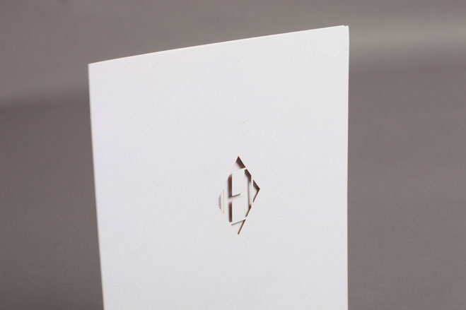
Hermès
Receive our daily digest of inspiration, escapism and design stories from around the world direct to your inbox.
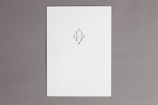
A discreet die-cut ’H’ from Hermès
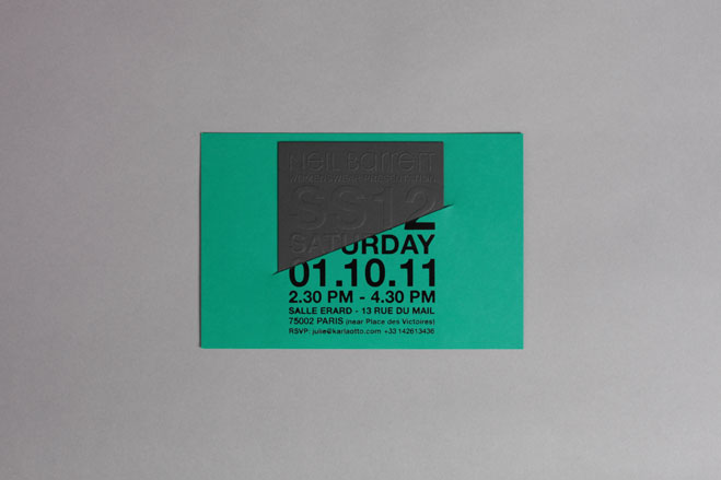
Mimicking earlier invitation styles, Neil Barrett produced a thick green card ’envelope’ printed with black foil, with a smaller card pull-out which was blind embossed
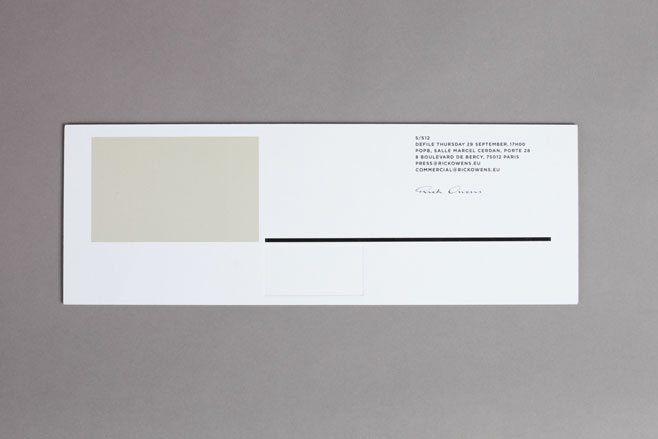
Rick Owens used three different printing techniques to create three abstract patterns in varying rectangular dimensions
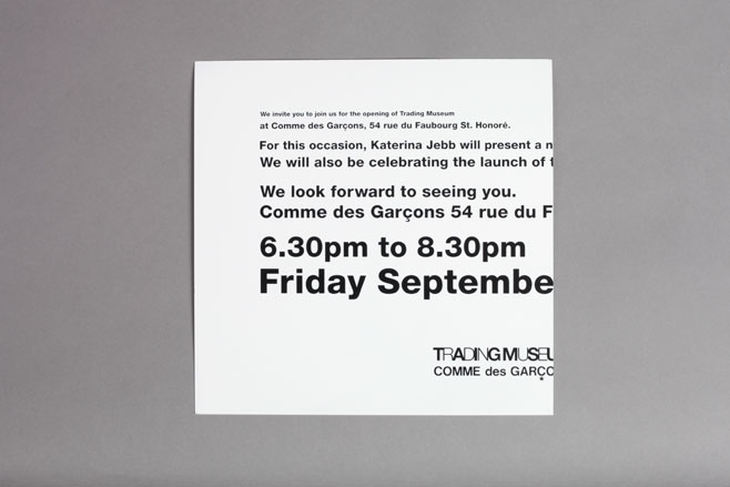
The puzzle-like card from Comme des Garçons for its new Paris Trading Museum required flipping back and forth between two sides of glossy white paper to get all the details - which were divided between two sides of the sheet
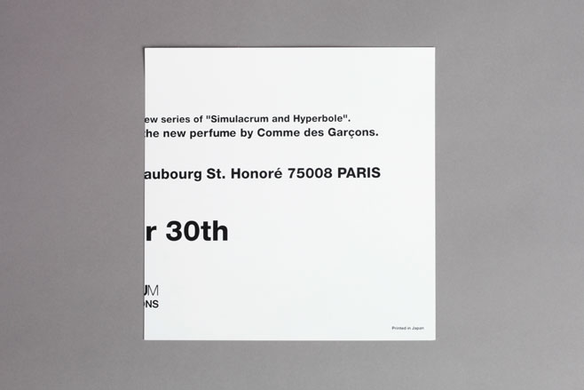
Comme des Garçons
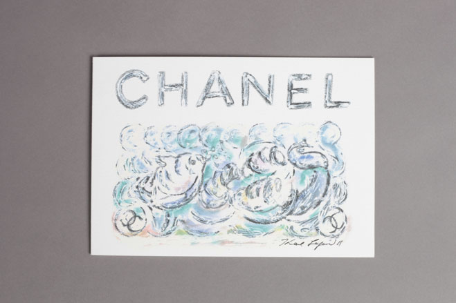
Made to look like an artwork, Chanel’s pastel acquatic came on heavy watercolour paper
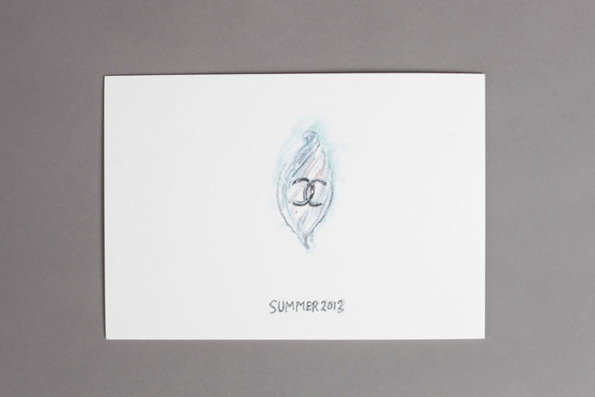
Chanel
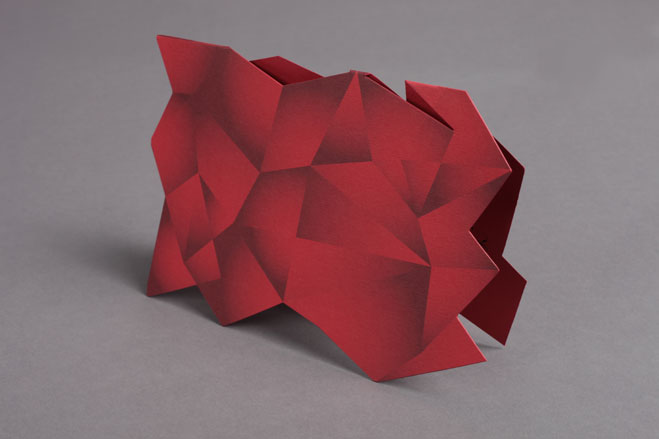
A die-cut geometric creation from Roger Vivier
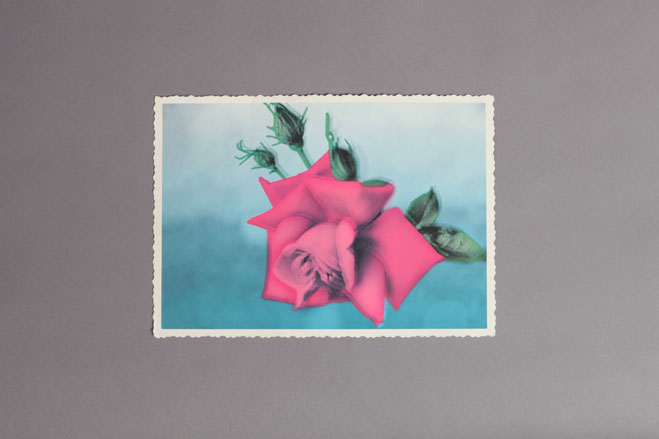
John Galliano’s out of focus rose printed on a card came in the form of a giant postage stamp, complete with perforated edges
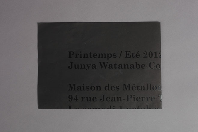
Junya Watanabe’s minimalist design, incorporating black print on black thin paper, folded out into a poster
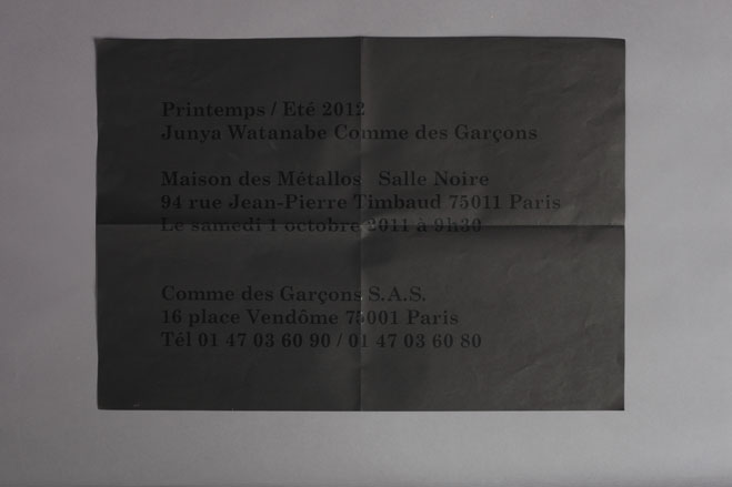
Junya Watanabe
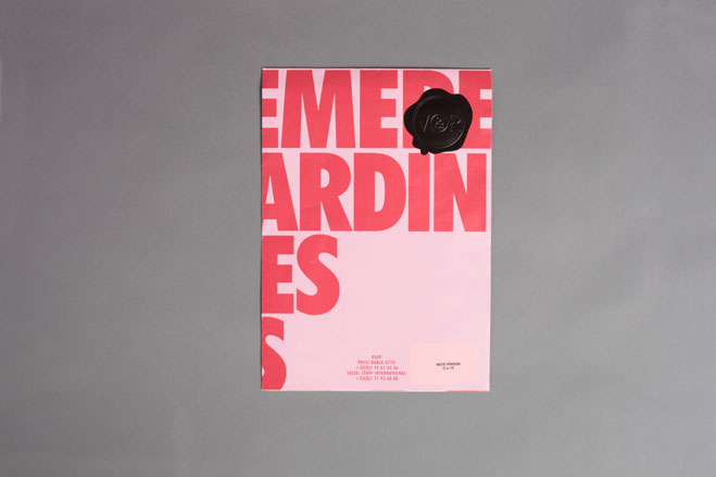
Another poster-like offering from Viktor & Rolf, embossed with a V&R stamp...
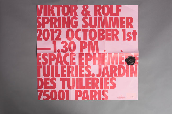
... this time folding out into a square sheet
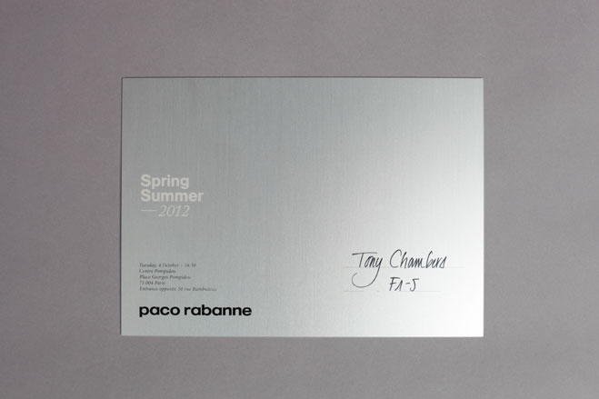
Kudos to Paco Rabanne for producing this very sleek brushed aluminium plate
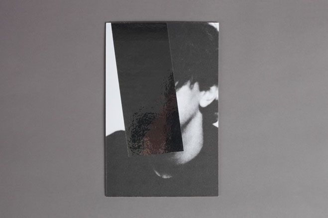
The ambiguous face on Céline’s invite got the silver metallic foil treatment...
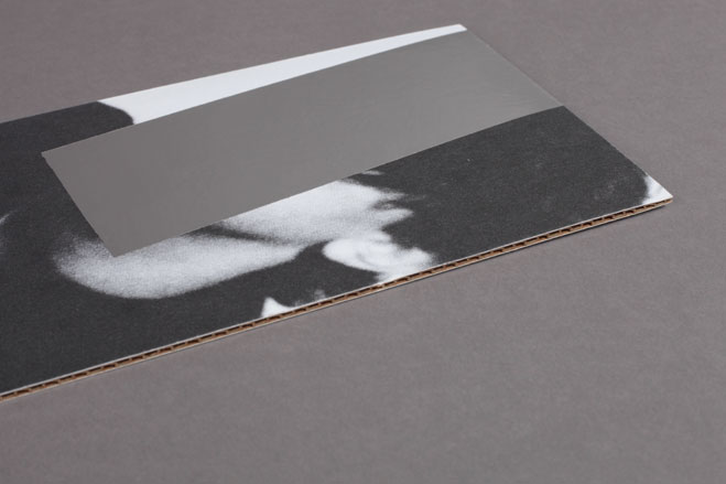
... and came printed on corrugated card
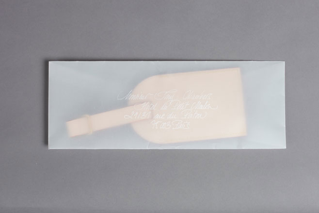
A tracing paper envelope from Louis Vuitton...
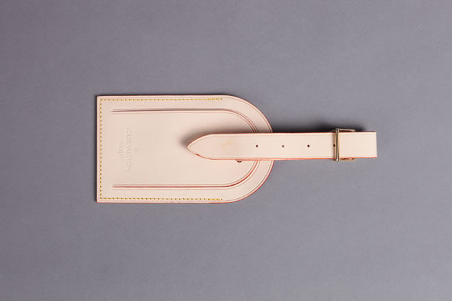
... conceals an oversized Louis Vuitton leather luggage tag...
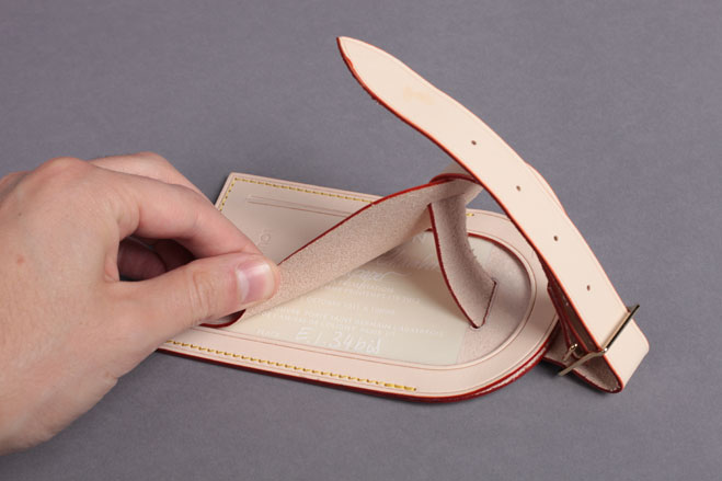
... with show details hidden under the tag’s flaps
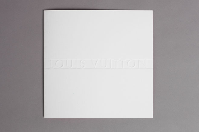
The Louis Vuitton Art of Fashion exhibition invitation - with just a hint of detail in its blind debossed cover - looked pretty understated. But things aren’t always what they seem...
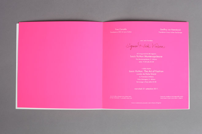
... it opens up to reveal a flourescent pink insert
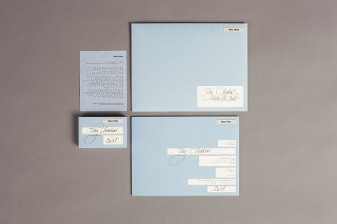
A powdery blue variation on Miu Miu’s perfectly assembled show stationary
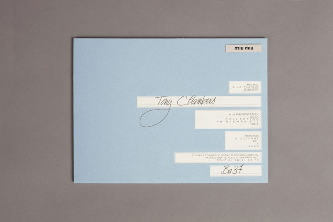
Miu Miu
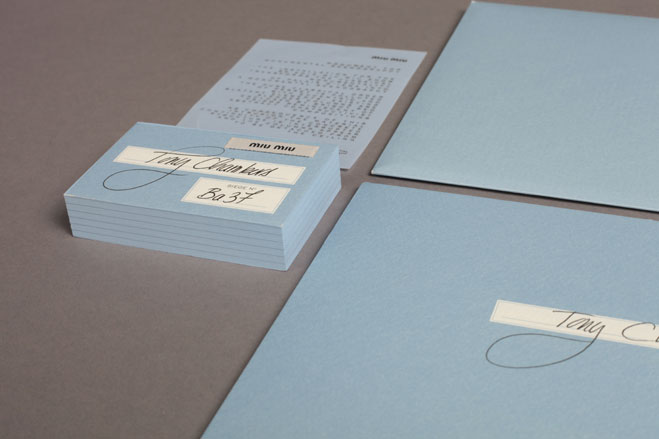
Miu Miu
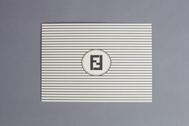
In Milan, Roman fashion house Fendi presented the ultimate lesson in monochromatic graphic
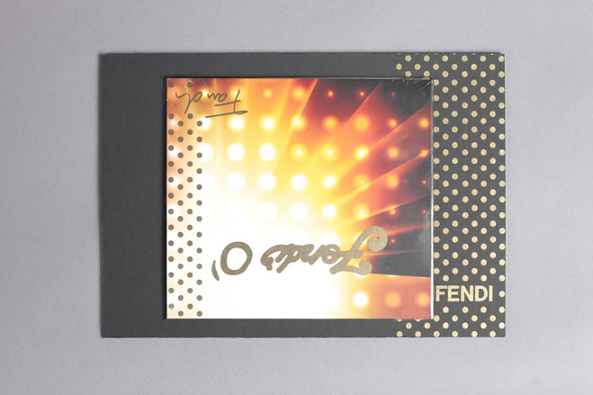
Meanwhile, invitations for the Fendi O’ party arrived complete with a CD mix taster of sounds that were to come during the course of the evening’s events
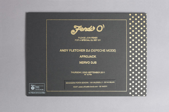
Fendi O’: On the reverse, the event details came emblazoned in a glossy gold print
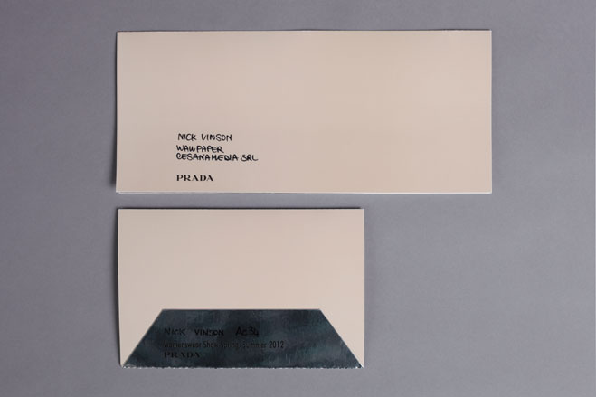
Prada’s invitation was deceivingly simple at first glance...
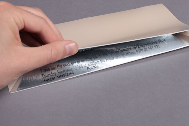
... but a clever optical illusion allowed the text - printed upside down and back to front - to be read coherently through the use of reflective mirrored card
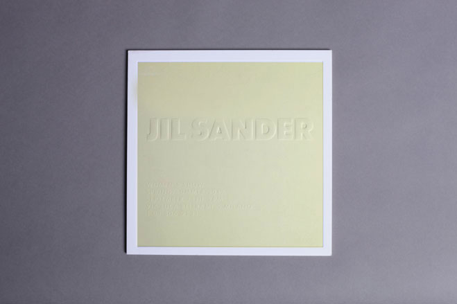
Jil Sander used of blind-embossing on thick square card
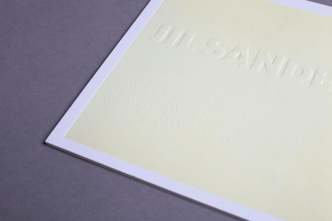
Jil Sander
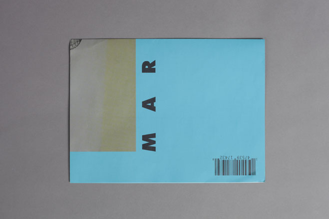
A colour block hit from the Marni invitation...
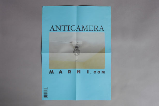
... which unfolds into an A3-sized poster
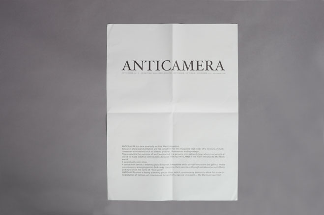
Marni
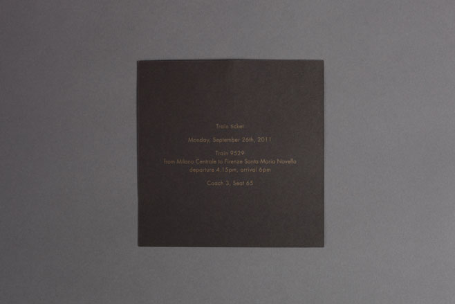
Our invitation to visit the new Gucci Museo in Florence came complete with a gold foiled personalised train ticket
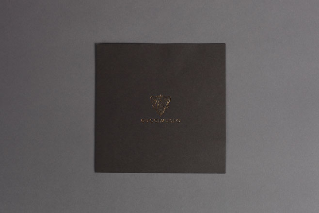
Gucci Museo
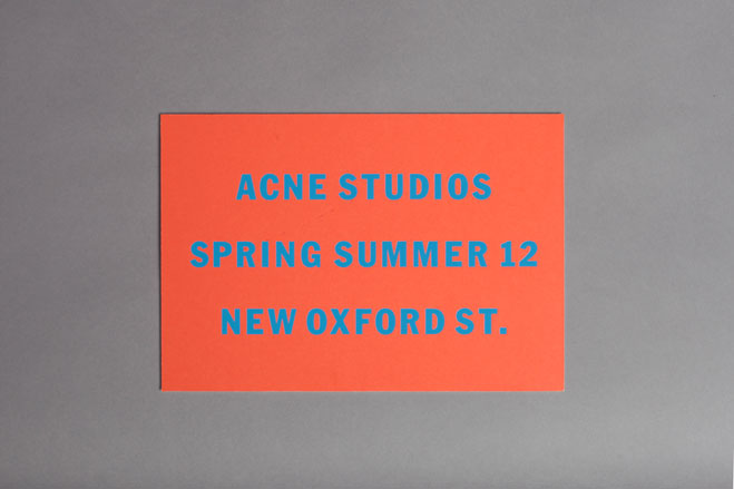
Over in London, a strong summer message came in the form of Acne’s thick flourescent invitation card, featuring a graphic debossed font
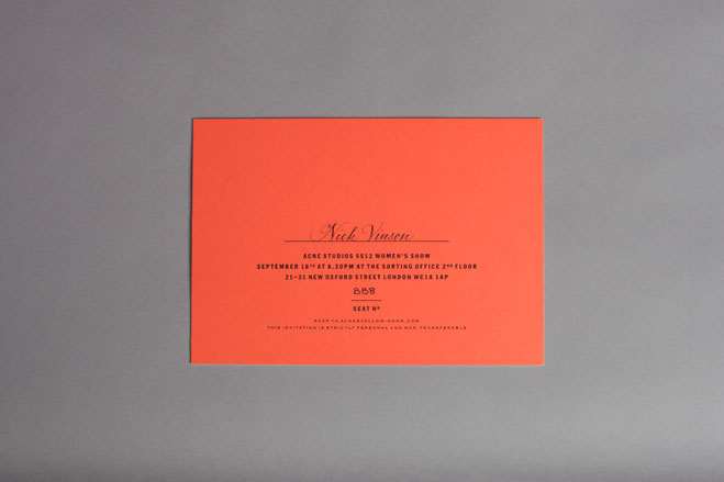
Acne
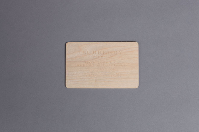
Burberry sent out its usual pack: an envelope which opened to reveal credit card-sized card printed with the show details - this time in wood
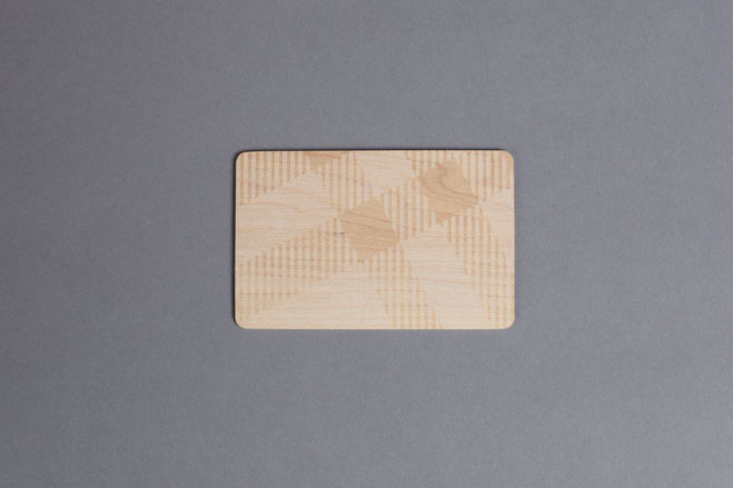
Burberry
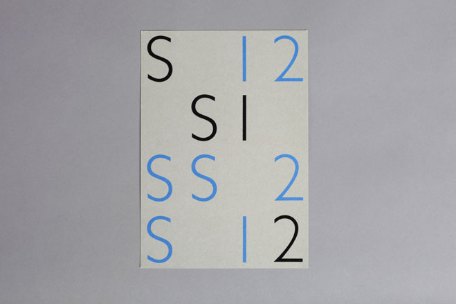
Margaret Howell chose blue, grey and black shades for her invites this season, with a pop-out black foil-stamped print appearing over the card
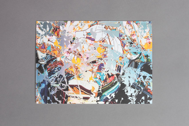
A colourful painted print transferred onto matt silver foil for the Mary Katrantzou show
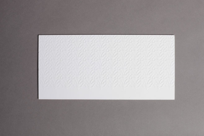
A simple offering from Pringle of Scotland, which made use of an embossed pattern on heavy white board for a tactile effect
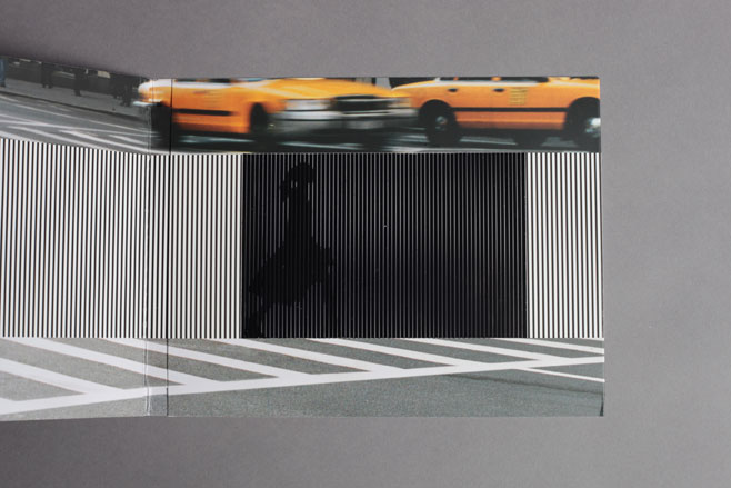
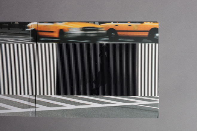
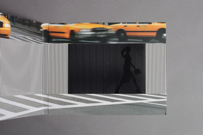
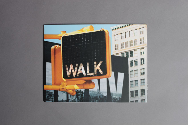
Using the pre-cinema French technique of Ombra Cinema (not dissimilar to the W* 139 Guest Editors issue cover featuring Robert Wilson’s eye-popping portraits), the DKNY invitation revealed a series of moving images of a girl crossing a road, controlled by the opening and closing of the card
DNKY
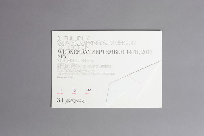
For 3.1 Phillip Lim, a subtle tactile effect was achieved with embossed text on a linen-like overlay. This folded back to reveal a heavy textured card
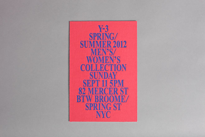
The Yohji Yamamoto and Adidas for Y-3 invitation incorporated a screen-printed blue text on a red fabric-like card
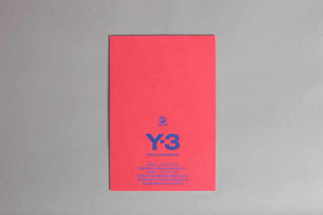
Y-3
Jack Moss is the Fashion & Beauty Features Director at Wallpaper*, having joined the team in 2022 as Fashion Features Editor. Previously the digital features editor at AnOther and digital editor at 10 Magazine, he has also contributed to numerous international publications and featured in ‘Dazed: 32 Years Confused: The Covers’, published by Rizzoli. He is particularly interested in the moments when fashion intersects with other creative disciplines – notably art and design – as well as championing a new generation of international talent and reporting from international fashion weeks. Across his career, he has interviewed the fashion industry’s leading figures, including Rick Owens, Pieter Mulier, Jonathan Anderson, Grace Wales Bonner, Christian Lacroix, Kate Moss and Manolo Blahnik.