'For a long time I dreamed of having a beautiful pen at Hermès,' says Pierre-Alexis Dumas, the company's artistic director. Hermès has always produced agendas, but not writing instruments. And as electronic communications increasingly predominate, Dumas believes it is more important than ever to support the act of writing.
'This is an encouragement to remember the pleasure of using one's hands,' he explains. 'It is through writing that we can explore our thoughts or even go further.'
Dumas hired Marc Newson to design the pen. When the two discovered a mutual admiration for Pilot, they asked the Japanese pen maker to produce it.
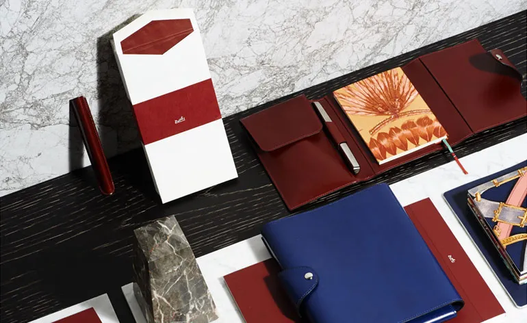
Following three years of creative and technical development, Hermès launches the 'Nautilus' pen (fountain and ballpoint) and a range of writing objects this September. Crafted from aluminium and steel, the smooth, cap-less instrument comes in colours of ebony, H red or carbon blue. A rotating mechanism makes the gold and iridium nib disappear with a touch of the hand.
Wallpaper* talked to Marc Newson about getting his design off the drawing board...
Wallpaper*: How did you get involved in this project?
Marc Newson: Pierre-Alexis asked me if I would be interested in designing a pen, and obviously I said yes. I'm a pen obsessive person, because that's what I use, that's my thing. But it was the type of object, which made everybody very nervous, because you don't want to get it wrong. Doing a pen and not doing it properly is just horrible, especially for a company like Hermès.
And for you?
Yeah, and for me. I'd never done one.
Can you explain what's happening inside this pen?
The retractable fountain pen nib is something that Pilot invented in the 1950s. It was also the type of pen that I had been using since living in Japan. Pierre-Alexis and I both loved it. I think we wanted to take it and reinvent it into a new iconic object. We did this little turning thing (he demonstrates how the nib retracts on its own). It doesn't seem like much, but it is, trying to contain all that in this tight little package and make it work every time.
What about the aesthetics?
It's an object that you can put on a table and look at, sort of ponder and play with it. It compels you to want to touch it, which is good, because if you don't have a tactile relationship with your pen then you're never going to use it. There's a strange biomorphic quality as well. 'Nautilus' is a shell, so there's this idea of a coque with this carapace made from a solid piece of aluminium. It's not an assemblage of things, the whole thing is actually machined. And the colour is applied with a chemical process called anodisation. It's an ink that's impregnated the surface of the metal.
What's the difference between designing a pen and designing a car or a chair?
Designing any object, you exercise the same muscles. It's the same métier, even if the materials change, the scale changes, the parameters are different. But the thing about a pen is that - at least for me - it's where it all starts. It's my interface with the world on a creative level. So it's lovely to be involved in such an unexpected kind of exercise.

'This is an encouragement to remember the pleasure of using one's hands,' says Pierre-Alexis Dumas, the company's artistic director

When Dumas (left) and Marc Newson (right) discovered a mutual admiration for Pilot, they asked the Japanese pen maker to produce it

'Nautilus' is a shell, so there's this idea of a coque with this carapace made from a solid piece of aluminium,' explains Newson

'It's not an assemblage of things,' the designer continues, 'the whole thing is actually machined. And the colour is applied with a chemical process called anodisation. It's an ink that's impregnated the surface of the metal'

A rotating mechanism makes the gold and iridium nib disappear with a touch of the hand

Hermès has always produced agendas, but not writing instruments until now

Crafted from aluminium and steel, the smooth, cap-less instrument comes in colours of ebony, H red or carbon blue