Jony Ive’s LoveFrom creates a new look for San Francisco’s much-loved architectural bookshop
LoveFrom has unveiled a new graphic identity and typeface for William Stout Architectural Books, a mainstay of the city’s architecture and design community for over 50 years

Receive our daily digest of inspiration, escapism and design stories from around the world direct to your inbox.
You are now subscribed
Your newsletter sign-up was successful
Want to add more newsletters?
William Stout Architectural Books is a San Francisco institution. Founded by Bill Stout in 1974, for over half a century the Jackson Square-based bookshop has been the go-to supplier of architectural monographs, biographies, material manuals, treatises and coffee table tomes. Beloved by the local design community and a regular stop-off for passing starchitects, Stout’s shop is also a favourite of one of their Jackson Square neighbours, creative collective LoveFrom.
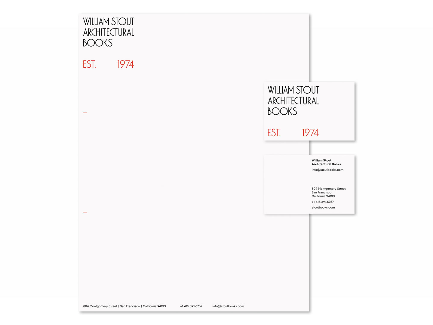
LoveFrom's identity for William Stout Architectural Books includes a letterhead and business cards
When it became known that the store was changing hands and a new identity was required, LoveFrom stepped forwards to offer its services for free. ‘We love and cherish the store and want to support our neighbourhood,’ says the studio’s Chris Wilson, adding that ever since it was founded by Sir Jony Ive and Marc Newson in 2019, the London- and San Francisco-based design agency has ensured it runs side projects just ‘for the love of doing it’, alongside regular long-term collaborators like Ferrari and Airbnb.

There's also merchandise like T-shirts...
The redoubtable William Stout set up his bookshop in 1974 to cater for his fascination with architecture, which he studied at the University of Idaho from 1960. After a spell working in firms on the East Coast, steeping himself in the architecture culture of Yale and its alumni, Stout headed West. Disillusioned by the practice of architecture but fascinated with the mechanics, influence and physical feel of architectural books, he started his own library.
This rapidly evolved into a modest store, catering to the many practices in the area, even though it was housed in the apartment he shared with the architect Steven Holl. After a few years, booming business allowed the shop to move to proper premises, first at Osgood Place, then to its current location at 804 Montgomery Street.
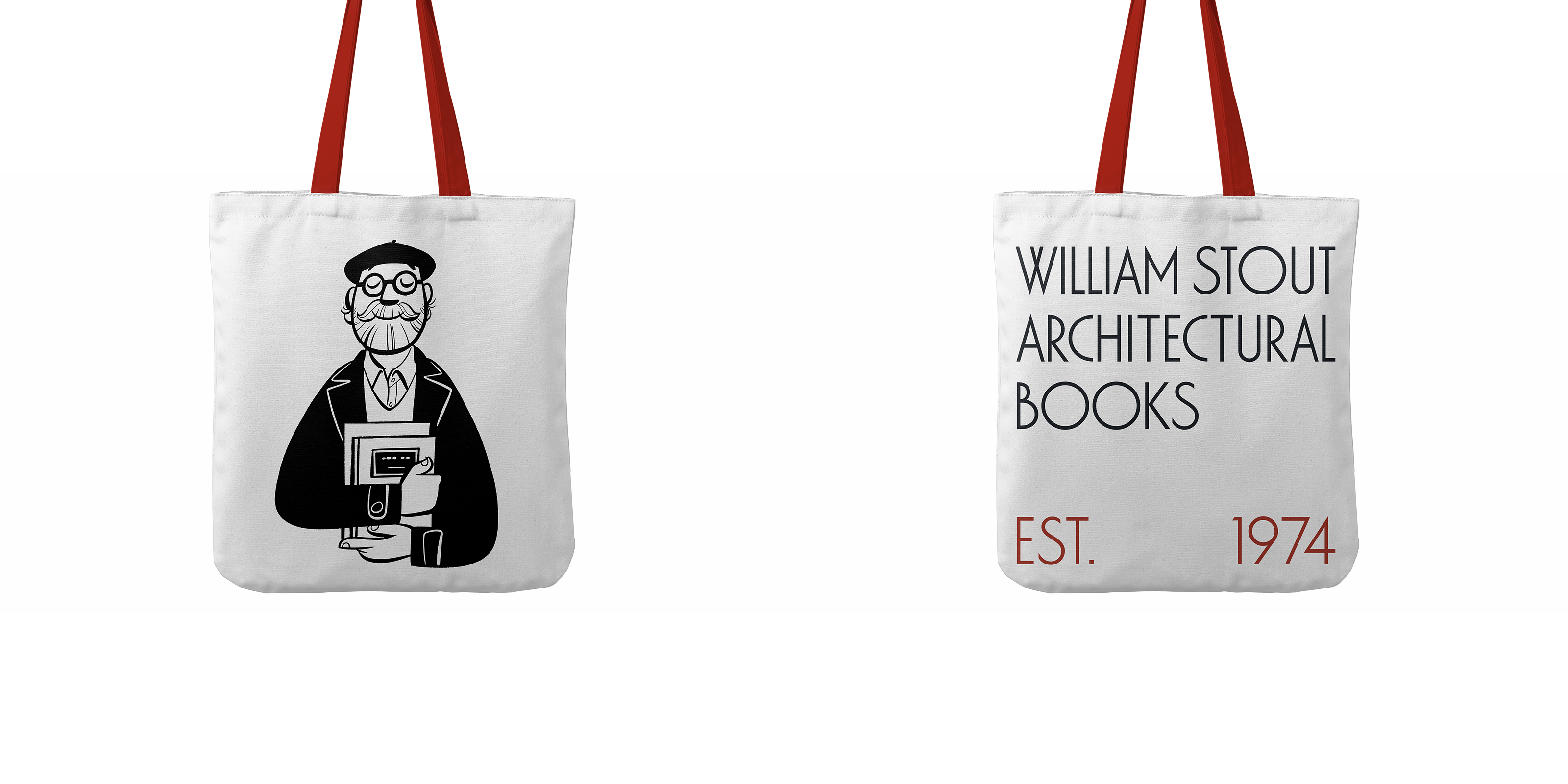
...and tote bags
Stout officially retired in 2022. Throughout his career, he not only catered to seekers of the new and notable but built up a formidable inventory of historic books (although he claimed to always keep the best works for himself when acquiring a new collection). That personal library is now the property of the Eames Institute of Infinite Curiosity, along with the store itself.
Lauren Smith, chief experience officer at the Eames Institute, is now in the enviable position of running a world-class design bookshop. The charitable organisation was launched in 2022 and is dedicated to ‘advancing the dynamic legacy of 20th-century designers Ray and Charles Eames’.
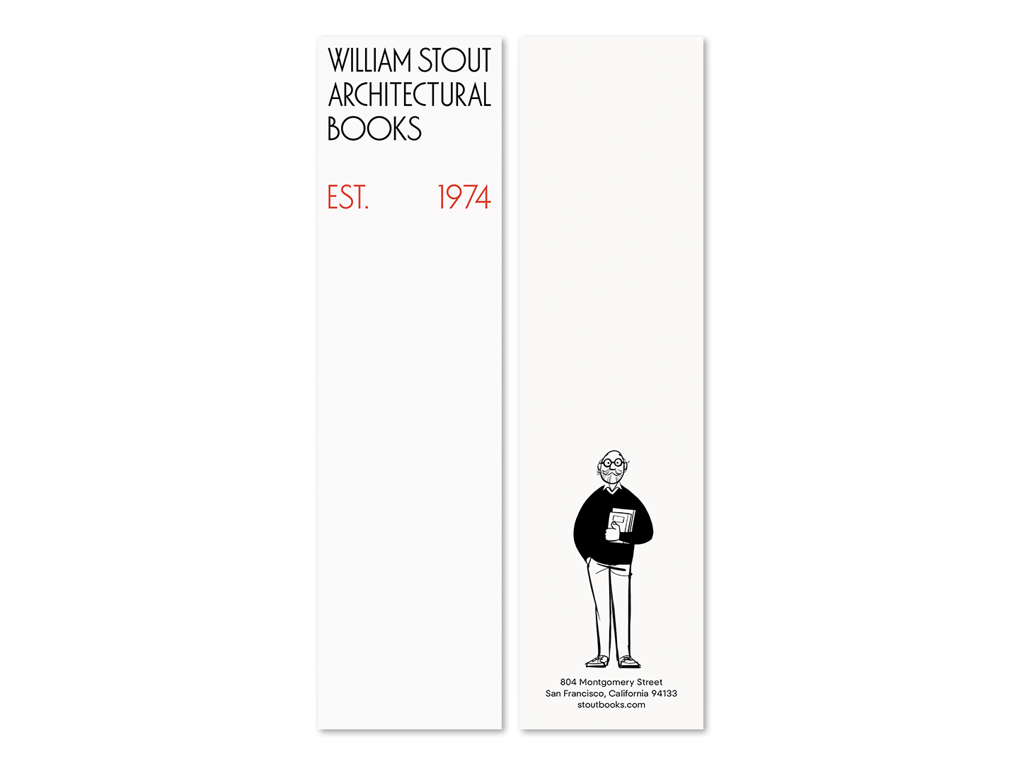
Bookmark from William Stout Architectural Books
Speaking to us from the basement stockroom of the bookshop, theatrically framed by looming piles of books, Smith explains how the acquisition came about. ‘We’d learned through a friend of the Institute that William was selling his personal library of architectural books.’ With a catalogue of over 40,000 objects from the Eames’s career, life and studio, Smith describes Stout’s archive as ‘a natural fit to add to the collection – we’re in the business of preserving legacies’.
Receive our daily digest of inspiration, escapism and design stories from around the world direct to your inbox.
In the process of arranging this sale, Stout let them know he was also selling the business. The Eames Institute stepped in, deciding it was a great opportunity to only preserve a vital creative hub in the city, but also to help it ‘move on to the next phase’.
‘We’re looking to the next 50 years,’ says Smith, adding that ‘one of our missions is to create communities of curious problem solvers.’ A bookshop dedicated to art and design fitted right in.

A poster for William Stout Architectural Books
At this point, LoveFrom also joined the fray after hearing that the team from Eames wanted to refresh the look and feel of the venerable store. Over the decades, the design and identity had evolved, with the original signage joined by a jumbled accretion of different styles and approaches.
‘We took Bill out to lunch to pick his brain about all this [visual] material,’ says Wilson. The principal identity was always the vaguely art deco-style sign, with an elongated, stylised sans serif that recalls both Mackintosh and the monogram used extensively by Frank Lloyd Wright from the 1920s onwards.
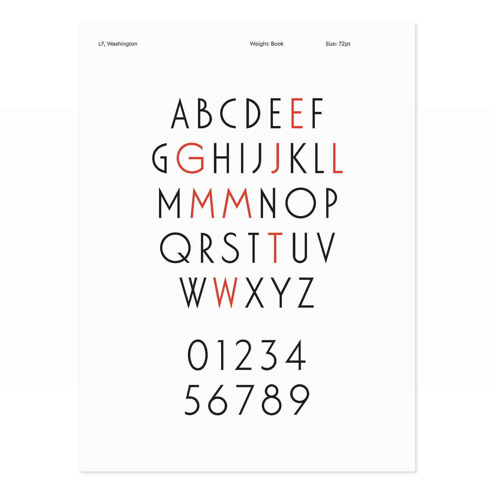
LF Washington, LoveFrom's bespoke font for William Stout Architectural Books
LoveFrom’s Antonio Cavedoni – described by Wilson as the studio’s ‘type detective’ – was set to research its origins. ‘It used a font called Washington, designed in 1970 by the Australian-born designer Russell Bean,’ Cavedoni reports. ‘As it references art deco, it has a very strong voice. So we decided to keep some elements, but also do something different.’
As Wilson says, ‘part of the brief was to understand the DNA of Stout – to help them see what they actually had. The quirkiness was what we liked – it definitely felt architectural as well, so we didn’t want that to go away. We wanted to give them a strong typographic voice.’
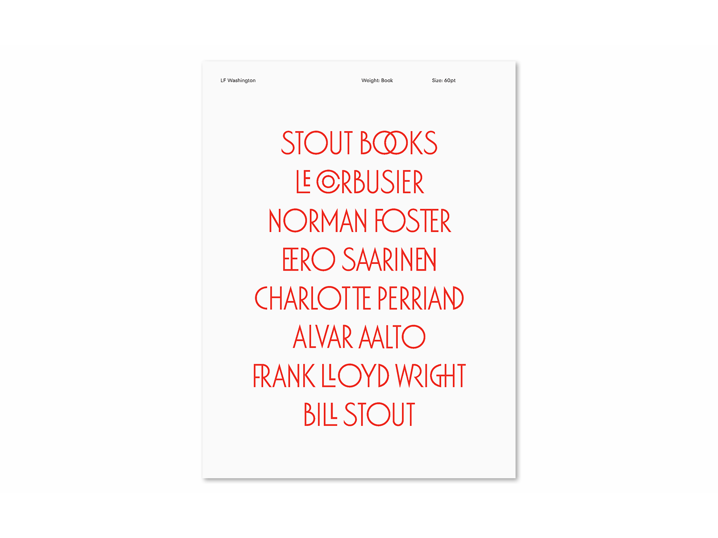
The font includes a set of custom ligatures
‘Because the original typeface was contemporary to when the store was founded, we reckoned they clearly wanted to have something that was of its time,’ Cavedoni explains. Washington had strong elements of Futura, a font that tended to be used for subsequent communications over the years.
LoveFrom approached Bean and asked if they could modify the original, as long as it was kept for use for the bookshop. The designer agreed and the result, shown here, is ‘LF Washington’, a bespoke sans serif that serves as the basis of the new identity.
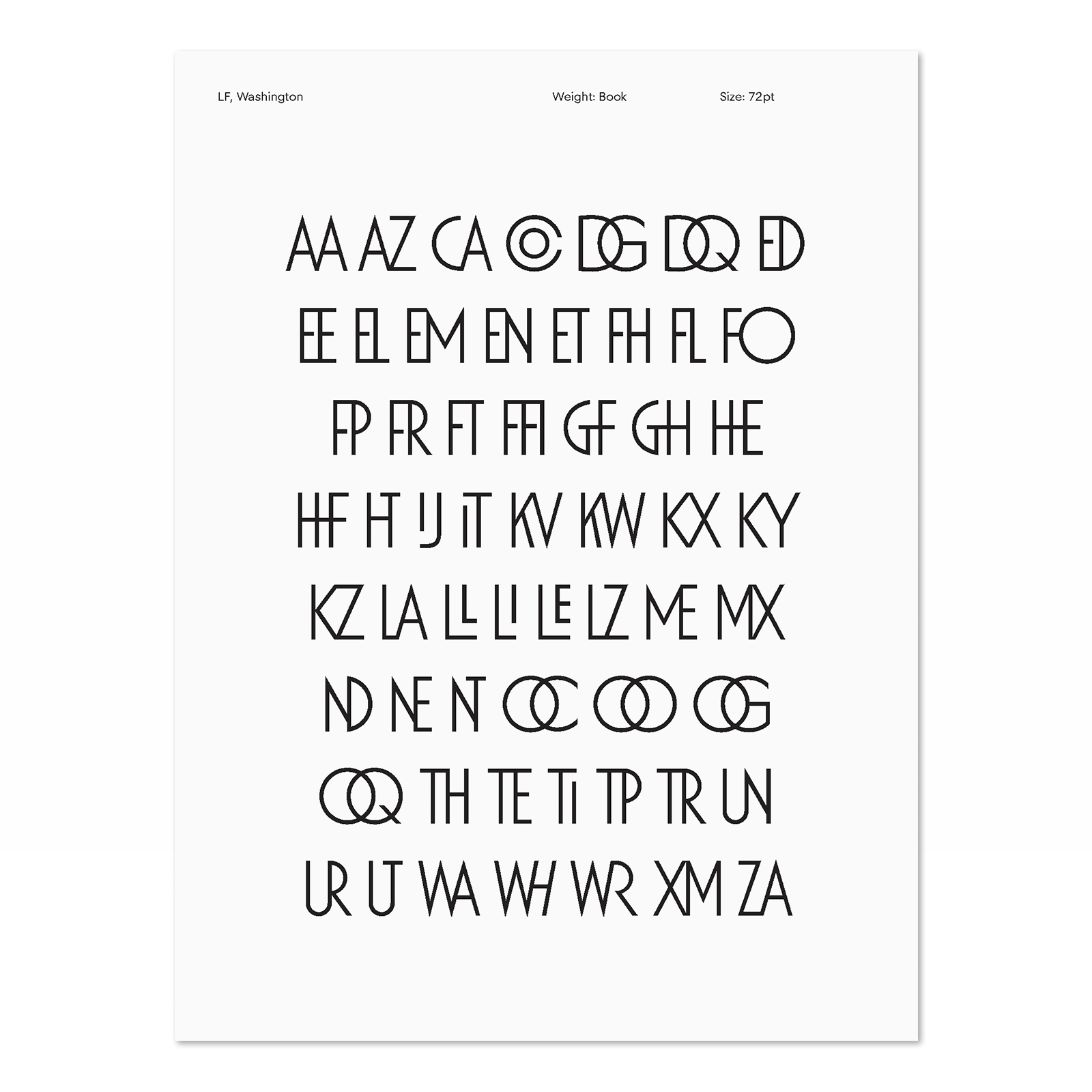
The 'LF Washington' font includes a set of custom ligatures
‘There was a lot of overshoot in the original,’ says Cavedoni. ‘We wanted to tame it down a bit as well as make it a little bolder.’ The studio also lowered the waist and redrew the numbers to follow the consistency of Futura – the originals were rather eccentric.
‘We needed to keep some of the history in there – it’s the Stout voice,’ he says. In addition, LoveFrom’s team developed a range of ligatures. ‘They add whimsy and personality to certain words,’ says Cavedoni, adding that these were inspired in part by the FLW monogram.
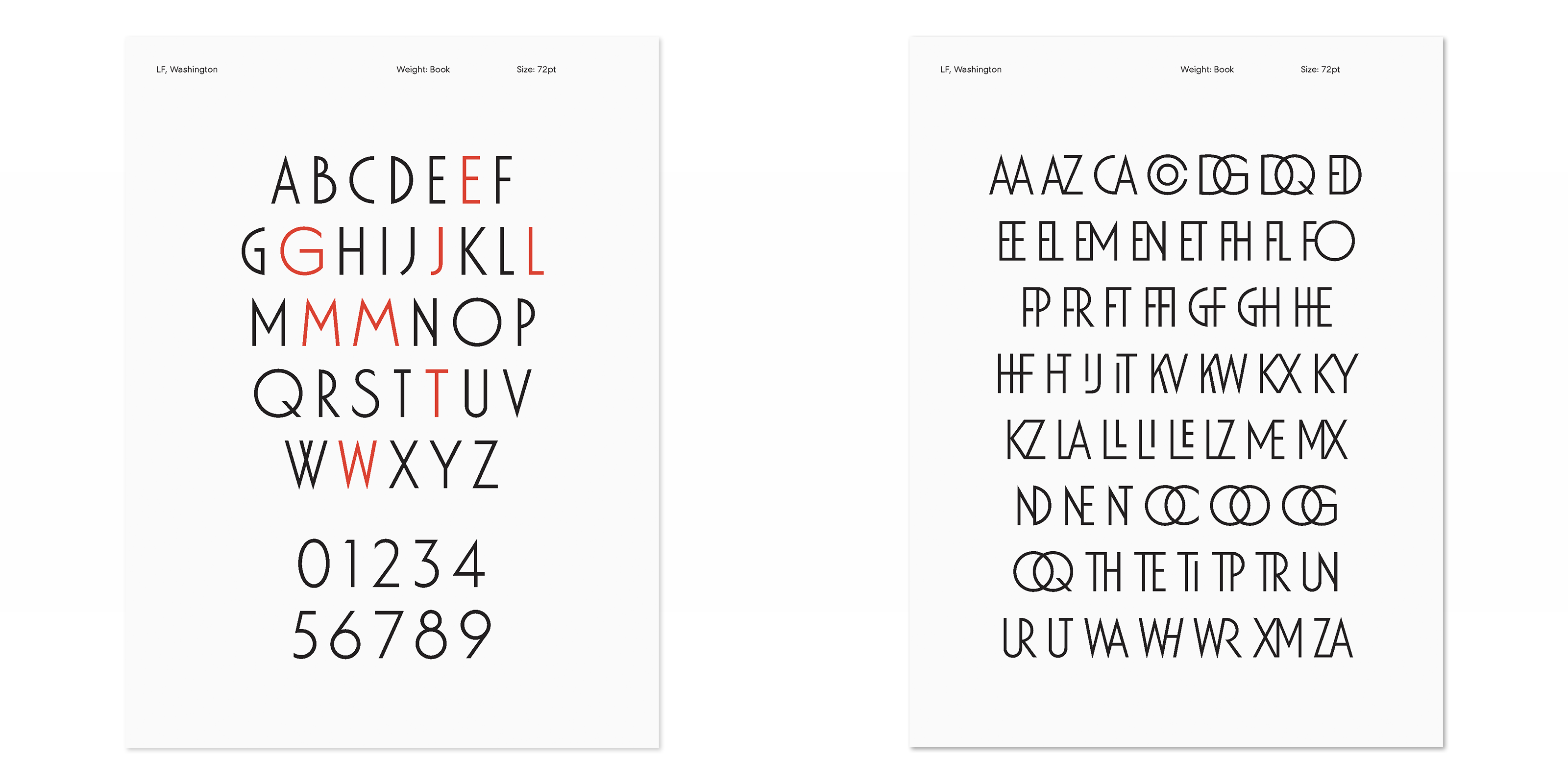
WF Washington, alongside some of the font's custom ligatures
‘We’re trying to use typography in an architectural way,’ says Wilson. The primary expression of this is the sign, a beautifully crafted piece of product design that builds on the original but not only renders the type more cleanly and graphically but boils the identity down to a crisply delineated square. ‘We also wanted to help people understand that this store has been around since 1974 – that gave the red bar at the base of the original logo a reason to be there,’ says Wilson.
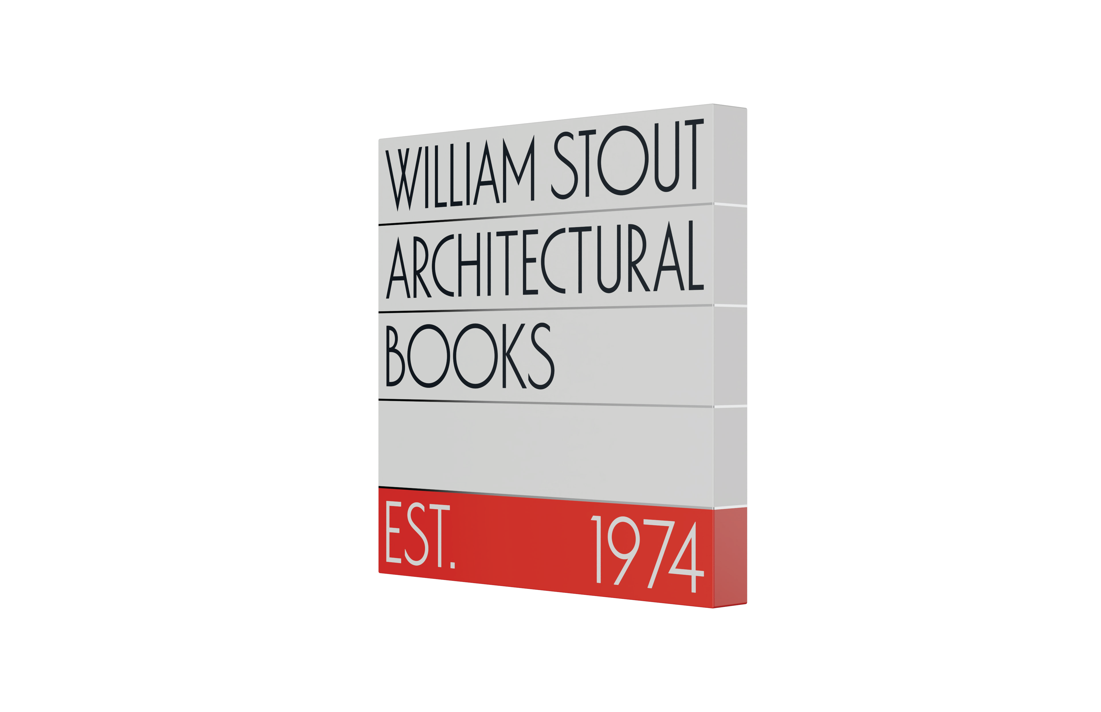
LoveFrom's new sign for the bookshop
The finished object, with its enamelled finish and polished stainless steel dividers, stands proud of the wall, a neat distillation of half a century of history both graphic and architectural.’ It also references the store’s internal reorganisation, removing a lot of the clutter ‘without removing the soul or the spirit’. In addition to the core palette of black, white and accents of red, LoveFrom has also developed an extended palette based on Le Corbusier’s Architectural Polychromy.
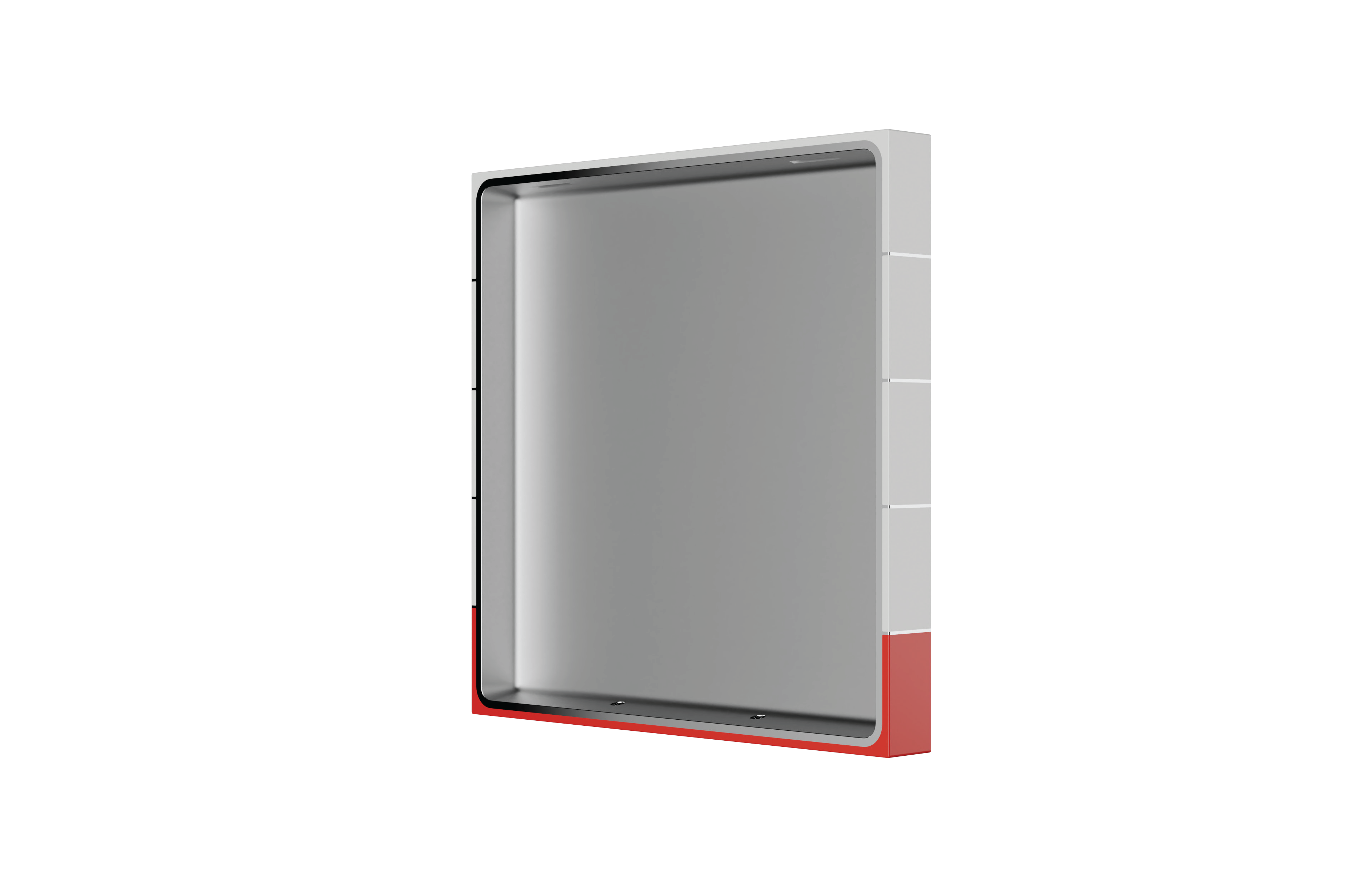
The rear of the bookshop signage, showcasing LoveFrom's attention to detail
The other key element of the new identity is illustration. ‘The physical store really is a destination for designers and architects when they come to the city,’ says Wilson, ‘but we also wanted people who discover the store online to go and check it out in real life.’
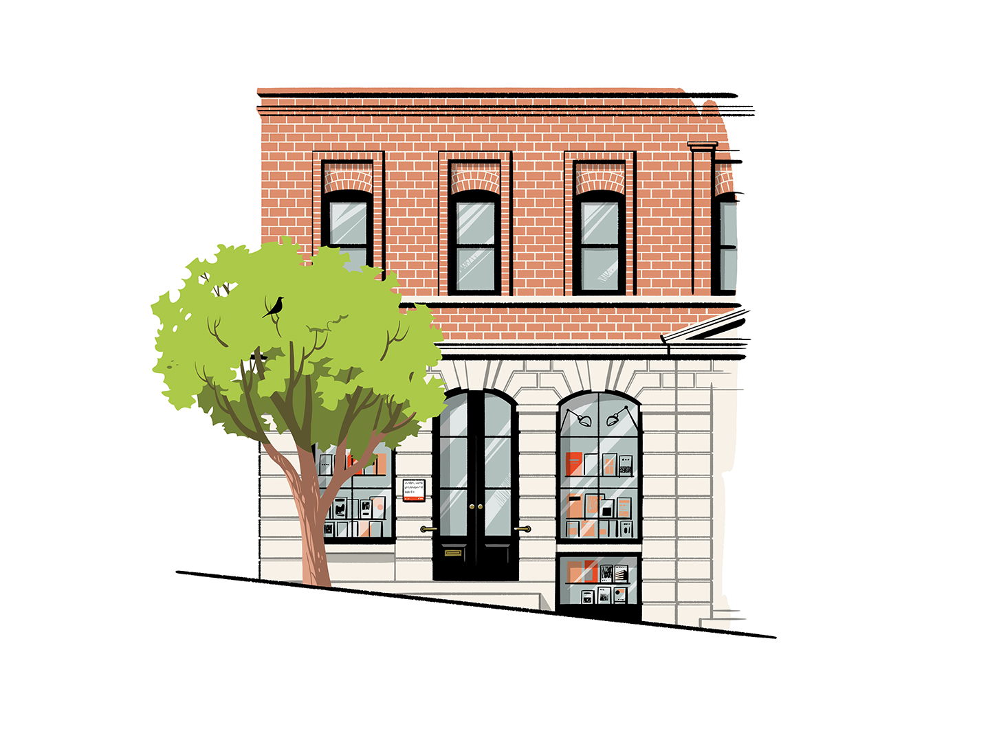
When the physical store is closed, so is the door on Hashimoto's website illustration
To that end, the team commissioned illustrator Satoshi Hashimoto, renowned for his hard-lined but whimsical approach to portraiture and places, to create a series of illustrations of the store itself, flanked by the signature gingko tree beside the front door. This serves as the online landing page, complete with a different illustration for each season – indicated by the presence or absence of leaves. There’s also a subtle Easter Egg, a rendition of the Eames House Bird sculpture that hops around various locations in the scene and provides a direct link to the Eames Institute.

Satoshi Hashimoto's portrait of Bill Stout
Additionally, Hashimoto has also created some illustrations of William Stout himself, a familiar and friendly character with beard and signature glasses, to continue the bookseller’s legacy and presence. ‘The caricature of Bill becomes the mascot for the store,’ says Wilson, showing how it illustrates the tote bags.
The designers will definitely be continuing their association with the bookshop. Next up is the 'Stoutmobile', a mobile bookshop housed in a 1970 Volkswagen Type 2 van that will soon be graced with a LoveFrom livery.
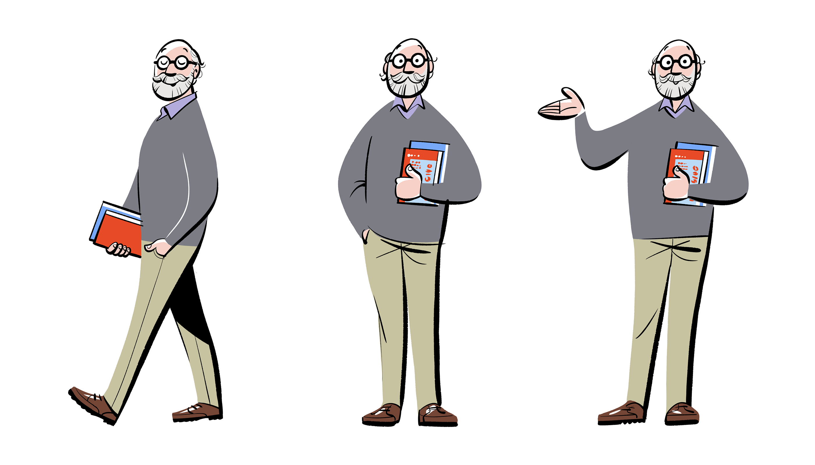
Hashimoto's Bill has become the store's mascot
‘We don’t just design guidelines and hand them off and hope for the best,’ Wilson says. As well as signage and templates, there’s talk of reviving the output of William Stout Publishers, a publishing arm that began with the Pamphlet Architecture series, as well as quarterly bulletins and even architectural maps of the area.
‘Just because we do something pro bono doesn’t mean we don’t do what it takes to do a proper job,’ Wilson says. ‘Our approach at LoveFrom is as a team that mixes graphic designers, product designers and architects. This project was a real intersection for us – it really played to our strengths.’

Customers, an illustration by Satoshi Hashimoto
The new identity and wider recognition for William Stout Architectural Books should mitigate the steep learning curve of learning old systems, adopting new ones and navigating the inevitable eccentricities one might find in a half century-old business driven by passion.
With a knowledgeable staff – the majority of whom are recent architecture graduates – as well as the collective retail experience on the Eames Institute team (including Smith, who started her own store in a former career), William Stout Architectural Books is in safe hands. Events, signings, talks and panels have already happened following the acquisition, and the new identity will take things up another gear.

Hashimoto even illustrated the store's famous book ladder, designed by Stout himself
The shop now has a Stout Junior section and recent publishing history has seen more and more design- and architecture-focused books for children. ‘It’s been so interesting as we’ve seen the clientele get younger and younger over the last few years,’ says Smith, who recognises that there will also be a hungry audience for beautiful design books amongst students.
‘Jony told us that the first time he came to San Francisco in 1989, he visited Stout Books,’ says Smith. ‘I have such a deep affection for this bookshop and the extraordinary community that Bill lovingly created over five decades,’ Ive says. ‘It has been an honour to be able to make a contribution to an institution we love and value so profoundly.’
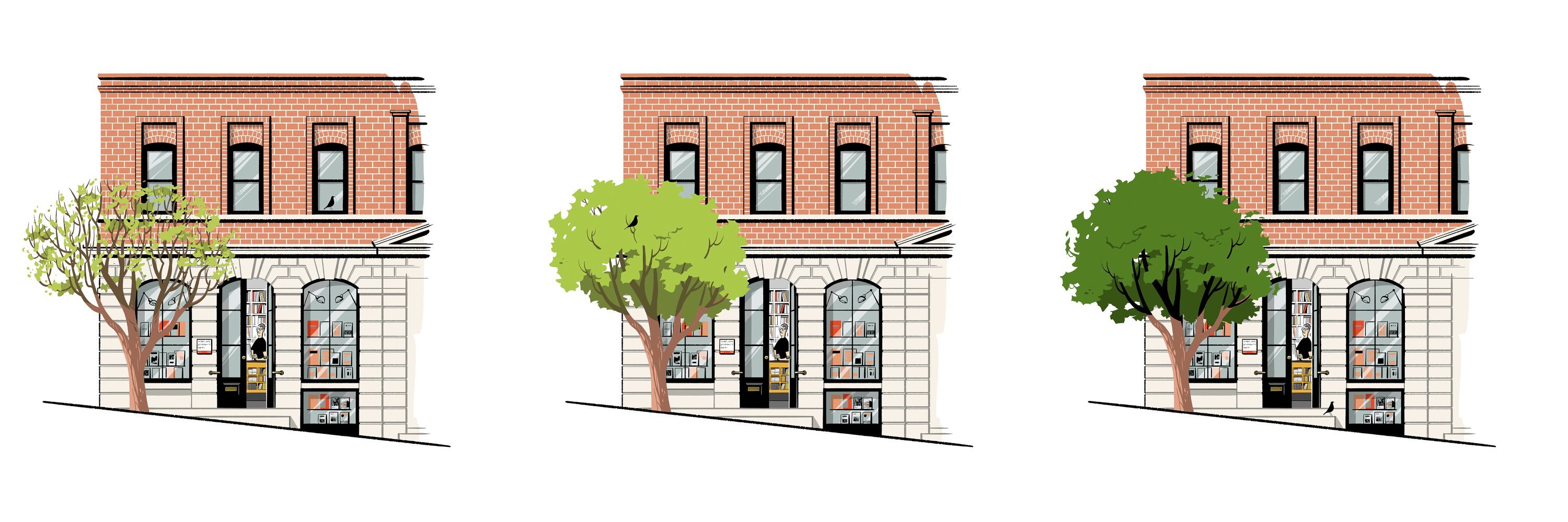
Hashimoto's seasonal exploration of the storefront: early spring, spring and summer
While Stout has now stepped back from the day-to-day running of the bookshop, his presence is still very much felt, and not just through Hashimoto’s deft pen portraits. According to Smith, ‘Bill says he started this store because he wanted to buy books for himself.’ Bibliophiles of all ages will find memories and creative magic within.
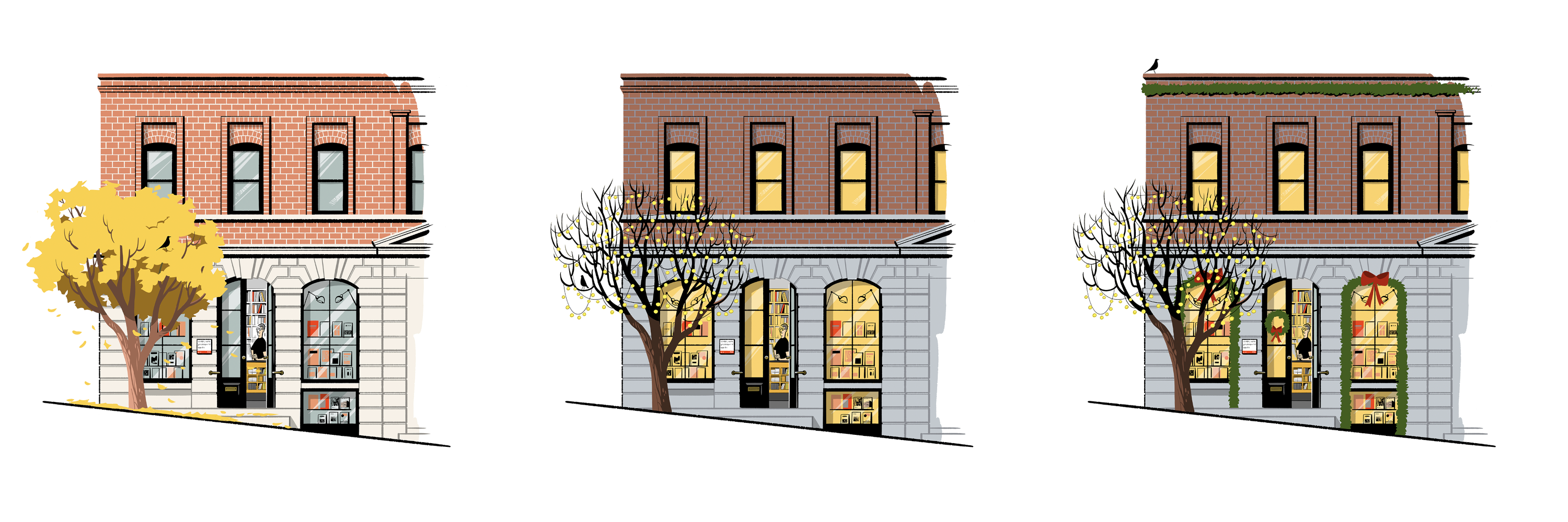
Hashimoto's seasonal exploration of the storefront: fall, winter and winter holiday
William Stout Architectural Books is at 804 Montgomery St., San Francisco, California 94133 and at StoutBooks.com, @StoutBooks
EamesInstitute.org, @EamesInsitute
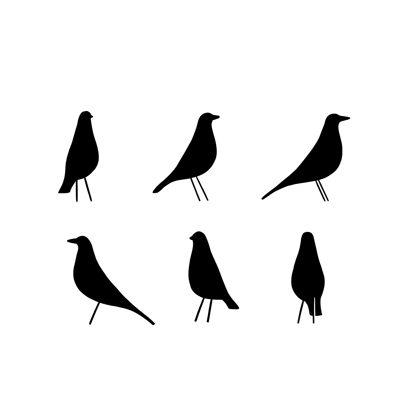
The Eames House Bird makes an appearance on the store's website
Jonathan Bell has written for Wallpaper* magazine since 1999, covering everything from architecture and transport design to books, tech and graphic design. He is now the magazine’s Transport and Technology Editor. Jonathan has written and edited 15 books, including Concept Car Design, 21st Century House, and The New Modern House. He is also the host of Wallpaper’s first podcast.