Get the picture? A new exhibition explores the beautiful simplicity of Japanese pictograms
The simple, minimalist forms of a pictogram are uniquely Japanese, as new exhibition 'Pictograms: Iconic Japanese Designs' illustrates

Simplicity is a complex thing to master, as the design team at Nippon Design Centre appreciated when preparing to welcome the world to Tokyo for the 1964 Olympic Games. In need of a visual communication which could elegantly bypass language barriers, they created the first full set of sporting pictograms, which set the international standard for sporting events. It changed our landscape as we know it, creating a new way to communicate – leading to emojis, from the Japanese, with e meaning picture and moji meaning character – and a new awareness of the power of good design.
‘For me, an effective pictogram is one that balances aesthetic appeal with consistency,’ says art director and graphic designer Daikoku Daigo, who has been considering the subject in his role as curator for the current exhibition, ‘Pictograms: Iconic Japanese Designs’ at Japan House in London. ‘In other words, it’s not just about the beauty of each individual icon, but also about how unified and harmonious the entire set looks when viewed together.’

The creating of a pictogram
Daigo has considered the history of the pictogram, tracing their origins right back to cave paintings 15,000 years ago and through to ancient Egyptian hieroglyphics. ‘What I found most fascinating is how pictograms vividly reflect social change, with their forms evolving dramatically over time,’ he adds. ‘This exhibition traces the history of visual communication – from the cave paintings of Lascaux to Olympic signage and today’s emojis – but as far as pictograms themselves are concerned, the story really begins with Otto Neurath.
Neurath’s designs – which I hesitate to call “pictograms” since many were statistical diagrams or collections of pictorial elements – nonetheless often featured motifs and themes to visually communicate information. While Nuerath’s work reflected the instability of wartime society, pictograms used at the 1964 Tokyo Olympics represented a new vision. With this international event, the focus shifted to how people from entirely different cultures could communicate with one another. Their functionality and design quality were tested and proven successful on a global stage.’

After the Olympics, rapidly growing advances in transport, particularly in rail and air, increased the demand for quick communication, which grew simpler as concentration spans get shorter. ‘To achieve a high level of aesthetic success when designing a pictogram, it’s essential to have a polished eye for the defining characteristics of a subject and the technical skill to distill complex forms into simple, easily recognisable shapes. Maintaining consistency across a series of pictograms, on the other hand, requires a broader perspective—one that considers how the pictograms work as a group, ensuring they follow the same design principles and remain cohesive when displayed side by side.

‘I also believe that a good pictogram should go beyond functionality; it should be designed with a clear sense of the impression you want to create. I often compare this to choosing a typeface: just as the mood of a text changes depending on whether you use a serif or sans-serif typeface, the expression of a pictogram should align with what you want to convey. Only when this harmony is achieved can we truly call it a successful pictogram.’
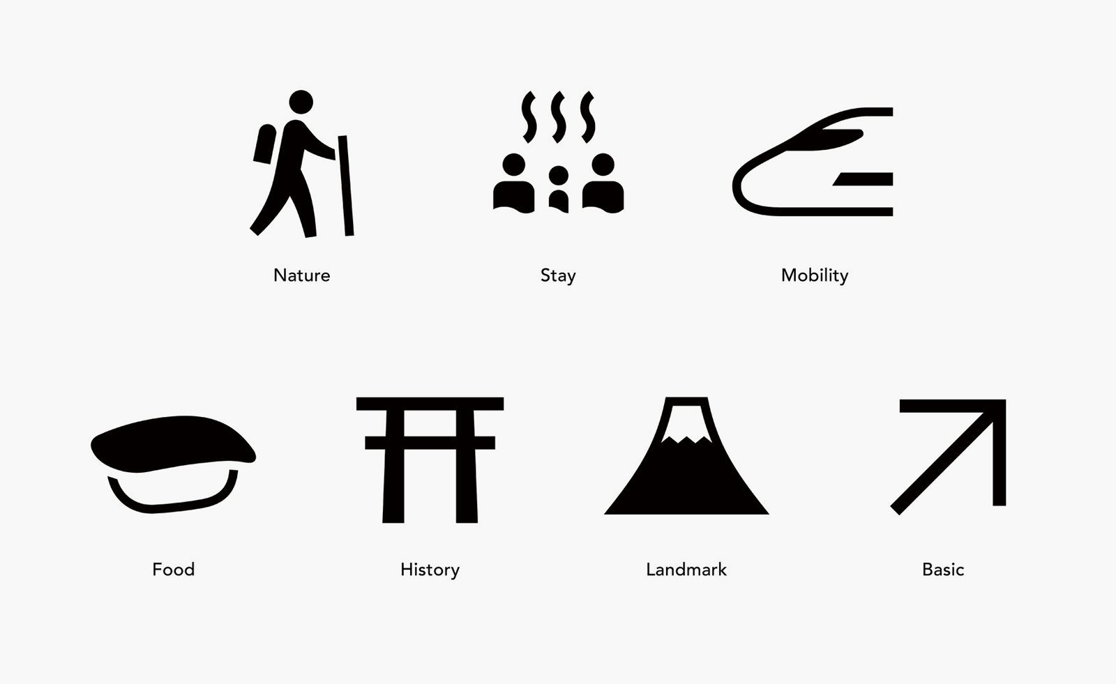
In their beautifully rendered attention to shapes and minimalist silhouettes, the pictograms are a classic example of reductive Japanese design, which removes, rather than adds, unnecessary details. ‘Successful pictograms have a distinct visual beauty,’ says Daigo. ‘When that appeal is paired with consistency that unites the entire set, the pictograms transcend mere symbols and become a true “visual language.”’
Pictograms: Iconic Japanese Designs at Japan House, London, until 9 November