Inside the design of Apple Mac's latest update
Alan Dye, Apple’s VP of human interface, tells all on the Mac OS update ‘Big Sur'

Receive our daily digest of inspiration, escapism and design stories from around the world direct to your inbox.
You are now subscribed
Your newsletter sign-up was successful
Want to add more newsletters?
Last month Apple announced the biggest design update of the Mac operating system since the launch of Mac OS X 20 years ago. That design overhaul caused some consternation amongst Apple’s long-term loyalists who loved the raw pixel power of the original OS, the mother of all screen-as-desktop OS designs.
Apple was then still transitioning from a cult niche player to industry titan with the pivotal iPhone launch still six years off. Apple’s family of devices now stretches from Apple Watch through phones, pads, laptops and desktops and it has developed a fabled eco-system of apps and services.
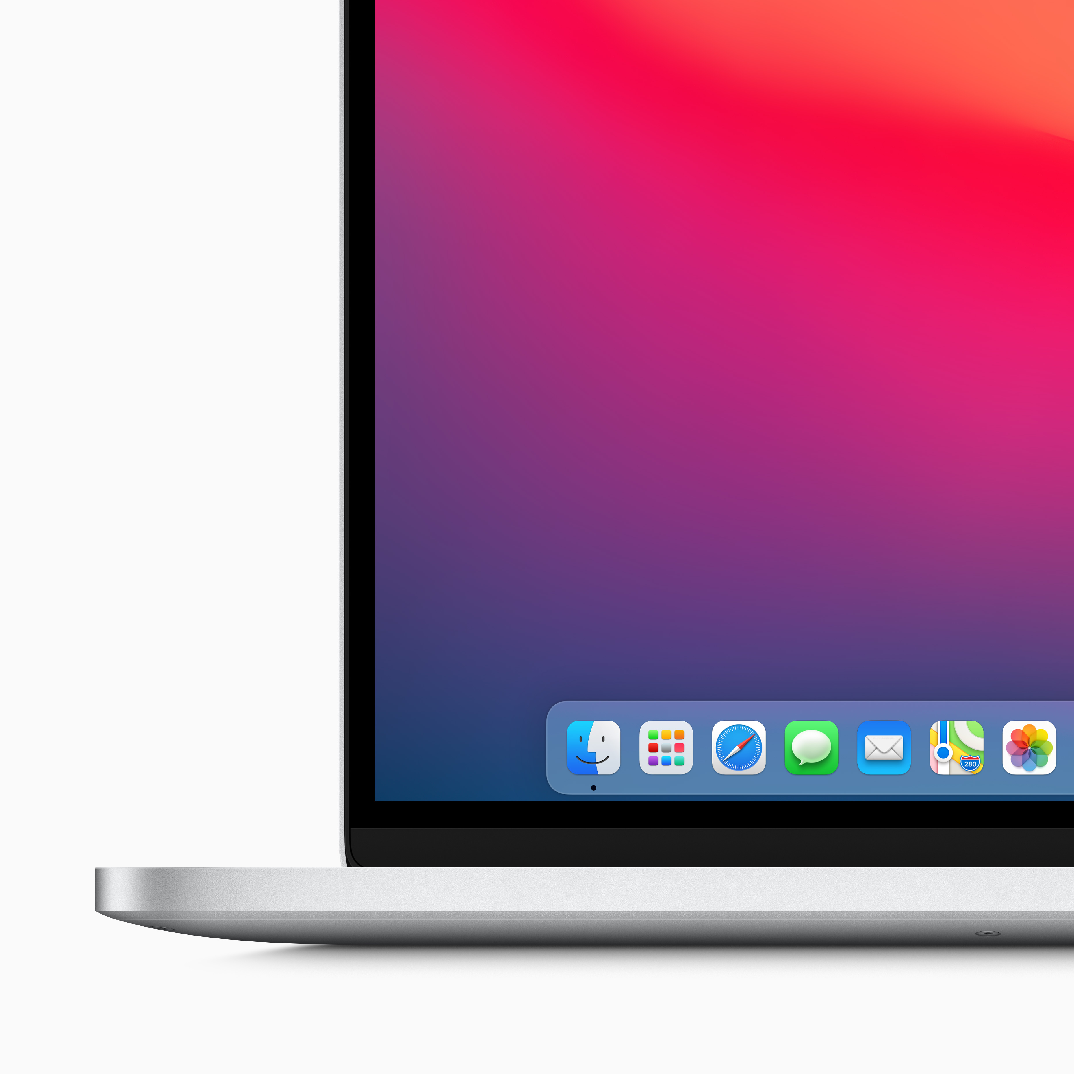
The new OS update, turning it up to 11, feels less like a radical shift than a closer alignment of the design language across that eco-system. Up until, now Apple has maintained a significant – if narrowing – design distance between the forms and furniture of the Mac OS and the iOS of its touch screen smart devices. Big Sur, as the new OS has been tagged, pretty much closes that gap, most obviously in the ranks of app icons in the Mac’s dock. They now align, sharing the carefully rounded-off box icons, or chiclets, on the iPhone and iPad. (It’s also a culmination of a long process of paring back and simplifying the design of the original OS X, at launch a little too literal, fussy and in love with the potential for creating depth, texture and shadow).

Alan Dye, Apple’s VP of human interface, says that this is more than a simple design merge of the Mac OS and iOS and that Big Sur retains something essentially Mac. ‘It would have been really easy for us just to use the same exact icons from iOS and probably saved us a fair amount of time. But we just didn't feel like that was the right thing to do. We really want to keep the spirit of what we love so much about Mac icons. And of course, what makes the Mac the Mac, the ease of use and the experience.’
And, says Dye, the re-design is less about Macs looking and behaving more like iPhones than pan-device cohesion. ‘I don't think of it so much as making the Mac more like iOS. I actually think we focused on the design of the system across all of our products and brought more consistency. We know people are moving between these products more so now than ever, and throughout every day of their lives.’
The Mac line-up represents only 10 per cent of Apple’s business so you can see the commercial sense in making the experiential shift from an iPhone or iPad to a Mac as seamless as possible. ‘We know that so many people who are coming to the Mac already have an iPhone,’ Dye says. Easing that slide across is something of a trick though when you have to protect the ‘Pro’ hardware’s reputation as a serious and powerful piece of kit for creative professionals.

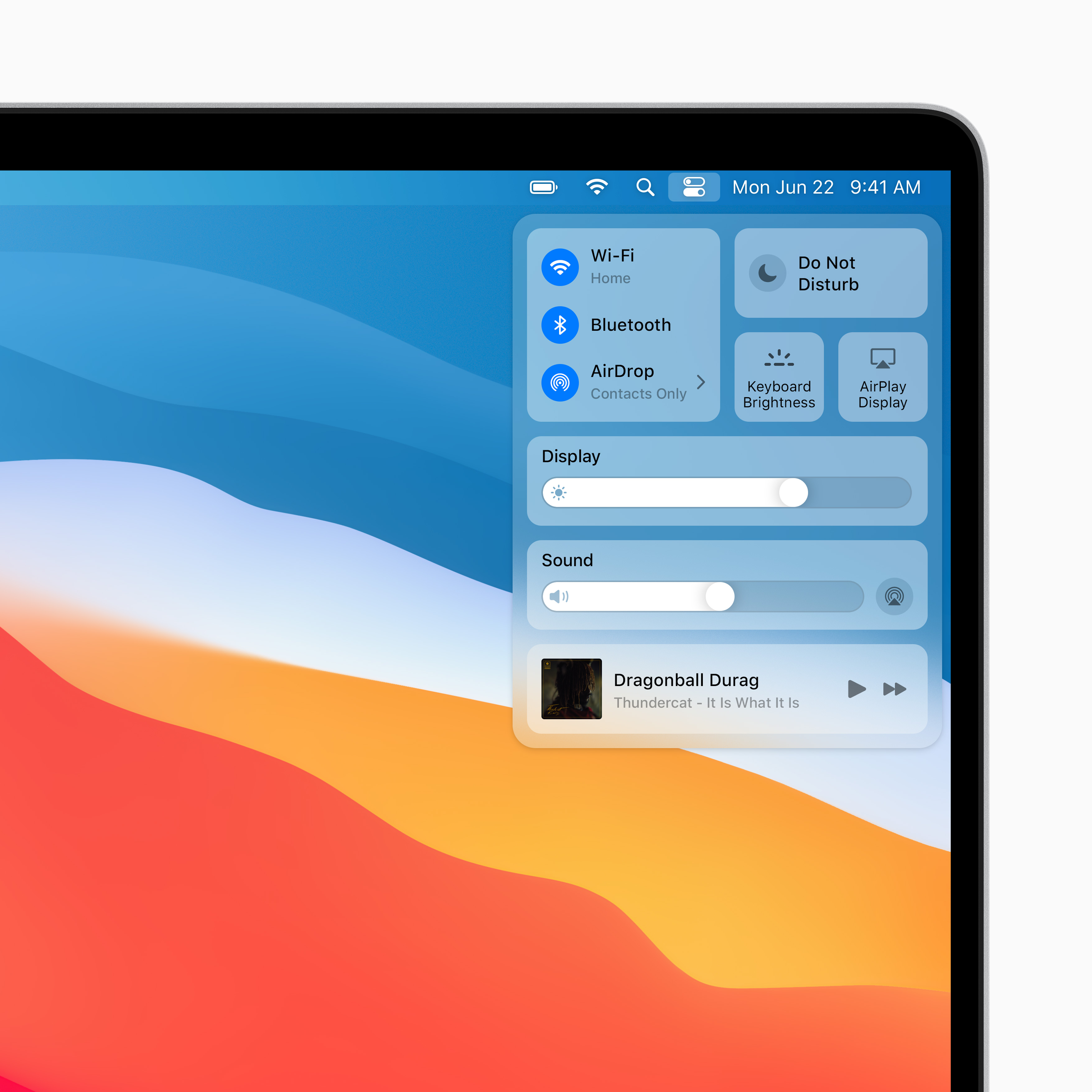
The redesign though is more rigour than razzmatazz. As Dye says, what is most obvious about Big Sur is a ‘reduced visual complexity’. A key part of this is making the right and relevant controls most visible and available at the right time. The smart use of translucency and shading helps create a kind of fluid hierarchy of controls. ‘Buttons and controls appear when you need them and disappear when you don’t.’ Full-height sidebars and integrated tool bars positions controls more handily. And a new control centre makes essential adjustments easier while on-screen ‘widgets’ offer bite-sized windows into favourite apps.
The Mac universe of available applications is nowhere near as big and diverse as the one that circles the iOS. But a key impetus for the Mac OS overhaul is to encourage developers to translate and re-engineer iOS-only apps for the Mac (remembering that iPhone and iPad apps are designed around the possibilities of touch screen technology). ‘We're making it so much easier for developers to make experiences and applications that can so easily live on whatever product,’ says Dye. ‘I think that's always been a goal of ours, to break down that need to consider what product you're on and just let the experience be the focus.’
Of course, more apps means potential for more screen clutters and chaos. Dye says the design discipline required to make apps useful on the reduced real estate of the Apple Watch has sharpened their de-cluttering skills. ‘We've been obsessed with this concept of information design,’ Dye says. ‘Because of the work we've done on the watch, we've learned a lot about expressing a great deal of information in a very small space and actually with zero interaction. I can look at my watch right now and see eight or nine different data points that tell me a lot about what's going on in my world. I never even have to open up an application.’

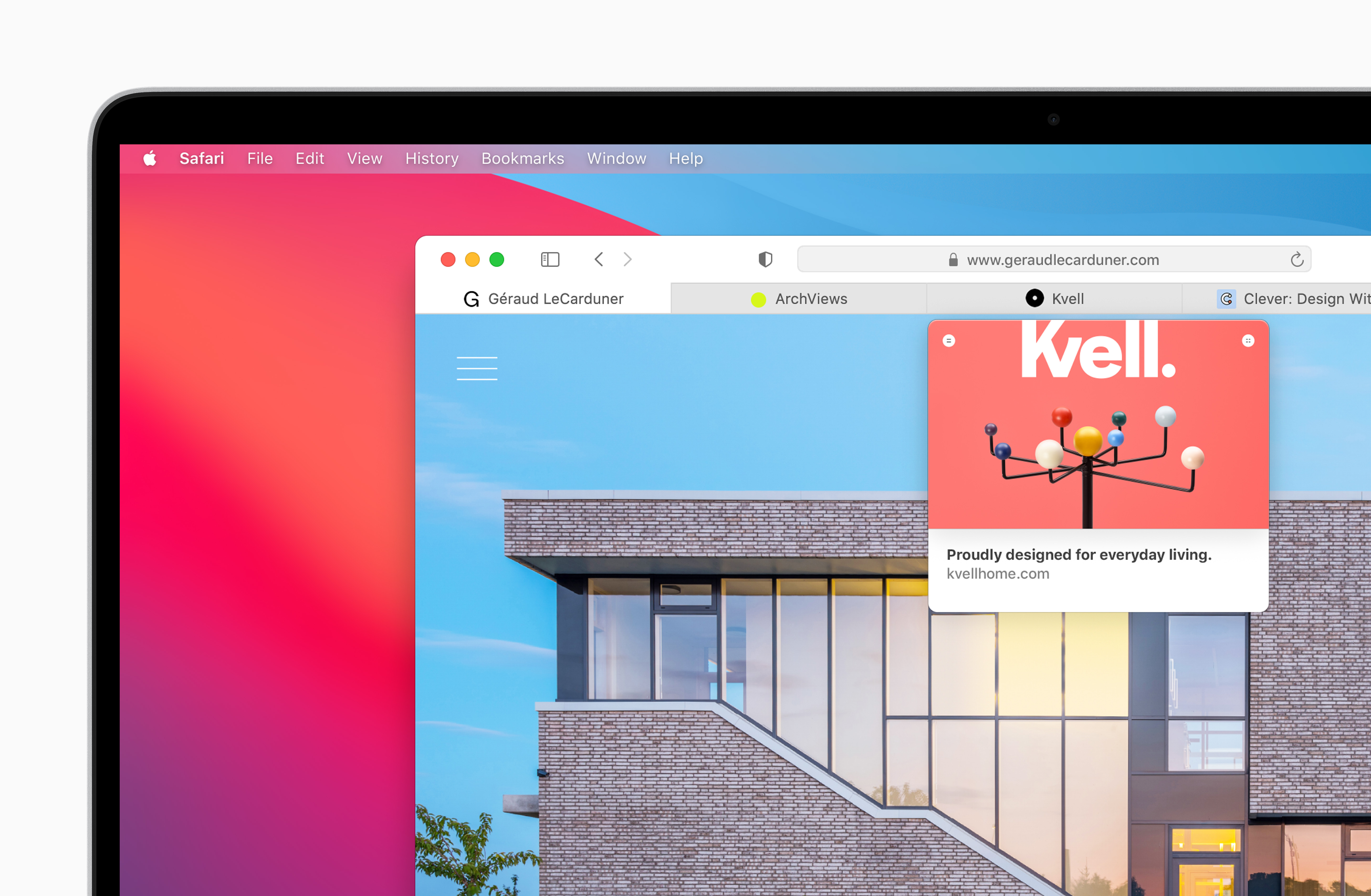
Apple’s in house-apps have also been given a re-boot. Safari, Apple’s web browser, has been given its biggest design over-haul since its launch and promises ‘industry-leading’ speed. The re-designed Messages app goes big on group chats and offers better search and more fun with emojis and ‘Memojis’ as Apple calls them. While Apple’s Maps, once one of it’s few mis-fires, has been completely redesigned. And while the new indoor maps of airports and shopping malls are less useful than they might have been six months ago, they are still a godsend.
Big Sur won’t actually be available until the autumn (unless you want to try out the Beta version), giving developers time to get their updates and advancements ready. But the launch of OS 11 comes when many of have been spending more time than ever looking at our laptop screens. And their functional stretch is now enormous.
Apple’s various Macs are now part-professional tool, part-conference room, modelling shop, front-of-house for an entertainment eco-system, virtual social space, shopping centre and more. The OS is the place we do much of our work and a good deal of our living. And the potential Covid-era and post-Covid revolution in where and how we work makes OS design even more important and challenging. ‘We have a lot of work to do there and we're thinking about that,’ says Dye
INFORMATION
Receive our daily digest of inspiration, escapism and design stories from around the world direct to your inbox.