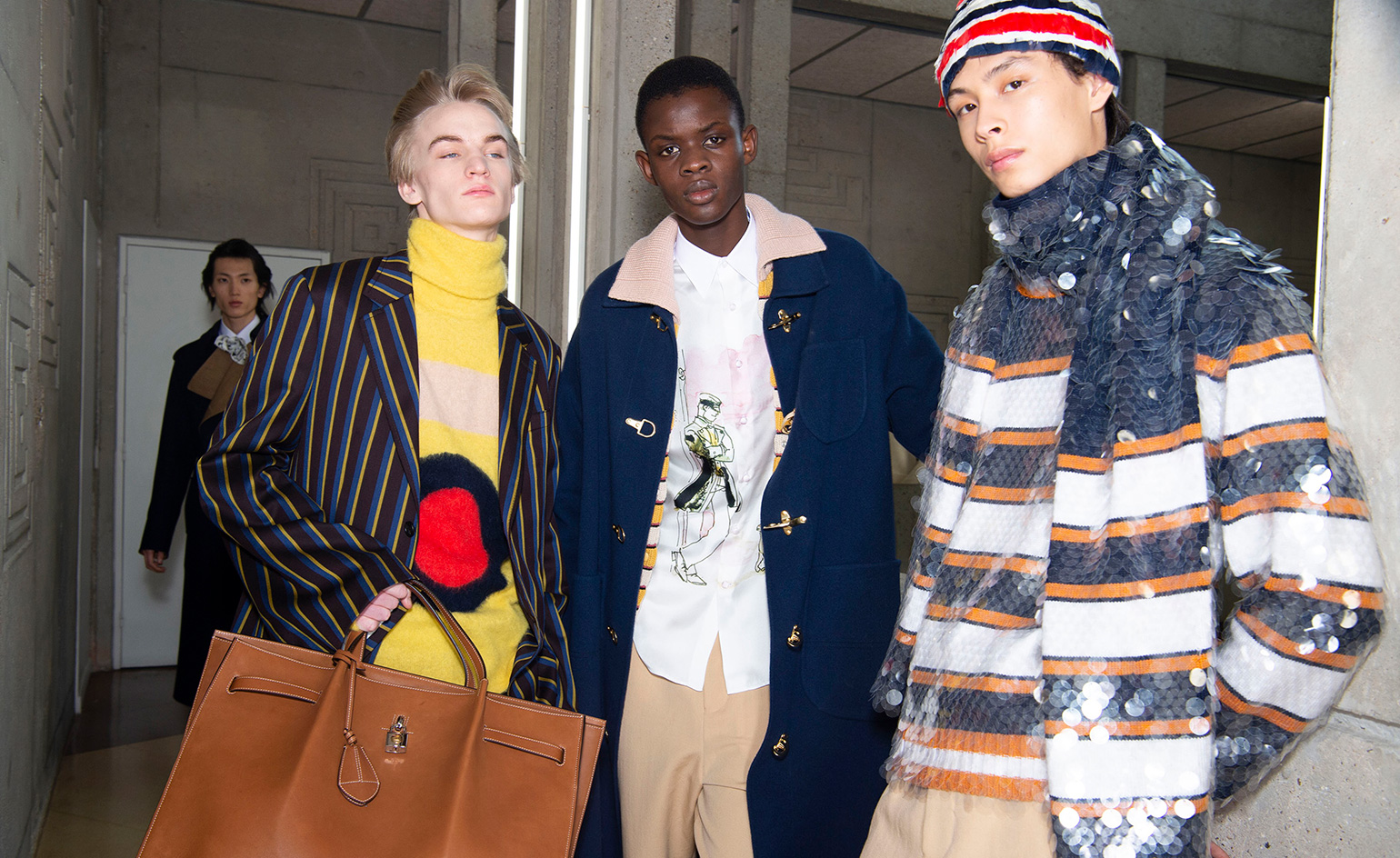
Lanvin A/W 2020 Paris Fashion Week Men’s

Mood board: The invitation to the show was a limited edition print of two men at sea by the Italian comic book maker Hugo Pratt. Since arriving at the house, creative director Bruno Sialelli has conceptualised a waifish sailor-boy charm. ‘It is a very accurate time to talk about your youth and naivety, about expectations and plans,’ he said of the collection. Growing up he was obsessed with the Corto Maltese series of comics created by Pratt in the late 1960s. The books followed the pursuits of an adventurous sailor. ‘His father is Cornish, his mother is Spanish and he crossed the sea. There’s something very beautiful in this story and thinking about him, his wardrobe, his trips. It felt very inspiring to me.’
Best in show: Striped blousons were worn with lightweight jackets. Pants ballooned at the hem or were tie-dyed at the cuff. Cotton shirting had matching cummerbunds. The look brought the maritime into the 1990s America of MTV and skater kids. ‘I was not really a skater but I was really into Tony Hawk and Jason Lee and the whole movement. It felt right to dig into that and imagine a cool, young crew who are looking further,’ Sialelli said. Some of the cropped wide trousers and boots were inspired directly by Corto Maltese. ‘He is a universal masculine figure that you would want to relate to. With certain constructions and covered buttons, we wanted to have an almost historical feeling but still very urban and real.’ The show was staged inside the Centre National de la Danse – on Instagram, models were taped skateboarding in and out of the lifts and up and down the ramps of the Jacques Kalisz’s brutalist citadel. Denims had swag. Knitted collars flopped out of coats. Clear paillettes on striped knitwear caught the sunlight.
Sound bite: Jeanne Lanvin was one of the first to create a logo and apply it to more than just the label. For A/W 20, it appeared liberally spilt over leather hold-alls and accessories: ‘It has been interesting to discover how she used the logo and that made me want to be more playful with it. It is the image of a woman dancing with her daughter so it has a softness. I wanted to use that image that comes from the very beginning of the house. It reflects the emotion, the reason she started the business in the first place,’ Sialelli said.
Receive our daily digest of inspiration, escapism and design stories from around the world direct to your inbox.
London based writer Dal Chodha is editor-in-chief of Archivist Addendum — a publishing project that explores the gap between fashion editorial and academe. He writes for various international titles and journals on fashion, art and culture and is a contributing editor at Wallpaper*. Chodha has been working in academic institutions for more than a decade and is Stage 1 Leader of the BA Fashion Communication and Promotion course at Central Saint Martins. In 2020 he published his first book SHOW NOTES, an original hybrid of journalism, poetry and provocation.