Sans serif: Google unveils new logo
Odds are, your office and your friends – or your Twitter feed, at least – were all talking about one thing this morning: Google's modern makeover.
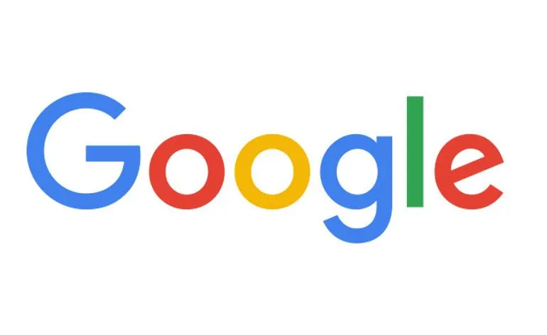
The internet behemoth launched a brand new logo last night, stripping it free of the characteristic serif font and bright, primary colours. Well, almost. 'We've taken the Google logo and branding, which were originally built for a single desktop browser page, and updated them on a world of seamless computing across an endless number of devices and different kinds of inputs,' states the brand's blog, announcing the big reveal.
The typographic logo dances around the screen in an animation created for the launch, transformed into a string of coloured dots that bounce and hop with childlike glee to form the definitively rounded new font and fleet of new logos. The move towards a flat sans serif with a slightly muted palette follows the neomodern wave the tech world is currently riding. The hybrid style, which values practicality and puritan asceticism above all, is clean, geometric and uniform.
Whilst legibility and loading times may be their main justification for the move, it is no doubt much more to do with the recent restructuring, having recently put its many divisions under the umbrella of new parent company, Alphabet. Either way, the (brighter, simpler, younger) design will soon become as loved as the former logo – if it hasn't already.
Receive our daily digest of inspiration, escapism and design stories from around the world direct to your inbox.