Graphic design studio LucienneRoberts+ reimagines the display system at the Royal Academy

It’s an exciting year for the Royal Academy, as it celebrates its 250th anniversary – with David Chipperfield’s highly-anticipated redevelopment that includes a new bridge connecting Burlington Gardens and Burlington House, an auditorium, and redesigned galleries.
Chipperfield described the redevelopment project as ‘a masterplan made of small pieces.’ Perhaps one of the smallest details in that masterplan comes courtesy of London-based graphic design studio LucienneRoberts+, who has contributed to the historic 250th anniversary redesign with a small but very significant shift inside the Academy: a new system for free displays – of which there are many more in Chipperfield’s transformation.
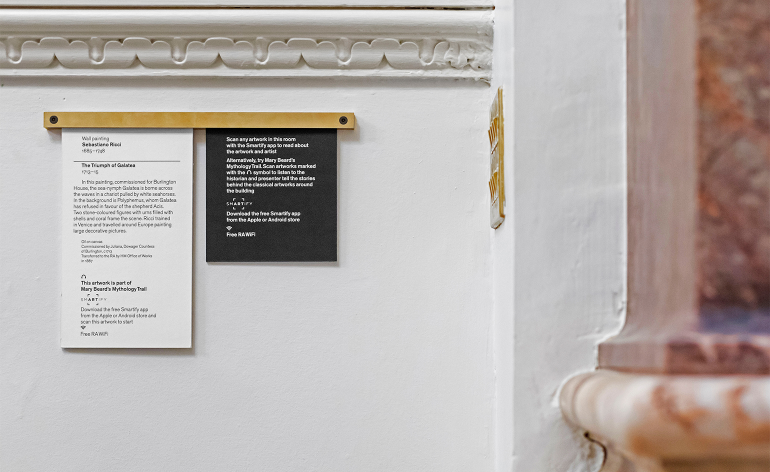
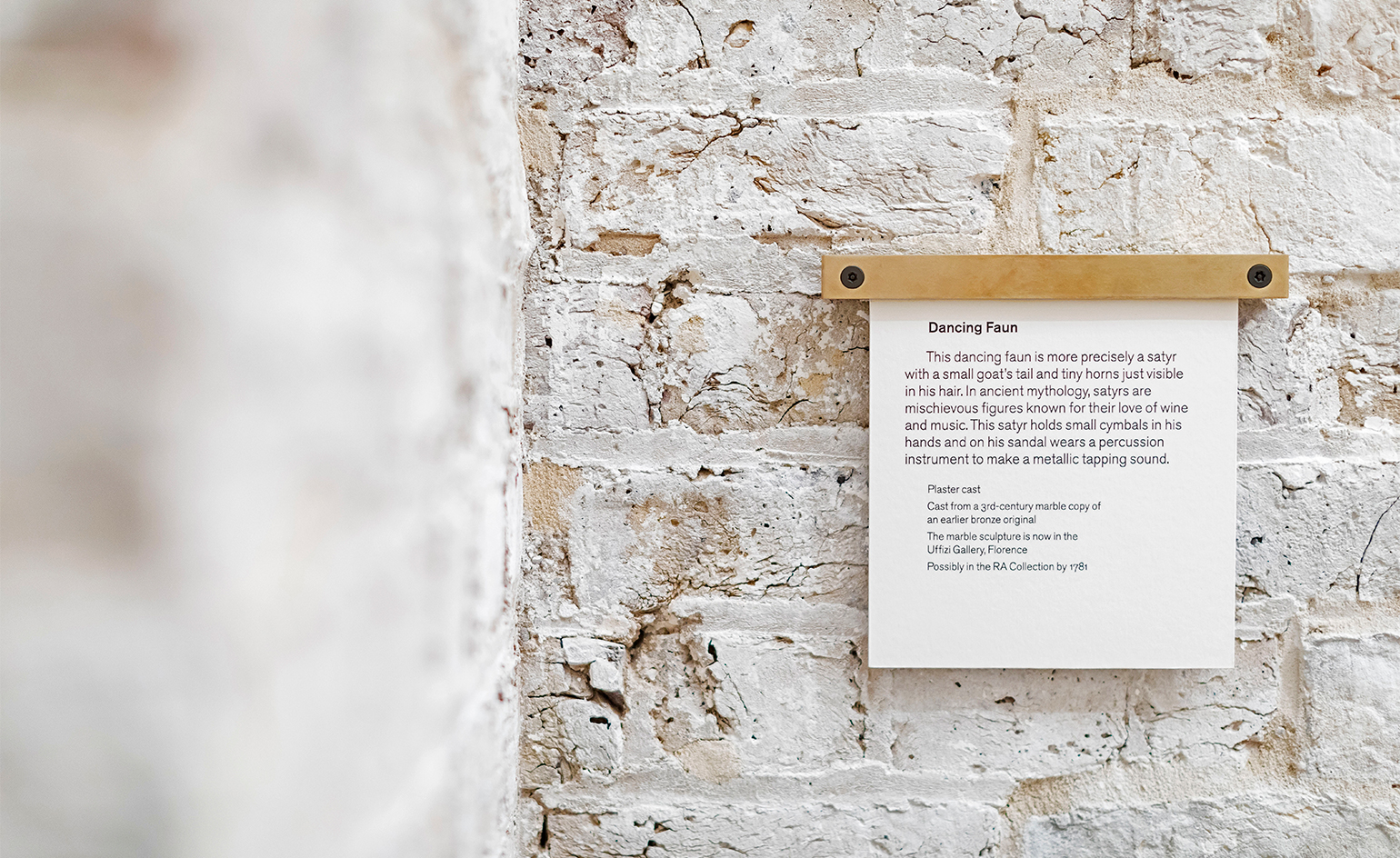
With the aim of ‘drawing on the past – but in contemporary ways just as the RA does’, the studio approached the brief with both function and fun in mind – reflected in the results. They have done away with unattractive and often unintelligible labels, and come up with an easy-to-install idea that looks good while not stealing the viewer’s eye.
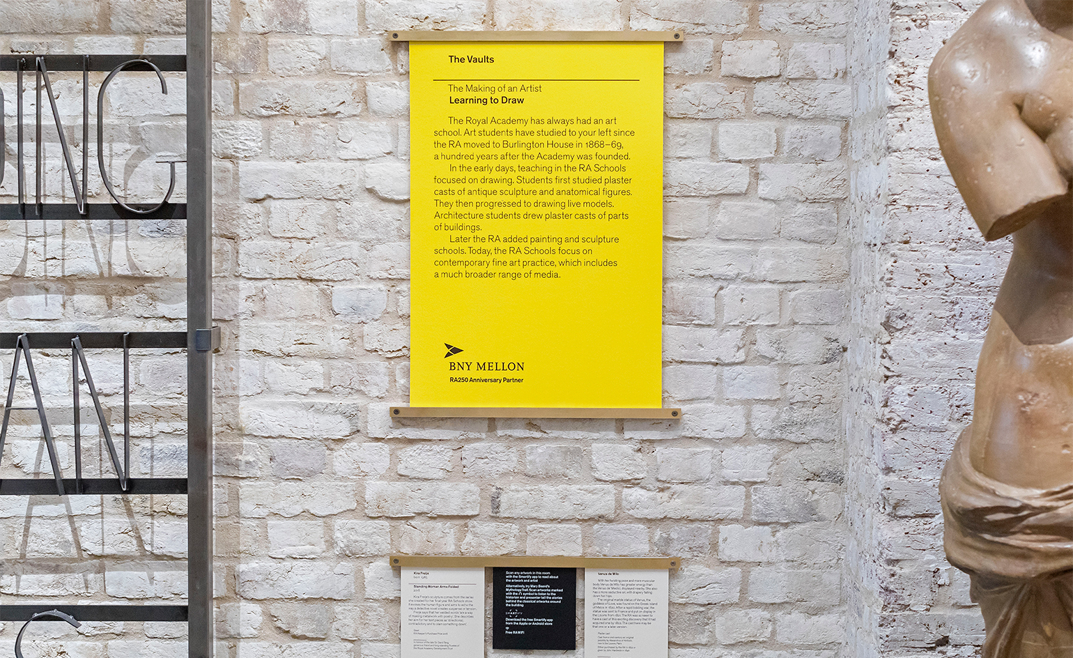
‘We developed a modular rod system that allows RA staff to change or reconfigure labels quickly and easily.’ LucienneRoberts+ explains. Their elegant, adaptable brass rods (brass was chosen as it’s ubiquitous in and around the RA, from door knobs to light switches) have several innovative touches, from their flexible positioning – they’re able to be hung horizontally or vertically, to respond to different kinds of artwork installations – to their two-point adhesion, meaning they can cope equally well with painted walls and the buildings’ historic bricks.
The labels that the rods will hold will be printed on luxuriantly thick card, made specially by GF Smith, using one of the RA’s house fonts, the Sans-Serif typeface Akzidenz-Grotesk. ‘We thought long and hard about using paper in some of the RA’s busiest spaces, but the schools’ early emphasis on drawing made it the right choice to complement to the brass.’
No matter the amount of information, the distinctive brass system will make interpretative labels throughout the galleries more cohesive and less cluttered. At the same time, the design of the rods makes it possible for several labels and labels of varying sizes to be hung side by side. While classic white is kept for object labels, they have taken a more experimental tack with the those introducing sections and subsections, with colours alluding to elements embedded in the architecture.
As advocates for graphic design that can distill complex ideas into accessible forms, these carefully crafted free displays prove why LucienneRoberts+ is leading the way in its field – and through the new RA.


INFORMATION
For more information, visit the Royal Academy website and the LucienneRoberts+ website
Receive our daily digest of inspiration, escapism and design stories from around the world direct to your inbox.
Charlotte Jansen is a journalist and the author of two books on photography, Girl on Girl (2017) and Photography Now (2021). She is commissioning editor at Elephant magazine and has written on contemporary art and culture for The Guardian, the Financial Times, ELLE, the British Journal of Photography, Frieze and Artsy. Jansen is also presenter of Dior Talks podcast series, The Female Gaze.