For the past few years, Loewe has been on a reinvention race. From a new design direction for its stores led by Peter Marino to the September 2013 appointment of London-based designer Jonathan Anderson as creative director, the Spanish leather goods brand has been undergoing a steady transformation. The next step on its journey is a fresh new identity, unveiled today.
'Past, Present and Future' is the mantra that is guiding the fashion house's reinvention, and as part of this creative renaissance, graphic duo M/M (Paris) have been tasked with interpreting the brand's essence with a new face that will be officially introduced at the menswear presentation later this month.
The original logotype, set in a version of the Bembo font, has been re-designed by the Parisian pair in a typeface inspired by German-born typographer and calligrapher Berthold Wolpe. Looking at the history of the brand, the designers found that the trajectory of Wolpe (who was born near Frankfurt and emigrated to Britain in 1935) echoed that of Enrique Loewe Roessberg, the German-born craftsman whose name came to identify a cooperative of Spanish leather artisans in the mid-19th century.
The new typography is a testament to Wolpe's legacy and the modernity of his work. Famous for his 1932 Albertus font (still used for signage across the City of London and widely present in popular culture - its fans including British band Coldplay and director David Lynch) and his book cover work for Faber and Faber, Wolpe has been having a moment in the past few years. The new logotype nods to his 1937 Pegasus font, a forgotten typeface that the designers discovered in the archives of the Victoria and Albert Museum, who paid homage to Wolpe with a retrospective in 1980. 'We then adapted his font structure, enhancing details through our digital tools and reinforcing it to give the house the authority it deserves,' explain the designers.
M/M (Paris), who have worked closely with Anderson since he took up the reins at Loewe, also remodeled the brand's Anagram (informally known as 'el cangrejo', or 'the crab'), a quadruple-L insignia designed in 1970 by Spanish artist Vicente Vela. The two designers' take was, as usual, meticulously researched, and their logo design was delivered after an attentive study of the cattle branding practices.
'We tried to understand why the original 1970-design Anagram from Vicente Vela had this specific structure and discovered it was based on branding irons used to mark the cattle and the leather skins,' the duo explain. 'We studied the branding irons from all around the world to comprehend how metal is folded to make these structures.'
Redrawn with characteristic M/M (Paris) finesse, the new streamlined Anagram is a faithful adaptation of Vela's artwork, imbued with a new lightness that gives it a more contemporary feel.
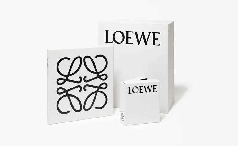
The logos appear in black on boxes, bags and envelopes delivered in a discreet grey shade called Humo (Spanish for smoke) designed especially for the rebranding, a strong contrast with the more nostalgic shades of beige and brown that defined Loewe until now.
This new identity merges the brand's quintessential Spanish tradition with its contemporary vision. Designed to be at the same time current and long lasting, it's a fitting new face to project Loewe into the future.

In a nod to the Germanic roots of Enrique Loewe Roessberg, the new logotype is inspired by German-born British typographer Berthold Wolpe's 1937 Pegasus font, a forgotten typeface that the designers discovered in the archives of the Victoria and Albert Museum, who staged a retrospective of Wolpe's work in 1980

The brand's famous Anagram, a quadruple-L insignia, originally designed in 1970 by Spanish painter Vicente Vela, has similarly been pared down for the brand's next phase

Sketches of cattle branding irons that M/M (Paris) drew inspiration from for the logo. 'We tried to understand why the original 1970-design Anagram from Vicente Vela had this specific structure and discovered it was based on branding irons used to mark the cattle and the leather skins,' they explain. 'We studied the branding irons from all around the world to comprehend how metal is folded to make these structures'

From left: Loewe's new logo launched today and the former incarnations of the 168-year-old house's branding

A selection of the house's logos from circa 1900 to 1970

'It's nearly impossible to find printed samples of Wolpe's Pegasus font,' say M/M (Paris), who found this Wolpe-designed catalogue for his retrospective in the V&A Museum's archives. 'We then adapted his font structure for Loewe, enhancing details through our digital tools and reinforcing it so to give the house the authority it deserves'

Other examples of Wolpe's work include, from left: a Faber & Faber book cover, featuring his famous Albertus font; his logo for Eagle magazine, picked out by our typographic advisor Paul Barnes (a big fan of Wolpe's work) as one of his triumphs

Another Faber & Faber book cover, with typography by Wolpe