Embrace calming blues this winter, design’s most soothing hues
Calming blue designs have a surprising effect on mood and space
Receive our daily digest of inspiration, escapism and design stories from around the world direct to your inbox.
You are now subscribed
Your newsletter sign-up was successful
Want to add more newsletters?
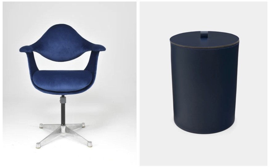
January and February are not kind to blues. Cliff Arnall, a renowned psychologist, knows better than most the impact that blue can have on our collective consciousness and, many would say, mood. It was Arnall, after all, who created the ‘Blue Monday’ tag for his client, Sky Travel, in 2004. The general thinking, based on something of a scientific formula, was that debt, gloomy weather and, perhaps, low motivation, meant January was indeed the cruellest month of the year. Therefore, the best way to raise collective spirits was to prompt us to dream about sunnier climes and book a holiday. Though, you might be more inclined to ponder the benefits of elevating the everyday with this ocean-blue velvet George Nelson 1960s Daf chair, by ICF Cadsana, Milan and charcoal-like blue Rudi Rabitti Orvetto leather wastepaper bin.
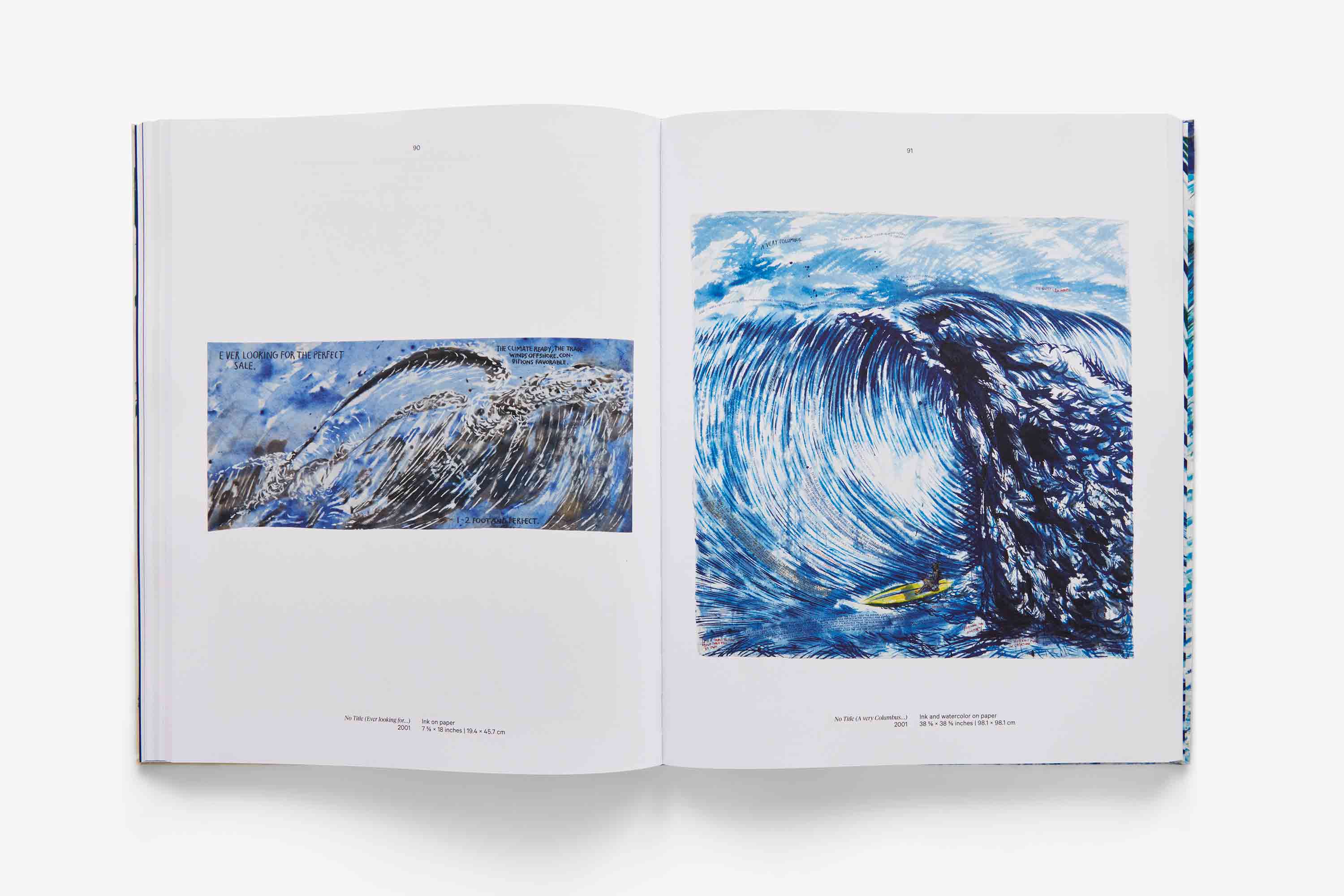
A flick through Point Break: Raymond Pettibon, Surfers, and Waves is an instant refresher on cold, dark days. Dive in and lose yourself in the all-round life-affirming glories of the ocean
Naturally, anyone, anywhere who sells anything loved the idea and so it’s never gone away, and though the PR concept has been much derided by mental health professionals and cynics everywhere, X, formerly known as Twitter goes into meltdown every January as #BlueMonday takes over. February hasn't fared so well on the public relations front, but there is an infinite stream of pages dedicated to it as the 'worst month of the year'.
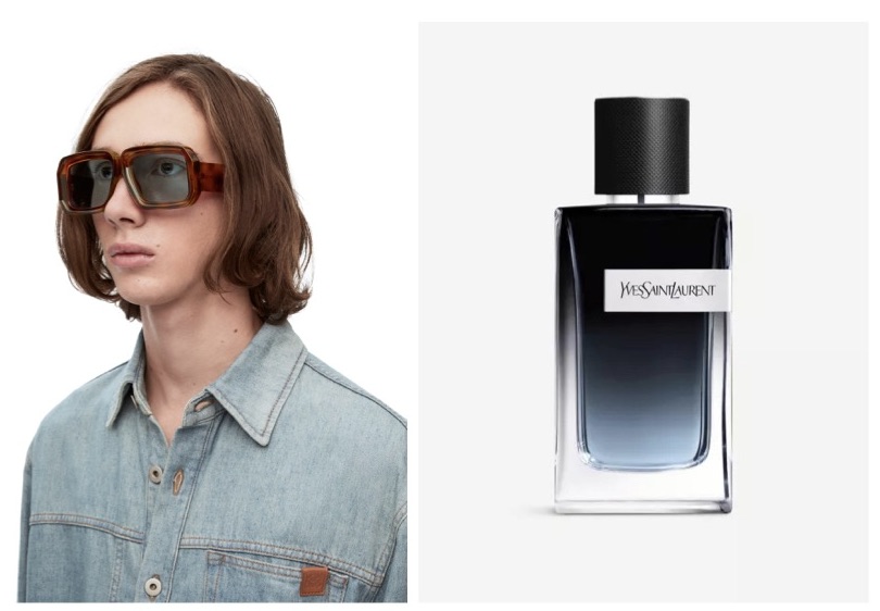
The light, Havana Blue lenses of Loewe's Diving Mask Sunglasses offer a fresh point of view, while the woody, warm scent of YSL Y Le Parfum is heightened by its inky blue bottle
Arnall, you might think, has a lot to answer for, though these days he is contrite, and has spent years seeking to reclaim the Blue Monday tagline and reframe his pithy notion of the January Blues as a time of hope, positive anticipation and bold thinking. This year, the British mental health charity Samaritans launched its own campaign urging people not to focus on that Monday as the most difficult day of the year, but to accept that ‘we all have our good days and our bad days’, and that ‘those aren’t for the calendar to decide’.
Why blue designs can be ‘warm, nuanced, and relaxing’
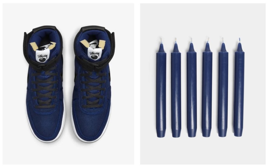
It's the saturation that gives the Nike Vandal High x Stüssy Deep Royal Blue sneakers their allure, and the light cornflower blue of Trudon's Madeleine candles, dyed in small batches at its Normandy atelier, that give them a particularly soft glow
Simon Rawlings, chief creative officer at David Collins Studio, the designers behind one of the most celebrated blue interiors ever created – the Blue Bar, at London's Berkeley Hotel – is unlikely to be circling his diary on the 15th of the first month of any year. In fact, right now, he is in a particularly buoyant mood, having just been voted onto the Walpole Power 50 List, as one of the most influential names in British luxury. ‘We don't find blue to be an inherently depressive colour,’ he tells me. ‘Our founder, David Collins, always had an affinity with the colour, as he grew up by the sea in Dublin.’
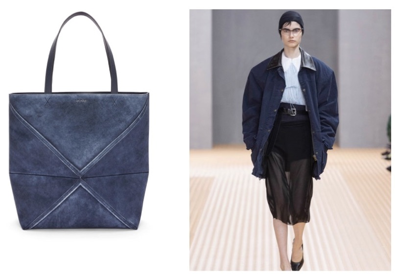
Textural blues add depth to Loewe's Large Puzzle Fold Tote in suede calfskin and Prada's layered take for spring
The studio’s all-blue Berkeley Hotel design undoubtedly kicked off a trend for destination bars in London in the early 2000s, highlighting blue’s unexpected warmth while it went about it. ‘David especially liked the lavender-hued element of the spectrum,’ Rawlings confirms. ‘Warmer tones like lavender and royal blue in the scheme counteract any “blues” effect for a more vibrant and balanced design. Used considerately, blue is warm, nuanced, and relaxing.’
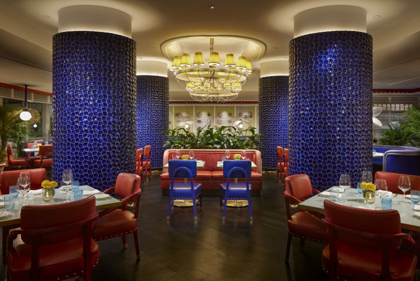
Lapis blue is key to David Collins Studio's interiors scheme for the Mirabella restaurant at the Fontainebleau Miami Beach
David Collins Studio’s new design for the Mirabella restaurant at the famed Fontainebleau Miami Beach hotel confirms blue’s more sociable side. So what more uplifting way than to banish the first month of the year in celebration of brilliant and calming blues.
Receive our daily digest of inspiration, escapism and design stories from around the world direct to your inbox.
Caragh McKay is a contributing editor at Wallpaper* and was watches & jewellery director at the magazine between 2011 and 2019. Caragh’s current remit is cross-cultural and her recent stories include the curious tale of how Muhammad Ali met his poetic match in Robert Burns and how a Martin Scorsese Martin film revived a forgotten Osage art.