
For Brody Associates, creating a brand identity for Shiseido was akin to developing a new language. Since it was founded 150 years ago, Shiseido has pioneered a unique approach to beauty, encouraging diversity through inclusive campaigns and offering products that are as equally grounded in nature as they are in science.
They are principals that might have once seemed avant-garde but are today pressingly salient, and evidence of the Japanese brand’s singular philosophy. A philosophy Brody Associates began to piece together as they combed through the archives.

Brody Associates' brand code is the first-ever for the 150-year-old brand
‘The work in the archives was so creative and unexpected that, in a way, it was a real challenge for us to look back at them,’ says Neville Brody, the iconic creative director, designer, and founder of Brody Associates. ‘How can we find a way to continue and evolve that heritage in a very different world?’
Creating the first-ever brand code for a company with a 150-year history is no easy task, particularly now that brands must find a cohesive visual language that can be recognised by an audience on both digital platforms and physical spaces. The changing landscape of visual communication is something Brody understands well, having pioneered some of the most inventive editorial work of the 1980s as creative director of The Face and Arena, before going on to found Brody Associates and work with global giants like Nike and Coca-Cola.

Brody Associates' looked back into Shiseido's archives (above) for an in-depth understanding of the brand's history
‘In the past, there was a much less complex world of communication than there is now. They didn't have websites with click through online sales; check out wasn't part of the communication space. I think in the past, you could do one poster, and then that would be the main thing for a whole season. But now there's like multiple products, there are multiple spaces and those products are going to be communicated in multiple countries. So it's less iconic now than it used to be, it’s much less concentrated.’

Shiseido's brand code is designed to work across digital and physical platforms
The key to creating that new, multi-platform vision came in recognising the core philosophies that have always been at the heart of the Shiseido brand. Globalism is one. As a French-inspired pharmacy that began in Tokyo’s Ginza district, the brand has always training its eye globally to understand the needs of people beyond one market.
It’s a universal perspective that’s reflected in its formulations, often using Japanese ingredients that are developed in European and American labs, and campaign imagery, which has historically featured models from a diversity of backgrounds.

A work in progress photo from the Brody Associate offices
Yet, while Shiseido has always been a global brand, they have also always maintained a uniquely Japanese aesthetic. Brody Associates recognised this particular ‘Japaneseness’ as an embrace of a certain dualism in both their campaign imagery and product formulations. It’s evident in the brand’s use of natural ingredients and high-tech science to develop their products.
As well as Shiseido’s embrace of wabi-sabi philosophy, or the idea that perfection can be found in imperfection and simplicity in the midst of complexity. It’s a concept Sheisido has promoted through paired-down packaging designs and a less-is-more approach to product formulations.

For Brody Associates, looking back into Shiseido's past was an essential part of developing a modern brand code
‘It's quite hard to grasp,’ says Brody, ‘but it could be anything from [an image captured] close up next to one far away, or from smooth to hard as a material finish, or flamboyance as opposed to thoughtful. So it's looking at how do we bring opposites in to create kind of a richer and more of a narrative, then the consumer and the audience and the viewer can engage with them in a slightly different way.’
‘The defining characteristics [of the brand code] are more about what we're not doing than what we are doing. We're not, we're not showing stereotypical ideas about beauty, or stereotypical ideas about Japanese brand. It’s finding other ways to do that that has been the big challenge, has been a two to three-year process.’

The new brand code is intended to give Shiseido a long-lasting, cohesive visual language
Brody Associates also developed a new typeface for Shiseido to align with the rest of the updated visual code. ’It’s not supposed to be a standout font, not supposed to be kind of a big personality-driven headline typeface, but it is supposed to support a lot of the personality traits. So it's, it's a Sans Serif, which means it's kind of a bit less fussy, a bit more rooted in contemporary design, and it's a slightly wider typeface. So this is sort of a sense, of peace, you know, feels more spacious. It was inspired quite a lot by a lot of the archive exploration.’
Brody Associates’ new brand code is intended to give Shiseido a long-lasting, cohesive visual language that can be used across all platforms including retail, e-commerce, social media, and product lines.

Shiseido's brand code includes an exclusive new typeface
‘When you’ve got a brand with 150 years of this amazing archive, you sort of need to de-complexify that and make it something that translates as a very modern brand image tool,’ says Philip Rodgers, studio director and founding associate of Brody Associates. ‘When you've got this sort of richness, there is this desire to overly simplify something or really kind of water down the message. But for us, I think the brand code process comes back to that duality again of finding really modern simple tools to tell a really rich story.’
INFORMATION
brody-associates.com
-
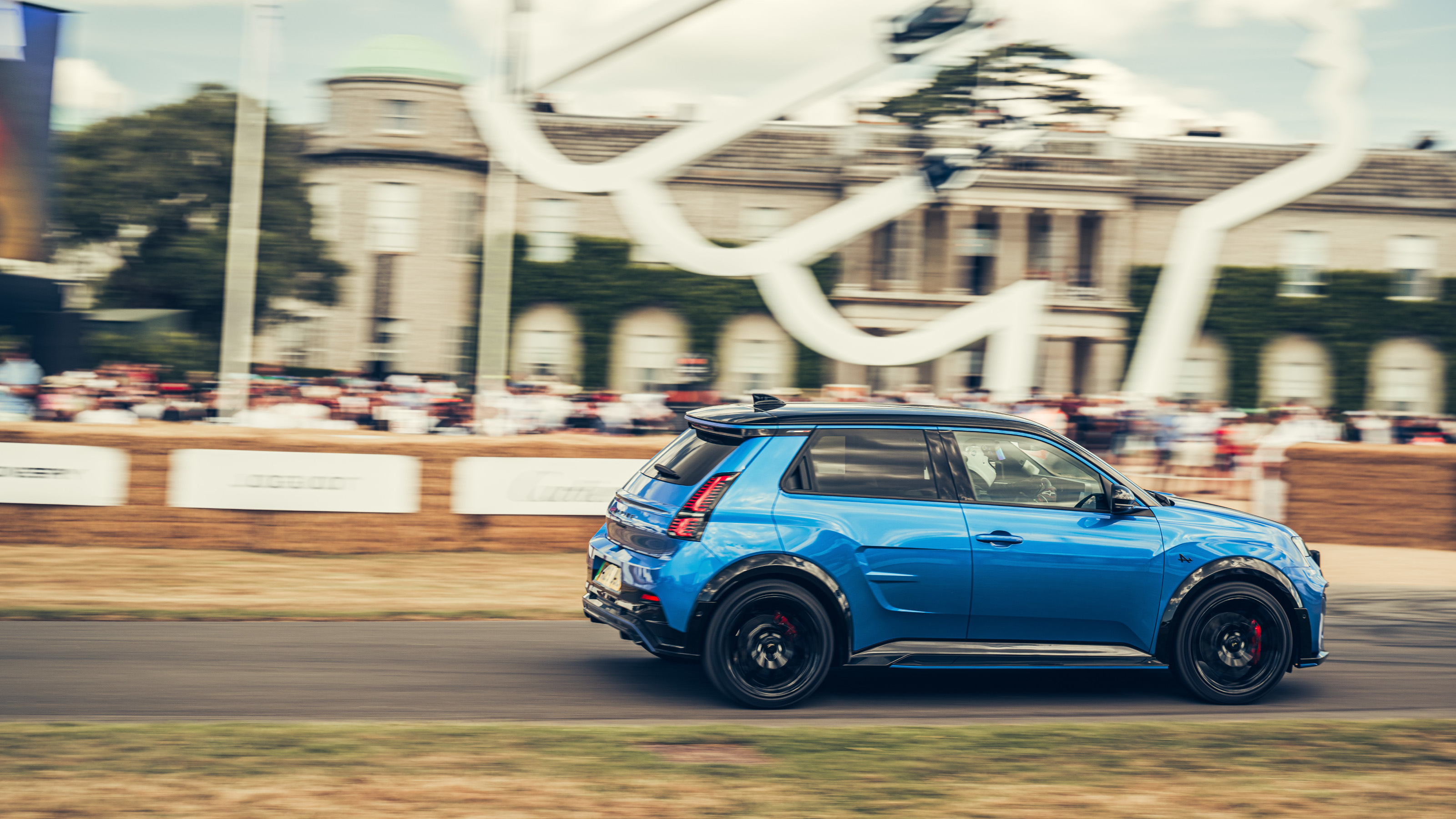 We bring you all the best bits from this year’s Goodwood Festival of Speed
As car makers switch their allegiance to the sunny West Sussex countryside as a place to showcase their wares, a new generation of sports cars were sent running up that famous hill
-
 Stay at Patina Osaka for a dose of ‘transformative luxury’ in western Japan
From nature-inspired interiors to sound-tracked cocktails and an unusually green setting, Patina Osaka is a contemporary urban escape that sets itself apart
-
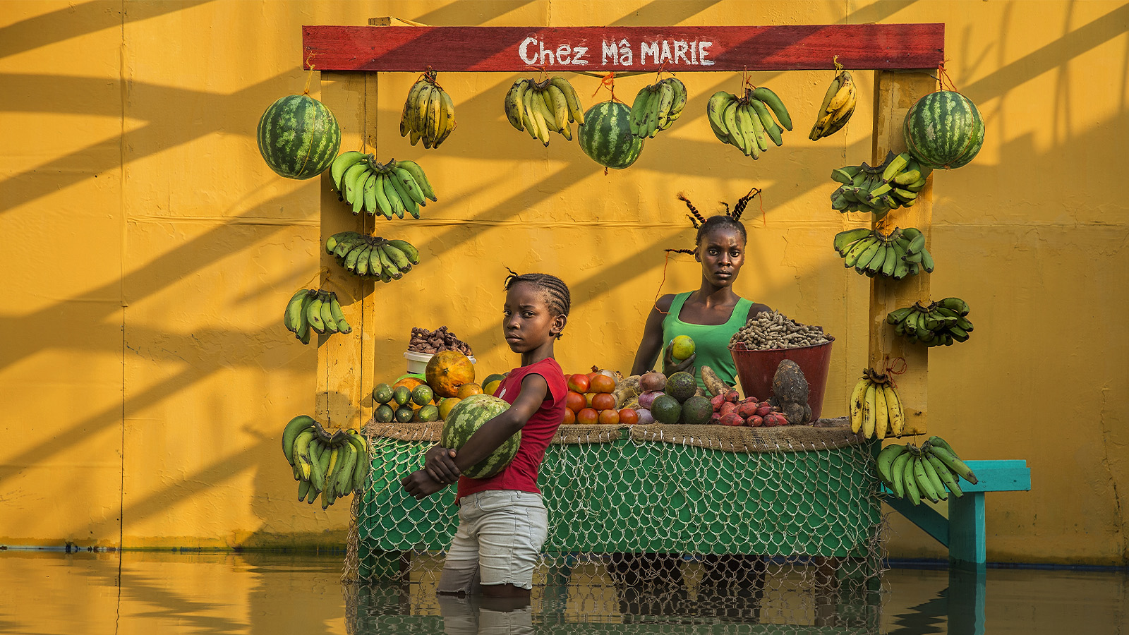 12 photographers vie for Prix Pictet 2025, lenses firmly focused on sustainability
Prix Pictet is the world’s leading award for photography and sustainability. Here’s how the 2025 shortlist responded to this cycle’s theme, ‘Storm’


