
When Daniel Buren was a little-known conceptual artist back in 1970, he somehow managed to charm a woman working for Paris’ transport system to let him hang his striped paper in the advertising frames of Métro stations for a short time between ad campaigns, an operation he called affichage sauvage, or clandestine billposting.
Today, the Frenchman – now one of the world’s best-known living artists – is putting his signature stripes up in London’s newly rebuilt Tottenham Court Road Tube station. Unlike the Paris installation nearly half a century ago, the current artwork is official and permanent, created in tandem with the station and part of the walls themselves.
The projects are different enough that the artist does not make a connection between them until asked. ‘The only thing they have in common is the question: “What is the Underground?”’ he responds, sitting in the offices of the Lisson Gallery, his London art dealer. ‘It’s all about movement. And then there’s this thing you might stop to look at.’ Aged 77 and as busy as ever, Buren is a compact man with an easy-going manner and dark eyebrows that contrast with his white hair, a colour scheme not unlike the stripes he’s famous for.
‘What I find interesting about the metro is the idea of motion and speed,’ he says. ‘The physical circulation of people who plunge underground, then emerge. The constant coming and going of hundreds of thousands of people in a precise chaos. And that’s not even taking into account the trains arriving and disappearing.’
Tottenham Court Road is one of London’s busiest stations, and one that will also serve the new Crossrail high-capacity railway starting in 2018. At that point, an estimated 200,000 people – office commuters, weekend shoppers, nightclubbers – will rush through this subterranean site every day, and at all hours.
When Buren’s project is fully completed in 2016, his artwork will greet them loudly and cheerfully at two different entrances. At the Oxford Street entrance, open since January, the walls facing and adjacent to the escalators are covered in big, brilliant, black and white striped circles and diamonds. As you descend the escalator, the 2.4m-high shapes loom towards you. To one side, they take up the entire two-storey wall, disappearing into the floor and the ceiling.
Buren says the shapes are ‘fundamentally banal’ on their own. But oversized, they create what he calls an ‘enormous, enveloping fresco’. The walls are glossy and reflective, made of clear laminated glass, screenprinted with the artwork. The alternating geometric forms unfurl across the surface, the diagonal line of the escalator slashing across it. At the bottom, people gliding off the moving staircase are framed from behind by a striped rhombus, a near-cinematic effect.
On the opposite side of the station, at the Northern and Southern Plaza entrances, another two-storey wall next to the stairs and escalator will be covered by the same shapes in bright, solid colours against vertical black and white stripes. Buren is also placing a transparent dividing screen inside the ticket hall, with the shapes engraved in glass. A display case exhibits two sculptures, a blue circle and yellow diamond, thick and shiny like enormous liquorice allsorts.
The artist says with a chuckle, ‘They are presented like a museum piece, but I would never do something like that in a museum. In the metro, it seemed amusing.’
Standing in just the right place, you will be able to glimpse all four compositions at once. And though it may not be obvious to the hurried commuter, the sculpted pieces in the glass case set the rhythm for the whole installation. ‘If you pushed them straight back to the colourful wall, they’d generate the circles and lozenges,’ says Harbinder Birdi, a partner at Hawkins\Brown, the principal architects for the station upgrade (in collaboration with Acanthus Architects LW).
As Birdi explains, the black and white wall is actually a mirror image of the coloured one, and the overall feeling should be of a continuous artwork, disrupted here and there by the infrastructure. ‘There are various layers of discovery,’ he says. ‘We hope that when people use the station time and time again, they will start picking up on the different ways the artwork manifests in the station.’
Commuters have grown used to seeing first-rate art at Tottenham Court Road station, where the passageways and platform walls are covered with mosaics created in 1984 by Eduardo Paolozzi, and where there are plans for future works by Douglas Gordon and Richard Wright. Indeed, the London Tube as a whole has an impressive history of art and design going back to Frank Pick, the visionary administrator who commissioned works including the typeface, symbol and map a century ago. In recent years, several artists have reimagined the map, including Buren, who layered the iconic blue and red roundel to make something he compares to a Scottish tartan.
Buren’s Tottenham Court Road installation is a permanent part of the ‘Art on the Underground’ programme, which Transport For London established in 2000 (under a different name) to commission new artworks, most of them temporary. The programme’s head, Eleanor Pinfield, says, ‘I want to build on our reputation for innovative commissions. We have a unique audience – all of London. We have the power to bring art to that group. I feel strongly we have to be on the cutting edge, providing for that wide audience.’
The committee chose Buren in 2008, before Pinfield arrived. Referring to the original sketches – which are surprisingly faithful to the final result – Pinfield says the jury had been struck by the proposition’s boldness and ambition, as well as Buren’s understanding of the environment and how to highlight its strengths. ‘His work plays so wonderfully to create a sense of location at those two entrances while having continuity.’ Friends can agree to meet at the coloured entrance or the black and white one, with zero chance of confusion.
No stranger to architecture, Buren’s creations are all intimately connected to their locations. He never works in an atelier (he doesn’t even have one), but chooses to do everything in situ, creating pieces that interact with a particular building or place. Stripes are his trademark visual tool, his way of defining and manipulating a space. They are always vertical and always presented in two contrasting colours precisely 8.7cm apart. He started using this width in 1965, after coming across a piece of striped upholstery fabric at a Paris market. He says the size and motif are neutral and legible on surfaces both small and large, and sketches an example in a reporter’s notebook as proof.
His best-known work is Les Deux Plateaux, in the inner courtyard of the Palais-Royal in Paris. Made of black and white striped and variously truncated columns, this intrusion of contemporary art in a historical site created a furore when it went up in the mid-1980s. Buren recalls that people tried to destroy it while construction was still underway, and that he and the architect paid a security guard out of their own pockets to protect it.
Now it’s an integral part of the Parisian landscape. Kids play on it, tourists take photos. The thing about permanent, public artwork, he notes, is that you can’t set out to please everybody. An artist can dream that he’s making a masterpiece, but it’s unpredictable how people will view it. ‘The biggest danger is that people will stop seeing it, as though there was nothing there at all.’ It’s hard to imagine this happening at Tottenham Court Road station, where hordes of people will engage with Buren’s creation simply by walking past it.
As originally featured in the May 2015 issue of Wallpaper* (W*194)

The entrance at Oxford Street utilises a monochrome palette

When Buren’s project is fully completed in December 2016, his artwork will greet travellers loudly and cheerfully at two different entrances
INFORMATION
For more information, visit the ’Art on the Underground’ website
Photography: Tim Gutt. Courtesy Cecilia Colussi Stock/Alamy
-
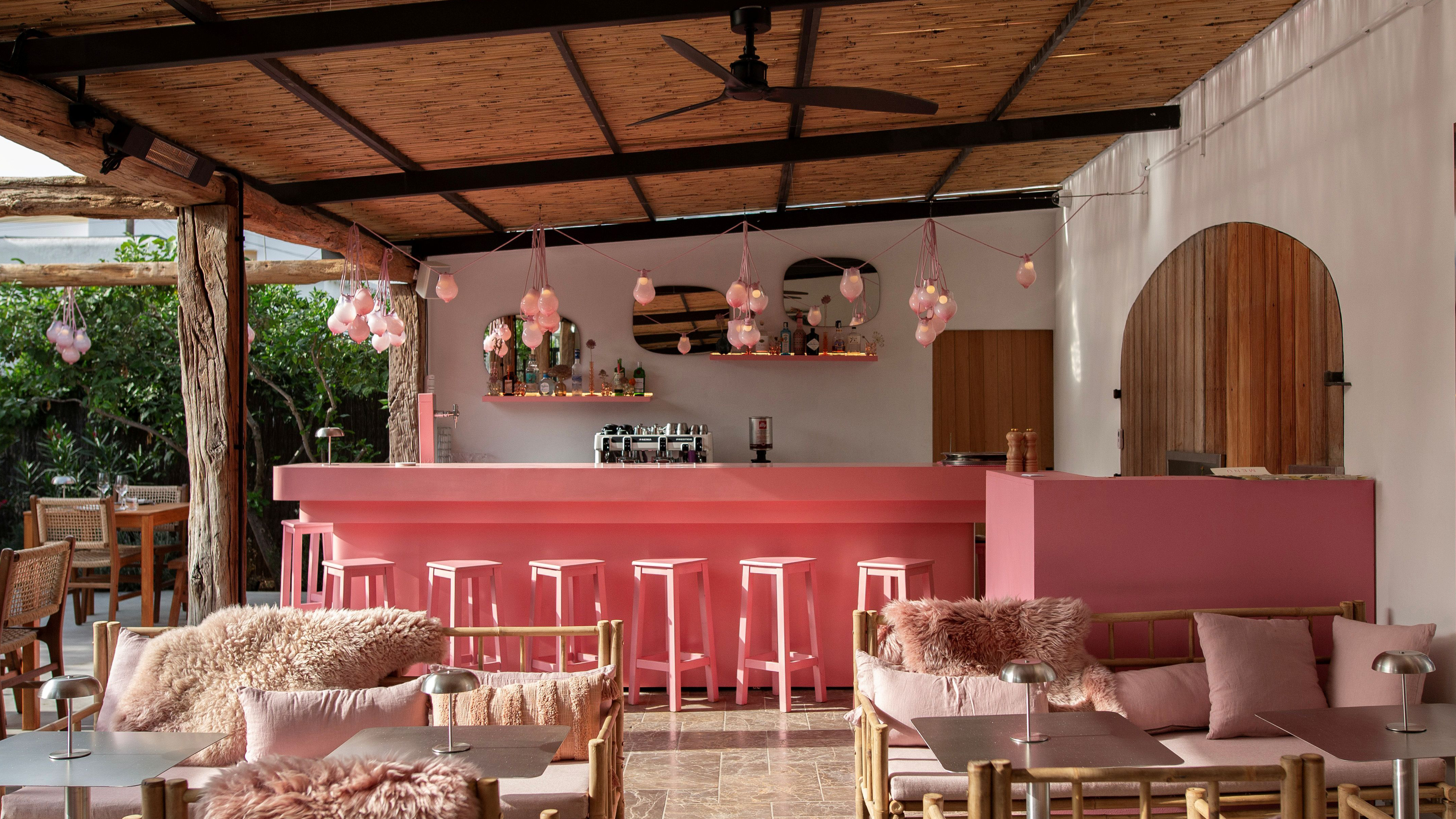 This chic new restaurant in Ibiza looks like a gallery and feels like a party
Mira by Gathering marries contemporary art, Mediterranean fare, and laid-back glamour in a space designed for both contemplation and celebration
-
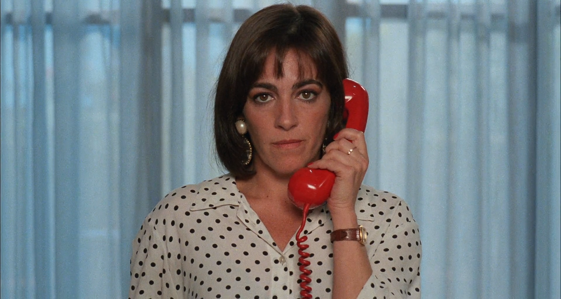 A new exhibition explores Spanish cinema through its female anti-heroes
‘Resolución’ is a new exhibit at MoMu: a three-channel audiovisual installation that catalogues a series of transformative moments in Spanish cinema through costume
-
 Can creativity survive in the United States?
We asked three design powerhouses to weigh in on this political moment


-
 From Snapchat dysmorphia to looksmaxing, have digital beauty standards made us lose sight of what's real, asks a new exhibition
AI, social media and the ease with which we can tweak our face mean we're heading towards a dystopian beauty future, argues 'Virtual Beauty' at Somerset House
-
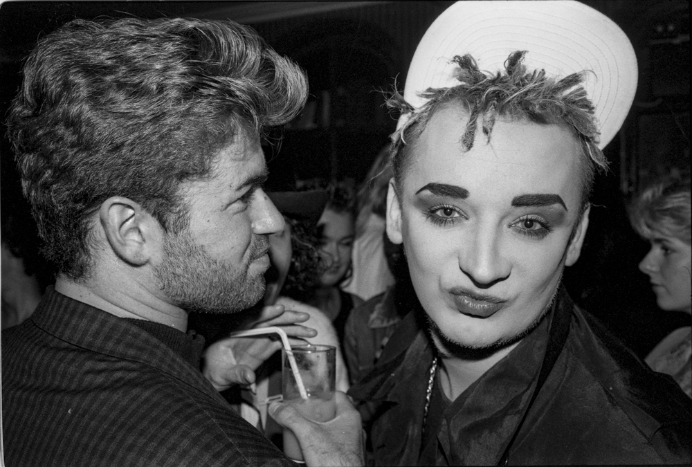 Take a rare peek inside eighties London's most famous club
From George Michael to Boy George, photographer David Koppel captured a who's who of celerities at Eighties nightclub Limelight
-
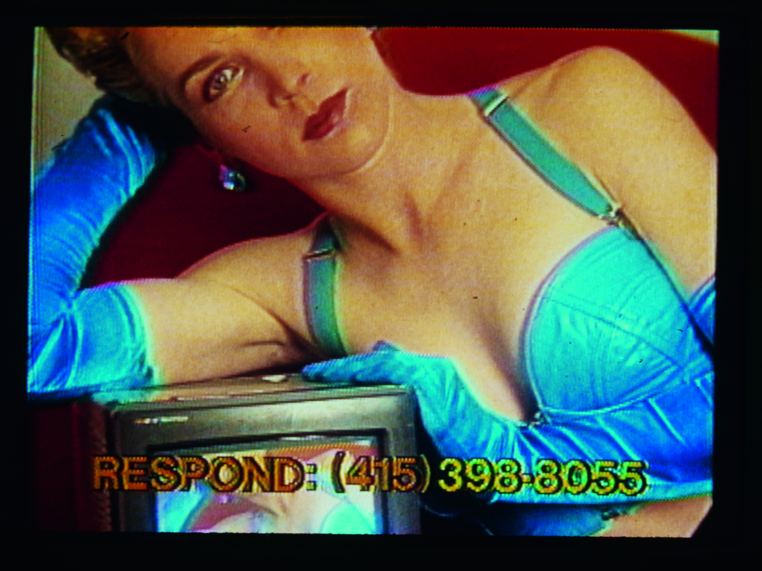 Thirty-five years after its creation, Lynn Hershman Leeson’s seminal video is as poignant as ever
Lynn Hershman Leeson’s 'Desire Inc', at 243 Luz in Margate, blurs the boundaries between art and reality
-
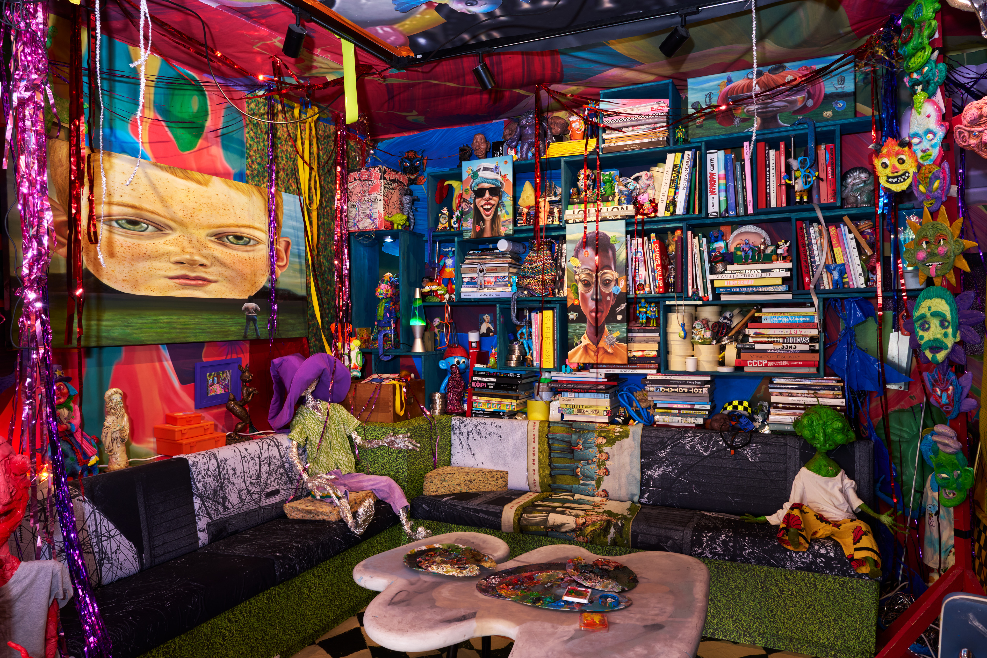 Shop the gloriously mad inner workings of Gary Card’s brain in London’s Soho
Set designer and artist Gary Card has taken over London's Plaster Store – expect chaos and some really good accessories
-
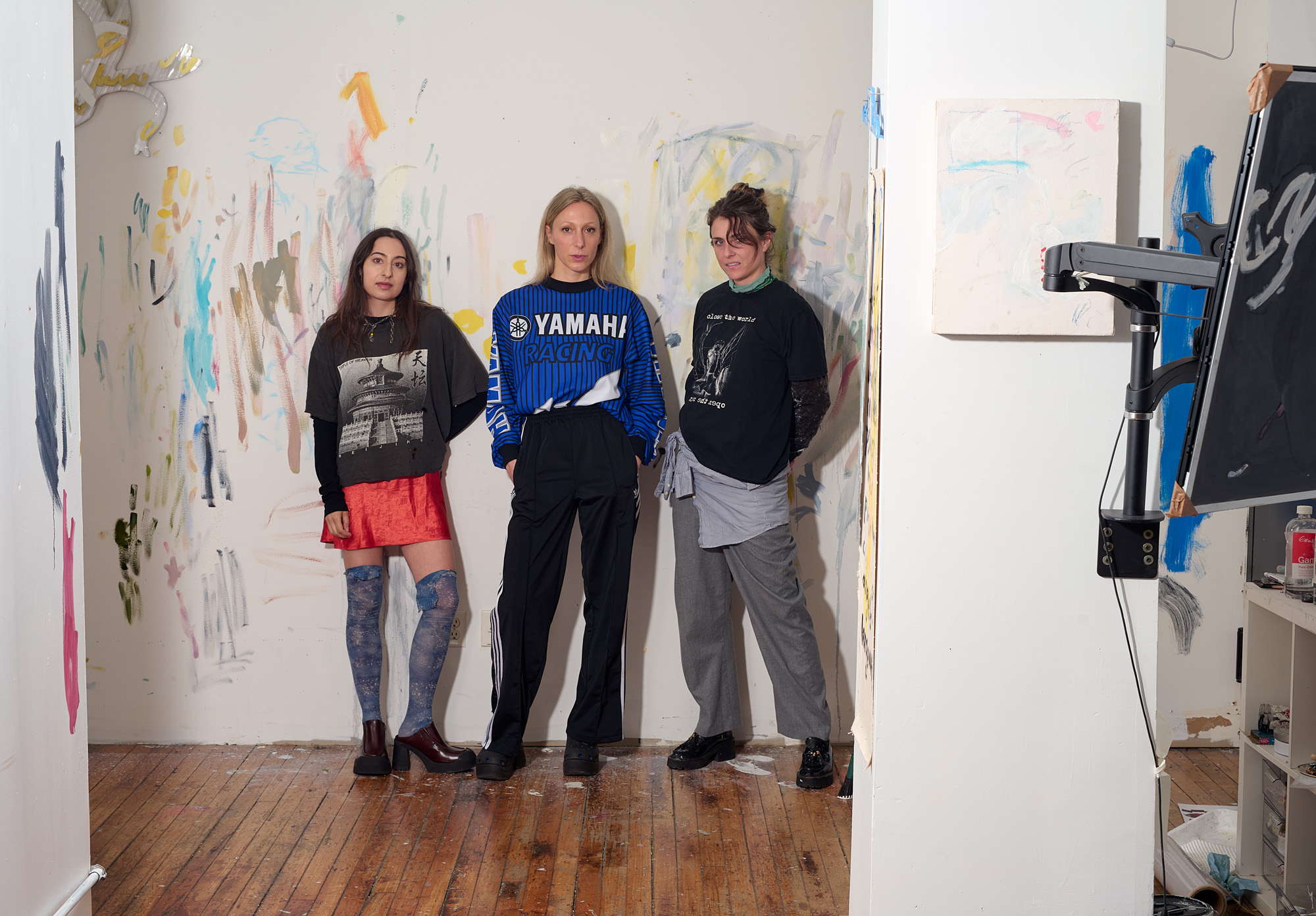 Meet the New York-based artists destabilising the boundaries of society
A new show in London presents seven young New York-based artists who are pushing against the borders between refined aesthetics and primal materiality
-
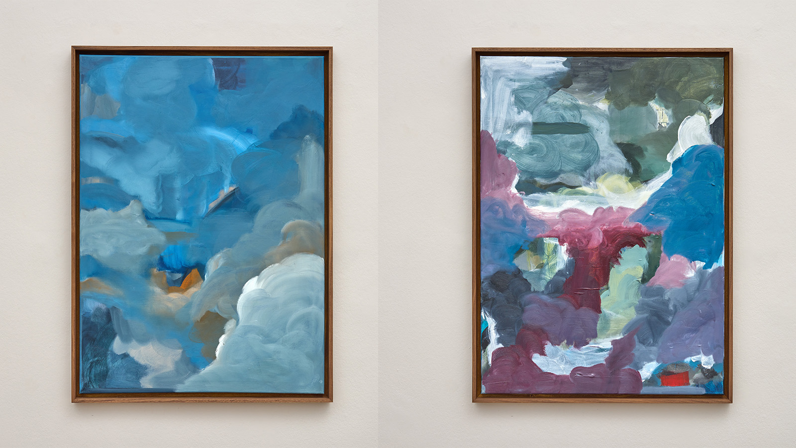 Leila Bartell’s cloudscapes are breezily distorted, a response to an evermore digital world
‘Memory Fields’ is the London-based artist’s solo exhibition at Tristan Hoare Gallery (until 25 July 2025)
-
 A bespoke 40m mixed-media dragon is the centrepiece of Glastonbury’s new chill-out area
New for 2025 is Dragon's Tail – a space to offer some calm within Glastonbury’s late-night area with artwork by Edgar Phillips at its heart
-
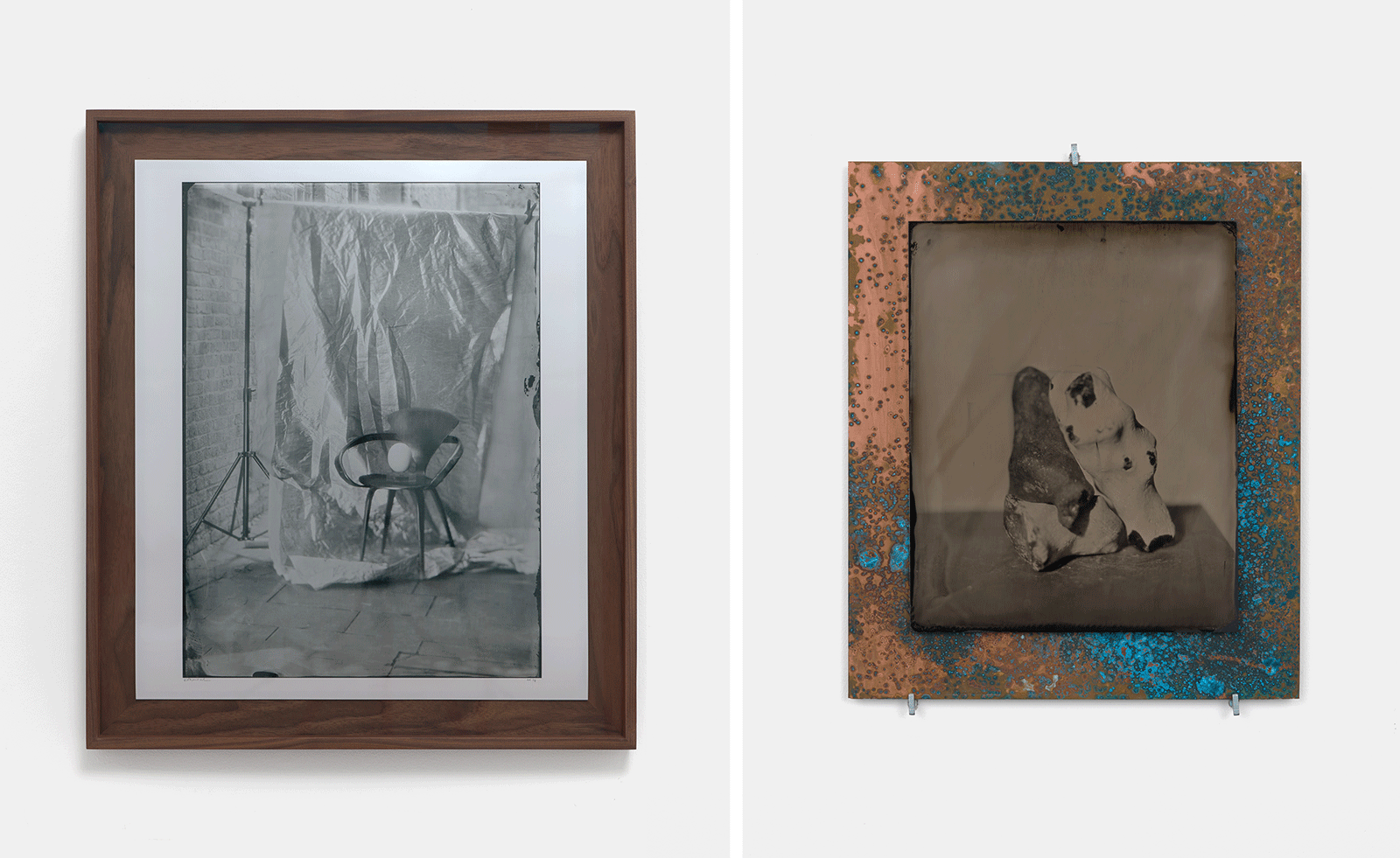 Emerging artist Kasia Wozniak’s traditional photography techniques make for ethereal images
Wozniak’s photographs, taken with a 19th-century Gandolfi camera, are currently on show at Incubator, London


