The drawn word: SFMoMA tracks the modern evolution of typography
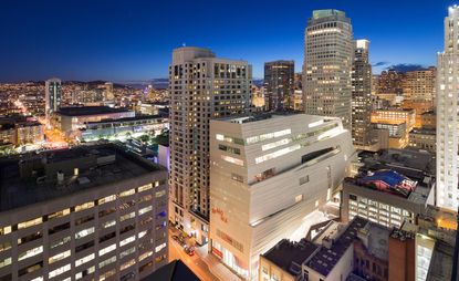
Before computers, graphic design relied heavily on printers to create visually striking images. 'Typeface to Interface', an exhibition on view at the newly reopened San Francisco Museum of Modern Art (SFMoMA) until October, traces the evolution of graphic design and typography from 1950 to the present day, through works from the museum’s collection.
The exhibition begins with a series of colourful posters from the 1950s and 60s for the Olivetti Company, which produced typewriters. From there it moves on to the movement that became known as 'Swiss Style', depicting posters by Karl Gerstner, Pierre Mendell and Armin Hofmann – practitioners that made use of negative space and utilised bold, balanced typefaces like Helvetica and other sans-serifs to get their point across. Another area showcases the lurid, psychedelic Bay Area concert posters for venues like the Fillmore, that were commonplace in the city during the 1960s and 70s, capturing a moment in design and in the region.
What follows ranges from Massimo Vignelli’s iconic 1972 New York subway guide and Paul Rand’s 1981 Eye-Bee-M poster for IBM, to more chaotic designs by the likes of Stefan Sagmeister, as well as Michael Bierut’s posters for the Yale School of Architecture. The equipment used to create these posters, like the 1984 prototype for the Apple Macintosh touch-screen tablet and the 1984 Apple Macintosh personal computer, is also on display.
'Typeface to Interface' provides an in-depth overview of how graphic design has evolved both in the Bay Area and globally for the past half-century, via the days of print and through to the present, the process of which is traced by an automated wall-drawing robot, Viktor (designed by Jürg Lehni) in a series called A Taxonomy of Communication, created by Lehni and and Jenny Hirons.
‘There are moments of oscillation between different schools of graphic design and different practitioners, where we go from structured formalism, to much more chaotic experimentation and back, and these things operate in waves,’ says SFMoMA associate curator of architecture and design Joseph Becker. ‘People pushing against the graphic design that’s come before them, finding their own voice and pushing against that.’
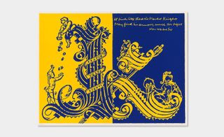
The exhibition provides an in-depth overview of how graphic design has evolved both in the Bay Area and globally for the past half-century. Pictured: a poster by the artist/activist Corita Kent
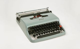
The exhibition begins with a series of colourful posters from the 1950s and 60s for the Olivetti Company, which produced typewriters (pictured)
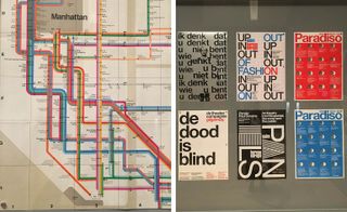
The show also highlights iconic examples of graphic design, from Massimo Vignelli’s iconic 1972 New York subway guide (pictured left) to the use of bold, balanced sans-serif typefaces like Helvetica (right) to get their point across
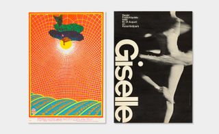
Pictured left: a colourful, psychedelic work by Bob Fried, that typifies the aesthetic of the 1960s and 70s. Right: a poster by Armin Hofmann, a proponent of the ’Swiss Style’, that made extensive use of negative space
INFORMATION
’Typeface to Interface’ is on view until 23 October. For more details, please visit the SFMoMA’s website
ADDRESS
San Francisco Museum of Modern Art
151 3rd Street
San Francisco, California
Wallpaper* Newsletter
Receive our daily digest of inspiration, escapism and design stories from around the world direct to your inbox
Ann Binlot is a Brooklyn-based freelance writer who covers art, fashion, design, architecture, food, and travel for publications like Wallpaper*, the Wall Street Journal, and Monocle. She is also editor-at-large at Document Journal and Family Style magazines.
-
 DAB 1α electric motorbike is the first product from French manufacturer DAB Motors
The DAB 1α is an all-electric motorbike born out of industrial design, gaming culture and aviation technology, and now available to order
By Jonathan Bell Published
-
 The 2024 Ivor Novello nominations for songwriting have been revealed
77 British and Irish songwriters and composers make up this year's nominees, announced tonight at London's Groucho Club
By Charlotte Gunn Published
-
 Why Bollinger’s La Grande Année 2015 champagne is worth celebrating
Champagne Bollinger unveils La Grande Année 2015 and La Grande Année Rosé 2015, two outstanding cuvées from an exceptional year in wine-making
By Melina Keays Published
-
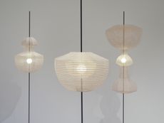 Nendo’s collaborations with Kyoto artisans go on view in New York
‘Nendo sees Kyoto’ is on view at Friedman Benda (until 15 October 2022), showcasing the design studio's collaboration with six artisans specialised in ancient Japanese crafts
By Pei-Ru Keh Last updated
-
 Italian craftsmanship comes to Los Angeles in this eclectic Venice Canals apartment
Boffi Los Angeles celebrates a juxtaposition of texture throughout a waterside bolthole
By Hannah Silver Last updated
-
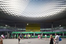 Design Miami/Basel 2022 explores the Golden Age
Design Miami/Basel 2022, led by curatorial director Maria Cristina Didero, offers a positive spin after the unprecedented times of the pandemic, and looks at the history and spirit of design
By Rosa Bertoli Last updated
-
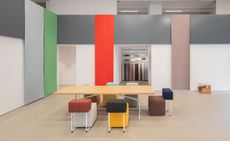 Kvadrat’s flagship New York showrooms encompass colourful design codes
Industrial designer Jonathan Olivares and architect Vincent Van Duysen have worked with Danish textile brand Kvadrat on the vast new space, also featuring furniture by Moroso
By Hannah Silver Last updated
-
 What to see at New York Design Week 2022
Discover Wallpaper’s highlights from New York Design Week 2022 (10 – 20 May 2022): the fairs, exhibitions and design openings to discover
By Pei-Ru Keh Last updated
-
 Colour defines LA ceramics studio and showroom of Bari Ziperstein
Step inside the multifunctional ceramics studio, office and showroom of designer and artist Bari Ziperstein, designed by local firm Foss Hildreth
By Pei-Ru Keh Last updated
-
 Design for Ukraine: Bocci and Design Miami join forces to raise funds
The online sale of iconic Bocci pieces will benefit GlobalGiving’s Ukraine Crisis Relief Fund, providing urgently needed humanitarian aid
By Rosa Bertoli Last updated
-
 The Future Perfect celebrates materiality in new Los Angeles exhibition
Coinciding with Frieze LA, a new exhibition titled ‘Momentary Pause’ (17 February – 18 March 2022) explores material-based practices that inspire change
By Hannah Silver Last updated