Breitling and Triumph unite on a racy new watch and motorcycle
1960s design codes are infused with a contemporary edge in the collaboration between Breitling and Triumph


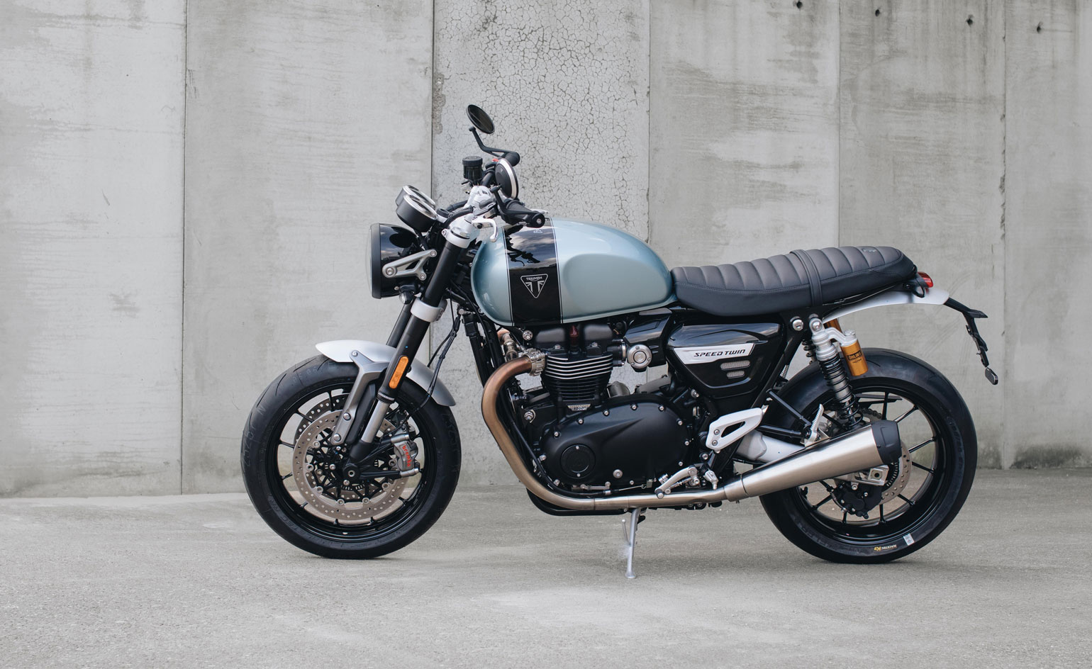
Breitling and British motorcycling brand Triumph have united on a collaboration that celebrates the heritage of both brands. The newly unveiled Top Time watches and Speed Twin motorcycle take their design cues from the chic motorcycles that epitomised 1960s café-racer culture, so called as the motorcycles were used to ferry their riders from café to café.
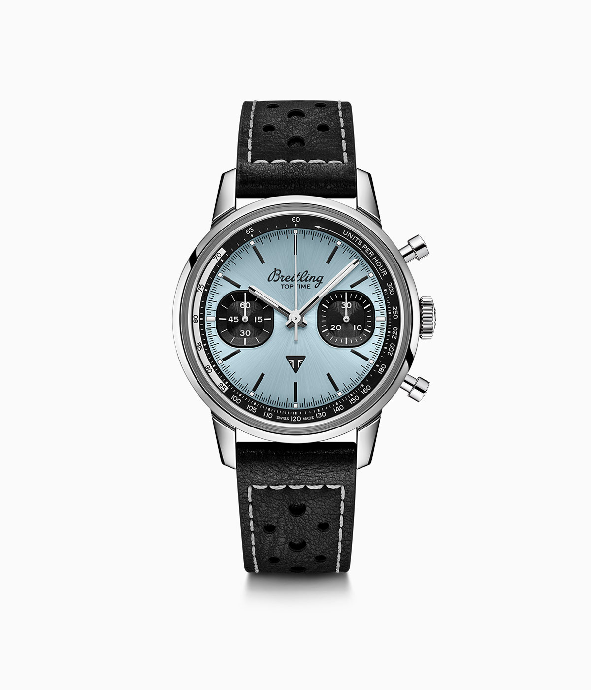
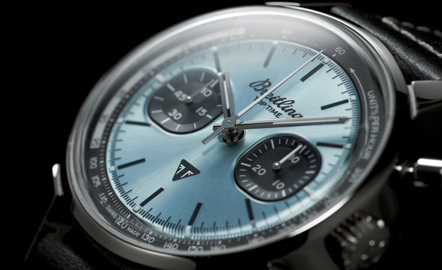
For Breitling, this freewheeling spirit was encapsulated in the relaxed proportions and graphic dial design of the Breitling Top Time, first released in the same decade and whose sporty spirit is now rethought in the new Top Time collaboration pieces. ‘For this modern Top Time Triumph, we opted for a more minimalist case, but brought back some of the Top Time’s most distinctive design features,’ says Breitling creative director Sylvain Berneron. ‘For example, there is the bow-tie motif, known as the “Zorro dial” by collectors, and the half-square, half-circle (aka “squircle”) counters.’

The distinctive brushed finish of the Zorro dial, which first appeared on the Top Time Ref. 2003 watch in the 1960s, originally possessed contrasting colours, such as black on white. ‘Because this Triumph edition is, at its core, a tool watch for reading speeds and timing events, the emphasis had to be on the tachymeter rehaut and the chronograph counters,’ adds Berneron of this reinterpreted watch design. ‘This led us to develop a more subtle, tone-on-tone Zorro dial plate created with an alternately brushed and polished finish.’
These historical design codes are brought up to date with the addition of a new, contemporary icy blue hue. ‘From our very first discussions with the Triumph team, we knew we wanted an exotic dial colour to make the collaboration truly special and unique – but that colour also had to have significance to both brands,’ says Berneron. ‘This ice blue is directly linked to a Triumph Thunderbird 6T from 1951, which came in a beautiful polychromatic blue, a colour that has rarely been used by Triumph since. Triumph was able to extract a mint-condition paint chip to recreate the colour. Breitling, meanwhile, has an extremely rare, ice-blue-dialled Top Time Ref. 815 from the 1970s in its archives of nearly the identical shade. So this dial plate alone is a strong link between both brands. The combination of this colour and the Zorro design creates a very contemporary, graphic and yet subtle look, which we fell in love with the moment we received the first prototypes.’


INFORMATION
breitling.com
Receive our daily digest of inspiration, escapism and design stories from around the world direct to your inbox.
Hannah Silver is a writer, editor and author with over 20 years of experience in journalism, spanning national newspapers and independent magazines. Currently Art, Culture, Watches & Jewellery Editor of Wallpaper*, she has overseen offbeat art trends and conducted in-depth profiles for print and digital, as well as writing and commissioning extensively across the worlds of culture and luxury since joining in 2019.