Information designer Federica Fragapane on the Covid-19 Community Vulnerability Index
Design Emergency began as an Instagram Live series during the Covid-19 pandemic and is now becoming a wake-up call to the world, and compelling evidence of the power of design to effect radical and far-reaching change.

Receive our daily digest of inspiration, escapism and design stories from around the world direct to your inbox.
You are now subscribed
Your newsletter sign-up was successful
Want to add more newsletters?
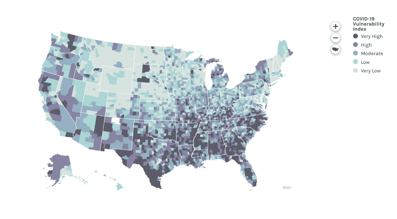
Having observed the explosion and progress of the infection in northern Italy, researchers at Surgo Foundation, a think-tank based in Washington, DC, set out to augment the Centers for Disease Control and Prevention (CDC)’s established Social Vulnerability Index (SVI) with data concerning, for instance, pre-existing health conditions known to increase Covid-19 mortality (such as diabetes and heart disease) and the state of the community healthcare system. The outcome is CCVI, or Covid-19 Community Vulnerability Index, a stronger tool to analyse the progression of this particular pandemic.
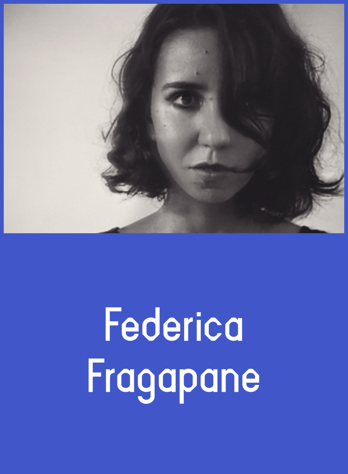
Paola Antonelli asked Federica Fragapane – the Italian information designer who provided the visual dimension to this pioneering investigation on how different communities in the USA are vulnerable to Covid-19 – to tell us more about her work and about the importance of information design.
Paola Antonelli: What do you think the role of information design is, in the contemporary world?
Federica Fragapane: We have a huge responsibility, as people, and also as professionals. It’s like being journalists and having words to communicate what’s happening – or being photographers and using photographs to show what’s happening. As an information designer, I have at my disposal data visualisation, infographics, visual shapes to communicate what’s happening. I have to use my role, my tools, and my competence to talk about urgent topics, and also to give a voice to people.
PA: How did you become involved with Surgo Foundation and start working on the vulnerability index?
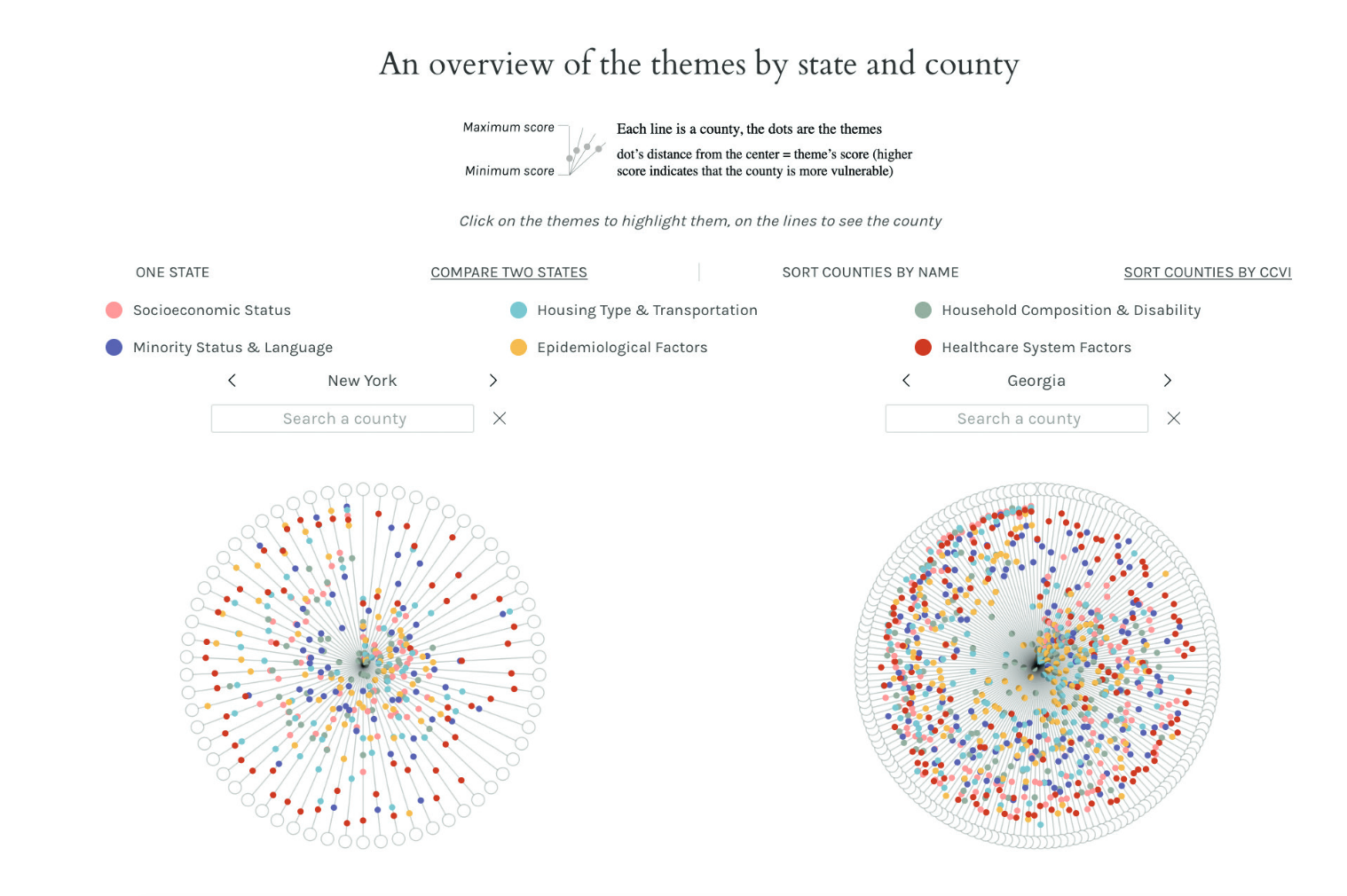
FF: I started working with them at the end of last year on a website project. And then in March, they asked me if I was interested in pausing that project to work on a new Covid-19 Community Vulnerability Index (CCVI), a complement to the Social Vulnerability Index (SVI) by the CDC. CDC’s SVI measures the expected negative impact of disasters of any kind. It is composed of 15 indicators, such as household composition, minority status and language, socioeconomic status, and access to transportation. Surgo Foundation combined four of these measures with Covid-19 specific indicators – such as healthcare system factors and epidemiological factors – to create the CCVI, and they asked me to help them visualise it. I live in northern Italy, and in March we were witnessing how in-time actions are essential, and how for certain areas in northern Italy, it was too late. So I knew how important it was to act in time, and to work on such a project. They asked me at first to design a map of the United States, showing the vulnerability index at a county level, and also the web page explaining how the index works, the data set behind it, and the methodology. The page – precisionforcovid.org – was then developed by Paolo Corti.

Infographics: Surgo Foundation
PA: We know about big data, but then there’s also ‘small data’, which you’ve been focusing on. What is it and why does it matter?
FF: We need both. We need big data because it helps us understand the global picture. Visualising small data can help us have a deeper comprehension of the topic. A few years ago I worked on a project, ‘The Stories Behind a Line’, that had no clients and no commission, but for me was one of the most important ones I’ve ever worked on. It was a visual narrative of the journeys of six asylum seekers who arrived in Italy in 2016, six people I met in my own town, Vercelli. I asked them to tell me about their travels from their homeland to Italy, because I wanted to show, to tell these stories and these journeys in a very simple way, using the data that characterised them. I asked them details about their travels, very small and simple data, because I wanted to show the whole picture, the shapes that these stories had. Combining small data and big data is a good way to talk about the complexity of a topic without losing sight of the humanity that stands behind it.
PA: How do you become an information designer at this level of sophistication?
FF: I am a designer, I studied communication design at the Politecnico di Milano and attended the DensityDesign Lab founded by Paolo Ciuccarelli, which is focused on data visualisation and information design. I don’t have a statistical background but I collaborate with data scientists and data analysts, when needed; sometimes when I work for magazines or organisations, I look for the data, explore it, and analyse it. And then it’s experience.
PA: You said there’s a parallel between information design and journalistic reporting. How do you discuss the commission with your clients? How much do you propose?
FF: Sometimes I propose an idea, sometimes I propose an angle to explore the story with. Many of my pieces are exploratory, they don’t want to prove something, but they aim to enable the exploration of a certain topic. Anyway, a human intervention is inevitable. There are cases in which I talk with data scientists or with the clients, and they tell me they would like to show certain aspects, and so we look for the best way to show the elements and the insights that are most relevant. When I worked with Surgo Foundation, I worked with data scientists, and there was a great dialogue because there was really a great combination of different competencies.
I think by now it’s clear that the role of design is essential in communicating data. A few years ago, I remember some tensions between journalists and data visualisation designers. I remember some discussions in Italy about the role of information designers – ‘Oh, they are going to steal our jobs, but they are not journalists. What are they?’ I think it’s not a problem anymore and I’ve experienced a very harmonious dialogue between different competencies.
PA: Have you worked on other Covid-related visualisations recently?
FF: I worked on another project for Marta Foresti from the Overseas Development Institute, showing migrants’ contribution in response to the Covid-19 emergency. I was, again, extremely glad to show migrants as essential contributors, not only as victims. ‘Key Workers’ documents the reforms, campaigns, and other initiatives that are dedicated to recognising the essential contribution of migrant key workers in the Covid-19 response. We wanted something informative and evocative at the same time, so I designed a few trees that are on the landing page. Each tree represents a geographical area: Latin America, North America, Europe, Asia and Oceania, and Africa. Then the trees are divided into branches, and the branches represent sectors such as healthcare or agriculture or transportation – essential sectors. The sectors are divided into other branches that represent the national or the local level. At the end are many red dots, and each dot is a story, is an activity, is a campaign. The user can interact with the trees and can explore the stories – and then of course, there is information about the geographical location, about sources, and about the story itself. It’s another angle from which to communicate the Covid-19 topic, but it’s an important angle. I think it’s an essential angle. I’ve worked on the project with Alex Piacentini, designer and developer.
RELATED STORY

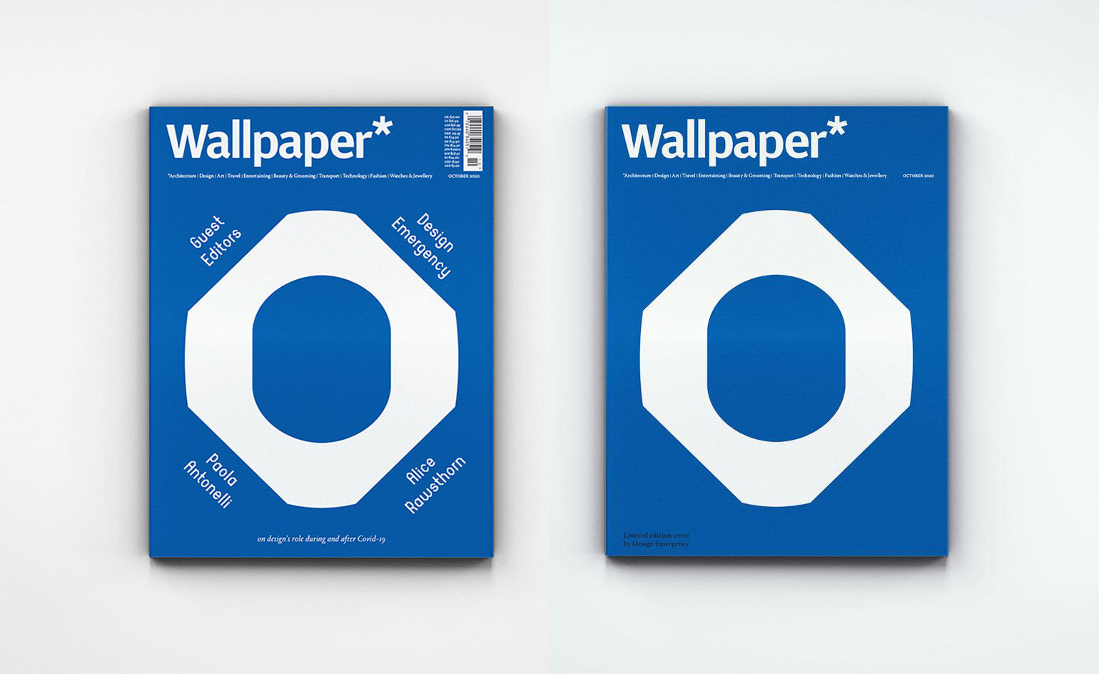
Studio Frith’s newsstand (left) and limited-edition covers for the October 2020 issue of Wallpaper*, featuring the Design Emergency logo and bespoke typeface in signature blue and white
Co-founders Paola Antonelli and Alice Rawsthorn took over the October 2020 issue of Wallpaper* – available to download free here – to present stories of design’s new purpose and promise.
Here, Paola Antonelli talks to information designer Federica Fragapane
PA: How do you approach each data set and decide which visualising tool you’re going to apply?
FF: It depends first of all on the data. The data analysis phase is essential in understanding what is the best structure to allow the readers to explore the data, and in communicating. To see patterns, to see insights. Then I really spend a lot of time looking for visual inspiration. There are projects in which I can visually experiment more – and in those cases I really love to look for inspiration from nature, or art, or worlds that I simply love. I like to understand which shapes, elements, texts, or textures I can work on to start a dialogue with readers, because my job is not producing beautiful visualisations, it’s communication.
PA: Have there been other examples of data visualisation for Covid-19 that have really struck you?
FF: I constantly look at the Financial Times’ Covid-19 visualisations, and The New York Times’ and The Washington Post’s, including while I was working for the Surgo Foundation project. I wanted to see how they represented Covid-19-related data. And then I’ve seen Giorgia Lupi’s project on re-visualising [New York governor] Andrew Cuomo’s update on New York’s new cases. She redesigned the slides that he used to communicate cases in New York daily, keeping in mind the human factor. I really liked her approach.
PA: What is the relationship between visualisation design and truth?
FF: I think that truth in data visualisation is connected to the transparency and honesty in admitting that there is human intervention behind it. I think that it’s very important to understand that a data visualisation piece has people behind it, designing it, deciding what to represent and why. So I think that it’s important to clarify what we are representing, why we are representing certain data and not other data. I think that data visualisation and infographics will always be subjective, because there is something or someone behind deciding what to show and why. The truth is in declaring that.
PA: Should there always be an introductory explanation by the visualisation designer?
FF: I think it’s very important. Very simple, short text. When I work with Corriere della Sera and do visualisations for them, I always have to explain. If I’m visualising data about, let’s say 50 countries, I always have to declare, ‘We selected the top 50 countries because of this reason.’ I think that using text, using words to explain what we are representing, combining words and visual elements, is very important. Protests stemming from George Floyd’s murder are happening all over the world right now.
PA: Are you itching to visualise anything?
FF: When the pandemic started, I decided not to take personal initiatives on it but to wait to be contacted by experts, because I didn’t want to create noise. Because I’m not an expert. In this case, right now I want to do something, but I also want to wait, I want to understand. Also, there are so many talented designers all over the world, African American designers that are so great and I think it’s important also to give them space, to see their projects, to see their work, and to see how they want to share their experiences. Right now I’m observing and I’m studying, and if I am contacted to help someone and to give my contribution, I would be very glad. But right now I’m in a waiting space.
Receive our daily digest of inspiration, escapism and design stories from around the world direct to your inbox.

Infographics: Surgo Foundation
PA: Can you tell us more about your background?
FF: After university, I started working at Accurat [a visualisation design studio based in Milan]. I worked there for a few years. It was essential for my career because I learned a lot and I was surrounded by inspiring people. Then after that I worked freelance. I have to say that social media really opened the doors of the world to me. I started working with clients from the United States thanks to social media, thanks to Twitter (more than Instagram). I wasn’t expecting that, but because there is a very strong data-based community on Twitter, I started working on projects – side projects and projects for clients – and I started showcasing them. This really helped me in connecting with clients all over the world – first in the UK, then northern Europe, and then the United States.
PA: Do you think that having this kind of connection with the rest of the world makes your vision more open and improves your design?
FF: Definitely, definitely, yes. Events are also great, not only social media. It’s not possible right now, but I’ve had the chance to speak and to attend amazing conferences around the world; it’s a great way to learn and to have new sources of inspiration. One of the conferences I attended that inspired me the most was Malofiej. Actually Malofiej is not a conference, it’s an award, and I was on the jury with amazing designers, not only from Europe and the United States, but also from Brazil, Mexico, Latin America. Being able to connect with colleagues who have to deal with different issues, who have so many different ways to communicate and deal with different political issues, was extremely inspiring.
INFORMATION
A version of this story appeared in the October 2020 issue of Wallpaper*, guest edited by Design Emergency. A free PDF download of the issue is available here.