Visual Editions launches its first book
Receive our daily digest of inspiration, escapism and design stories from around the world direct to your inbox.
You are now subscribed
Your newsletter sign-up was successful
Want to add more newsletters?
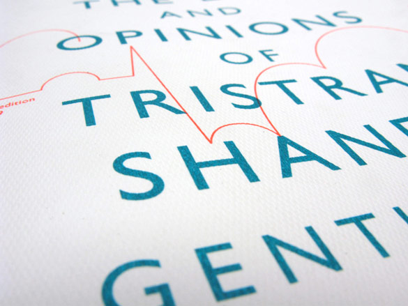
'With most experiences in life now, we expect more and more,' says Britt Iversen, co-founder of new London-based publishing house Visual Editions. 'So why not with books?' As she proves with the company's first tome - a new edition of Laurence Sterne's 'The Life and Opinions of Tristram Shandy, Gentleman' - the traditional reading medium has not lost its capacity to surprise.
At the axis of Visual Editions is a belief in 'visual writing'. It is via this approach - which the company takes to both fiction and non-fiction - that Sterne's 18th-century novel shakes off its Dover Classics image and emerges refreshed for a 21st-century readership.
Visual Editions approached A Practice For Everyday Life, a London-based graphic design studio that has taken commissions from the likes of FAT architects and the Tate, with one clear instruction: to stay faithful to Sterne's playful spirit. That aside, the designers were given free reign to create a book that remains elegant and visually beautiful amidst the pervading liveliness - which is backed up by a suitably irreverent forward from Will Self.
That Iversen and Visual Editions co-founder Anna Gerber bonded six years ago over a shared love of colour is self-evident; the book is shot through with an arresting shade of orange. 'Anna has been teaching design for ten years, currently at the London College of Communication,' Iversen explains. 'When we met, we quickly discovered our devotion to colour.' Meanwhile, Iversen herself works at advertising agency, Mother, now in her ninth year, and so brings a 'broader, more poppy' experience to the table.
The central tenet of Visual Editions is that aesthetic additions should never be extraneous or gimmicky; rather they should reinforce and help deliver a narrative. Visual devices range from using photography, die-cuts and even blank pages. In the new edition of Tristram Shandy, a shut door is represented by a folded down page, and perspiration is depicted using a marbled black-and-white photograph in a feat of ocular onomatopoeia.
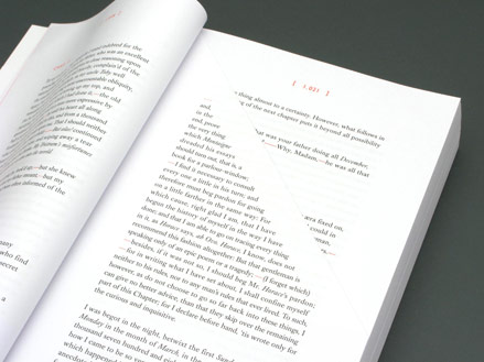
A folded-down page represents a shut door in the narrative
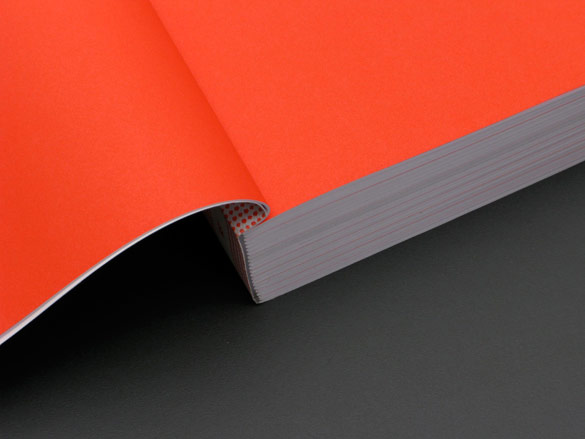
Anna Gerber and Britt Iversen bonded over their shared love of colour, as evidenced by the fluorescent orange inside cover
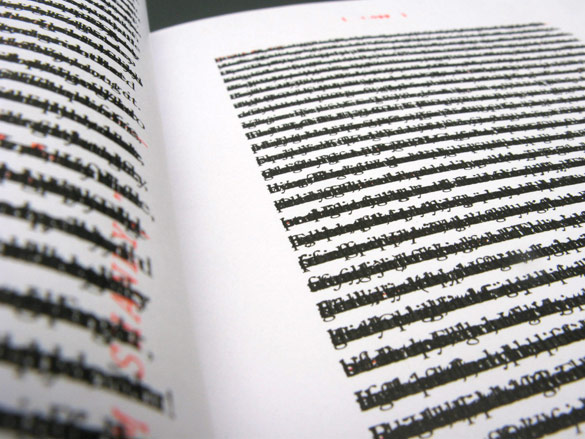
The black page from ’Tristram Shandy’ features overprinted text from previous chapters
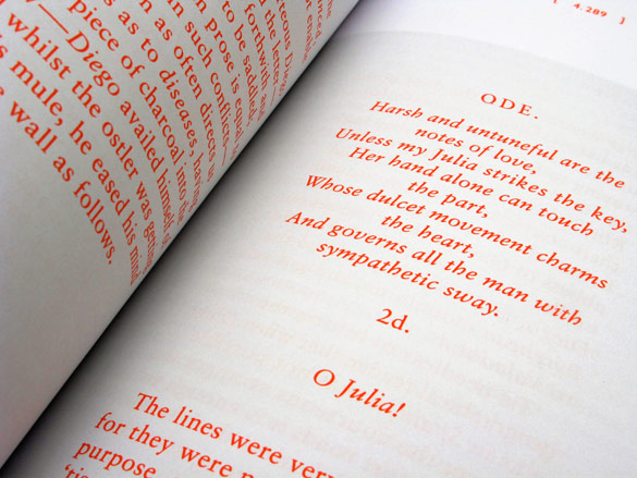
The book is shot through with this arresting shade of orange
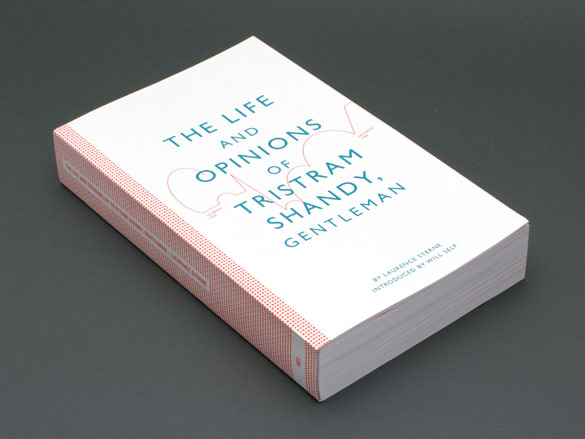
Visual Editions’ debut book demonstrates the ’visual writing’ principle on which the company is founded
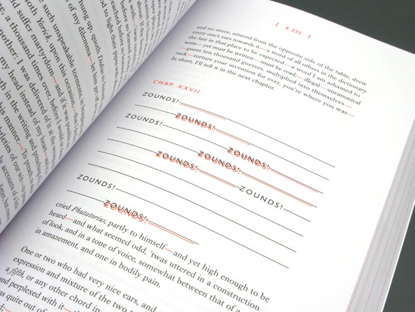
Repetitive sounds in the narrative take on a visual shape, reinforcing their impact
Receive our daily digest of inspiration, escapism and design stories from around the world direct to your inbox.