Minimal with a twist: German watch brand Nomos’ new Neomatik collection

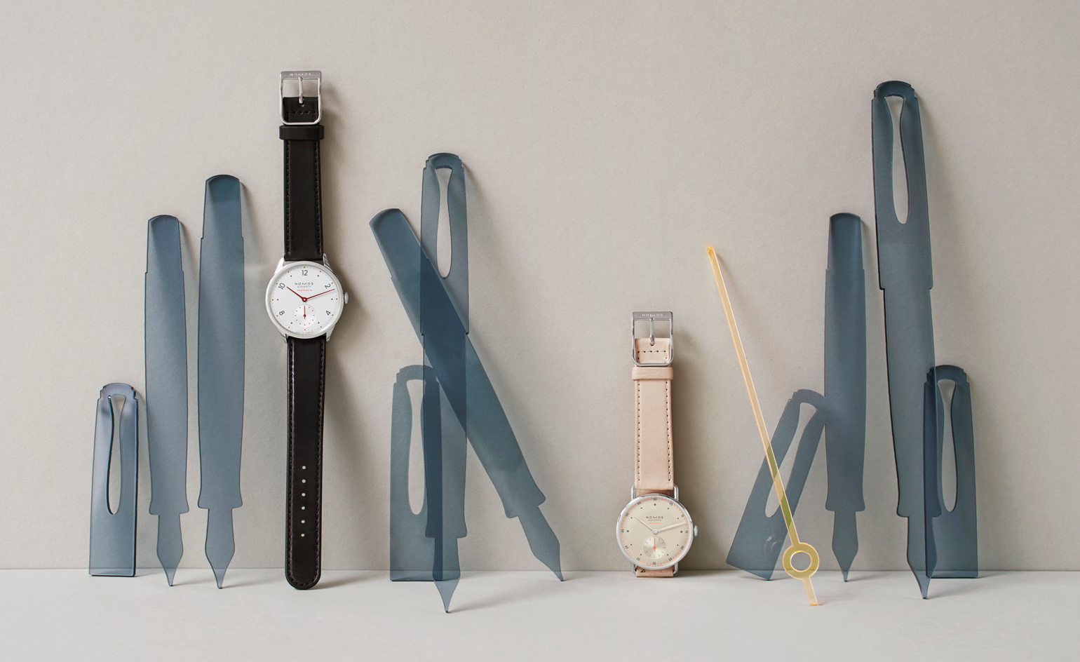
It could be easy to label German brand Nomos' restrained, clean aesthetic as fundamentally minimalist, but for designer Thomas Höhnel, this is peripheral. ‘If you think minimalism is just about leaving things out, well that’s too easy - when you look at the details in our watches there’s always a little twist.’
The new Neomatik collection is made up of ten automatic models. Designers cite an interesting amalgamation of influences, and pay tribute to the German history of great product design; Höhnel cites Christian Dell's ‘Kaiser lamp’ from the Thirties and the ubiquitous ‘pearl bottle’ from Gunter Kupertz as pertinent examples of products that are both functional and well-designed.
The Deutscher Werkbund movement, which preceded Bauhaus, also shapes key Nomos design codes. Höhnel admits though, that finding the right balance between function and design is a compromise: ‘We do have our fights with construction; they design the movement and dimensions of the watch and we build around that.’
The design twists that Höhnel refers to are discreet; particulars you only notice at second glance. Dials are in either white or elegant champagne, contrasting with contemporary details picked out in neon orange and cyan blue. The curved, slender case with integrated lugs creates a streamlined silhouette: ‘It adds twists and turns, creating another level of interest when you look at it again. There's also the curved glass over the dial you can only see at certain angles.’ Other design details, like the gently padded straps crafted from organic leather and the archetypal crown, show the importance they have placed on creating a watch that can be worn everyday and sits comfortably on the wrist.
Colour is key, although nothing is quite as it first appears. As well as the bright accents of neon, what seems to be golden pearled indices on the Minimatik model are, on closer inspection, actually cut-outs that reveal the brass dial underneath; subtle effects that work well alongside the strict proportions on the face of the watch.
The font, Avant Garde, which was created in the Sixties, was chosen because: ‘It's a constructed font made up of straight lines, one which helps to keep the angles of the dial.’ These angles and the space on the dial are carefully considered. Designer Mark Braun pays close attention to the distance between the numbers, hands and dots: ‘It can be a mathematical process. I like proportional rules and start with the Fibonacci – if it looks good, I'm happy. If it's not working, it's better to rely on your senses.’
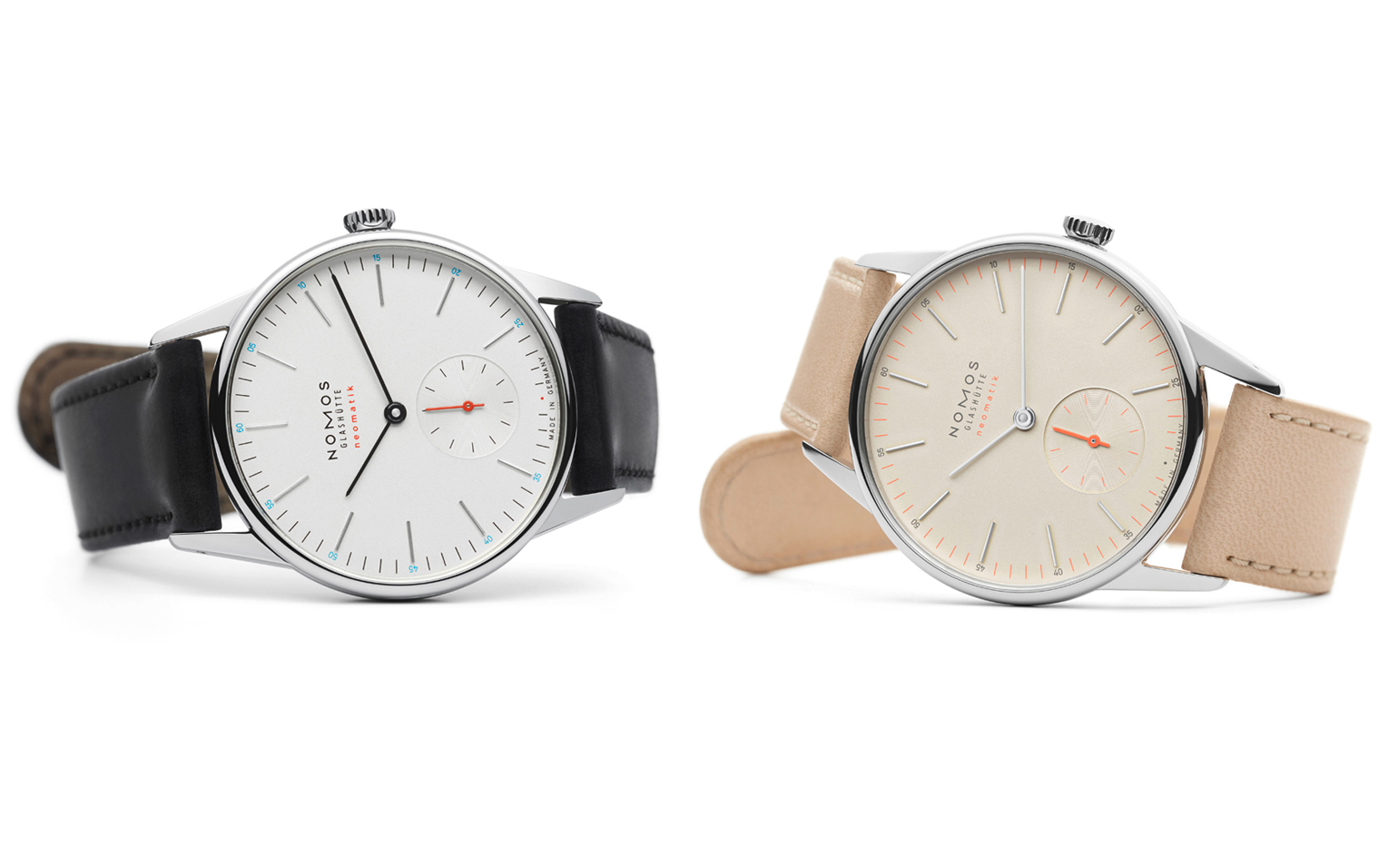
‘If you think minimalism is just about leaving things out, well that’s too easy - when you look at the details in our watches there’s always a little twist,’ explains Höhnel. Pictured is the Orion Neomatik and Orion Neomatik Champagner
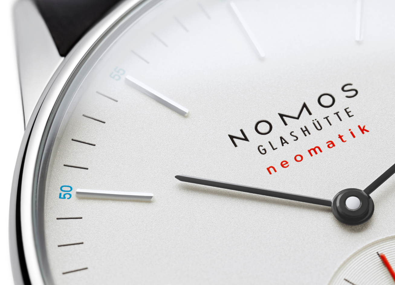
A close up of the Orion Neomatik design
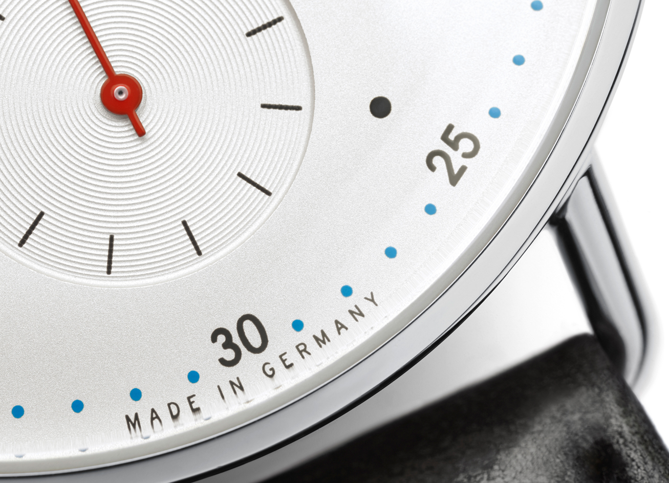
Höhnel admits that finding the right balance between function and design is a compromise: ‘We do have our fights with construction; they design the movement and dimensions of the watch and we build around that’
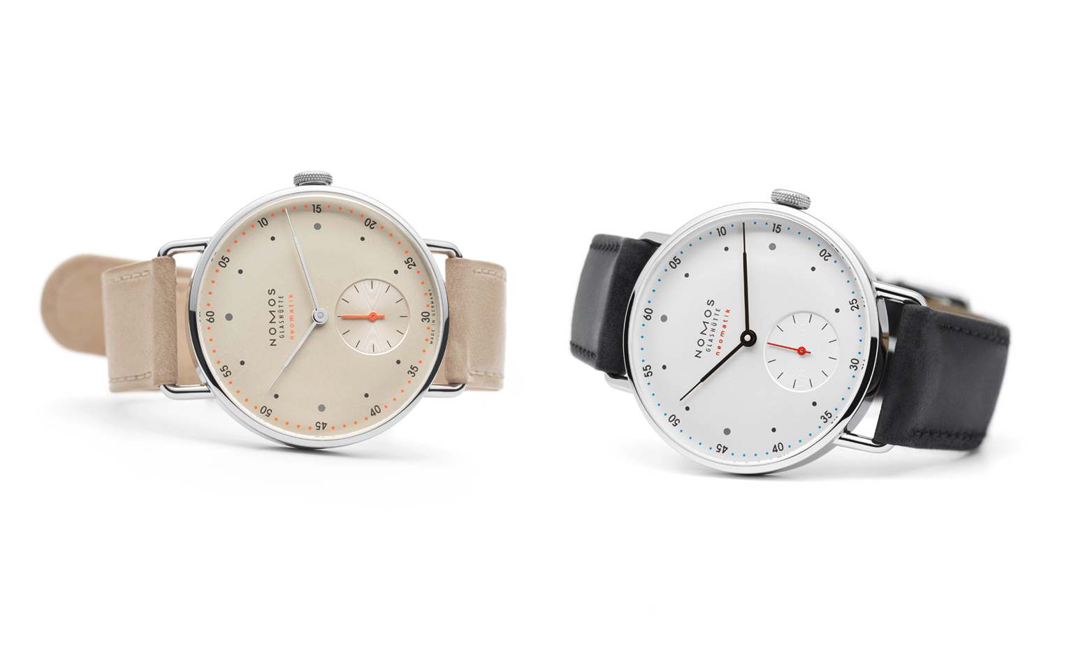
The design twists that Höhnel refers to are discreet; particulars you only notice at second glance. Dials are in either white or elegant champagne, contrasting with contemporary details picked out in neon orange and cyan blue.Pictured: Metro Neomatik and Metro Neomatik Champagner
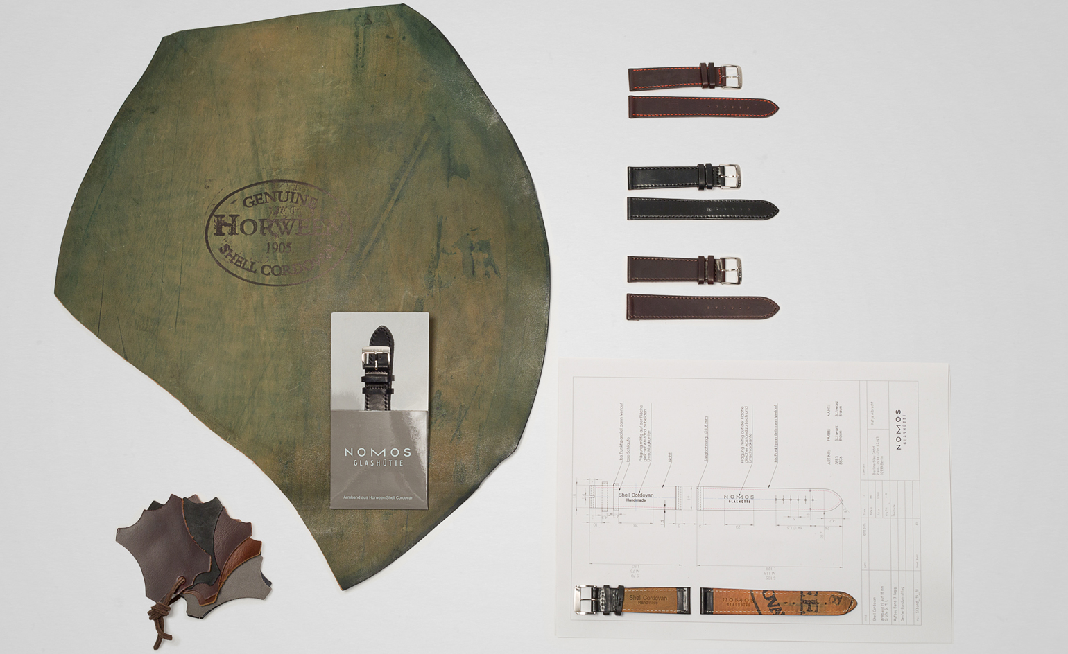
Each watches’ gently padded straps are crafted from organic leather
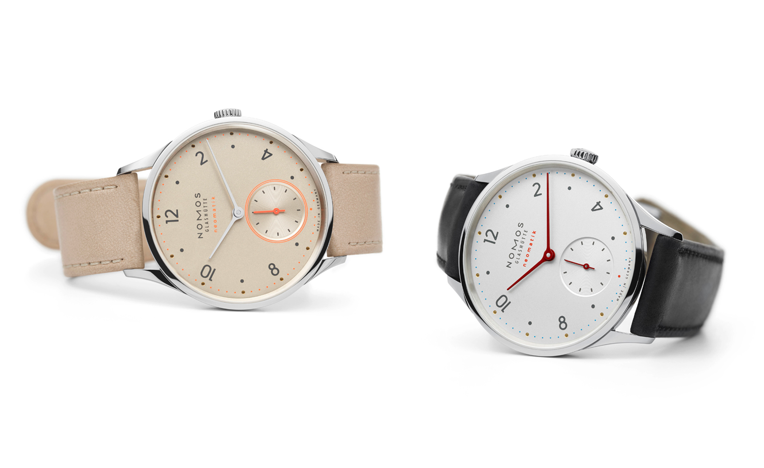
’There’s also the curved glass over the dial you can only see at certain angles,’ he says. Pictured: Minimatik and the Minimatik Champagner
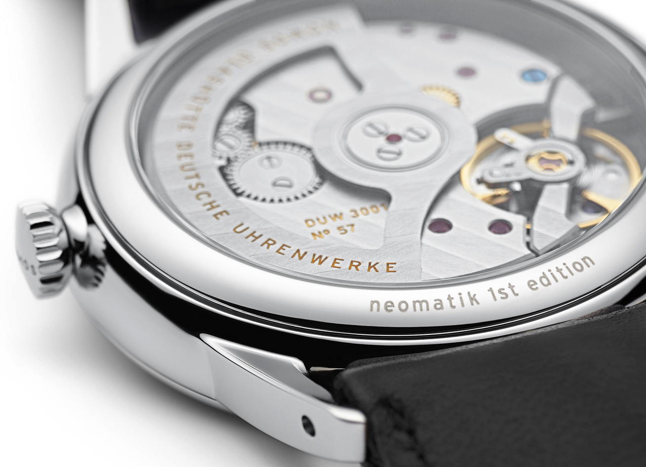
The curved, slender case with integrated lugs creates a streamlined silhouette: ‘It adds twists and turns, creating another level of interest when you look at it again.’ A close up of the Orion Neomatik
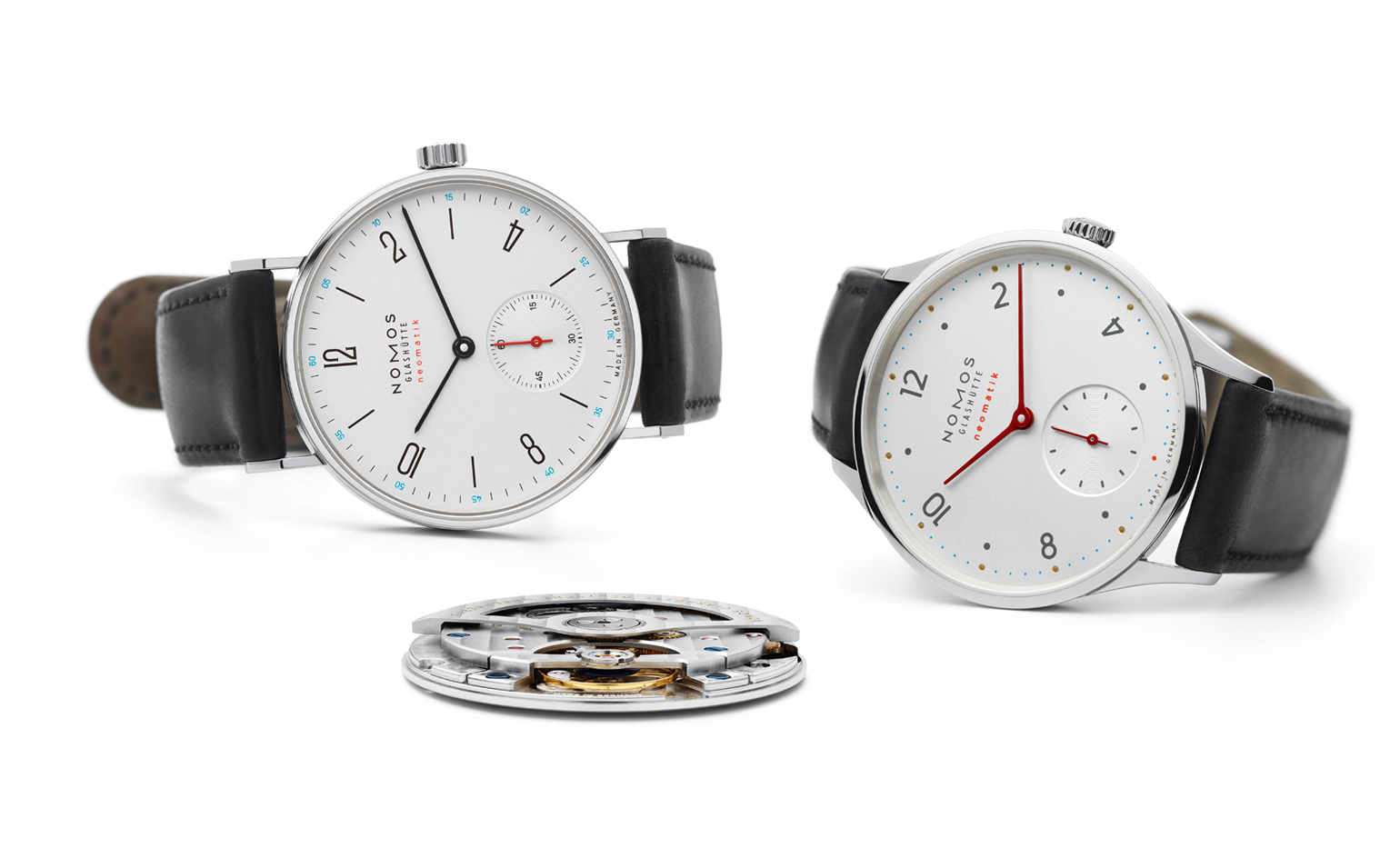
Colour is key, although nothing is quite as it first appears. As well as the bright accents of neon, what seems to be golden pearled indices on the Minimatik model are, on closer inspection, actually cut-outs that reveal the brass dial underneath; subtle effects that work well alongside the strict proportions on the face of the watch. Pictured: Minimatik Tangente Neomatik Duw 3001
Receive our daily digest of inspiration, escapism and design stories from around the world direct to your inbox.
Hannah Silver is a writer, editor and author with over 20 years of experience in journalism, spanning national newspapers and independent magazines. Currently Art, Culture, Watches & Jewellery Editor of Wallpaper*, she has overseen offbeat art trends and conducted in-depth profiles for print and digital, as well as writing and commissioning extensively across the worlds of culture and luxury since joining in 2019.