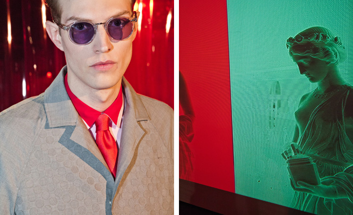
Jonathan Saunders
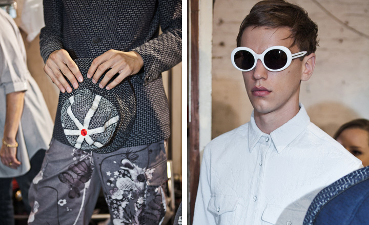
It was in the wardrobe of the city businessman that Jonathan Saunders found the inspiration for his Spring 2014 man. 'It's all these traditional men's fitting, but they're in synthetic colours or printed with flowers,' said Saunders. 'It's playing with these traditional techniques and applications, and that kind of early digitalisation that came from early computer times.' There was certainly a yuppie vibe to the collection, but the grey-on-grey print blazer and shiny canary yellow and fern green satin bombers brought an almost plastic sense of sex appeal to the table, introducing a techno dimension to the Jonathan Saunders man. 'I'm feeling optimistic,' the designer said of the collection, and it showed.
Writer: Anders Christian Madsen
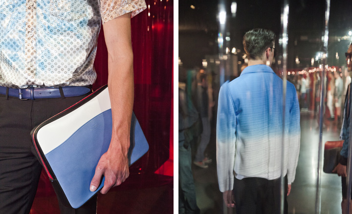
Hackett
The Victorian fishmongers, who used to call the Old Billingsgate Market home, hardly imagined that one day a succession of posh lads in straw boaters and cricket gear would be prancing through their great hall to the (live) tones of the London Philharmonic Orchestra's rendition of the 'Prospero's Boys' score. And yet this was the scene on Monday night as Hackett showed its Spring collection, based on 1960s photographer Terry O'Neill's classic movie-star portraiture and the menswear illustrations by his fellow 1960s artist René Grau, whose work with clashing patterns and colours was referenced throughout. But there was an intrinsically 'Oxford in the 1920s' charm to the collection as well, which didn't just manifest itself in summer tweeds and checks, but also in the Brideshead-esque styling of the show, which, when combined with a soundscape of dreamy violins, was nothing less than beautiful.
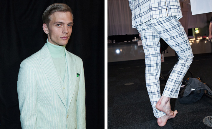
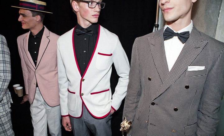
Burberry Prorsum
This season marked Burberry Prorsum's menswear debut at LC:M, and what better way to celebrate than by hailing a British icon? Basing his Spring collection on the work of David Hockney and the artist's trademark colours in particular, it was a triumphant homecoming for Christopher Bailey. There was a roundness and a softness to the silhouette, which made the whole thing feel rather boyish in a sort of 'cute nerd' way, not dissimilar to the intellectual uniforms of the arty, academic young set of the 1960s and early 1970s. And in that sense, it wasn't far off from something a young David Hockney would have worn himself.
Receive our daily digest of inspiration, escapism and design stories from around the world direct to your inbox.
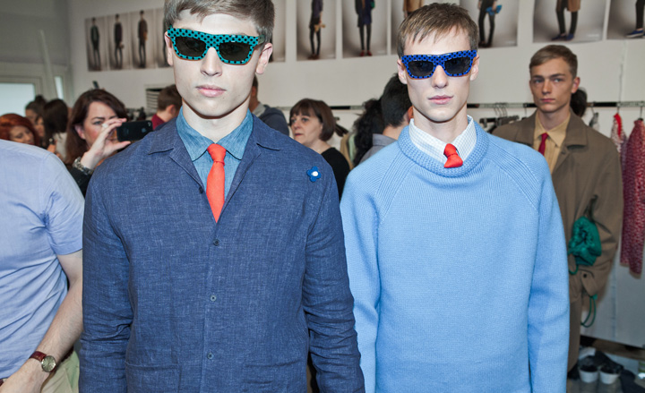
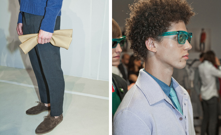
Spencer Hart
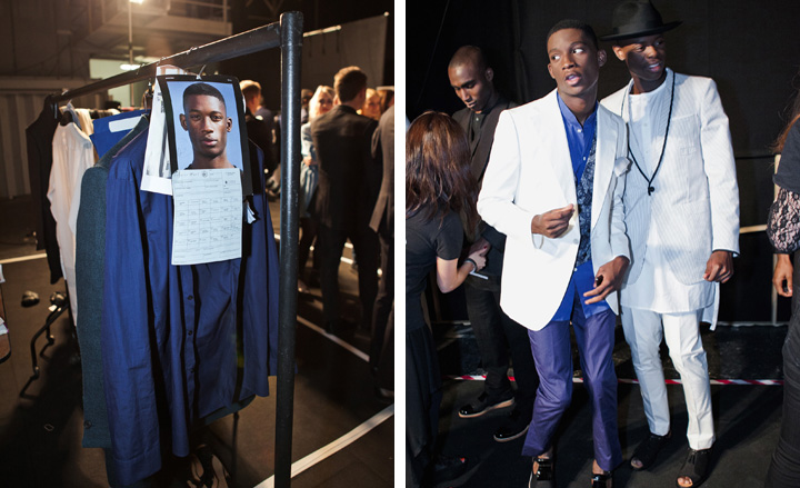
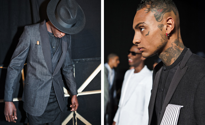
There was always going to be a lot of Soul at Spencer Hart (when you open your show with an old recording of James Brown's MC introducing the Godfather at a concert, it can pretty much only go one way). That is, of course, unless you completely take your audience by surprise and throw in references to traditional Middle-Eastern dressing, such as long tunics and buoyant tops. Next to each other, the Arab and Soul tailoring vibes created an almost religious kind of 'Sunday best' look with a touch of Harlem, which wouldn't have looked out of place on a young Jermaine Jackson.
Hardy Amies
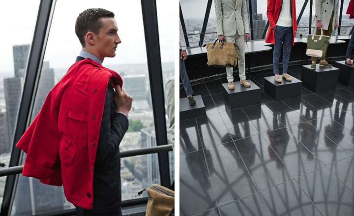
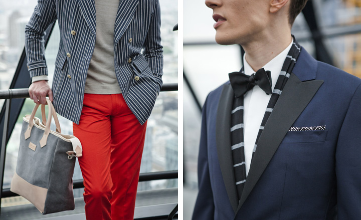
Folded neatly into the breast pocket of a mushroom-coloured summer suit was a pocket square featuring the historic monogram created for Hardy Amies by Saul Bass, which spelt out a graphic, red-on-white 'HA, HA, HA'. It was a comic touch to the Savile Row mammoth's pristine and rather epically staged Spring presentation. In the penthouse dome of London's Gherkin building, a red, grey and navy colour scheme drew on Hitchcock film posters from the 1950s. Bass' opening sequence for Psycho was expressed in intricate stripe work, appearing in pieces such as a casual blazer and a double-breasted number, both of which aced the mid-century spirit of Amies' unforced cool.
MAN
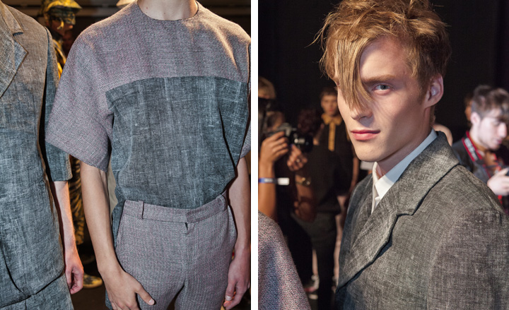
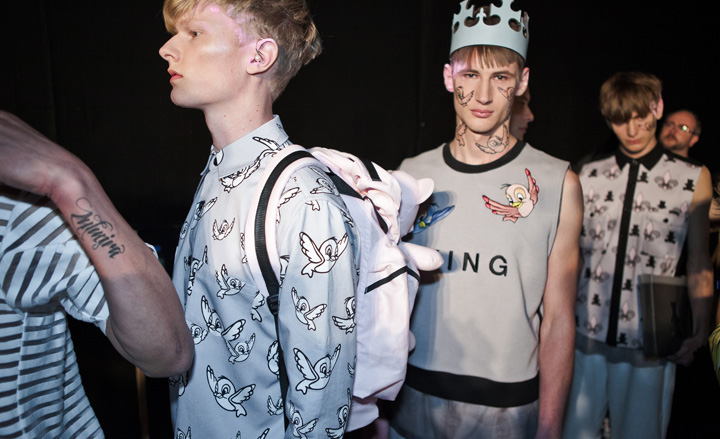
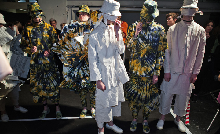
From bluebirds to blackened cardboard boxes, this season's MAN show seemed to sum up the poles of London menswear in three sweeping acts. Most sombre was Irish newcomer Alan Taylor's analogue parade of 'shorts suits' and sculptural silhouettes playing with ideas on functionality, executed in 'TV-flicker' melange and something resembling hessian. Meanwhile, Bobby Abley's teddy bear-take on medieval times saw the Tudors head for Disney World, with cubic basket print, transparent tracksuits and leather crowns in tow. Craig Green's industrial trance beats, however, turned up the severity factor considerably, although the MAN sophomore's gloom levels took a New Age turn in the shape of multi-layered (and coloured) tie-dye looks, which, in addition to the sun hats and general nautical undertones, added a certain Californian vibe to it all.
Pictured: Alan Taylor
Richard Nicoll
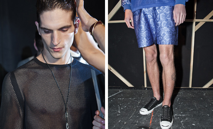
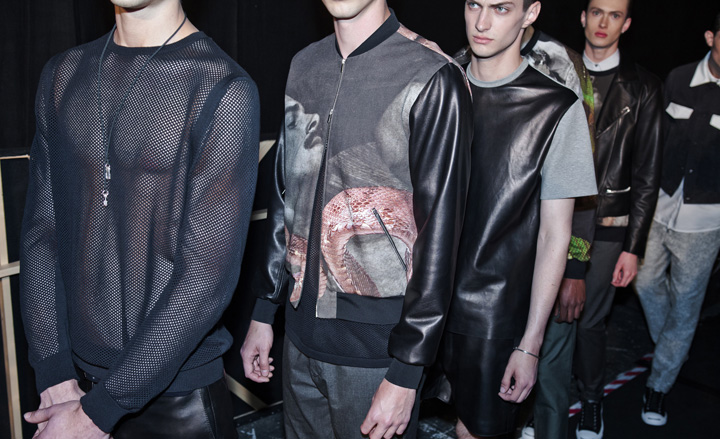
Richard Nicoll has stepped over to the dark side. 'I wanted to do something I felt was quite challenging and new for me,' the designer told us after the show. It was Pietro Mattioli's book '1977' and his visual portrayal of a Zurich nightclub and its male clientele that inspired the collection's rock 'n' roll vibes. The delightfully seedy undercurrent was fuelled by a series of Linder Sterling prints centred round a selection of gay porn images from the 1970s, which Nicoll had found on a recent holiday in Barcelona. But the sexiness was never too overt, thanks to Nicoll's measured hand with materials. Partnering with Converse for his show, the designer kitted his boys out in plimsolls by Jack Purcell, which kept the collection intrinsically Richard Nicoll.
E. Tautz
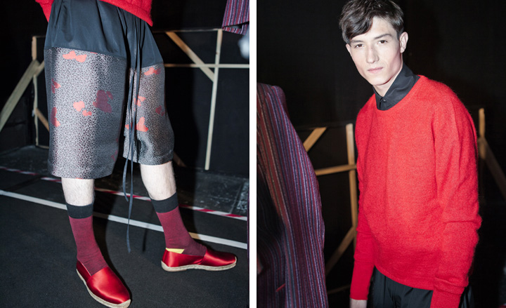
It turns out Patrick Grant is rather the nature boy, at least if his Spring collection for E. Tautz was anything to go by. There was something organic about the variations on bird prints and kaftans he sent down the catwalk, backed up by the kind of light, shiny materials worn in Middle-Eastern cultures, and framed by the studio's impeccable tailoring. When it comes to the Shoreditch vs. Savile Row theme that defines LC:M, Grant stands out with his masterly morphing of the two poles. While his collection was rich on tailoring, it felt just as much about fashion as it did about style.
Rag & Bone
Perhaps David Neville and Marcus Wainwright wanted to guard themselves against 'dirty chic', an aesthetic often associated with London fashion, or maybe the British expat New Yorkers just wanted to start off with a clean slate for their first Men's show outing in their motherland. Either way, the collection established a new and more pristine side to Rag & Bone. Working men's staples such as cargo trousers and utility jackets received the cultivated treatment, while refined fabrics (largely unsuitable for physical labour) were used in menswear basics, resulting in an ultra clean-cut, somewhat formal approach to leisurewear. An excellent LC:M debut for the duo, whose work has always aimed to morph British heritage with American soul.
Gieves & Hawkes
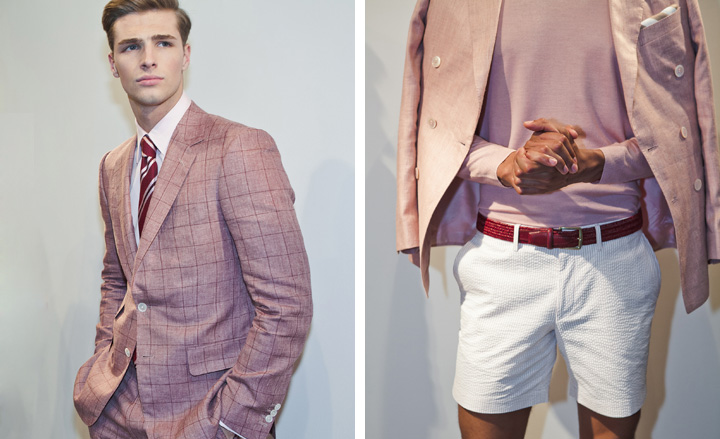
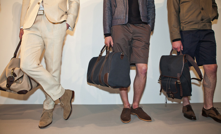
When the archive you have to work with is a complete representation of British history over the past two and a half centuries like Gieves & Hawkes', you could say you can be pretty confident when it comes to house aesthetics. 'It's style more than it's fashion. For us it's about an evolution of the brand more than a revolution, and what we're doing feels right,' Jason Basmajian told us at his Gieves & Hawkes presentation. For Spring, he added luxury sportswear and casual wear into the mix, although a tailcoat and a morning suit were still front and centre. 'The idea was to lighten it up and give it a very modern, fresh cut,' Basmajian said of the collection. 'What I love about London is that it mixes incredible tradition and something very old-school with something very cutting-edge and underground, and the fact that the two exist so well together is innately British.'
J.W. Anderson
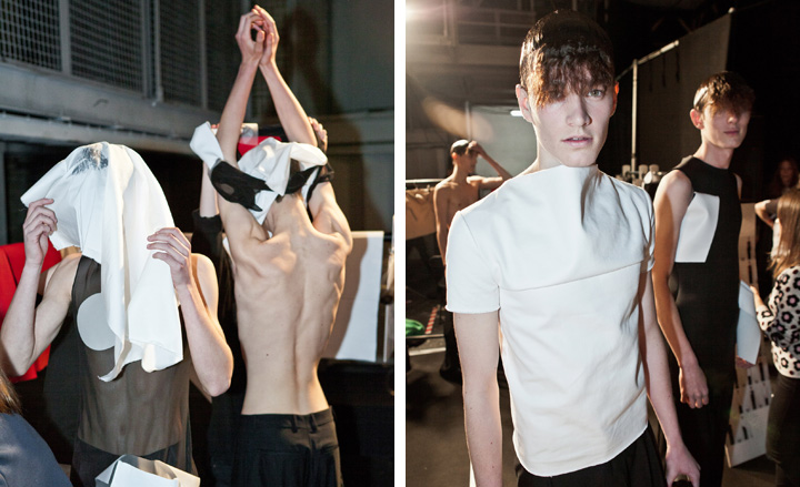
If last season's cross-dressing feast at J.W. Anderson left male followers pining for more, the studio's Spring effort gave its devotees plenty of fresh garments to savour. From dresses doubling as tops to little 'Malibu Barbie' halter-necks - all styled with oversized trousers - the collection played on geometry, dabbling in a bit of arts and crafts in the process. Some pieces resembled maxi origami, while others were an exploration of depth and volume, resulting in a costume-like, hyper-modern, almost sci-fi aesthetic - referencing the likes of Rick Owens and Rei Kawakubo all at once.
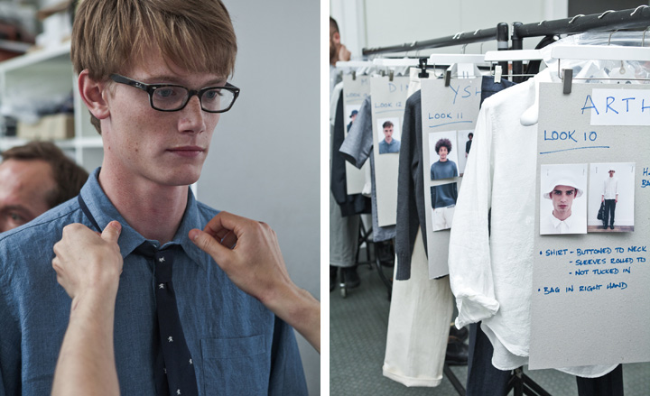
Here comes the sun, it's alright,' George Harrison's evergreen tune assured guests at Margaret Howell as models in bucket hats strolled down the catwalk. At Mag's house, there's no rush, no gloss, no pretence, and it was the laissez-faire attitude that created this season's boy. The combination of a muted palette - blues, greys and khakis - and rich lightweight materials made for a decidedly casual cool vibe. The collection seemed to draw delicately on certain 1950s features - boyish soft-collared, short-sleeved shirting and sporty shorts, not far off from the image of a young JFK. There was an ease to it all, which Margaret Howell does better than anyone else. Casual luxury, you might say.
Richard James
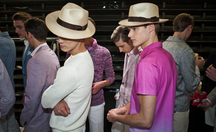
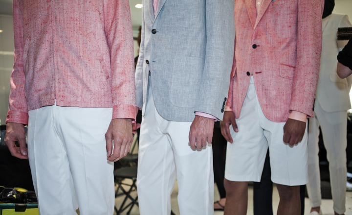
There was no Elton in a purple suit at this season's Richard James show (although possibly a PR or two, instead), but the Rocket Man's better half did make an appearance. David Furnish and his fellow guests witnessed all the stages of a sunset, from beginning to end, represented in the colours of each look that paraded down the catwalk at the BMW showroom on Park Lane. But it was the South American spirit of the collection that was the true star of the show. With a Portuguese soundtrack, bejewelled espadrilles, crisp white crepe and linen summer blazers and a couple of Panama hats, Spring 2014 by way of Richard James is the wardrobe of a modern-day Hemingway in his Cuba years.
Rake
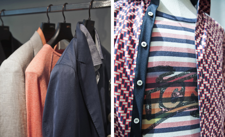
It was a case of the fast and the furious with Clive Darby showing his collection based on the inimitable François Cevert, the Formula One legend who died in 1973 doing what he loved doing most. From blazers to bombers, every piece had undergone a sporty transformation, which gave the collection's superior tailoring a certain frisky freshness and youthful charm. And it wasn't just man-made horsepower that got the Rake treatment. Leather from one of nature's sprinters, the kangaroo, was used in jackets, which, like the rest of the collection, appeared in the blues, reds and yellows to reflect the colours of Cevert's famous helmet.
Alexander McQueen
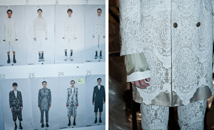
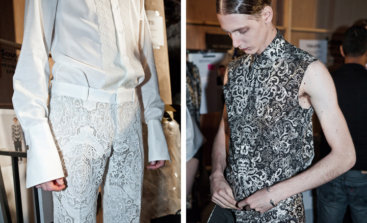
Thanks to a cobblestone catwalk, thick smoke and fierce violins, we could well have been about to witness Dracula's arrival in gloomy Whitby circa 1890s. With slicked back hair, clad in Victorian coats covered in lace, richly woven suits and prints resembling the stained glass of a Renaissance cathedral, Alexander McQueen's priestly princes walked through the outdoor space of the Central Saint Martins King's Cross campus like it was a funeral march, filling the air with a pungent whiff of drama. As the violins led into frenzied church choir music, lace and prints grew increasingly intricate and heavy. But there was a poetic lightness to Sarah Burton's collection, which felt almost celestial, and kept the spleeny dandyism to a non-hysterical and highly beautiful level.
Oliver Spencer
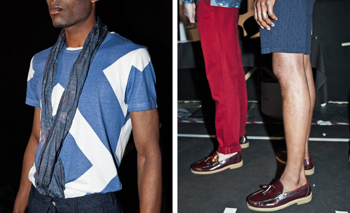
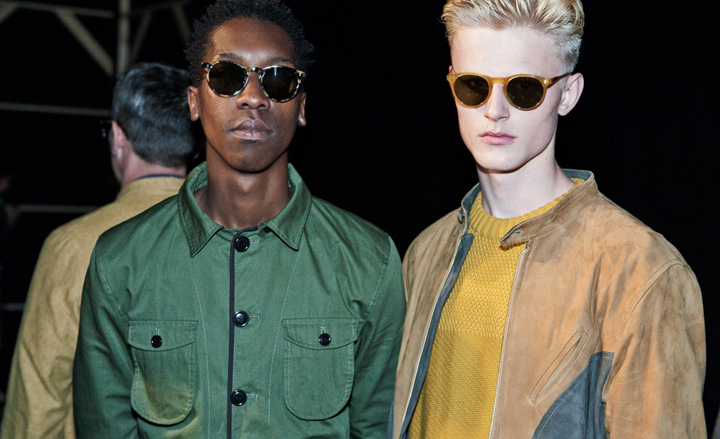
If there's a popular notion on fashion, it's that it no longer surprises. Trust Oliver Spencer to prove that said notion wrong. Take for instance his Spring show, in which actor Idris Elba popped out of nowhere, mounted a mixer built in the vein of Jean-Michel Basquiat and started DJ'ing, while a diverse cast of models circled around him. With the neo-expressionist American artist as his point of departure, Spencer created a collection based on Basquiat's 'suggestive dichotomies', expressed in the graffiti trademark of the artist's work, which was used in tailoring throughout. It was a buzzing collection, which had no trouble pulling off the often-difficult task of merging art and fashion.
CP Company
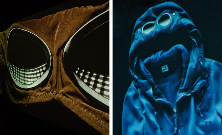
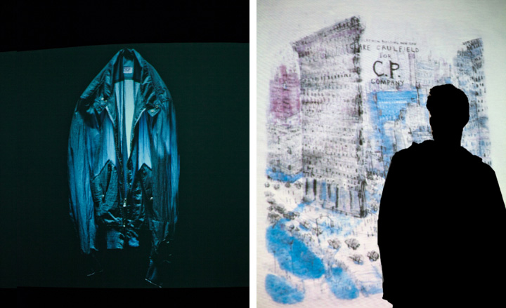
Just because you're can't take your presentation to the Amalfi coast doesn't mean you can't take the Amalfi coast to London. It was an exercise executed with excellence at the CP Company' presentation, which saw the courtyard of Mercer Street Studios transformed into an Italian garden. Inside, the collection revealed a lighter side to CP Company, where nylon took centre stage. Parkas were kept lightweight, while the labels' classic jackets were given shirt shapes. A couple of jackets done in collaboration with denim specialist ISKO added a certain rawness to the collection, and looked perfect for a spin down the Amalfi coast.
Pringle of Scotland
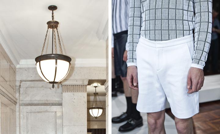
With checks reigning supreme this Fall, there's nowhere better to be Scottish right now than in menswear. Having always stuck to its highland guns, Pringle of Scotland is undoubtedly a step ahead of the tartan game for Spring 2014. Working with the notion of 3D check and argyle, creative director Massimo Nicosia presented an intricate collection borne from state-of-the-art weaving methods and even yarn from a special mill. And by 3D he actually meant 3D - there was no trompe l'oeil in sight, just pure texture. It made for a highly modern collection, whose bright colour scheme, sleek, impressive detailing and super lightweight qualities had a chic sportiness and newness about it, which isn't always easy to find in ancient Scottish heritage.
Tom Ford
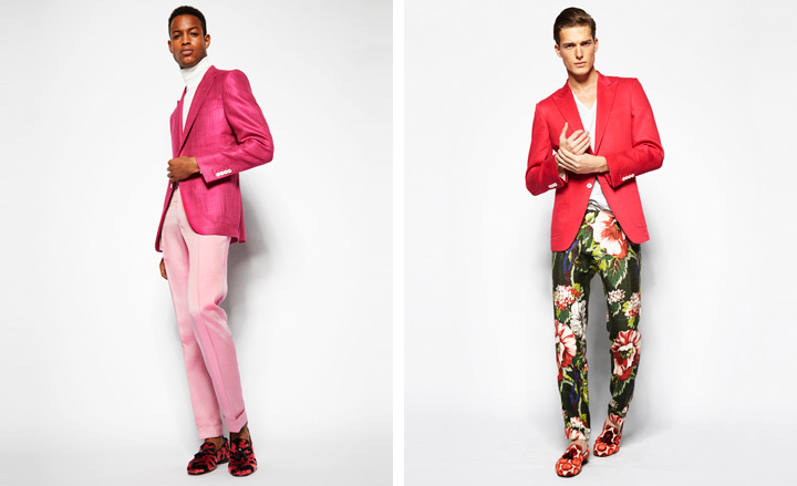
There's something sculptural about a Tom Ford collection. Every jacket and trouser hugs the body with the kind of heavenly precision you find only in the uncompromising world of the Texan feinschmecker. 'We were in a mood for florals,' Mr Ford said while a model walked by in a tropical print trouser during an intimate presentation at Ford's headquarters on Tuesday morning. It was a collection rich in colour, from pale pinks and blues to hotter, louder hues. Combined with Ford's master cutting that had a hint of the 1970s to it ('I'll always be fascinated with that decade,' he confessed), it was a treat to the eye. Emphasising the casualness of the presentation, the last look was modelled by Igor - a Ford favourite - who came out on crutches. 'Igor hurt his foot playing football, but we love him so we quickly made him some Tom Ford crutches,' the designer quipped. 'They're covered in velvet.'
Christopher Raeburn
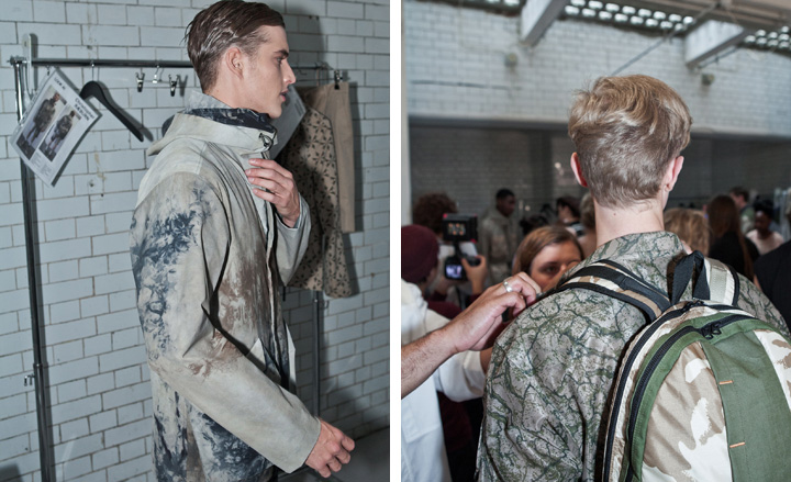
Who doesn't love a desert trooper? Christopher Raeburn sure does. So much so that he based his remarkable Spring offering on the Long Range Desert Group of World War II. Playing with the idea of the multitude of materials used by extreme-terrain soldiers, the designer dreamt up a multi-faceted collection incorporating elements such as the forest-like motif that appeared on jackets, a camouflage material made from 1950s' rubberised cotton that appeared on tops, and a starchy maxi-mesh used in jumpers. Raeburn's oeuvre may be all about performance wear and self-protection, but the collection went far beyond outdoorsy parkas and rainproof capes.
Nicole Farhi
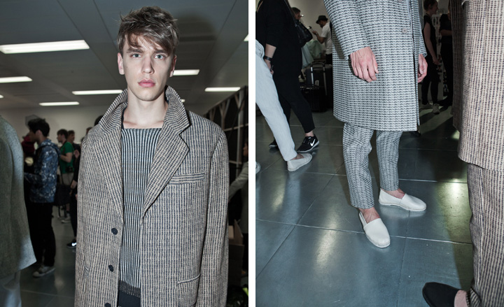
Joanna Sykes' Spring offering was in part inspired by skyscrapers. Whether she looked to London's more diverse skyline, or the perhaps more structured panoramas of other metropolises, is anyone's guess, but her stark and streamlined Nicole Farhi show looked perfectly at home on the LC:M catwalk. The gleaming, silvery slickness of skyscrapers was clearly reflected in looks such as the opening suit, the pattern of which resembled the windows of behemoth buildings. While it made for an austere collection, there was still room for some of that summery lightness they do so well at Nicole Farhi - for instance in a pale blue suit or a clean-cut lightweight linen jacket in pure white.
Shaun Samson
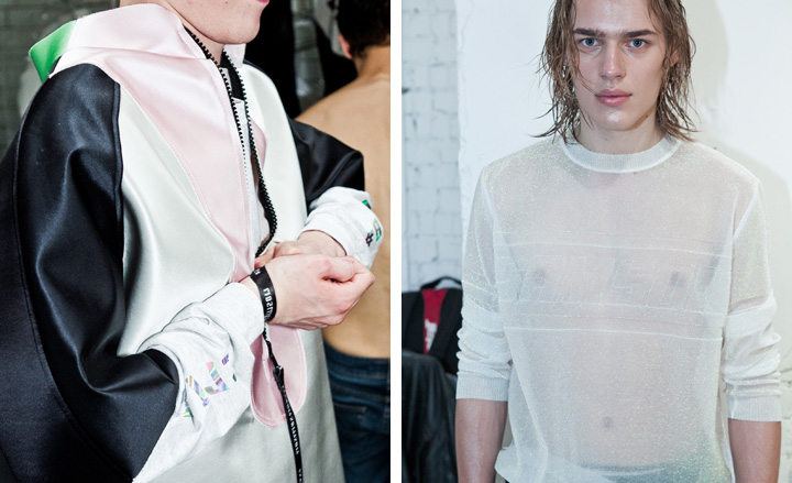
If there's one way to make the pop-fanatical fashion press love your show before its even started, it's to play the comeback song of the newly reunited original Sugababes, Mutya Keisha Siobhan. And thankfully Shaun Samson's collection didn't disappoint either. Sticking largely to metallics and powder pastels, the designer created a sort of crystallised or perhaps aquatic universe, the easy, breezy, beautiful serenity of which was only interrupted by a certain amount of streetwear elements, such as heavy logo work and utility vibes in shirts and trousers. From the lightness of a buoyant pink top with frayed edges flowing in the wind, to soft, sporty shorts and the odd bucket hat, there was something beach-like about the collection, which somehow fit in perfectly on an LC:M catwalk.
Jack Moss is the Fashion & Beauty Features Director at Wallpaper*, having joined the team in 2022 as Fashion Features Editor. Previously the digital features editor at AnOther and digital editor at 10 Magazine, he has also contributed to numerous international publications and featured in ‘Dazed: 32 Years Confused: The Covers’, published by Rizzoli. He is particularly interested in the moments when fashion intersects with other creative disciplines – notably art and design – as well as championing a new generation of international talent and reporting from international fashion weeks. Across his career, he has interviewed the fashion industry’s leading figures, including Rick Owens, Pieter Mulier, Jonathan Anderson, Grace Wales Bonner, Christian Lacroix, Kate Moss and Manolo Blahnik.