Rosalía’s bespoke Instagram font ushers in a new element of a globe-conquering identity
Rosalía’s Instagram font went briefly viral earlier in the summer. We talk to Monotype about handwritten fonts and personal brands
Receive our daily digest of inspiration, escapism and design stories from around the world direct to your inbox.
You are now subscribed
Your newsletter sign-up was successful
Want to add more newsletters?
How do you know if you’ve made it? A sure sign that your social media presence is keenly felt around the world is when Instagram co-opts your aesthetic and bakes it into the system. That’s what happened in July 2025, when Spanish singer Rosalía (26.8m followers) became the progenitor of a distinctive new Instagram font, Rosalía.vt, based on her own handwriting.
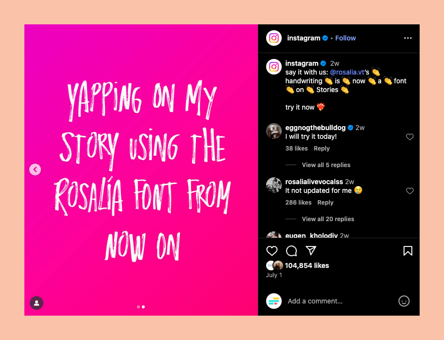
The Rosalía.vt font in action
Replete with a set of secret emojis and usable across reels and stories, the all-caps font was greeted with fervour by the singer’s legions of fans. But what does it mean for design? We spoke to Spike Spondike, senior typeface designer at Monotype, about this new trend in personal branding and how every aspect of design can be co-opted to build an identity.
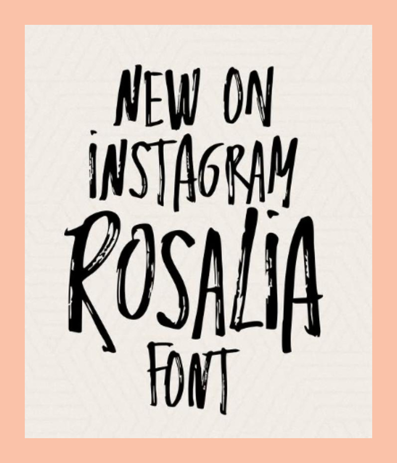
The Rosalía.vt font in action
Wallpaper*: As a designer, what's your opinion of the way platforms create these kinds of typefaces and visual identities?
Spike Spondike: It’s no surprise that platforms like Instagram commission bespoke typefaces. They are offering a wide range of customisation for their creators! Content creators are brands. And to be successful, brands need to build a recognisable, consistent identity. Typefaces are a crucial element in expressing a brand’s tone of voice and personality.
Instagram and other platforms could easily license off-the-shelf fonts, but to keep ahead of the game, they offer many fonts exclusive to them. I’ve had the pleasure of working on some of these myself. All of the bespoke fonts in Instagram stories and reels are just as much about identifying with the Instagram brand as with the content creators and users.
There is a real shift in graphic design where brands, in general, are emphasising typography and reducing the use of traditional graphics. This isn’t just within the world of social media. With this trend, brands are using typefaces that are unique to them [to speak] to their target audience.
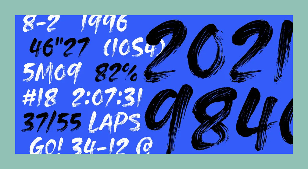
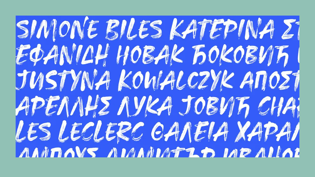
Eurosport RAW by Monotype
Wallpaper* Do you think they’re devaluing the work of designers?
Receive our daily digest of inspiration, escapism and design stories from around the world direct to your inbox.
SS: No, I don’t think so. A typeface inspired by handwriting requires the expertise of a designer to transform the analogue drawings into a digital format. And typeface design within the branding context is most often a collaboration between the brand, a branding agency, and the typeface designer. This is no different. A social media platform commissions a typeface. They use a pop artist’s handwriting as the design. A type foundry draws it and turns it all into a usable font.
From my experience, I would assume that Rosalía (the singer) didn’t draw every single letter and symbol of Rosalía (the font). She would have probably drawn the A-Z, numbers and some punctuation, but the typeface designer would need to fill in the blanks and draw the remaining glyph set based on the design. If Rosalía has as many characters as the other custom fonts designed for Instagram, that’s about 749 glyphs!
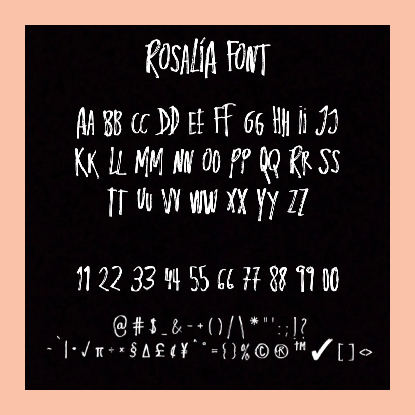
Rosalía.vt
‘The right typeface makes content more accessible and enjoyable, which in turn encourages users to spend more time with it’
Spike Spondike
W*: Rosalía seems to be created to lean into a desire to convey more ‘authenticity’ – any thoughts?
SS: You can’t get much more authentic to your own brand than using your own handwriting. From the sounds of it, the collab with Rosalía is to introduce new ways to share what you’re listening to on Spotify directly through Notes, making connections with friends easier.
I think Instagram did a good job of filling the gaps in fonts offered in stories and reels. There wasn’t a handwritten font offered until now. The intention is to inspire creativity and risk-taking, and a grungy brushstroke design does the job in connecting to Instagram’s younger fanbase, especially fans of Rosalía. Not to mention connecting with Spanish culture.
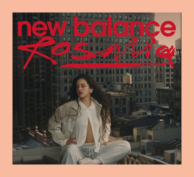
Rosalía's recent New Balance collaborabion leans into the hand-written aesthetic
‘Whether you love the Rosalía font or hate it, it’s a high-quality font, offering many stylistic variations; it’s well crafted, and covers a massive number of languages’
Spike Spondike
W*: How is celebrity branding driving more emotional, expressive design and what creative and technical design considerations go into creating celebrity-inspired fonts like Rosalía?
SS: Handwriting fonts are really difficult to get right. From a technical and production standpoint, a brushed typeface is time-consuming and tricky – many, many nodes and segments. And for a handwriting font to look ‘authentic’, you also need many variations of each letter. There are way too many handwritten fonts out in the wild that don’t offer these variations, and of course, they don’t look like true handwriting.
There is also a lot of engineering and scripting behind these fonts to make them work authentically right out of the box. I think whether you love the Rosalía font or hate it, it’s a high-quality font, offering many stylistic variations; it’s crafted well, and covers a massive number of languages.
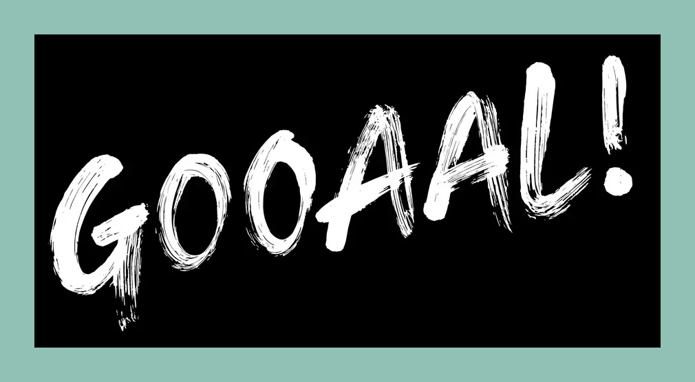
Eurosport RAW by Monotype
W*: What role do typefaces play in building lasting brand identity, ie, helping celebrities like Mariah Carey reinforce their personal brand and emotional connection with fans?
SS: Typefaces have played a role in the branding of celebrities for decades. Not all celebrities and pop stars can say they have an entire typeface, but just look at their word marks and the emotional connections they make with their fans – The Beatles, KISS, Metallica, Pink Floyd, Prince, ABBA – I could go on for days. Now that I think of it, it would be a fun exercise to draw iconic band names in other bands’ iconic designs.
Maybe it has already been done? Custom fonts are essential to creating engaging, memorable content. The right typeface makes content more accessible and enjoyable, which in turn encourages users to spend more time with it. At the same time, a poorly chosen font, will lead to a lack of engagement and frustration. One thing is for sure, you can’t please everyone, so offering a variety of choices can help to keep all of your users happy.

Rosalía
W*: Finally, do you think the font points to a future of greater personalisation? Are you seeing anyone creating fonts using AI yet? Is that next?
SS: There is definitely a future of greater personalisation within fonts. Variable fonts are already doing this. Depending on what axes are set up in the fonts, users can change a number of characteristics. Fonts can automatically change weights, widths, slants, all depending on what devices you are using, or based on your screen size. Variable fonts can even change serif styles. And there’s some really cool examples of experimental variable fonts that dial expression up and down in quite extreme ways.
AI is already being used to aid with font recommendations, font identification, and font pairing. As I mentioned before, AI will provide the possibility of more personalised experiences in the digital world, offering text that can respond to our individual preferences and needs, changing fonts, spacing, colours, widths, weights.
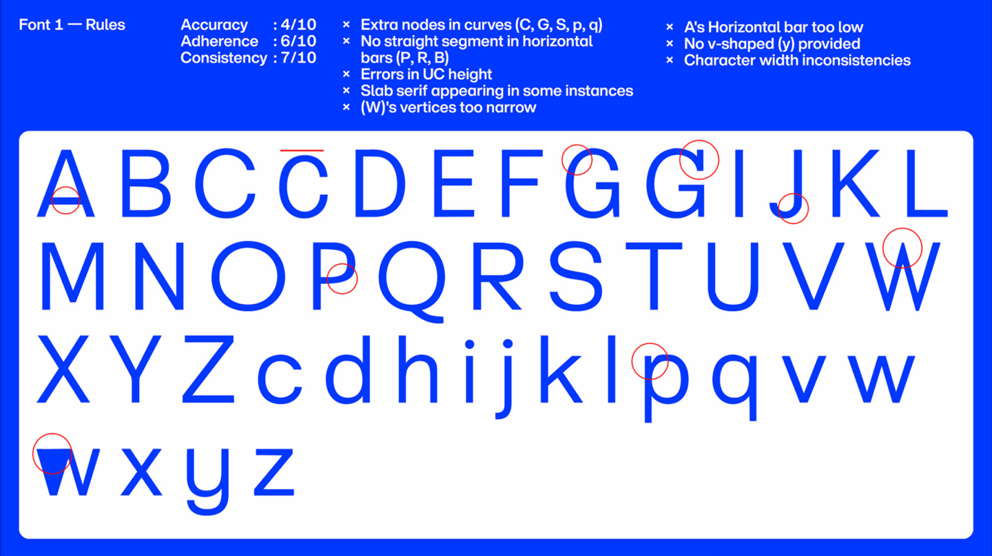
From Monotype's collaboration with Matthieu Salvaggio at Blaze Type: 'AI can output the initial skeleton and establish stroke weights. Clean, reliable curves less so.'
At Monotype, we are experimenting with AI as we speak. Monotype teamed up with Matthieu Salvaggio, the founder of Blaze Type. Blaze Type co-created six limited fonts with an AI type-design tool to explore what a machine would design if provided with a limited range of characters. The results were full of imperfections but offered an interesting insight into letter design variations.
Internally, we’re also exploring the possibilities and promise that this evolving partnership between human designers and AI will bring. As we [develop] new ways of working creatively, the human touch, keen eye, and expertise of typeface designers and font engineers remain the guiding light at the centre.
Monotype.com, @ByMonotype, @Rosalia.vt
Jonathan Bell has written for Wallpaper* magazine since 1999, covering everything from architecture and transport design to books, tech and graphic design. He is now the magazine’s Transport and Technology Editor. Jonathan has written and edited 15 books, including Concept Car Design, 21st Century House, and The New Modern House. He is also the host of Wallpaper’s first podcast.