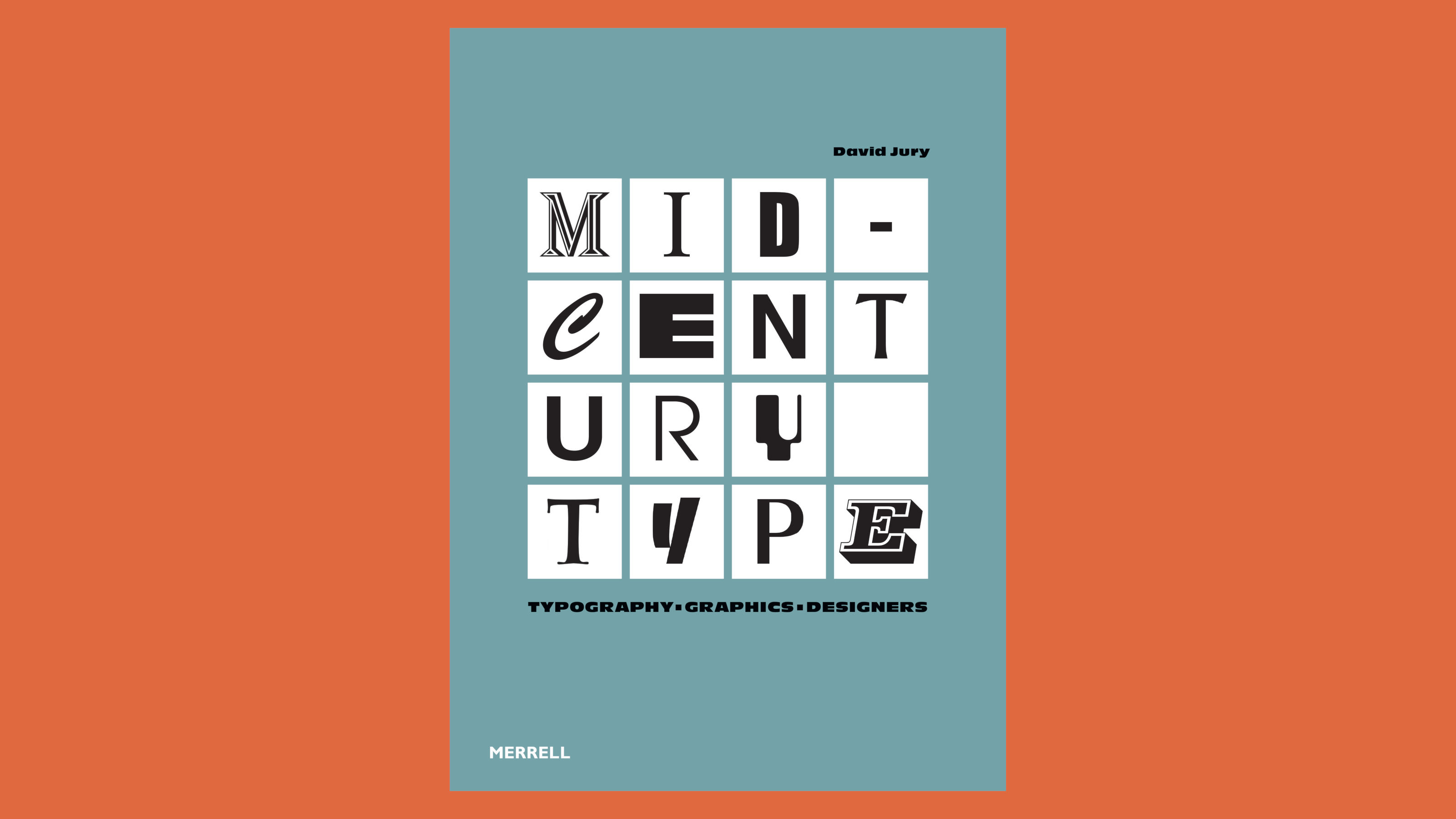
‘Mid-Century Type’ surveys the best graphic design from 1945 to 1965
This must-have manual of post-war graphic design tracks the evolution of midcentury visual culture and the people and studios that shaped it
Receive our daily digest of inspiration, escapism and design stories from around the world direct to your inbox.
You are now subscribed
Your newsletter sign-up was successful
Want to add more newsletters?
Mid-Century Type sets out to chronicle the rapid change in graphic design in the post-war era, as the commercial world collided head-on with the aesthetics and aspirations of modernist-minded designers. Richly illustrated throughout, typographer and graphic designer David Jury’s book ably captures a richly eclectic era, suffused with the colour and form enabled by new typesetting and printing technologies.
Inside Mid-Century Type, a celebration of graphic design
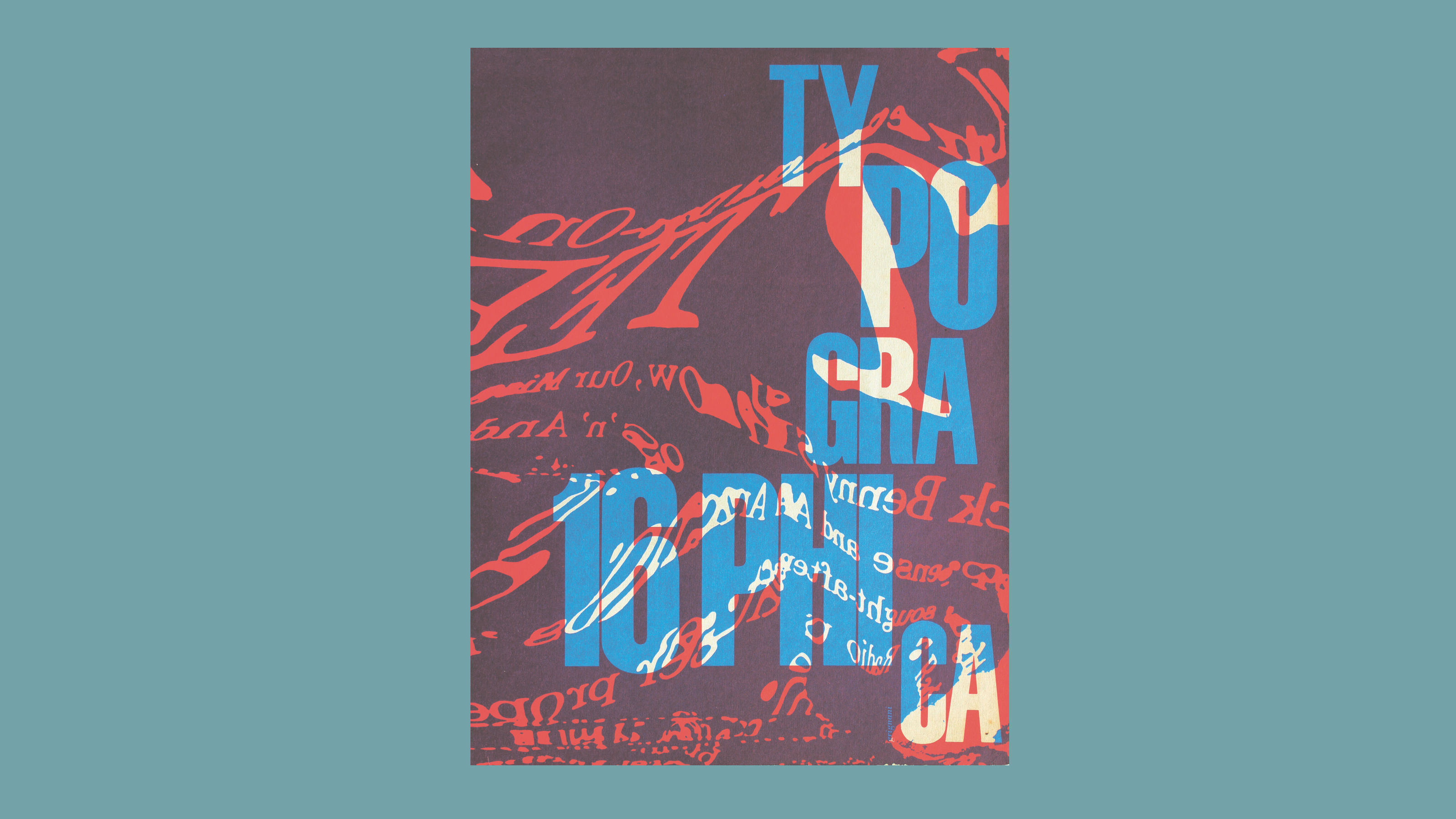
Typographica Magazine 16, Series 1, Herbert Spencer, 1959 (Lund Humphries)
The book surveys all forms of graphic art from the era, from typography and corporate identity through to the posters, advertising and magazine design that came to define the birth of pop culture. There are also digressions into signage design for transportation – from Noorda and Vignelli’s NY subway maps and signage to the huge swathes of public work undertaken by Jock Kinneir and Margaret Calvert in the UK.
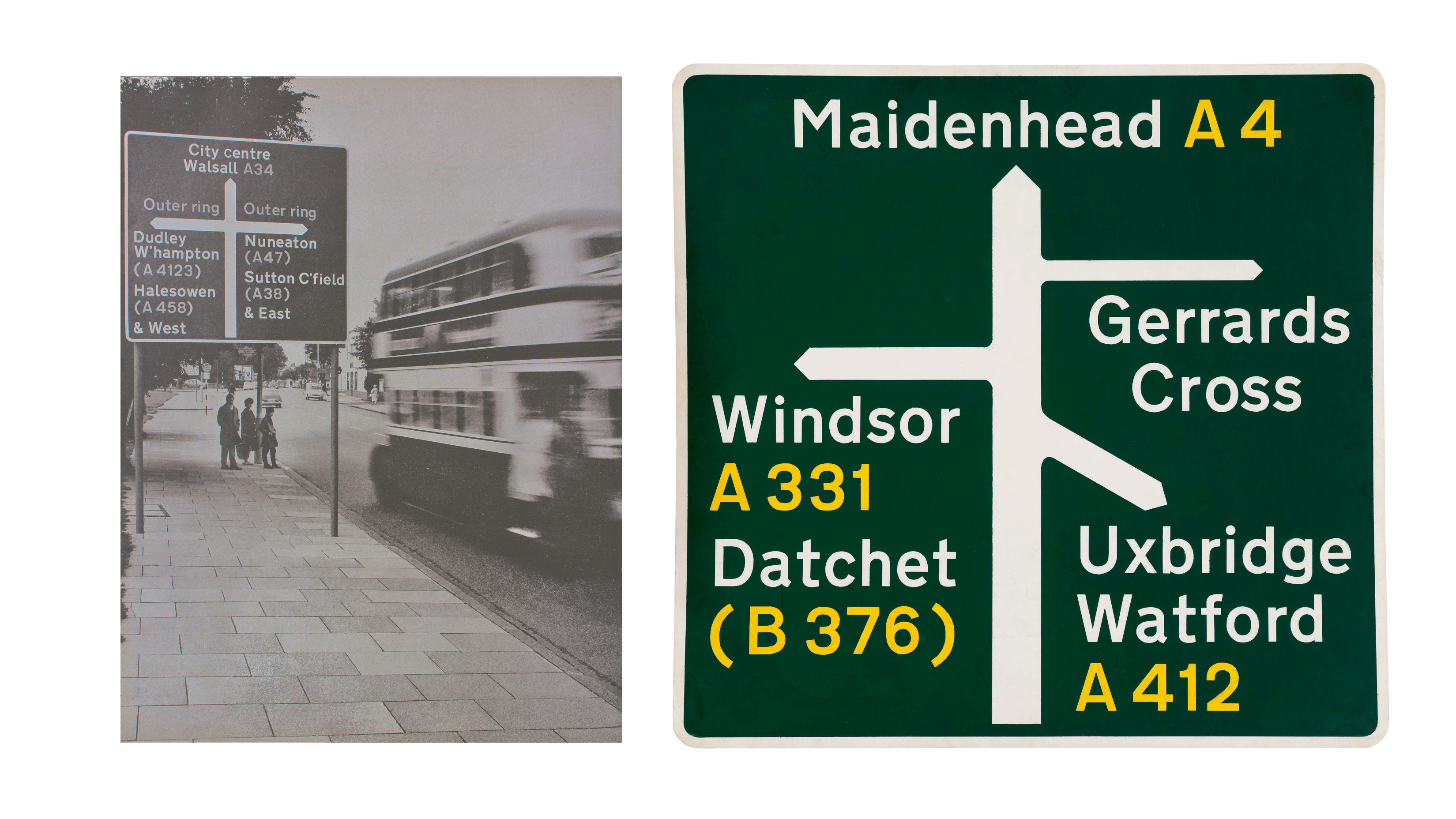
Sign using the Transport Typeface, Jock Kinneir and Margaret Calvert, 1964 onwards (Margaret Calvert Collection)
There’s also a digression into book cover design and film and TV credits – always a rich source of graphical innovation. Although many of the book’s 450 images might be familiar, it’s especially helpful to have them rounded up in a single, indexed place (although the index strangely shows no mention of the influential Design Research Unit), and Jury is especially good at tracking the partnerships, collaborations and commercial and academic associations that often underpinned the most interesting work.
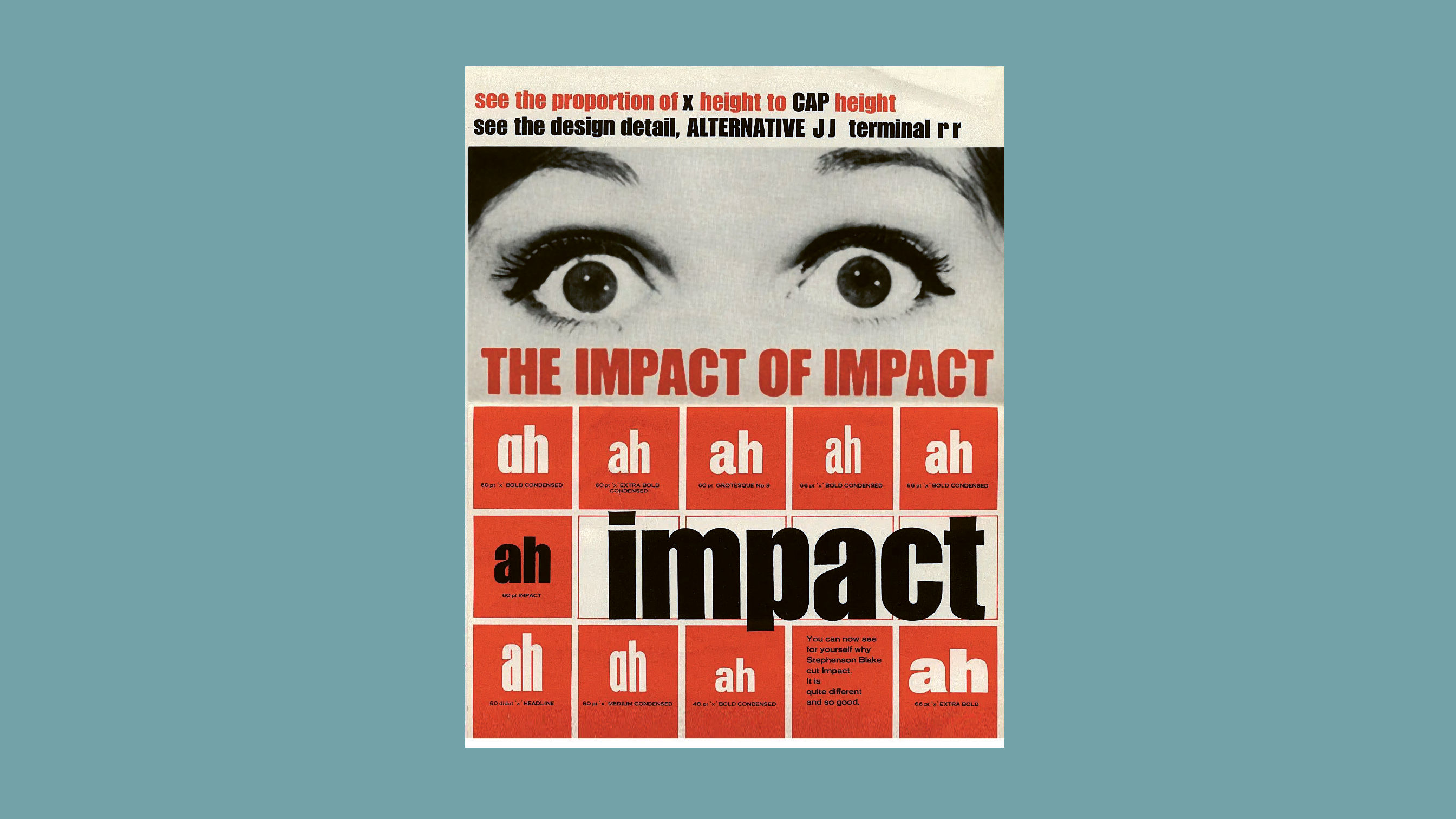
Impact promotional brochure cover, Geoffrey Lee, 1965 (Stephenson Blake Foundry)
The midcentury was a period of massive change for graphics, as layout technologies emerged and evolved, vastly increasing the flexibility, speed and variety of layouts. Letraset, introduced in 1959, transformed the small graphic design office, whilst phototypesetting, a precursor to digital desktop publishing, started the wholesale move away from traditional hot metal type.
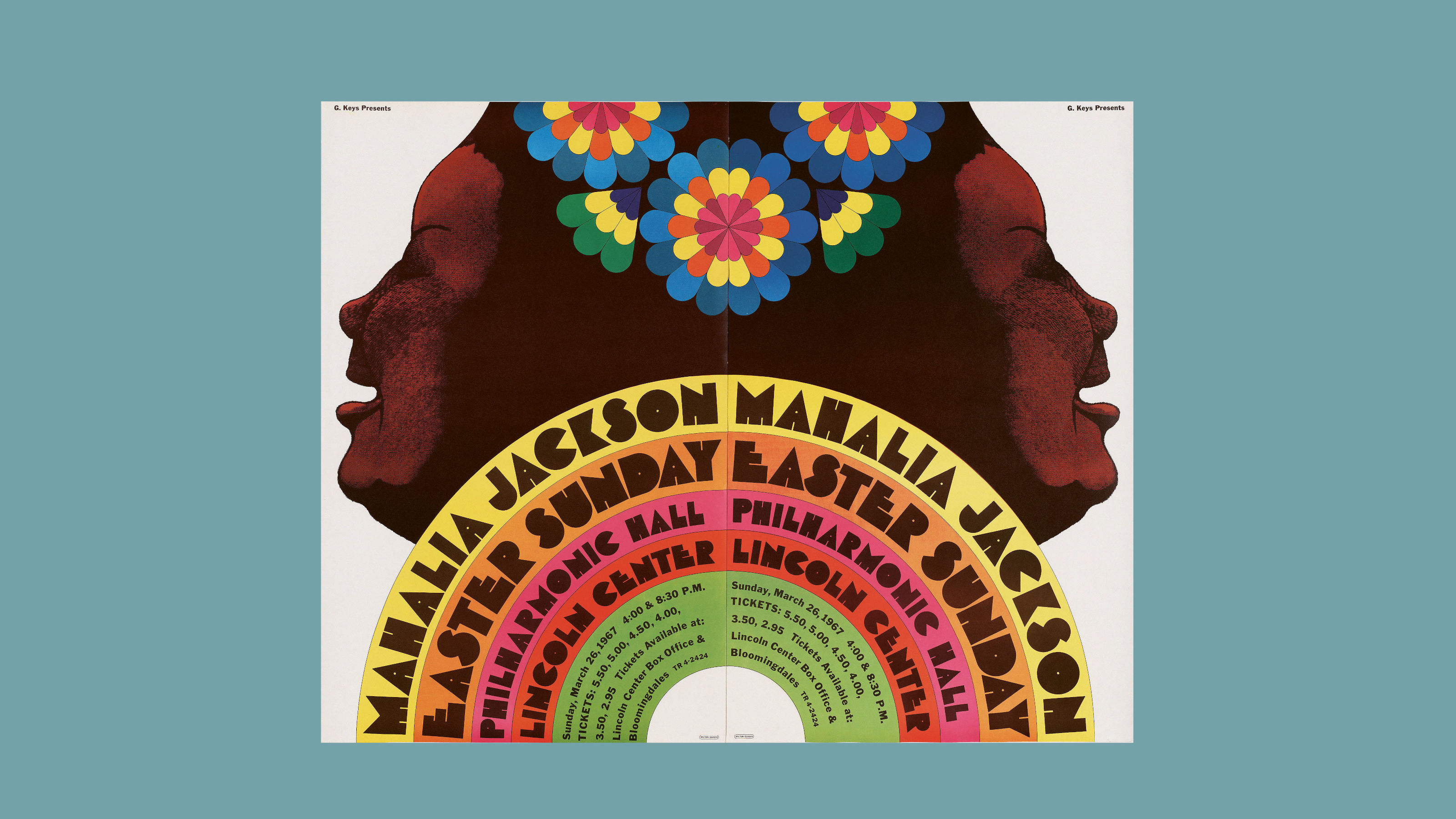
Push Pin Studios, Mahalia Jackson, Milton Glaser, 1967 (Milton Glaser /Digital image, The Museum of Modern Art, New York/Scala, Florence)
Mid-Century Type captures the very best of the new design’s adaptability to a changing world, a world of mass transit, documentaries, pop music and political posters. Although the grid-driven rigour of modernism clung on in certain quarters, the era’s most memorable visual culture built on and transcended tradition, extending graphic art into every facet of modern life.
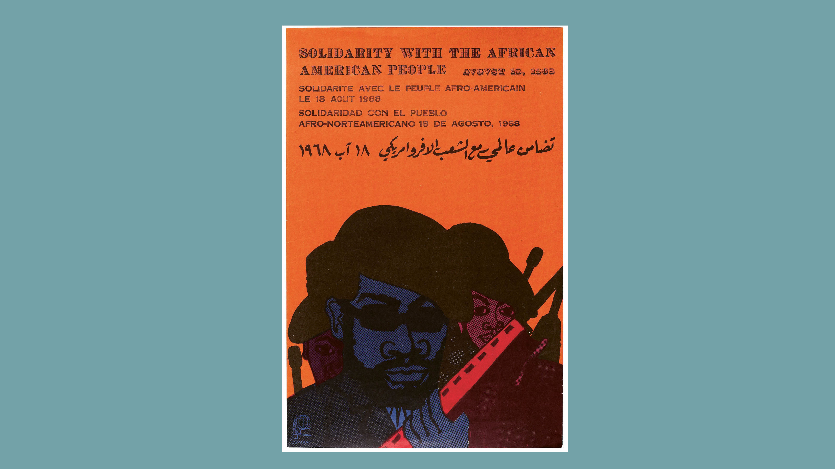
Solidarity with the African American People poster, Lazaro Abreu (Design), Emory Douglas (Artist), 1968 (OSPAAAL)
Mid-Century Type: Typography, Graphics, Designers by David Jury, £40, Merrell Publishers, MerrellPublishers.com
Also available from Amazon
Receive our daily digest of inspiration, escapism and design stories from around the world direct to your inbox.
Jonathan Bell has written for Wallpaper* magazine since 1999, covering everything from architecture and transport design to books, tech and graphic design. He is now the magazine’s Transport and Technology Editor. Jonathan has written and edited 15 books, including Concept Car Design, 21st Century House, and The New Modern House. He is also the host of Wallpaper’s first podcast.