
For decades, the visual language of Barbara Stauffacher Solomon (1928–2024) has shaped how we move through buildings, read space, and understand place – often without realising it. Her monumental letters painted directly onto walls, bold symbols embedded in architecture, and radical use of colour helped define a new relationship between graphics and space.
Working at the intersection of art, architecture and design, Stauffacher Solomon pioneered what came to be known as supergraphics: a way of thinking about space as something to be read as much as it is seen. As an exhibition of her work opens at Anthony Meier in California (on view until 27 February 2026), Wallpaper* looks back at her remarkable work.
Barbara Stauffacher Solomon formation: Swiss modernism
Born on 5 December, 1928, in San Francisco, Barbara 'Bobbie' Stauffacher Solomon trained first as a ballet dancer before earning a scholarship to study painting and sculpture at San Francisco Art Institute. At 20, she married experimental filmmaker Frank Stauffacher, who died suddenly from a brain tumour six years later. Left with no money and a young daughter to support, she travelled with her mother and three-year-old daughter to Basel in 1956 to train as a graphic designer under the tutelage of Swiss graphic designer Armin Hofmann. Here, the only American student, she was introduced to the principles of Swiss modernism: clarity, reduction and the disciplined use of typography.

Barbara Stauffacher Solomon, her daughter Chloe, artist Luchita Hurtado and son Matt Mullican, March 1960, St Moritz
On returning to California and opening her studio in 1962, she applied this approach to a very different visual landscape. At a time when San Francisco remained dominated by traditional lettering and decorative graphics, Stauffacher Solomon introduced a bold new typographic language – including the use of Helvetica – that prioritised function, legibility, structure and truth. Rather than reproducing Swiss modernism, she adapted its logic to architectural space, laying the groundwork for the work that would follow.
The Sea Ranch

Barbara Stauffacher Solomon’s supergraphics in the men’s locker room of the 1966 Moonraker Athletic Center at the Sea Ranch
In the US, Barbara Stauffacher Solomon met landscape architect Lawrence Halprin, who offered her an office and entrusted her with all of his graphic work. Through that relationship came her first major commission: the signage and environmental graphics for The Sea Ranch, the radical Northern California development realised in 1964 by a collective of young architects and designers including Halprin.
When the project ran over budget, she was asked to devise a low-cost signage system. Her solution was swift and direct: oversized letters and symbols painted straight onto walls and buildings in red, ultramarine blue, black and white.

Sea Ranch brochure designed by Solomon in 1965 for which she also designed the distinctive ram’s head/waves logo
The result was a new graphic language – later termed supergraphics – in which scale, orientation and legibility took precedence over decoration. Words became spatial tools; colour was used to guide movement and mark thresholds. Executed in a matter of days, the work quickly drew national attention, appearing on the cover of Progressive Architecture magazine and setting off a wave of imitation.
'Nobody thinks of me as a mommy. But that’s why I [pursued graphic design] – I needed to make money, otherwise I would have been a painter,' she told Wallpaper* in 2023. 'That’s what I was trained for in the first place. And that’s why when I was faced with walls at places like Sea Ranch, I thought “Fine, sure, make things big – anything is possible”.'
From surface to system

Scanlan’s Monthly magazine, volume 1, No 2, April 1970
Following The Sea Ranch, Stauffacher Solomon’s practice expanded, with projects in San Francisco, New York and Europe that continued to test how graphic systems could operate at architectural and urban scale. Yet by the early 1970s, she had begun to pull away from graphic design as a commercial profession.
A brief turn as art director of Scanlan’s Monthly in 1970 – a short-lived political magazine that called for the impeachment of President Nixon – reflected her resistance to fixed categories. The following year, she had a daughter, Nellie King Solomon, now an artist in her own right. She returned to the University of California, Berkeley, graduating in 1977 with a bachelor’s degree in history and in 1981 with a master’s degree in architecture. She redirected her attention towards landscape and public space. Working increasingly as a landscape architect – often alongside Dan Solomon, whom she married in 1969 andf later divorced in 1990 – her focus shifted from surface to system.
Green architecture

Alcatraz from Crissy Field, 1993. Colored pencil, graphite, ink, vellum
Running parallel to her large-scale architectural interventions was a quieter but no less rigorous body of work focused on landscape, order and control. For Barbara Stauffacher Solomon, the garden, the city grid and the image of paradise were closely entwined ideas. Across decades of drawings and paintings, she returned repeatedly to the green rectangle: a pared-back symbol of cultivated nature, framed, contained and imposed upon the land.
She articulated these ideas most clearly in her 1989 book 'Green Architecture and the Agrarian Garden', developed from her University of California, Berkeley thesis. In it, she described California as a constructed Eden – where 'yellow deserts were watered, and the green gardens grew,' and where San Francisco’s grid carved controlled green spaces into natural hills and sand.

Barbara Stauffacher Solomon, Untitled (French Formal Garden Variation). Colored pencil and graphite on paper
In her drawings, city plans, fields and imagined terrains collapse into a single visual language that sits between landscape, architecture and abstraction.
Later life and legacy

Installation view of Barbara Stauffacher Solomon's 2019 exhibition 'Relax into the Invisible' at LAXART
Across more than eight decades of work, Barbara Stauffacher Solomon built a career that transformed the way we see landscape, architecture, and art. Her projects were widely realised, published and emulated, and her ideas travelled far beyond the contexts in which they first appeared.
Yet her story also traces a broader pattern of under-recognition. Working largely alone in a male-dominated field, she resisted the structures – studios, movements, institutions – that often consolidate authorship and legacy. Her work was absorbed quickly into the mainstream, its ideas normalised and detached from their source.
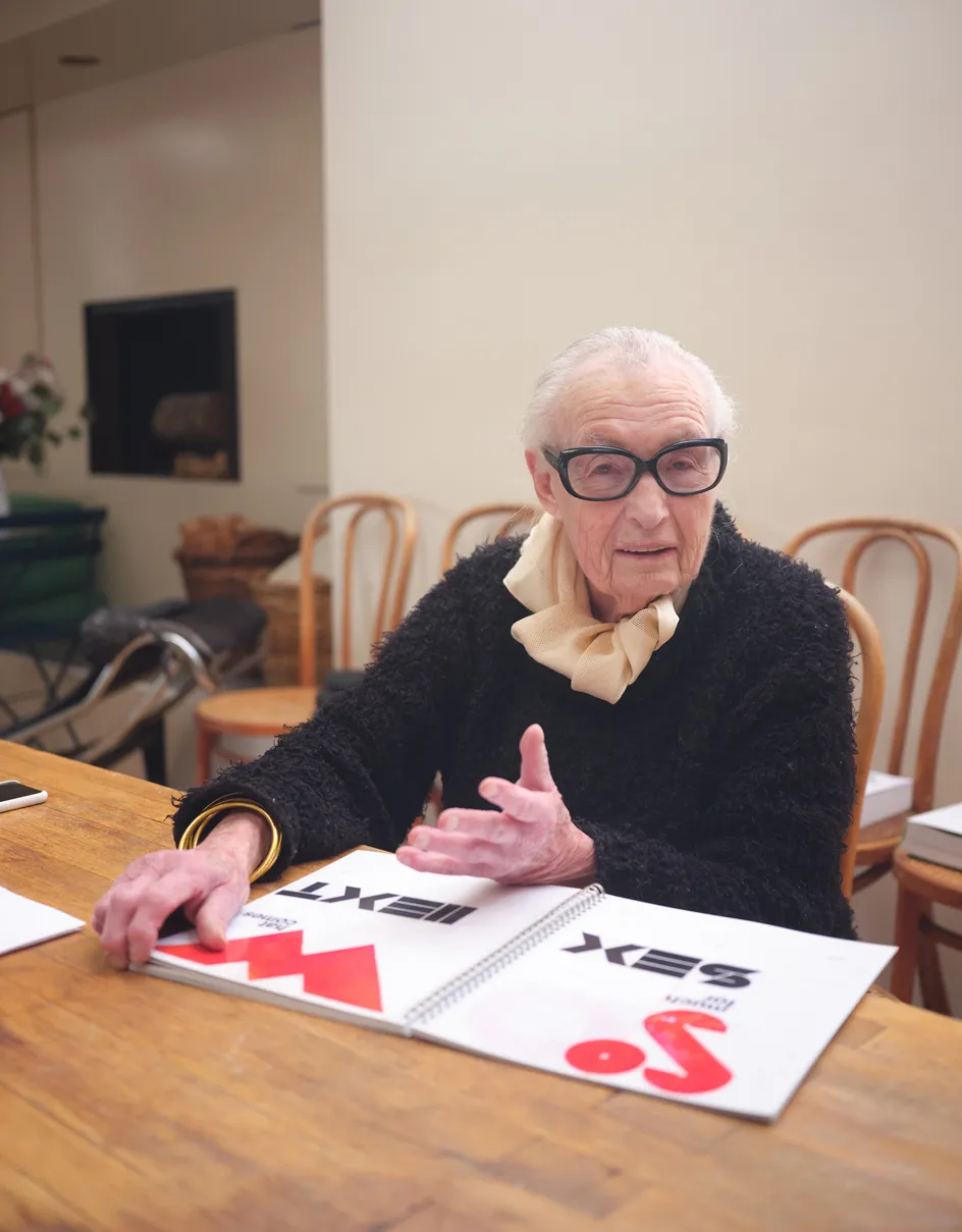
Well into her eighties, Barbara Stauffacher Solomon continued to work with the same clarity and curiosity that had defined her early career. A keen writer, she published books including Making the Invisible Visible (2018), Utopia Myopia: Plays on a Page (2013), and a memoir, Why? Why not? (2013).

Later projects revisited familiar concerns – text in space, orientation, thresholds – with renewed economy. A welcome sign for Basel, created decades after her formative years there, brought her career full circle, while drawings and paintings from this period distilled the garden, the grid and the city into increasingly spare, symbolic forms. Rather than summing up her work, these late pieces extended it, reinforcing a practice rooted not in period or style, but in sustained attention to how people read, move through and make sense of the world.

Welcome, sketch by Barbara Stauffacher Solomon, 2021
'Garden = Grid = City' runs until 27 February
21 Throckmorton Ave, Mill Valley, CA 94941
anthonymeier.com

Barbara Stauffacher Solomon