Tom Hingston talks 20 years of cover design and upping the ante on artist ‘merch’
Receive our daily digest of inspiration, escapism and design stories from around the world direct to your inbox.
You are now subscribed
Your newsletter sign-up was successful
Want to add more newsletters?
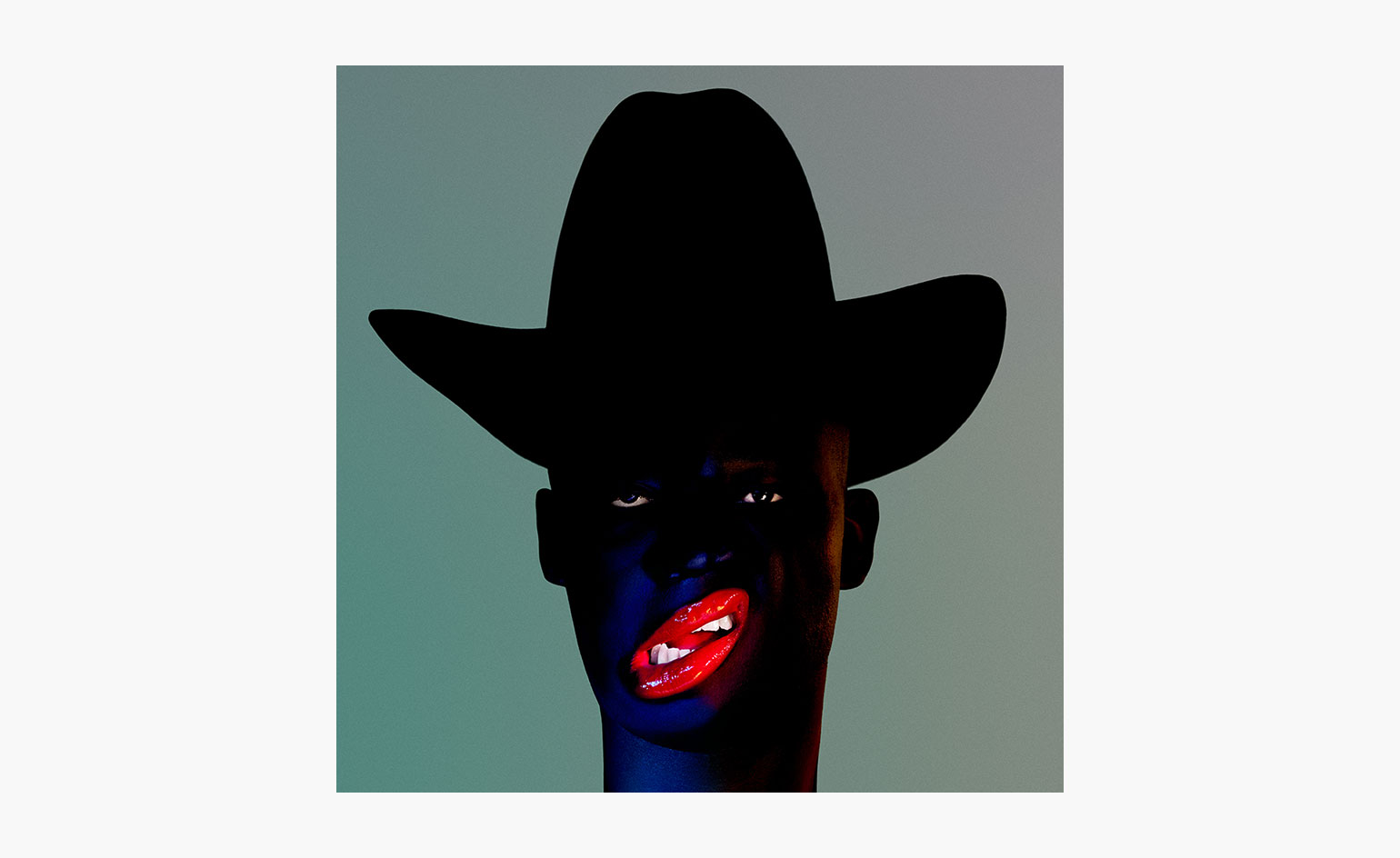
The British art director Tom Hingston is behind some of most innovative album artwork of the post-Peter Saville era. Over the last two decades he has worked with the Rolling Stones, Nick Cave, U2, the Chemical Brothers and Young Fathers as well as collaborating with David Bowie on his final music videos. Perhaps his best-known work though are the covers created for Massive Attack in collaboration with band member and artist Robert del Naja and the photographer Nick Knight, including 1998’s Mezzanine (part of Moma’s permanent collection) and 100th Window from 2003.
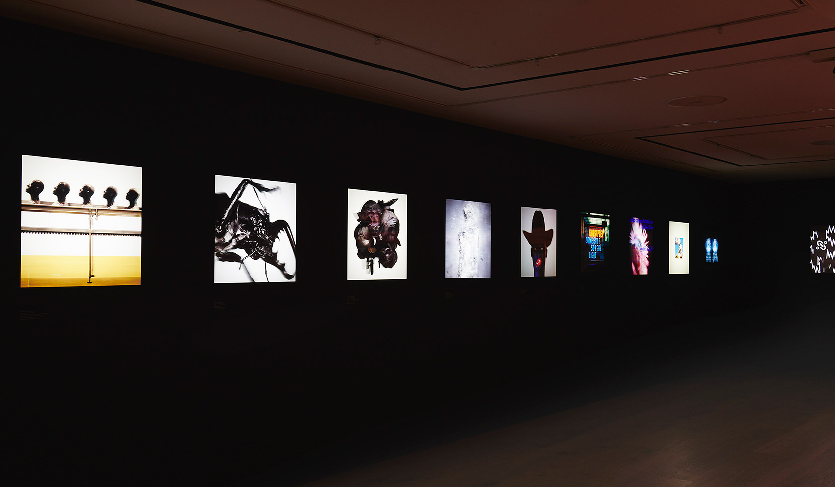
Installation view of ‘Progress’ at Paul Smith’s flagship store in London
To celebrate his studio’s 20th anniversary, Hingston has joined forces with Paul Smith to create ‘Progress’, an exhibition to open in Smith’s flagship store on London’s Albemarle Street. The show (2 – 20 May) will include 16 of Hingston’s album covers reworked as lenticulars. Del Naja, Nick Cave and The Chemical Brothers have also worked with Hingston and Smith to create a superior range of band merchandise. The Nick Cave blue velour bomber jacket features embroidered mermaids based on the artwork for his Lovely Creatures album; The Chemical Brothers knitwear features zig-zags taken from the Born in the Echoes sleeve while del Naja is part printing, part painting some of his own artwork onto leather jackets.
Del Naja, better known as 3D, established a reputation as a graffiti artist in Bristol before helping found Massive Attack and his artwork has been featured on all the band’s sleeves. He has also collaborated with United Visual Artists on Massive Attack’s live shows.
To help celebrate Hingston’s anniversary we sat him down with del Naja to talk beetles, biker jackets and the future of the rock artefact in the digital age...
W*: So, when did you two meet?
Tom Hingston: I guess a year before Mezzanine was released in 1997. Robert had worked with a bigger design studio and there was an impetus on his part to explore a more one-on-one relationship, something that was a bit more collaborative.
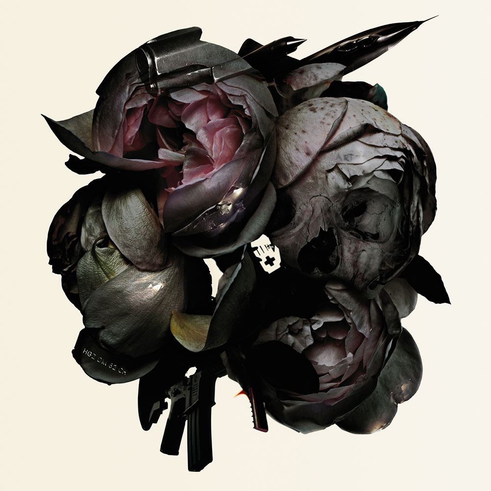
Collected, 2006, by Massive Attack
W*: Given your background in graffiti art Robert, it was never going to be a case of outsourcing the band’s artwork – did working with Tom make that easier?
Robert del Naja: Yeah, but it’s a very different thing from having lots of ideas and concepts and sketches and having the ability to realise them and see them through and make them into something that has a format and that you can print from. I had always used symbols in my painting and when we collaborated very early on with Judy Blame and Michael Nash, we talked a lot about symbology – that’s how we ended up with the flame and those kind of industrial symbols associated with Massive Attack. So then we talked about how you take that from a concept to something that looks great as a piece of cardboard, to something that you can hold in your hand.
W*: So you worked on the Mezzanine cover for a year, just trading ideas back and forth?
RDN: Yeah, and a lot of that process has to do with materials as much as it does imagery and sources. We looked at a lot of different materials, printing processes and things along the way and that would often define how the artwork went. Rather than finishing a piece of art work and then thinking, 'well how do we print this?’. It was the other way around.
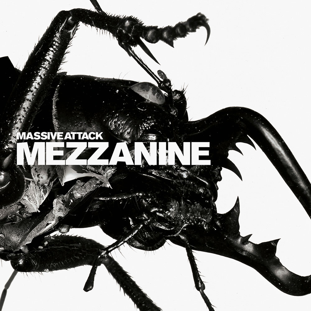
Mezzanine, 1998, by Massive Attack
W*: How many iterations did you go through to get to what is now an iconic design?
TH: It is interesting how that whole thing evolved. When he and I had our first conversation there were a whole load of references that he had found, blown up pictures of spider skin and insect skin and then there were these Rorschach images he had been playing around with. That was very much our starting point. And seeing those was the spark that lead us to Nick as there were lots of parallels in the subject matter held been exploring in his work.
Nick had done a whole series of images with Simon Foxton where they montaged fight sequences. They were really kinetic with shattering glass and paint explosions, combined with stuff that was very figurative. That really opened our eyes to the possibilities of creating collage, or photo-montage that had much higher production values.
RDN: Yeah, it’s funny because our music is often described as collage. And it is a collage process. Nothing is written in a traditional classic sense. It would often be a collision of ideas. And I had always grown up with the collage process. When we were designing flyers and doing things for the parties with the Wild Bunch in Bristol, the very process of putting things together was collage.
But when Tom started working with Nick, it was almost like deep collage, working with photomontage, working on Paint Box and using programmes that I hadn’t seen before and after effects that you would normally see in movies you know, to blend things and cut into things, build things that almost snap together in a three-dimensional space within a flat plane. In a way the process was no different from working back in the day but the techniques and the machinery and the abilities, the people you were working with, meant you could get deeper and deeper into a similar way of working.
Nick would take something that had a lot of different elements to it but end up as something very symbolic. You could stand back from it and see a sculptural shape and that really appealed, coming out of the work that used very direct industrial symbology, amongst other things, in terms of Blue Lines and Protection. It was a really interesting evolution in terms of going into the world of photographic collage work but end up with something that was symbolic.

DONT THINK, 2012, by The Chemical Brothers
TH: That concept of iconography has always been something has always been an over-arching idea with Massive Attack. You take the flame or the Euro-child or the beetle or the figure from a 100th Window, what connects them all is that they are a series of powerful emblems.
RDN: Yeah, maybe it is an innate need to simplify everything, to break it all down into one thing because to describe it in another way is too complicated and long winded.
W*: It’s a branding exercise in some ways but the way it is a branding exercise has changed over the years?
RDN: Seeing what Public Image Ltd did was really formative, the idea of turning a band into a brand. And in the political climate of the time. I thought was really interesting, the idea of creating an anti-brand symbol. And the promotion and marketing of Massive Attack, right up to Heligoland has always been about that, creating a symbol that under normal circumstances would be considered a brand identity but actually was the opposite.
Mezzanine came out at a time when the whole idea of what branding and identity was – think of Adbusters magazine and Naomi Klein’s No Logo – was being rethought and questioned and subverted.
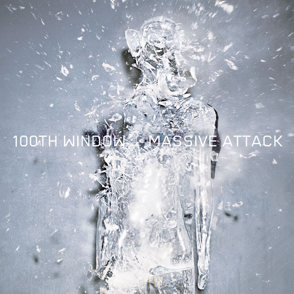
100th Window, 2003, by Massive Attack
TH: Definitely, and I think also at the time that Mezzanine was released we were coming to the end of the Brit Pop era. Back in the day that fly posters were the fabric of the streets if you like – it was a very multi-coloured landscape, Spice Girls, boybands and so on. That was something that we were really conscious of and wanted to create the antithesis to that. So the whole campaign had to be monochromatic and black and white because at the time it sliced through everything else that was out there.
RDN: We designed our own typeface. It was a chrysalis moment where we were trying to emerge as something different. In terms of brand identity, we had gone through that whole Nineties thing of being the new kids on the block and becoming part of this movement called trip-hop and that was like a small satellite that was feeding off the giant Brit Pop team. And none of us felt a part of that. We just wanted to firmly establish our own identity and I think Mezzanine was the opportunity to do that.
W*: How did the collaboration with Paul Smith come about?
TH: I’ve known Paul for years as a friend and there were two conversations in parallel really. One of them was that we as a studio are 20 years old this year and Paul suggested it would be great to do a product collaboration to mark that anniversary. He’s curious about artist merchandise; how badly produced it is, how underwhelming the offering is and it is actually a conversation that Rob and I have also had over the years. Paul has this long-standing relationship with people like Patti Smith, Bowie, REM. His passion for music goes back a long way and so he was interested in exploring this idea of very limited edition one-off pieces that the artist or musician could sell on tour or be sold in Paul Smith stores. High end merchandise if you like. But mostly it was about raising the bar on what exists out there at the moment.
W*: And what was the idea behind the lenticular covers?
TH: We have taken 16 of the better-known artworks and represented them as lenticulars. I’ve always been interested in taking more traditional processes and bring something new to them. So we took the original sleeves and we’ve remodelled them into a 3D space and that’s the data we’ve used to create the lenticulars. It gives a different dimension and depth to the image. They are a weird half-way point between the physical sleeve and how you might view a sleeve on screen.
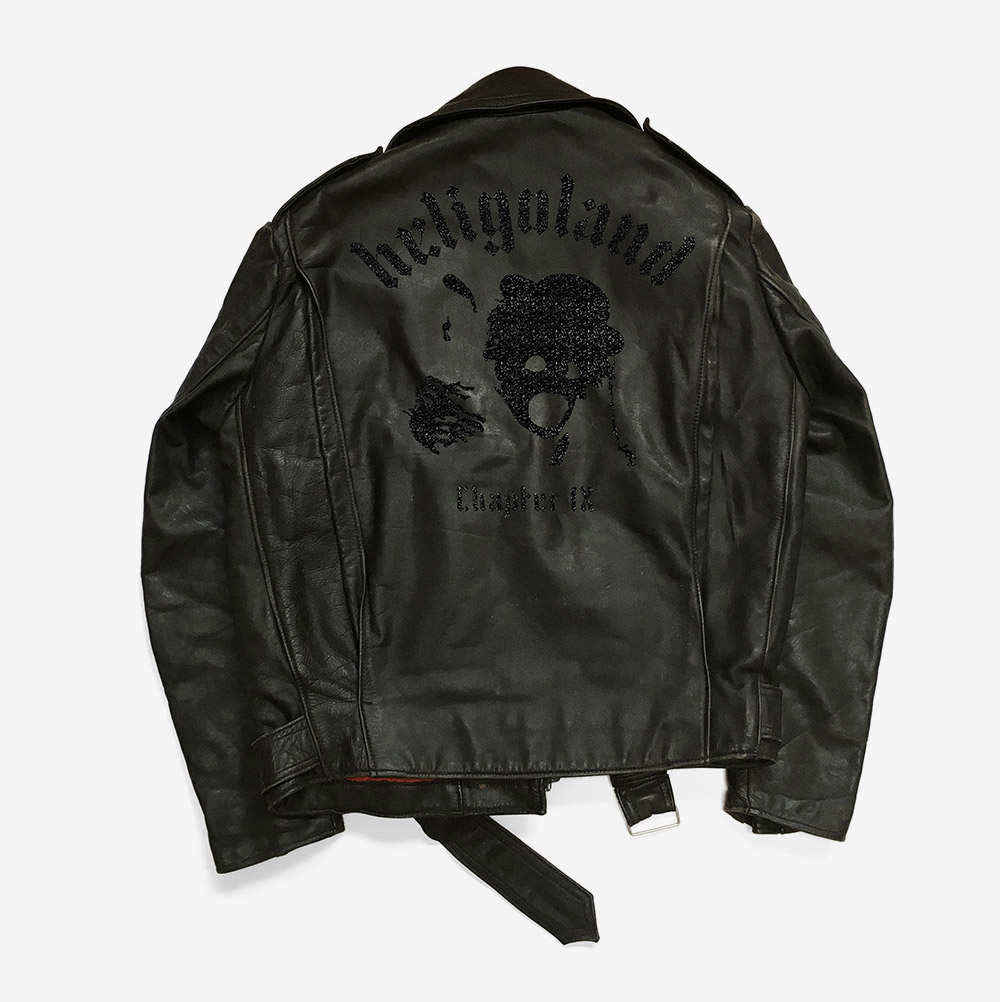
W*: And Robert, you’ve been painting jackets (pictured above)?
RDN: Yeah, it is a sort of throwback to the biker jackets with the album sleeve painted on the back, the way a dedicated punk fan would painstakingly paint an album sleeve on the back of a jacket.
W*: It’s interesting that the more music become immaterial, because of streaming, the more there is a fascination with the physical artefacts of rock or a physical connection.
RDN: Yeah, and that is very much what going to gigs is all about, that special moment that you share with friends and strangers. And that is something that everybody is trying to capture and monetise at the moment. It’s impossible because it is of the moment but I like to think that there is a way of bridging that emotional space with the physical space and something digitally in between. And people can plug into that at any moment and see what’s happening. And that could be location-based, be time-based, mood-based but not in a prescriptive platform situation but something that is more direct between the artist and the listener and vice versa.
And the physical sense of having that object in your hand is not something that will go away. Books and vinyl, they fill that same need for something to touch and hold. But there is a way of transferring that value to the augmented world, there are definitely ways that we are exploring at the moment. You can actually represent the values of what the band is all about, what it stands for, what’s its beliefs are. I think that is where the real interest is at the moment.
As originally featured in the May 2018 issue of Wallpaper* (W*230)
Receive our daily digest of inspiration, escapism and design stories from around the world direct to your inbox.
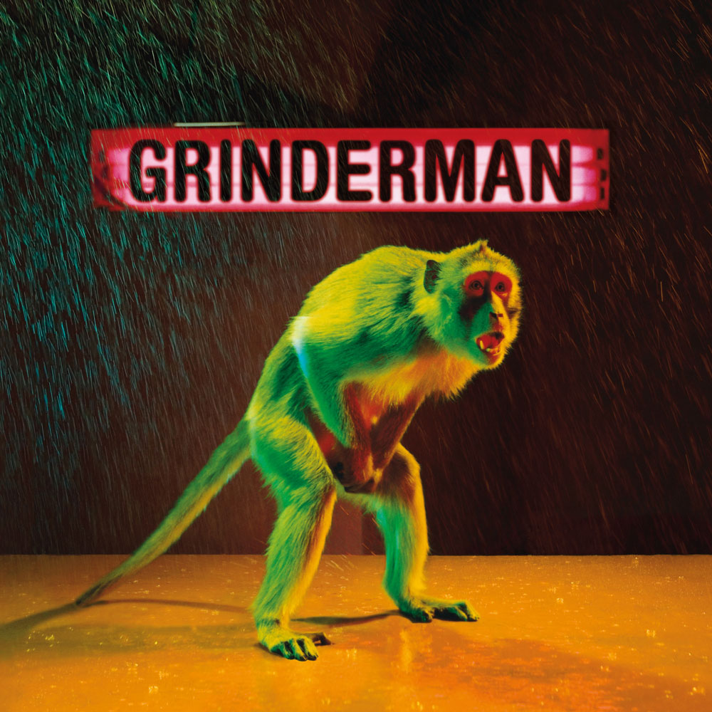
Grinderman, 2007, by Grinderman
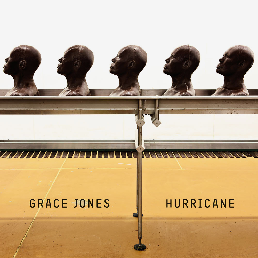
Hurricane, 2008, by Grace Jones
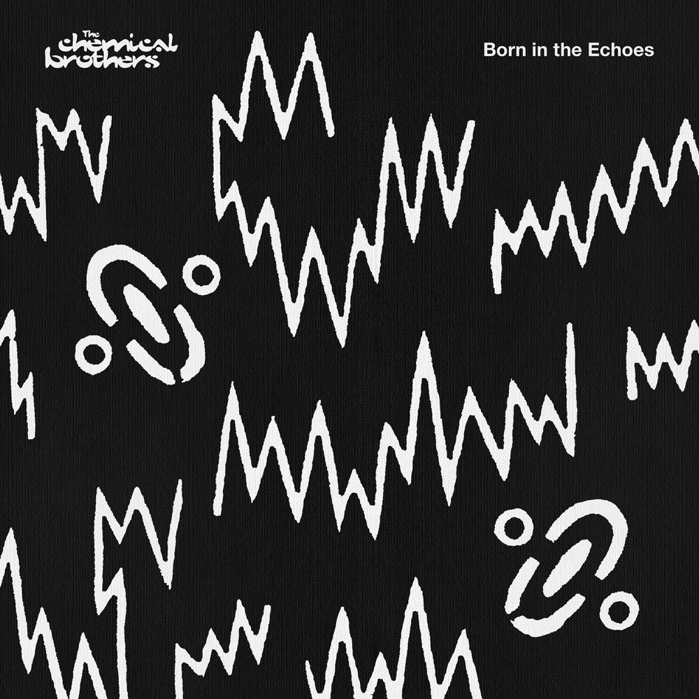
Born In The Echoes, 2015, by The Chemical Brothers
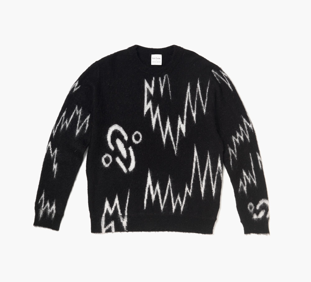
A sweater from the Paul Smith capsule collection, inspired by Born In The Echoes, 2015, by The Chemical Brothers
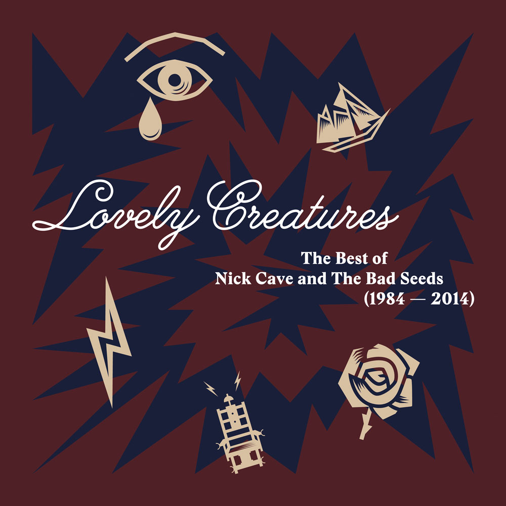
Lovely Creatures: The Best of Nick Cave and the Bad Seeds, 1984-2014, Nick Cave and the Bad Seeds
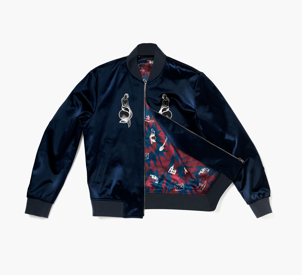
Paul Smith jacket inspired by Lovely Creatures: The Best of Nick Cave and the Bad Seeds, 1984-2014
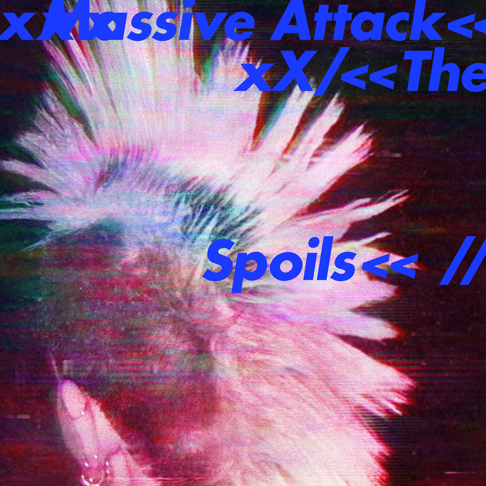
The Spoils, 2016, by Massive Attack
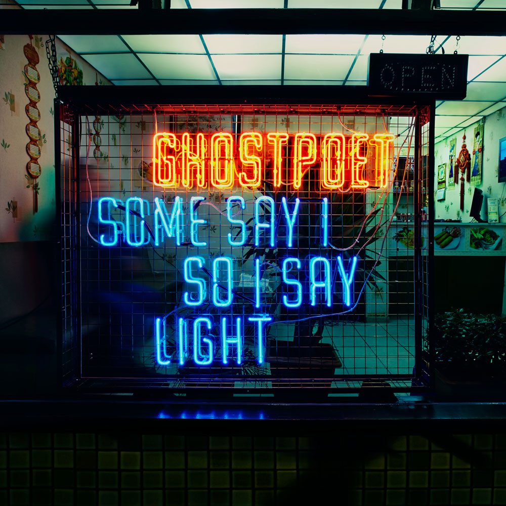
Some Say I So Some Say Light, 2013, by Ghostpoet
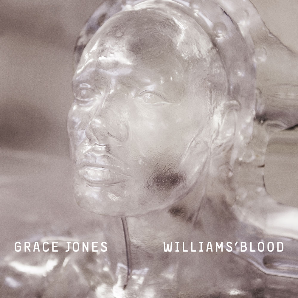
Williams Blood, 2008, Grace Jones
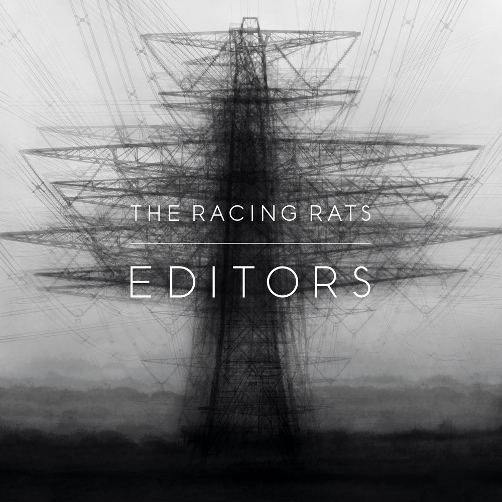
The Racing Rats, 2007, by Editors
INFORMATION
‘Progress’ is on view from 2 – 20 May. Profits from the sale of selected works in the show will be donated to the Teenage Cancer Trust charity. For more information, visit the Paul Smith website
ADDRESS
Paul Smith
9 Albemarle Street
London W1S 4HH