Stanley Donwood on decades of Glastonbury poster design
While Glastonbury fans huff and puff over this year's line-up announcement, we talk to the man responsible for designing the festival’s poster, for the last two decades
Receive our daily digest of inspiration, escapism and design stories from around the world direct to your inbox.
You are now subscribed
Your newsletter sign-up was successful
Want to add more newsletters?
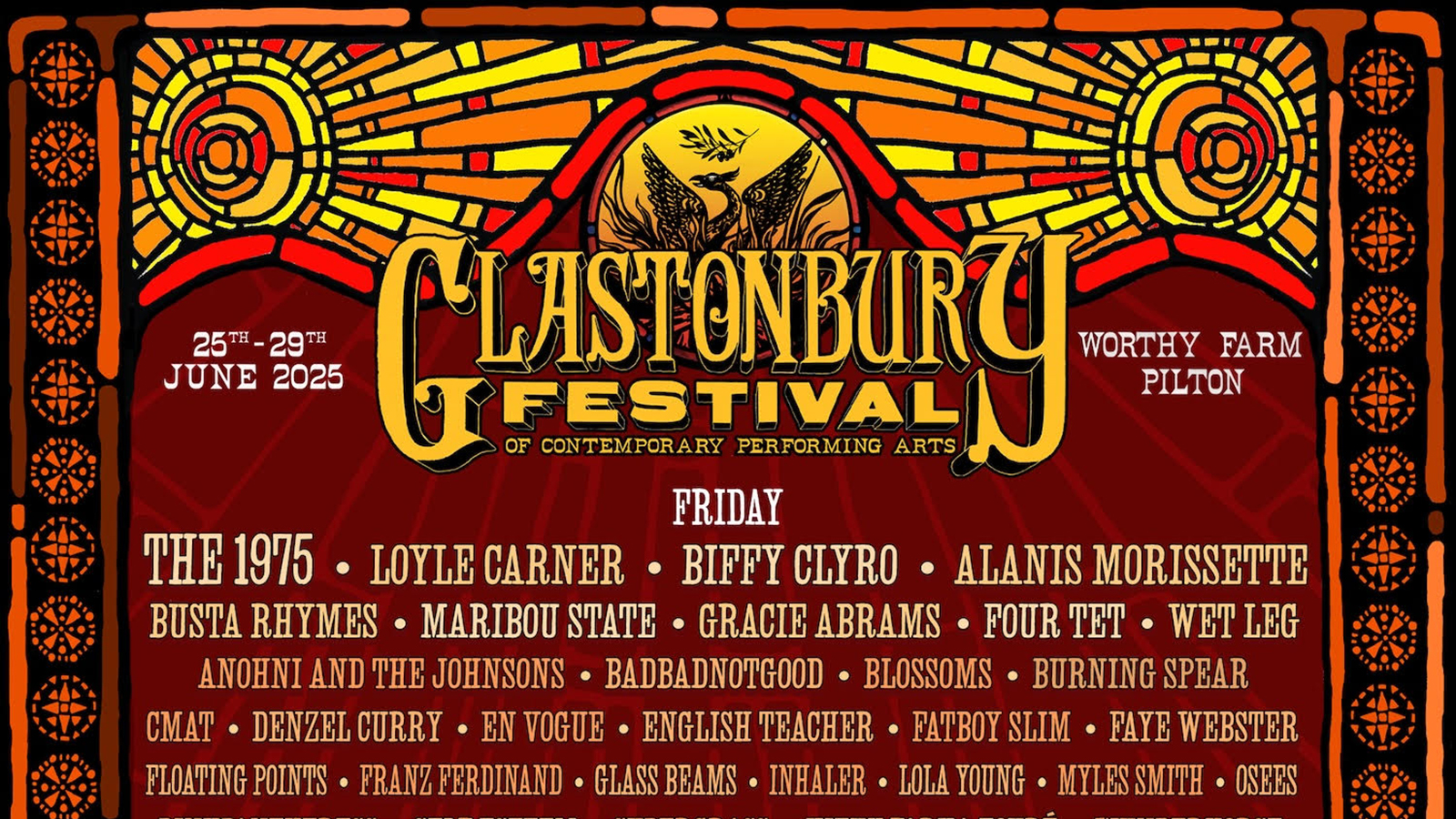
Amid the mandatory clamour that attended last week’s announcement of the line-up for 2025’s Glastonbury Festival – yes Gen Z game-changers Doechii and Gracie Abrams! No Rihanna! Whoop more Kneecap! Why Olivia Rodrigo billed bigger than Charli XCX? – there was one unifying response: that is a really beautifully designed poster.
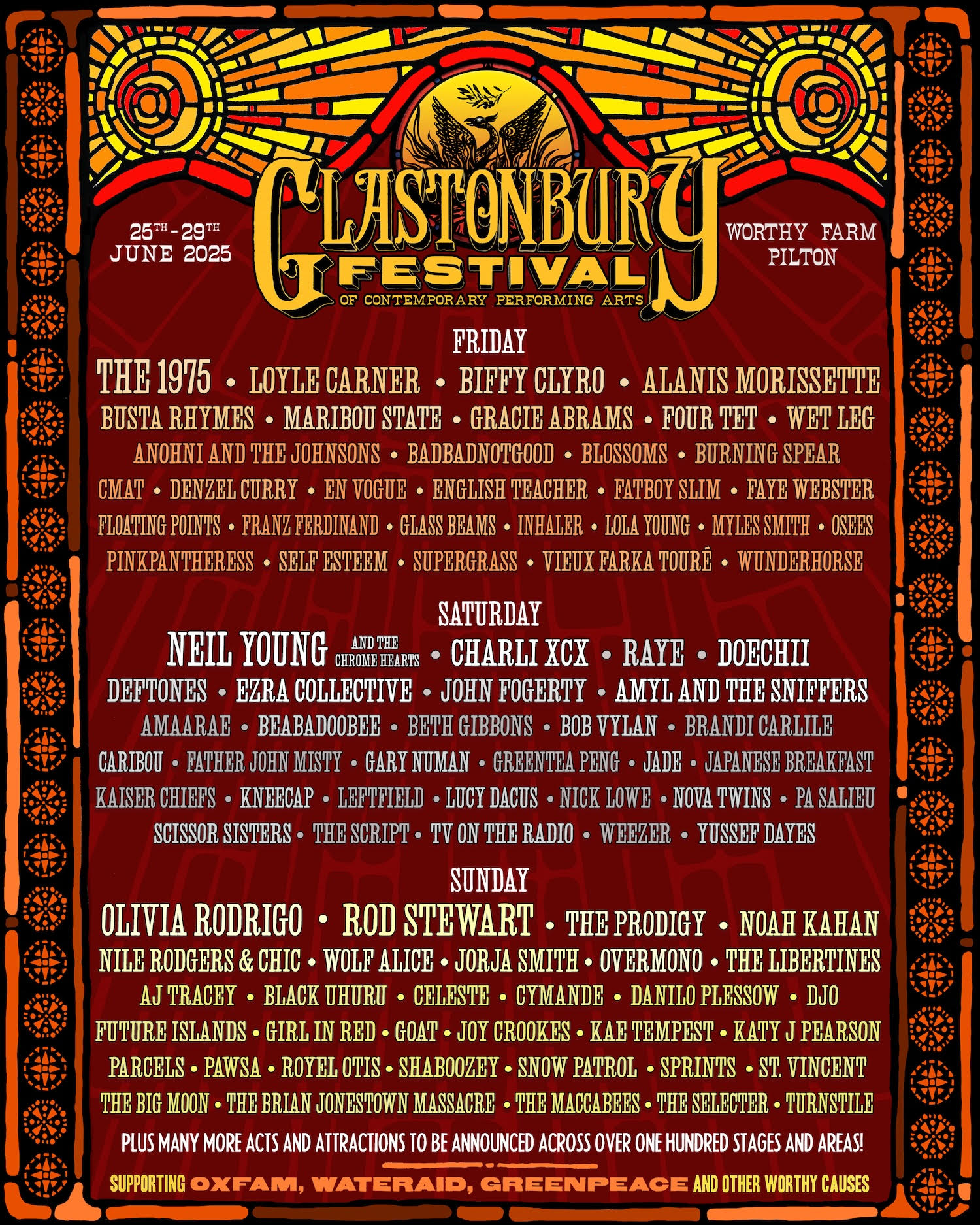
Kudos, then, to the artist with the stained-glass sass, phoenix fetish and family-pass to the Bodleian Libraries. Stanley Donwood is the man in the (woodblock) frame, a long-term, serial collaborator with Radiohead and Thom Yorke who’s been designing posters for the world’s greatest music festival for almost as long as the world’s greatest band have been playing it.
How many has he designed over the years? Mr Donwood regrets that he forgets, but hopes that 'surely someone else has a better grasp of reality than I do? I can't remember how many times I've been to Glastonbury. But artwork, I think I've done each year since 2002. How many is that?' This religious attendee of the festival has an equally shaky grasp on Glasto-related reality, but will suggest that that number is around 20, depending on whether the artist had already completed posters for the festivals that were Covid-cancelled in 2020 in 2021.
This month, Mr Donwood is also busy at the 40th edition of London Original Print Fair at Somerset House, at which he’s showing one of his Glastonbury paintings, some of his Radiohead pieces and a new, currently hush-hush series created with Yorke at famed Montparnasse printing studio Idem Paris. He’s also undoubtedly gallery-deep in preparations for This Is What You Get, the first major retrospective of his and Yorke’s work, opening this August at Oxford’s Ashmolean Museum.
Nonetheless, he graciously took time to answer some questions about his twentysomething-th foray into getting everyone proper excited about the festival summer ahead.
Wallpaper*: Greetings from the Stone Circle of the nation’s mind, Stanley. What were your inspirations for this year’s Glastonbury poster?
Stanley Donwood: Stained glass. Specifically, a few years ago I went at the closing of the day to a chapel on the Île de la Cité in Paris, the Sainte-Chapelle. More stained glass than I've ever seen in one building. More recently I got a copy of a Gazetteer of Irish Stained Glass, and another book called Stories in Glass, and kind of took it from there. I'm not remotely religious, and a lot of the subject matter conveyed by the glass was incomprehensible, so I tried to imagine stained glass made by a culture that venerated the sun.
Receive our daily digest of inspiration, escapism and design stories from around the world direct to your inbox.
W*: What’s the name of this year’s font?
SD: I don't know. I made it by printing a woodblock typeface at the Bodleian Bibliographic Press in Oxford. I think it was carved in the 19th century, but it’s hard to tell with inky old bits of wood. Personally, I refer to it as Arcadia, but that's just me.
W*: The phoenix was also a feature of your line-up poster last year, and of your Worthy Forest painting for the festival. We know what a phoenix generally signifies, but what’s the specific significance here?
SD: I've been employing the phoenix for a few years as the emblem for a resurgent festival, flying once again after, firstly, years of police and establishment opposition and obstruction, and latterly for surviving Covid and all the economic uncertainty that lockdown entailed. One of my daughters drew the first incarnation, and it has developed further since then. It will never die. And of course, every year, on the Wednesday night, a huge wooden phoenix is burned on the hill overlooking the Vale of Pilton.
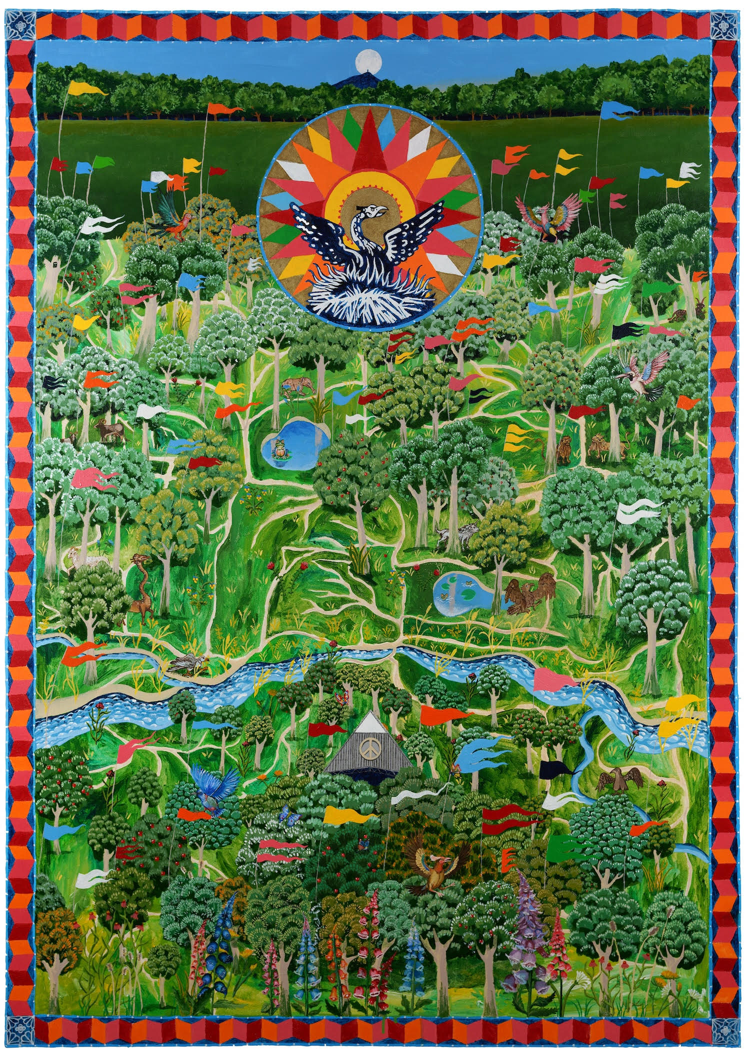
‘Worthy Forest’, Glastonbury Festival 2024 artwork
W*: That Worthy Forest painting was a collaboration with your two daughters. How old were they then, and what did they contribute?
SD: They were 26 and 29. They did most of the painting. I did the 'art direction'.
W*: Can you tell us about the medieval tapestry in the Bodleian that you 'copied' slash were 'inspired by', and how that became a Glastonbury-friendly image?
SD: It's a massive tapestry, about four metres square, and it was woven in – I think – the 15th century, although I could easily be wrong. It's of Oxfordshire and part of Gloucestershire and some bits of other counties. Aha… I've just got the book down off the shelf and discovered that it's the Sheldon Tapestry map of Gloucestershire, from circa 1590. I had been very interested in medieval art lately. We appear to be re-entering the Dark Ages. I thought that rewilding a version of the Glastonbury Festival site, making it sort of Post-Human, would be, you know, kind of interesting.
W*: According to Glastopedia, one of your earliest Glastonbury posters was 2003. Did that artwork come about via your relationship with that year’s headliners, Radiohead?
SD: No. Funnily enough, I met Michael Eavis' daughter-in-law at a playgroup when my daughters were very young, and we got talking, and so I ended up doing a design for the festival in 2002. Very long ago. In the olden days.
W*: How did you approach that year’s design?
SD: I had just been to Tokyo, so I based it on the Tokyo underground railway map.
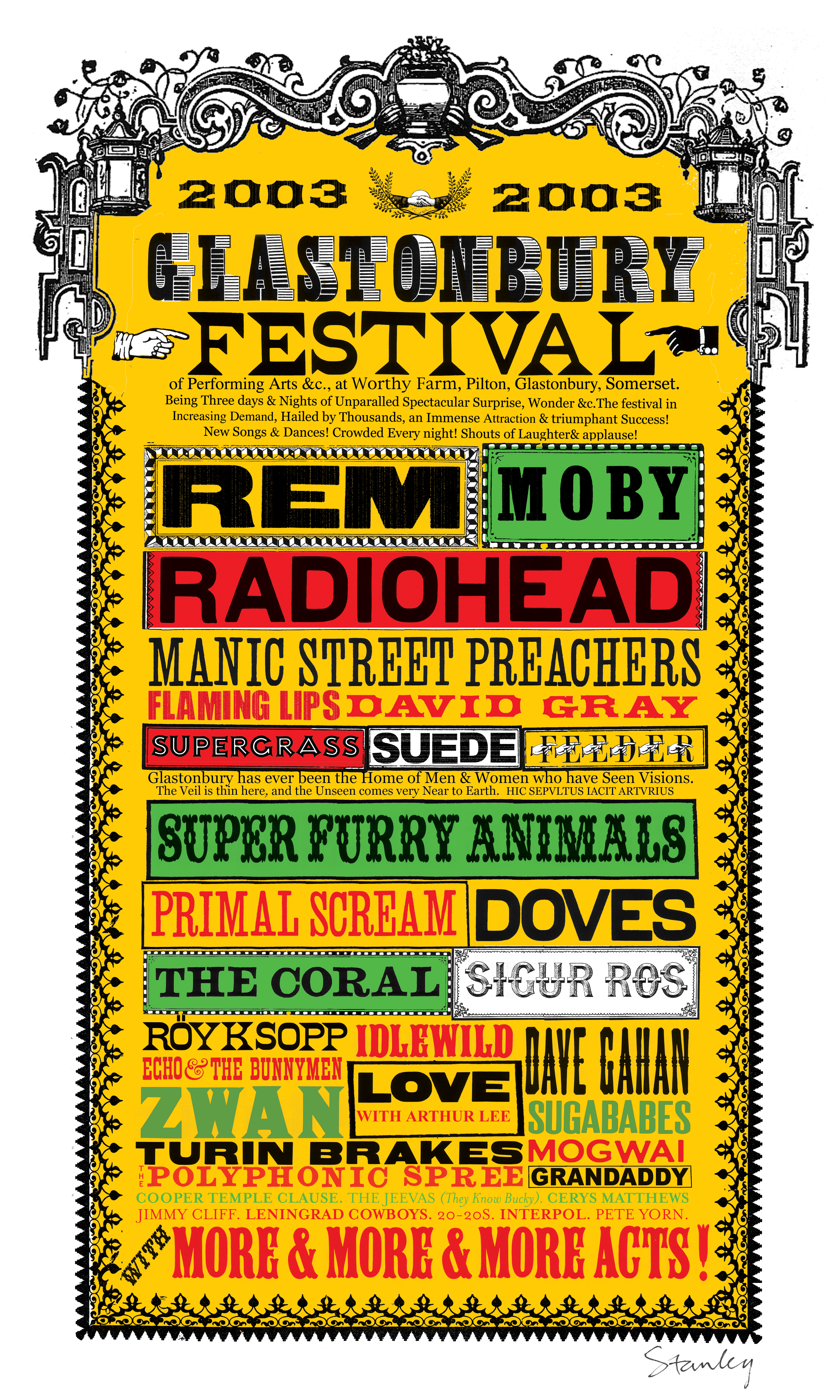
The 2003 poster
W*: Did Thom Yorke contribute to the design in 2003?
SD: What? No! And he never has. Demarcation, isn't it?
W*: When, generally, do you begin work on each year’s poster, and what are the earliest stages of the design process?
SD: Earlier every year, it seems. Definitely in the winter. In the bleak months, the short, darkening days. It's quite difficult to envisage a time of warmth and light, of fun. The earliest stages of the 'design process' are pretty much the same as all the other stages: there's a lot of drawing in sketchbooks.
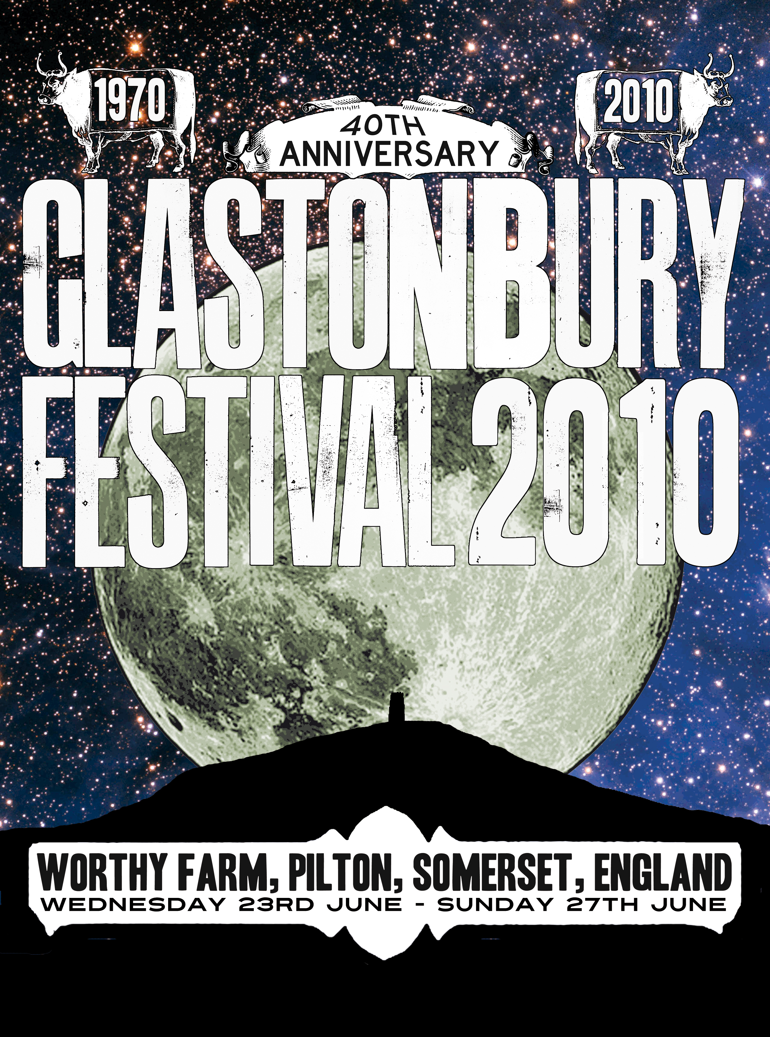
2010’s poster was printed with glow-in-the-dark ink
W*: What kind of conversations do you have with Michael and Emily Eavis about the design of each year’s poster?
SD: None at all. They just let me get on with it.
W*: In terms of filling in the artist names: do you add them as each artist is booked, or wait for everyone to be confirmed?
SD: No way. I used to do that and it was a nightmare. So now I just design the poster and fill it with fake names devised by my colleague Lionel Hatred. Then I leave it to the festival folk to put the real names in, so it's much easier. I can send you the Lionel Hatred version if you like. [Editor’s note: we’re still awaiting Maestro Hatred’s work.]
W*: Of all the work you do, what appeals about being a serial collaborator with Glastonbury?
SD: I guess in some ways it's a sort of holiday in the mind – there are different considerations when I make artwork for a festival. Somehow I need to project a sort of happiness, a kind of cheery vibe that doesn't, to be honest, come very naturally to me. But over the years I've been to dozens of festivals of all kinds, from travellers' gatherings in the 1980s to, well, fancy-assed Glastonbury in the 2020s. So I have a considerable memory-bank of various psychedelic experiences to draw upon for inspiration.
W*: If push comes to shove, what’s your favourite of your Glastonbury posters?
SD: I did one in 2010 with a massive full moon on it that we printed with glow-in-the-dark ink. But, you know, I kind of like all of them.
W*: And what’s your favourite that’s been designed by someone else?
SD: I really like the 1980s ones when it was called Glastonbury CND Festival and it was less than a tenner to get in. Not that we paid, we got in underneath a mattress in the back of the van that gave us a lift.
W*: Best ever Glasto gig?
SD: Probably Radiohead in 1997, which I didn't even see because it was very muddy, my girlfriend was very pregnant and our daughter was only two. We got the bus back to Bristol, but apparently it was a good gig. [Editor’s note: it was.]
Glastonbury runs 25-29 June 2025, glastonburyfestivals.co.uk..
London Original Print Fair runs 20-23rd March at Somerset House. For more on Stanley's work, visit tinmanart.com
London-based Scot, the writer Craig McLean is consultant editor at The Face and contributes to The Daily Telegraph, Esquire, The Observer Magazine and the London Evening Standard, among other titles. He was ghostwriter for Phil Collins' bestselling memoir Not Dead Yet.