Anatomy of a logo: Andy Warhol's Campbell's soup can
For our August US issue, we celebrate American design, encapsulated here in Andy Warhol's can of Campbell's tomato soup
Before becoming a master of Pop Art, Andy Warhol was a commercial illustrator, with his drawings appearing in both fashion advertising and in magazines in the 1950s. It marked the start of the artist’s respect for consumer culture, in contrast to others of the era who publicly disdained commercial work. Warhol could see the powerful role logos and packaging held in communicating a message, a realisation in direct opposition with the artistic style popular at the time.
In 1950s America, abstract expressionism reigned, with Jackson Pollock and Mark Rothko offering meditative, often energetic musings on a post-war, politically charged society. When Warhol created his soup cans series, between 1961 and 1962, he chose instead to recontextualise and therefore elevate an ordinary object familiar to millions, with his concrete, figurative style standing apart.
Viewed as a whole, they emphasise the single can’s place in a larger system of production, much like the identity of the end consumer herself
Hannah Silver

Andy Warhol's "Campbell's Soup Cans" paintings displayed at the Museum of Modern Art
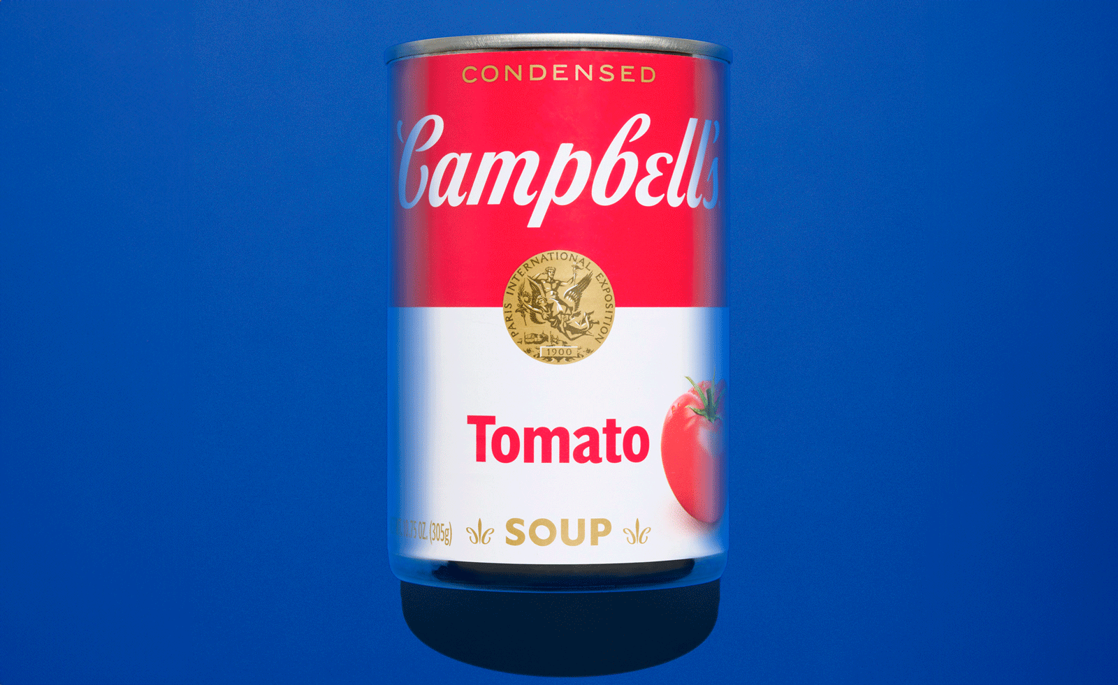
The series is composed of 32 works, each with a different flavour of Campbell’s soup, faithfully rendered in the design consumers instantly recognised. By focusing on repetition and standardised design, Warhol eschewed the individual entirely. Created in the late nineteenth century, the Campbell’s soup can was already a design classic, defined by its bold red and white colours, typography and a gold medallion epitomising the trust consumers put in the product. The red attracted attention; the white, a trustworthy assurance of cleanliness. By the 1960s, the design was among the most recognisable pieces of packaging in America, clearly epitomising the influential role graphic design was set to play in a burgeoning consumer society. Warhol was unique in recognising the power packaging had to transcend the mundane, becoming a cultural symbol in its own right. By reproducing it almost exactly, and without comment, Warhol asked viewers to consider why such an everyday item held so much significance - and whether it came from his reproduction, or the effectiveness of the original package design.
The repetition in the series was crucial for Warhol - when the 32 works are displayed together, they appear as if stacked on supermarket shelves. Viewed as a whole, they emphasise the single can’s place in a larger system of production, much like the identity of the end consumer herself. Taken as a series, the familiar reliability of repetition is lent an unsettling edge. By presenting this ambiguity without defining it, Warhol avoids either critique or commendation, leaving us feeling uneasy. Warhol was adept at blurring these boundaries between commercial design and fine art, and by elevating a commercial product to fine art status he foresaw the increasing dominance of brands in society. In his soup cans, Warhol predicts the power of the logo, and the potential of a brand to eclipse more traditional art in influence. Warhol’s work played a part in triggering this change, leading designers increasingly to respect the extent that everyday objects can shape visual experience. His paintings highlighted the artistry embedded within commercial graphics, influencing generations of graphic designers and advertisers.
The work became a defining image of Pop Art, the artistic movement which rethought familiar motifs from popular culture, from advertising to comics and consumer goods. Arguing against the separation of culture into high and low, in Pop Art everyday products were as legitimate a subject for an artwork as religious iconography, portraits or historical scenes had been. It is an idea epitomised most famously in Warhol’s soup cans, which presented an entirely new vision of what contemporary art could be - and are still as accessible and provocative as ever.
This article appears in the August 2026 Issue of Wallpaper*, available from 2 July in print on newsstands, on the Wallpaper* app on Apple iOS, and to subscribers of Apple News +. Subscribe to Wallpaper* today