It's impossible not to leaf through Modern British Posters without experiencing a wistful longing for times past. For despite the vicissitudes of the eras represented, one thing was remarkably constant; the sheer brilliance of public art and design.
Paul Rennie is an expert and dealer in the objects, artwork and ephemera of this golden age of British design. His new monograph brings together the many and various aspects of the British poster, the application of pure graphic art or delightful illustration to such ends as public information, education and entertainment.
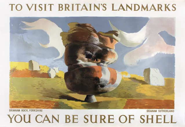
The big players in this happy collision of aesthetic ambition and raw talent are well known; London Transport, Shell, the Post Office, and the government itself, all working alongside artists like Paul Nash, Graham Sutherland, Manfreid Reiss, and many, many more. The resulting outpouring of graphic art shaped a generation's visual sensibilities, as well as an ongoing lament for its apparent passing.
We love a poster as much as the next publication, and the internet has seen a resurgence of interest in both these originals and the art of publicity art. But until an enlightened official body picks up the baton and ushers in a new era of public graphic art, Rennie's excellent retrospective will have to suffice.

’Rye Marshes’, Paul Nash, 1932, 30 x 45", Shell Mex & BP. (p63)

’Explorers Prefer Shell’, Edward McKnight Kauffer, 1934, 30 x 45", Shell Mex & BP. (p81)

’Footballers Prefer Shell’, Paul Nash, 1932, 30 x 45", Shell Mex & BP. (p88)

’Prevent Falls’, Tom Eckersley, 1940s, DC (30 x 20"), The Royal Society for the Prevention of Accidents. (p105)

’Wear Goggles’, Tom Eckersley, 1940s, DC (30 x 20"), The Royal Society for the Prevention of Accidents. (p105)

’Examine Ladders’, Tom Eckersley, 1940s, DC (30 x 20"), The Royal Society for the Prevention of Accidents. (p105)

’Stow Tools Safely’, Tom Eckersley, 1940s, DC (30 x 20"), The Royal Society for the Prevention of Accidents. (p105)