Pencil to Pixel typography exhibition, New York

Receive our daily digest of inspiration, escapism and design stories from around the world direct to your inbox.
You are now subscribed
Your newsletter sign-up was successful
Want to add more newsletters?
The veritable British typography firm Monotype has dreamt up the ultimate showcase for the font fiends in all of us. 'Pencil to Pixel' is a comprehensive exhibition offering typography fanatics a chance to get up close to rare implements, artworks and artifacts relating to type history, charting the development of typography up to its present technology-infused state.
'In an era where most people interact with type as a digital experience, Monotype's collection of artifacts relating to type history - examples of precision drafting, metal and film masters, photographs and tools - provide a chance for visitors to explore the very physical history of the typefaces they already know,' explained Dan Rhatigan, Monotype's UK Type Director.
The exhibition also offers an opportunity to see the hand of the author. Says Monotype's James Fooks-Bale: 'A lot of designers are familiar with the "tick-down" menu in their applications but aren't familiar with the fact that it originally came from someone's hand.'
With a history dating back to 1897, Monotype is certainly in a position to hold typographic court. The exhibition, which opens in New York this week, is actually a reprise of a first installment that was staged in London last November. The American leg will feature examples with special relevance to the United States, such as a copy of the 1931 Linotype magazine 'Typographic Sanity,' published in Brooklyn, as well as original Monotype Centaur typeface drawings by American typographer and type designer Bruce Rogers.
Other artifacts on show, which have previously never been seen, include phototype masters for Haas Unica and Neue Helvetica fonts, the original drawings Eric Gill made for Joana and an impeccably maintained manuscript showing the exact Firmin Didot typefaces that inspired Adrian Frutiger's Linotype Didot.

The show charts the development of typography up to its present technology-infused state.
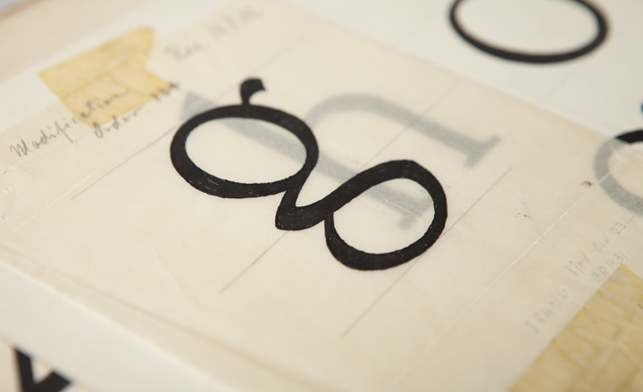
Original letter drawings of 'Littleworth', an unreleased typeface, from the Monotype archives
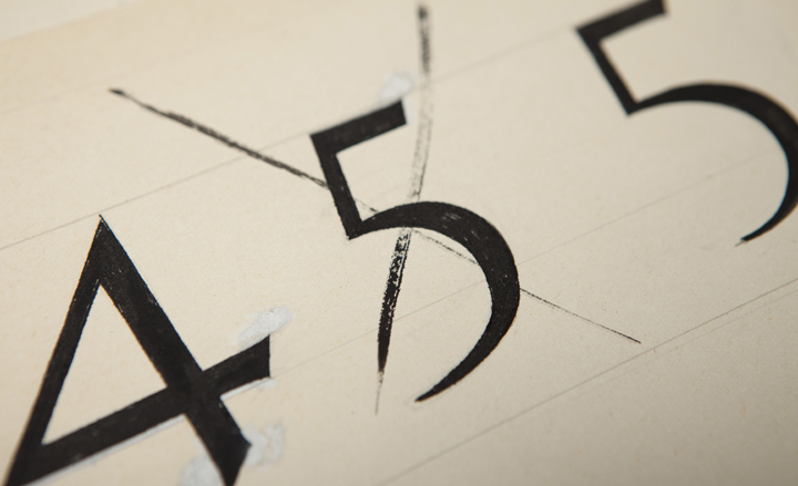
Original artwork for 'Littleworth', from Monotype's archive
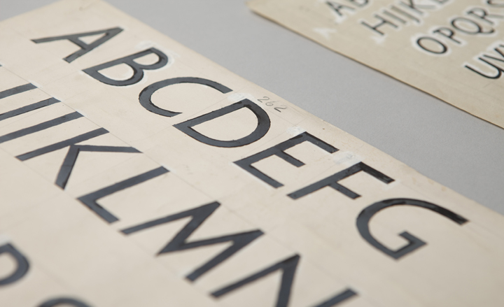
Eric Gill's 1928 pencil and ink drawings for 'Gill Sans Italic'
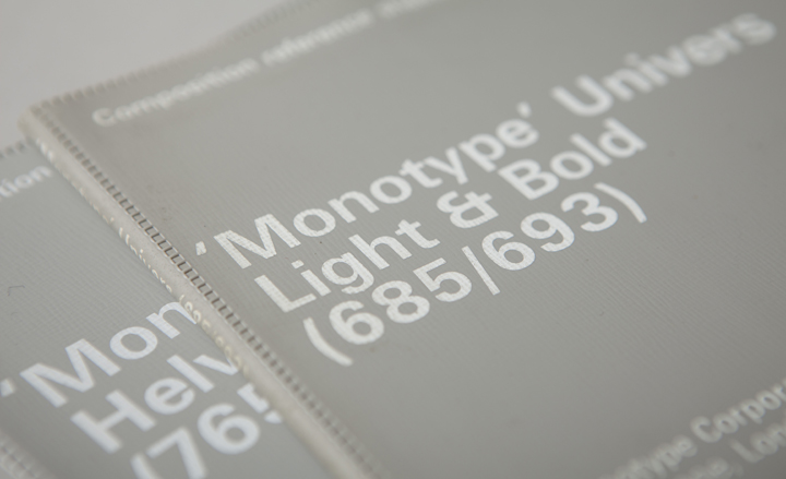
Monotype released versions of 'Helvetica' and 'Univers' for phototypesetting years before the Linotype versions joined the library
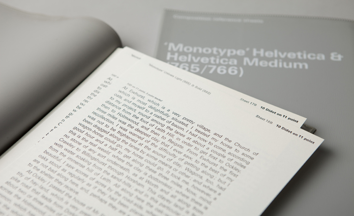
'Pencil to Pixel' offers typography fanatics a chance to get up close to rare implements, artworks and artifacts relating to type history
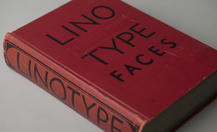
One such artifact is this copy of 'Big Red' - a comprehensive specimen book of Linotype faces, published in 1939
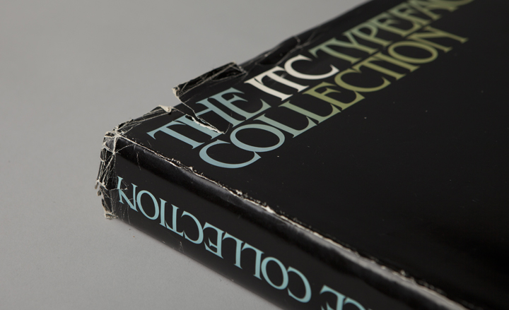
Specimen book showcasing the library of the International Typeface Corporation (ITC), 1980
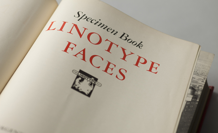
The inside-cover of 'Big Red'
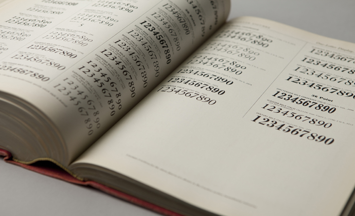
Essentially a reference tool, the book is a showpiece of the Chauncey Griffith era
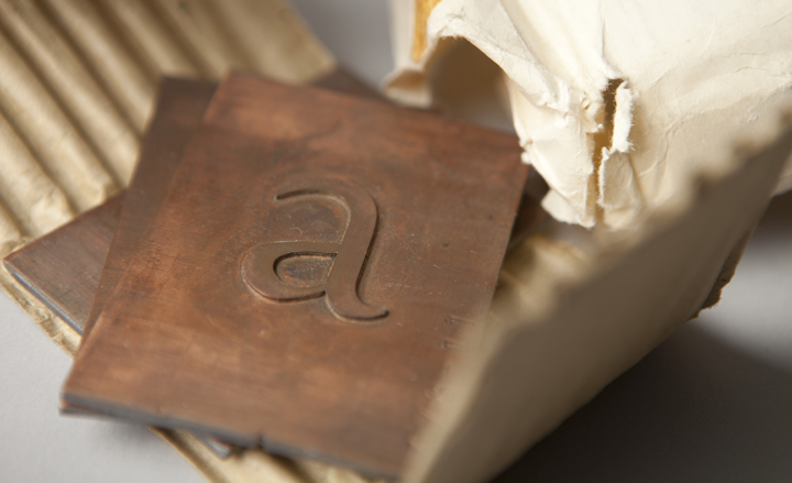
Copper patterns for Eric Gill's Joanna (1937) show one of the manufacturing stages between the drawings and type itself
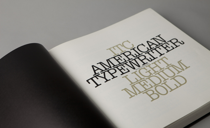
A sample of ITC's 'The American Typewriter', from the company's 1980 specimen collection
ADDRESS
Tribeca Skyline Studio
205 Hudson Street
Penthouse
New York
Receive our daily digest of inspiration, escapism and design stories from around the world direct to your inbox.
Pei-Ru Keh is a former US Editor at Wallpaper*. Born and raised in Singapore, she has been a New Yorker since 2013. Pei-Ru held various titles at Wallpaper* between 2007 and 2023. She reports on design, tech, art, architecture, fashion, beauty and lifestyle happenings in the United States, both in print and digitally. Pei-Ru took a key role in championing diversity and representation within Wallpaper's content pillars, actively seeking out stories that reflect a wide range of perspectives. She lives in Brooklyn with her husband and two children, and is currently learning how to drive.