It takes time: meet Sekford, the new British watch brand making its mark

It’s been a big year for new watch design. The latest horological name to reach our radar is a European brand with a very British character: Sekford.
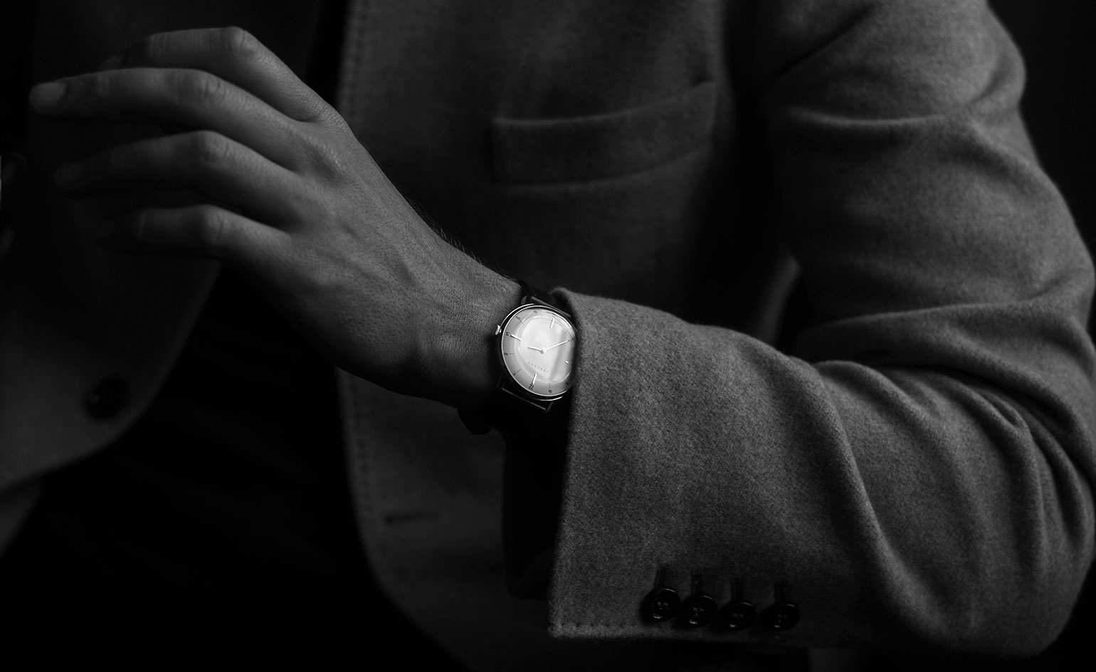
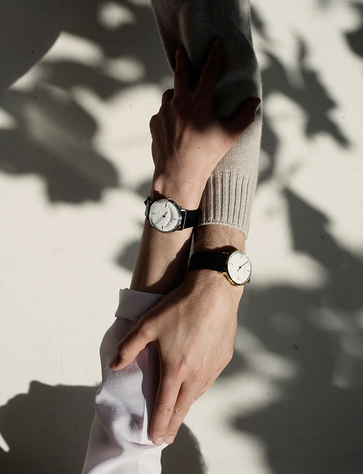
The three founders of the new British watch brand - creative director Kuchar Swara, watch designer Cédric Bellon and industrial designer Pierre Foulonneau - hail from different design disciplines, which may go some way to explaining its particular horological aesthetic. We caught up with Swara and Bellon to discuss their first, Swiss-made watch, the Sekford Type 1A and their pin-sharp typography…
Wallpaper*: Creating a new watch brand is an ambitious task - especially today when watch wearing is more in focus than it has been in recent times. Why did you all decide it was the task for you?
Kuchar Swara: As a graphic designer I have a keen interest in the organisation of space, proportions and typography. I wanted to apply it to a 3D medium. A watch requires all these considerations.
You wanted to create a watch with a midcentury style. Why not just wear a carefully chosen vintage piece?
Cédric Bellon: You could, obviously. But it is not so easy to find old watches in good condition at an affordable price and there is no guarantee of precision nor waterproofness, no warranty, no service agreement. Plus, a lot of people don’t want to wind manual movements everyday. Our timepieces have a contemporary mood, finishes, production and service, and branding. All the seduction of a timeless accessory.
Is there a particular English watch design from the past that inspired you?
KS: It was more about the English approach to crafting a watch; from typography and the thickness of hands to the engravings and clean dials. 18th and 19th century English pocket watches demonstrate the finest draughtsmanship I’ve seen on any watch. Pocket watches by Perigal & Duterrau and Statter of Liverpool are fine examples of this.
Which of the great watch designs did you look to when creating the watch?
CB: Pocket watches mostly. I love the softness of pebble-shaped goussets, their readability, clarity and ability to be loved by everybody. Pocket watches have this inner beauty you can’t explain in words.
Tell us about the design process incorporating three different visions
CB: We shared our different visions and exchanged a lot of ideas to refine the Sekford brand and watches as much as possible. In France we mainly focused on the product and the industrial processes, yet everyone has been involved in each part of the project, and each opinion carefully listened to.
All Sekford straps are made in England. It’s a nice heritage touch
CB: We wanted a typical leather strap: cut, waxed and stitched. The leather - which is made flat and thin to fit the profile of the watch - is the link with the British origins of the brand.
The logo is distinctive. Tell us more.
KS: The Sekford fox is a gothic revival wood engraving. It symbolises a thread of modernity with reference to nature and its relationship with machinery and technology. For us, it was a way of the crafts of lettering artists and engravers into modern precision engineering.
You worked with Commercial Type to create a new font for the dial. How did that come about?
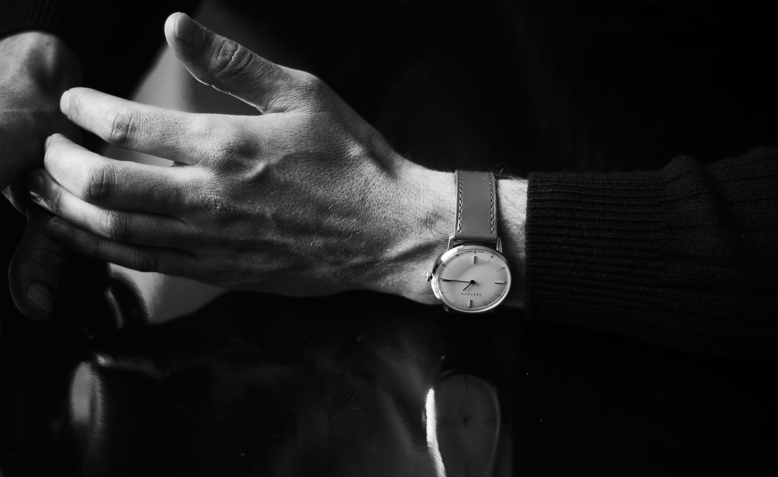
KS: After a few trips to the Clockmakers’ Museum in London I consulted Christian Schwartz of Commercial Type as to how such fine typography and balance was achieved on old pocket watch dials. He explained they were painted using single hairline brushes. We talked to our manufacturer about what they thought the thinnest line we could produce on our dials would be. Commercial Type drew the font to meet that limit. A special cut of Edward Johnston’s Underground typeface, which we named Sekford Underground Tiny, was also created: it is thinner than the point of a fine needle.
Its first, Swiss-made watch owes its clean, midcentury look to industrial designer Pierre Foulonneau’s dedication to functionality. Watch the making of Sekford Type 1A. Video courtesy of Sekford

Sekford’s three founders all hail from different design disciplines, which may go some way to explaining its particular horological aesthetic

Creative director Kuchar Swara engaged Commercial Type to create the dial font and markers, inspired by 19th century British pocket-watch dial typography, generally painted using single-hair brushes
INFORMATION
Prices start from £695, www.sekford.com
Receive our daily digest of inspiration, escapism and design stories from around the world direct to your inbox.
Caragh McKay is a contributing editor at Wallpaper* and was watches & jewellery director at the magazine between 2011 and 2019. Caragh’s current remit is cross-cultural and her recent stories include the curious tale of how Muhammad Ali met his poetic match in Robert Burns and how a Martin Scorsese Martin film revived a forgotten Osage art.