Graduate Directory 2020: Visual Communication
We’re championing the talented graduates that transform clever concepts into visual reality. Check out our selection of the best communications, combining typography, graphic elements, and page layout techniques

Receive our daily digest of inspiration, escapism and design stories from around the world direct to your inbox.
You are now subscribed
Your newsletter sign-up was successful
Want to add more newsletters?
Micah Barrett Yale School of Art, US
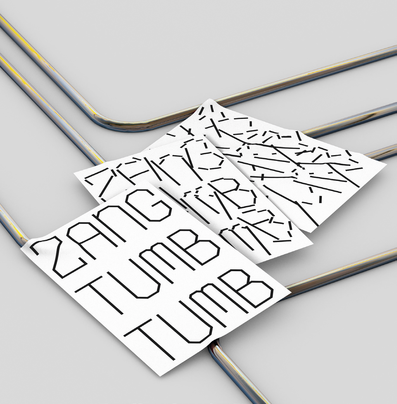
Dream collaborators: Dan Deacon, Nam June Paik. ‘I would also love to work on signage for a municipal transit system.’
micahbarrett.work
Barrett’s variable font experiments explore text’s relationship to imagery, in an attempt ‘to infuse graphic design’s legacy of “text as image” into a contemporary digital environment’.
Hugo Dumont and Anthony Vernerey ENSAD, France
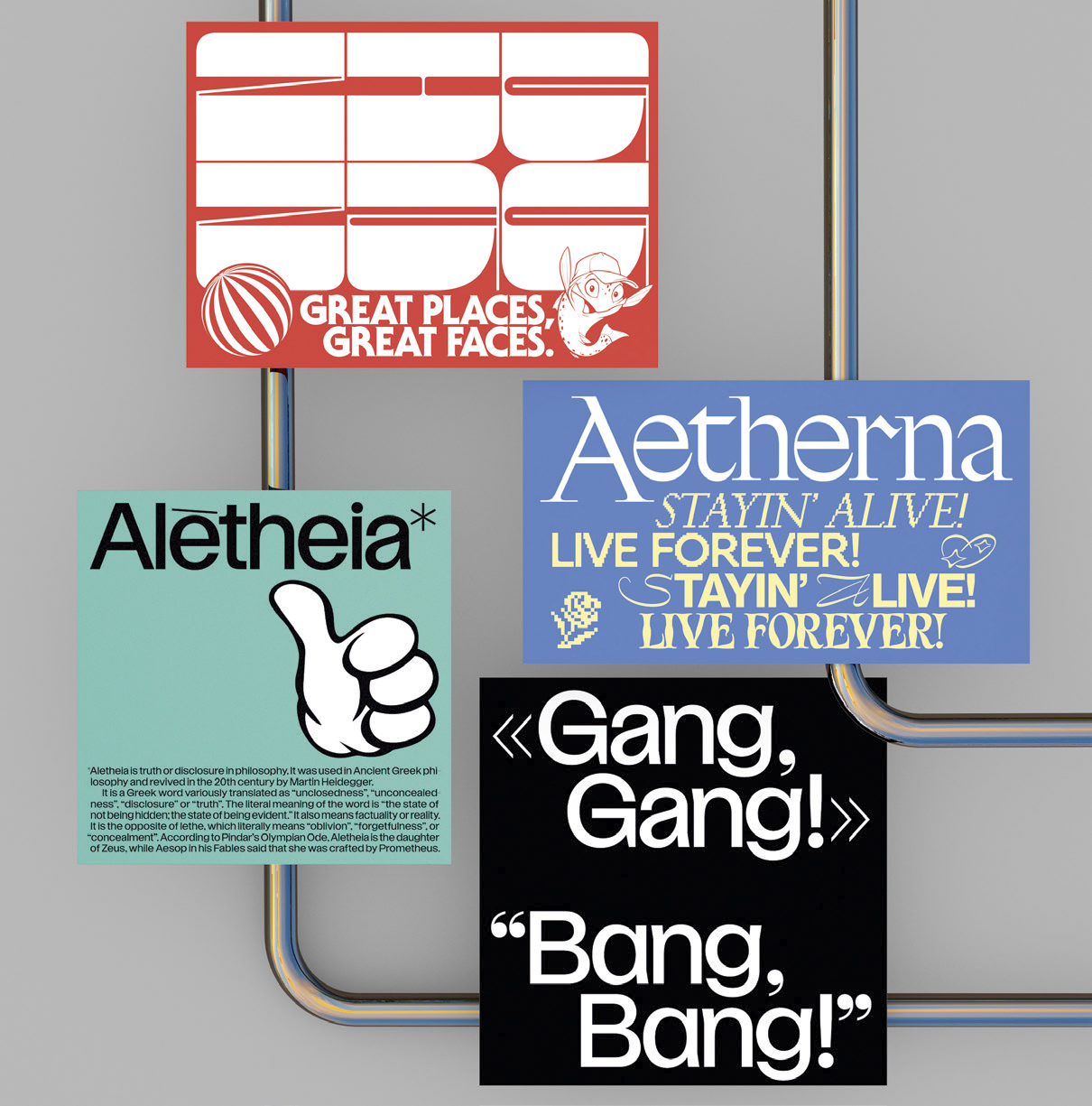
Dream collaborator: Frank Ocean
hugodumont.co; @anthony_vernerey
The French duo devoted their joint project to the world of Instagram, using graphic design to imagine alternative futures. ‘We questioned the fact that this social network could create a fake world where appearance takes over from content.’
Aurelia Peter Zurich University of the Arts, Switzerland
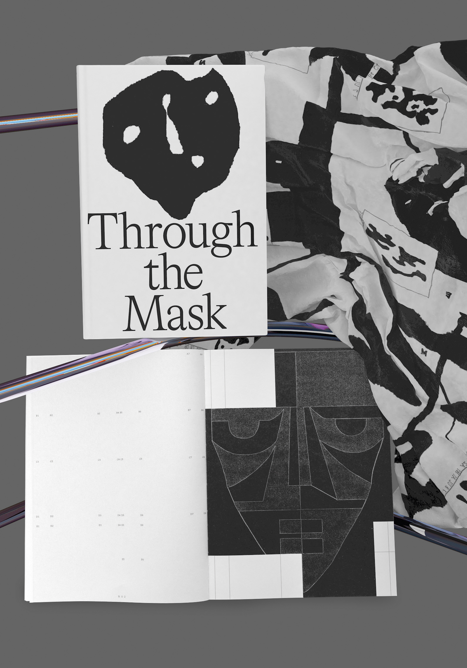
Dream collaborator: Craig Green
aureliapeter.ch
‘My interest in ritual masks was the starting point of this project,’ says Peter of her work, Through the Mask, which embraces graphic and textile design. It includes a scarf that is designed to swathe and conceal or open up the wearer to the world in a ‘graphic transition’.
Maximilian Haslauer ABK Stuttgart, Germany
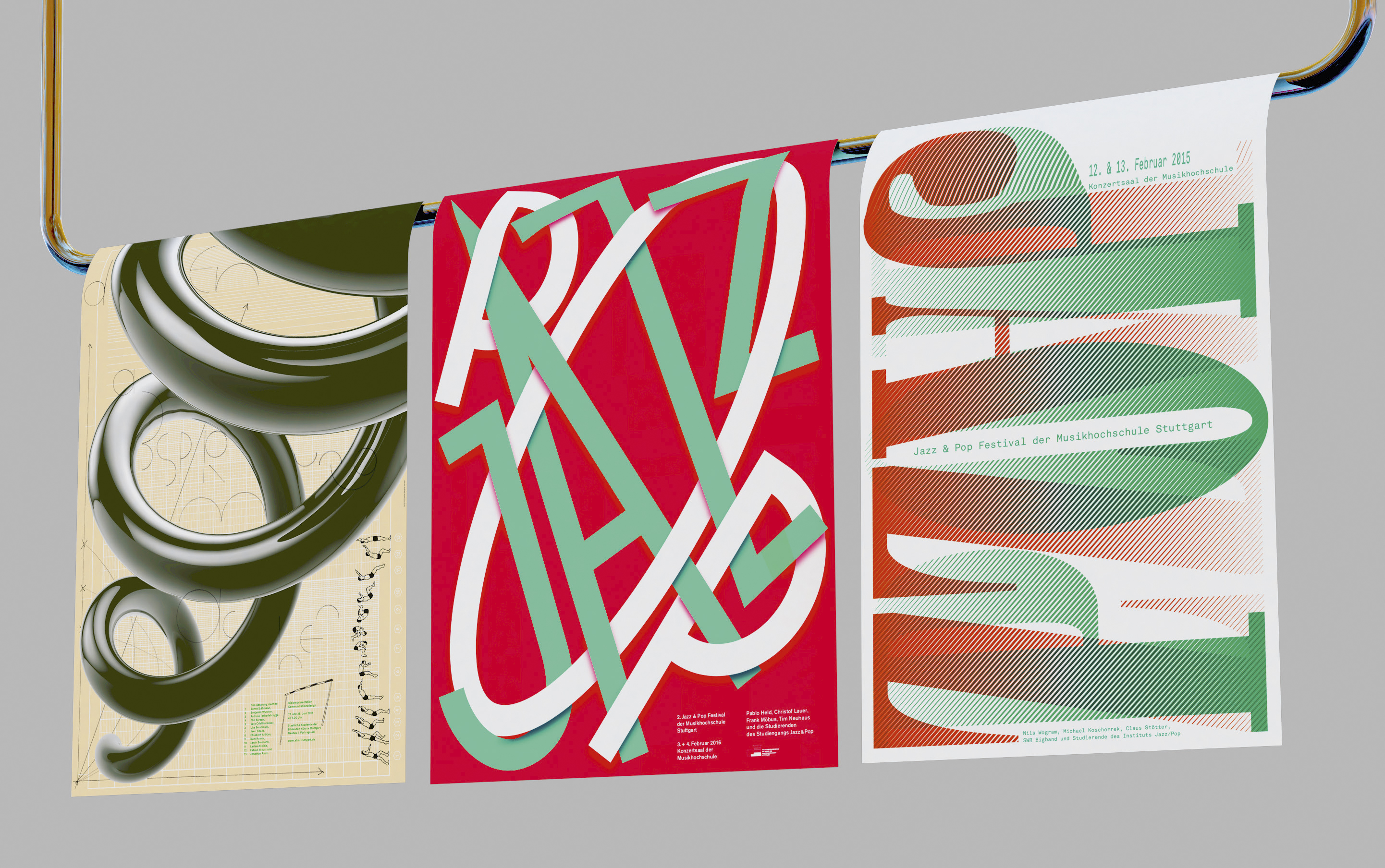
Dream collaborator: Artist and odour researcher Sissel Tolaas
haseaufderlauer.com
Haslauer’s vibrant poster designs splice the aesthetics and sensibilities of pop and jazz using only typography. ‘Niklaus Troxler is definitely an inspiration; he taught at ABK and is the number one poster designer when you think about jazz,’ he says.
Sapir Ziv Central Saint Martins, UK
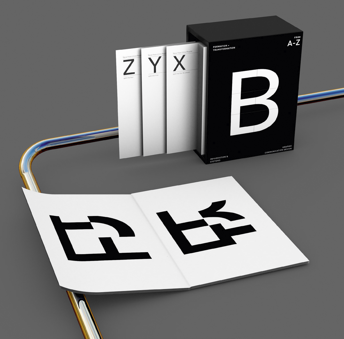
Dream collaborator: Kenneth Goldsmith
sapirziv.com
Ziv’s ‘Dynamic Grid’ uses random forms to change typography and layouts. ‘I was prompted to think about systems to manipulate and defamiliarise existing letterforms.’ Ziv’s 26 booklets take you through the alphabet, with each letter altered by a machine-generated code.
Dávid Molnár ÉCAL, Switzerland
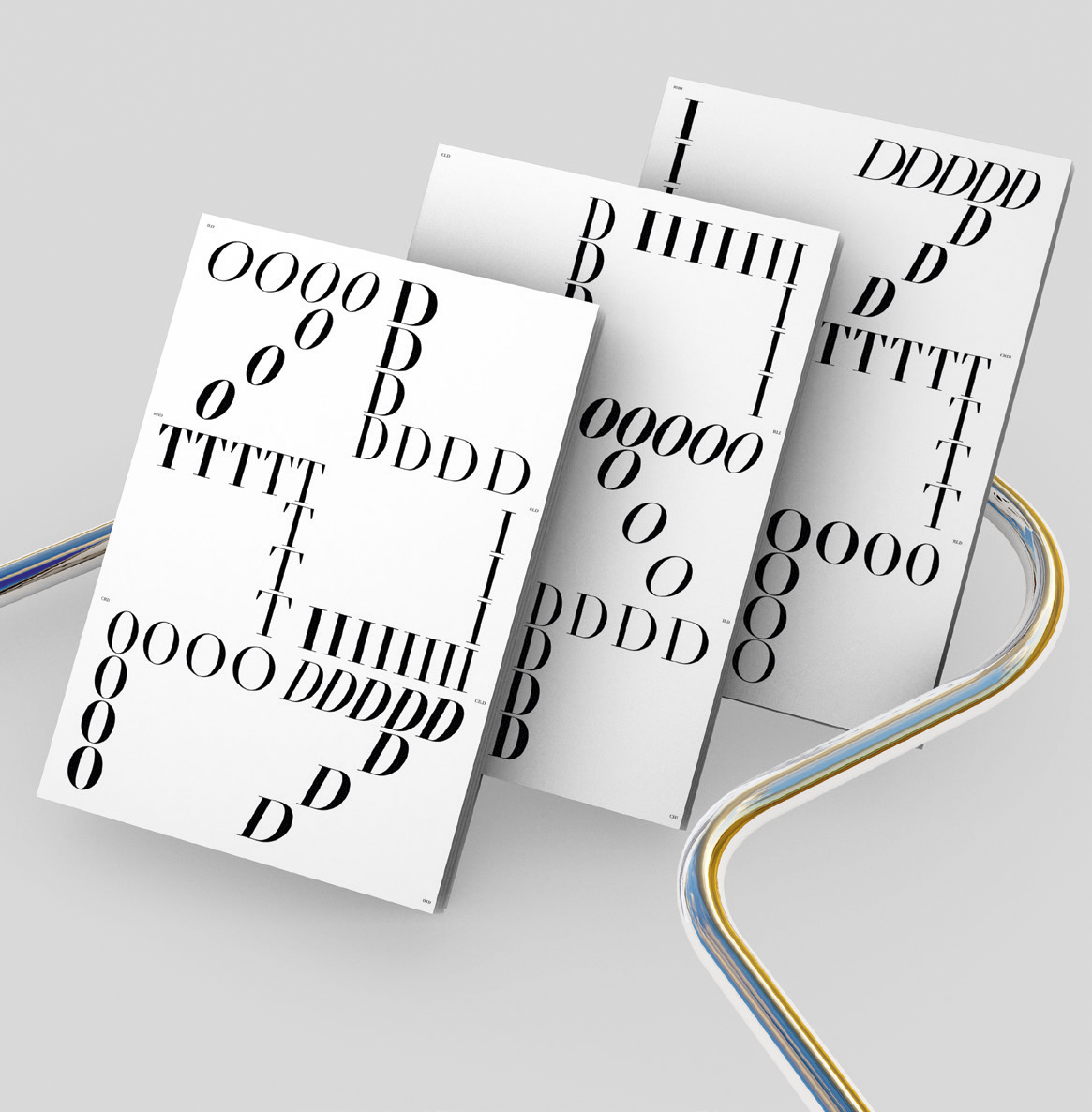
Dream collaborator: Dutch designer Erik van Blokland
davidmolnar89@icloud.com
Molnár’s typographic work explores an early family of serif typefaces named Didot, after French printer and type pioneer Firmin Didot. Molnár’s own take on Didot reinterprets the history for modern mediums and needs.
Tania Alvarez Zaldivar Yale School of Art, US
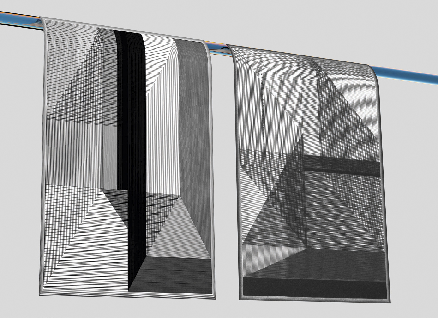
Dream collaborators: Isamu Noguchi, Patricia Urquiola
zaldivartania.com
Focusing on the Japanese philosopher Kitarō Nishida’s aesthetics of nothingness, this compilation includes texts by the likes of Kengo Kuma and Richard Neutra. Alvarez Zaldivar illustrated the essays with dense drawings of interpolated lines that evolve through the book.
Receive our daily digest of inspiration, escapism and design stories from around the world direct to your inbox.
Vitek Skop UMPRUM, Czech Republic
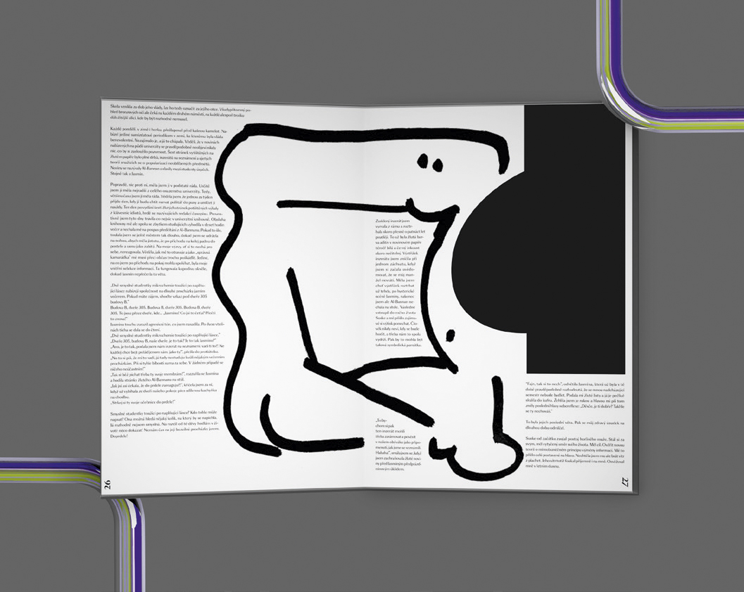
Dream collaborator: Nicholas Negroponte
vitekvitek.com
Written, illustrated and typeset by Skop, Madame Monsieur is a limited-edition novella set in Lyon and focusing on the ‘changing roles of men and women in society’. The Czech designer, who has owed text around the bold graphic illustrations, ‘wanted to create a graphic novel’.
Laura Csocsan Moholy-Nagy University of Art and Design, Hungary
Dream collaborators: Hassan Rahim, Kasper-Florio
lauracsocsan.com
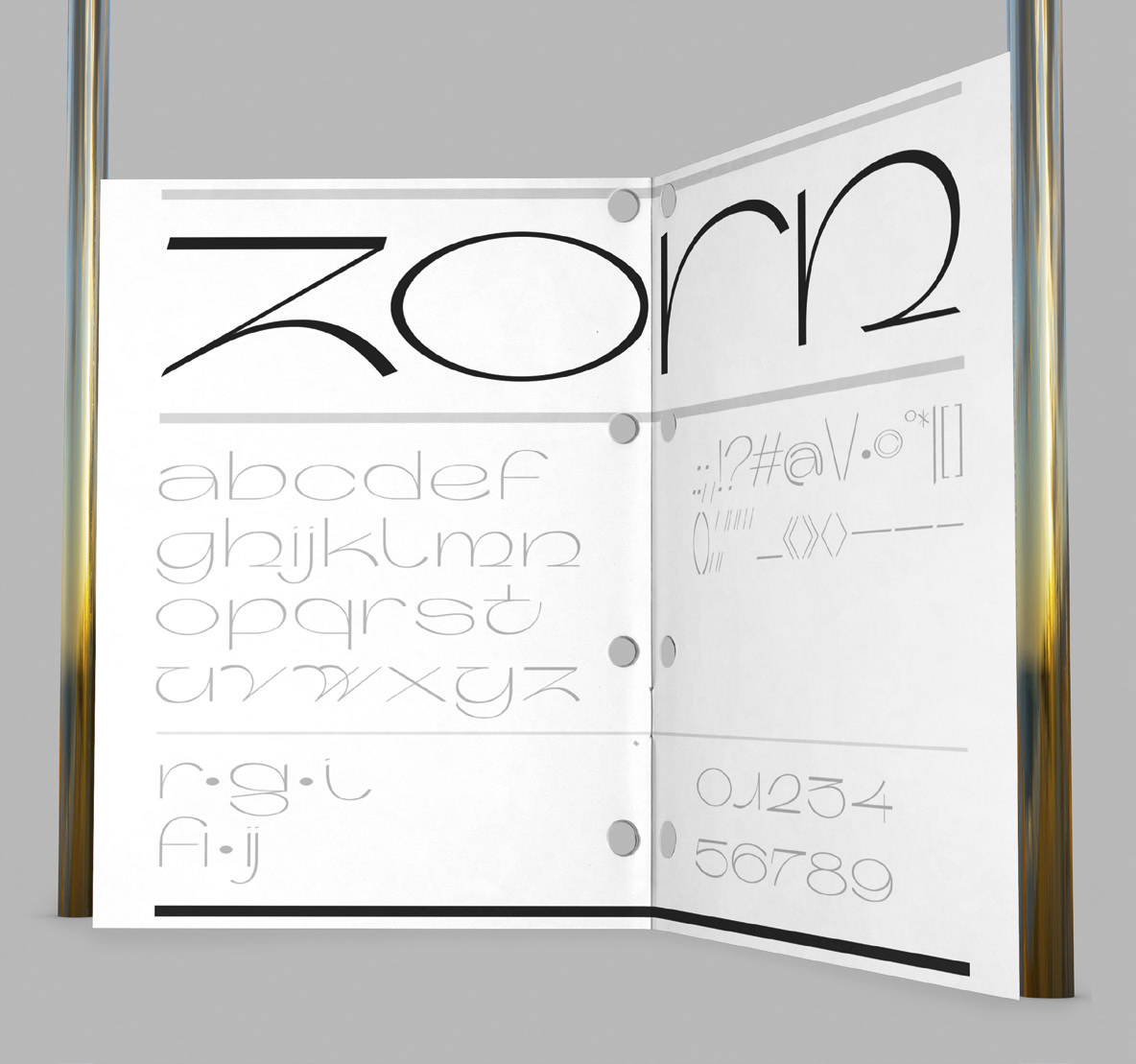
Csocsan describes Zorn as ‘a typeface that I had not planned to design’. The letterforms were shaped by the desire to capture the dynamic feel and contrast of sketches. ‘The contrast is not always consistent, so the letters have this somewhat odd feel to them,’ she says.
Rosa Bertoli was born in Udine, Italy, and now lives in London. Since 2014, she has been the Design Editor of Wallpaper*, where she oversees design content for the print and online editions, as well as special editorial projects. Through her role at Wallpaper*, she has written extensively about all areas of design. Rosa has been speaker and moderator for various design talks and conferences including London Craft Week, Maison & Objet, The Italian Cultural Institute (London), Clippings, Zaha Hadid Design, Kartell and Frieze Art Fair. Rosa has been on judging panels for the Chart Architecture Award, the Dutch Design Awards and the DesignGuild Marks. She has written for numerous English and Italian language publications, and worked as a content and communication consultant for fashion and design brands.