In the world of music festivals, two days are most important. One is the day the gates open, and the rabble-rousing begins. The other is the lineup poster drop. That graphic is often the deciding factor in whether attendees buy a ticket.
Well, when III Points, Miami’s alternative music festival, released its full lineup in 2024, fans saw something uncommon on the poster: a circle.
Generally, these rosters are read horizontally like any other piece of text. Some, like Coachella, gradually decrease the font size to indicate artist calibre. Some, like Lost Lands, have a block of big text for the more popular artists and a block of small text for the rising artists. Tomorrowland has a list of over 850 artists, all in the same size font.

The 2026 festival line-up poster for III Points
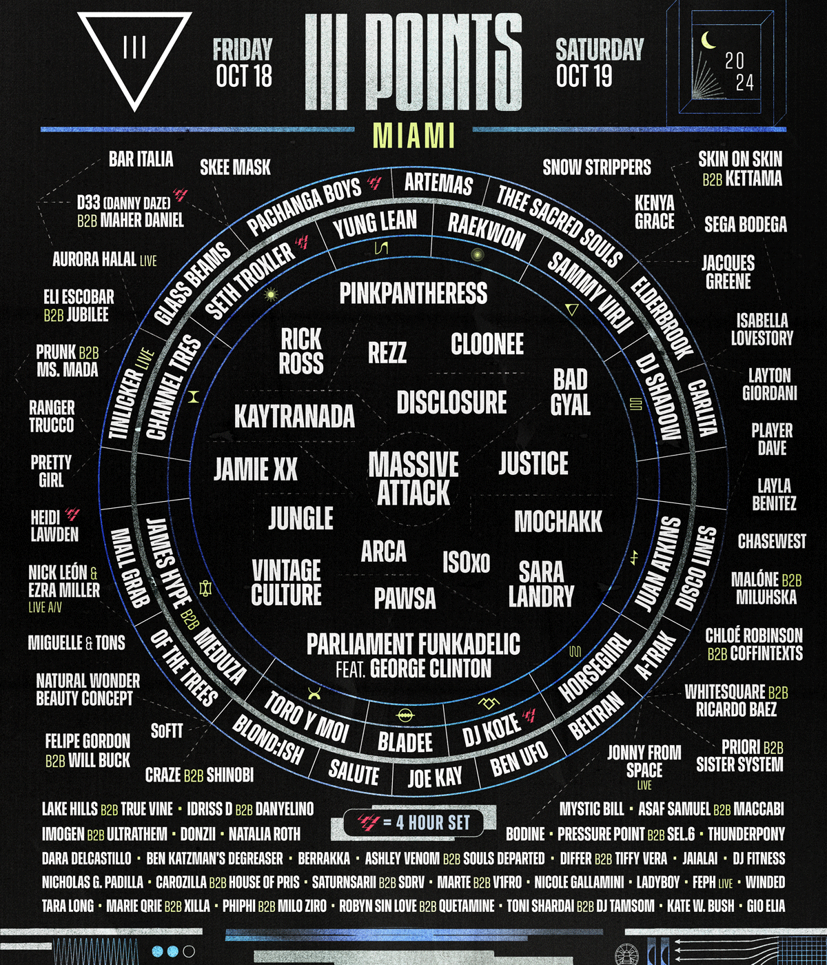
III Points reinvented the wheel (pun intended). For the last two years, the centrepiece of the roster has been a circle. Some names are within the circle. Some sit in the ringed frame, curved to fit. Others are outside of it, and the smallest names are listed horizontally below.
'I kinda reinvented what billing means,' says Santi Vidal, Talent Buyer for III Points. He books the artists and designs the poster. The lineup might not seem like a forum for innovation. After all, Vidal explains its purpose rather simply: '[You want] to get eyes on your biggest talent, but also present your talent in a way that is legible, so people could dissect it and not overwhelm.'
Yet numerous other festivals have started using non-traditional designs. In 2024, Tyler The Creator’s weekender Camp Flog Gnaw used a crossword puzzle. Two other major festivals, HARD Summer and Portola, relied on a more graffiti-esque look, rejecting sequential sizing and uniform font. Vidal comments that the latter two are following the trend he started.
'If you look at those lineups, it's the same thing as us,' Vidal says. 'You don't know who's headliner, who's bigger than who. There's no order.'

Vidal tells me the main reason for this ambiguity is to ease the pressure on the negotiations. Unless a lineup poster is like Tomorrowland, fully alphabetical with the same font size, every artist placement is a negotiation with their agent. I’ve personally heard from agents that billing can be the most stressful part of festival bookings.
Every agent wants their artist to be as high and as big as possible, while Vidal and his counterparts need to consider which acts are the biggest draw for ticket sales. The circle disrupted this standard process.
'It makes how agents perceive it ambiguous. There isn’t one headliner. You're either in the circle or [not]. The font sizes are the same. They don't know what's better than what,' Vidal explains. 'These 20 acts in the middle are all headliners. Then the acts surrounding it on the rings are the sub-headliners. You don't know if the person above you or next to you is billed higher. There’s no Coachella tiered hierarchy.'
Coachella’s poster has maintained the same format since 2003, long before it was a massive cultural touchpoint. But back then, the artist's fame level was obvious. Today, with social media and streaming, artists can attract millions of new fans in a matter of hours, and agents are sure to use those kinds of metrics as points in negotiations.
'In the festival landscape, so many artists are blowing up left and right,' Vidal says. 'If you create this format where it's ambiguous, it makes your life easier.'

Some points of the negotiation go beyond anything concrete as well. Vidal has had agents of more alternative artists request not to be placed beside more mainstream acts. Agents are the ones who are approving these artists to perform, which brings in the ticket sales that keep the festival alive.
'I'm also trying to make these agents that we're paying a lot of money to happy with the way that their client is presented,' Vidal says. 'It's a balancing act, and it's very tedious sometimes with the approval process.'
It might sacrifice some legibility, but a unique design is one way Vidal gets creative to keep the agents happy while easing his stress. Not to mention, he’s in a position to curate a lineup that he wants to see. He likes posters that create hierarchy to help discern which acts are more obscure:
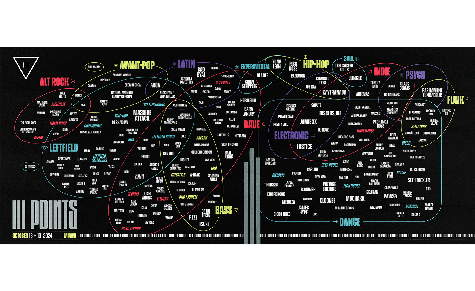
'My taste is kind of niche. I find the nuggets at the bottom, and then I'll go to the top,' Vidal explains. After the negotiations are done and the poster is out, he goes the extra mile and creates a second primary lineup graphic: the music map. He takes every booked artist and arranges them in overlapping Venn diagrams by their genres, creating a cheat-sheet for artist discovery.
'I think that's a really cool way to present a lineup,' Vidal says. 'If you like this artist, then the one next to it you would probably also like.'
With this asset, attendees will have a deeper understanding of who they paid good money to see when that next vital day of the festival comes.